
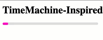
TimeMachine-Inspired Progress Indicator Using CSS Keyframes Animation
As I mentioned on the Working Code podcast a few months ago, I finally started using Apple's TimeMachine to back-up my Mac. The back-up process goes through a few difference phases: preparation, backing-up, and clean-up. During the "preparation" phase, the TimeMachine system menu shows a fun little progress indicator in which the progress bar bounces back-and-forth from left-to-right. Seeing as I've been so focused on ColdFusion / Lucee CFML code lately, I thought it would be a fun code kata to try and recreate the TimeMachine progress indicator using CSS @keyframes animation.
Run this demo in my JavaScript Demos project on GitHub.
View this code in my JavaScript Demos project on GitHub.
CSS @keyframes animation define a series of states that an element will be in during the course of the animation execution. The browser then transitions (hopefully smoothly) from one state to another using a timing function. In our case, since we want the progress indicator to move from one side to another and then back again, our @keyframes definition needs to define a timeline in which 0% is to-the-left, 50% is to-the-right, and then 100% is back to the left again. This way, as the animation iterates infinitely, the indicator will animate in a continuous cycle: left, right, left, right, left, right, ad nauseam.
To keep things simple (aka, so that I can build it), I'm going to use the CSS property, left, in order to move the indicator as an absolutely positioned element within the parent progress bar. In an ideal world, I'd use something like translateX() in order to move the indicator around as that would allow me to take advantage of GPU-accelerated animations. But, that was a bit beyond my skill-set; so, left it is!
Getting the CSS @keyframes to look good and transition smoothly required a good deal of trial-and-error. And, it's still not perfect. I wanted the animation to run a bit faster; but, doing so caused some janky on my browser. In the end, here's what I came up with:
<!doctype html>
<html lang="en">
<head>
	<meta charset="utf-8" />
	<title>
		TimeMachine-Inspired Progress Indicator Using CSS Keyframes Animation
	</title>
</head>
<body>

	<h1>
		TimeMachine-Inspired Progress Indicator Using CSS Keyframes Animation
	</h1>

	<div class="progress-bar">
		<div class="progress-bar__indicator"></div>
	</div>

	<style type="text/css">

		.progress-bar {
			background-color: #e0e0e0 ;
			border-radius: 7px 7px 7px 7px ;
			box-shadow: inset 0px 1px 1px rgb( 0, 0, 0, 0.1 ) ;
			height: 7px ;
			overflow: hidden ;
			position: relative ;
			width:  300px ;
		}

		.progress-bar__indicator {
			background-color: #ff00c8 ;
			border-radius: 7px 7px 7px 7px ;
			box-shadow: inset 0px -7px 3px -7px rgb( 100, 0, 78, 0.6 ) ;
			height: 7px ;
			left: 0px ;
			position: absolute ;
			top: 0px ;
			width: 0px ;

			animation-duration: 2500ms ;
			animation-fill-mode: both ;
			animation-iteration-count: infinite ;
			animation-name: progress-bar-calculating ;
			animation-timing-function: linear ;
		}

		/**
		* Since our indicator is moving from left-to-right and then back from right-to-
		* left, the half-way point (50%) of the animation is when the indicator is all
		* the way to the right. It will be visually in the "middle" at 25% and 75%, which
		* is half-way through both directions.
		*
		* To keep the indicator a constant size until hits the edges of the parent
		* container, the WIDTH property must be same for all keyframes except when it is
		* change size at the start / half-way points.
		*/
		@keyframes progress-bar-calculating {
			/* Left-most position. */
			0%, 100% {
				left: 0% ;
				width: 5% ;
			}
			/* Touches the left-side (with full-width indicator). */
			10%, 90% {
				left: 0% ;
				width: 40% ;
			}
			/* Mid-way point (with full-width indicator). */
			25%, 75% {
				left: 30% ;
				width: 40% ;
			}
			/* Touches the right-side (with full-width indicator). */
			40%, 60% {
				left: 60% ;
				width: 40% ;
			}
			/* Right-most position. */
			50% {
				left: 95% ;
				width: 5% ;
			}
		}

	</style>

</body>
</html>
Because the animation moves left-to-right and right-to-left in a linear fashion, I can use a comma-delimited list of offsets to define multiple keyframes at the same time. For example, the indicator is touching the left-side at both 0% and 100%, bringing it full-circle.
In this case, the width of the indicator stays a constant size - 40% - as the indicator travels horizontally. However, when the indicator hits one of the edges, it shrinks down to 5%. This is what gives the animation a kind of "bouncy" effect off the sides of the container element.
Like I said above, it's not perfect; it took a lot of trial-and-error; and, it still has a bit of animation jank. But, it was fun to exercise a different part of my brain for a hot minute. In general, I'm not a huge fan of animations as I find that they make an application appear sluggish. But, sometimes, animations are fun.
Want to use code from this post? Check out the license.

Reader Comments
Ben,
I think the reason it's jerky is because the keyframes are overly complex. Since your parent container is hiding the overflow, I'd just move the inner element outside the viewable area, so start the progress meter outside the viewing area and then on the "right" of the animation, push it outside the right edge.
Here's an example of the CSS:
And here's a live demo:
https://jsfiddle.net/dswitzer/b16mco7a/
@Dan,
Sorry about that formatting, I'll fix it up later today. But, yeah, your approach is super clever!! That's much nicer that my approach! And, allows you to use other types of easing. I had to go with
linearto make sure that it didn't get extra janky as you pass through each keyframe. But, now that you basically only have two states, you can play around with timing.Oh man, so good!!
@Ben,
I'm glad it was helpful to you!