Animating The Pseudo-Element Content Property Using CSS Keyframes Animation
At InVision, I'm building a small user interface (UI) that loads a list of documents and then caches them in memory for all subsequent renderings of the UI. During that one-time-only loading phase, I'm showing the static text, Loading...., in the view. But, this static text got me thinking about low-effort animations. And, whether or not I could use CSS @keyframes animations to animate the ellipsis portion of that text. It turns out, animating the content property works in modern browsers!
Run this demo in my JavaScript Demos project on GitHub.
View this code in my JavaScript Demos project on GitHub.
Normally with @keyframes animations, we use the timeline to define numeric CSS properties that can be animated gracefully using some sort of timing function. That said, it appears that we can use individual keyframes to set the state for non-animatable properties. These properties will be applied for the duration of the keyframe; but, will not receive any sort of transitiony magic.
In this demo, I'm animating the content property in order to apply an increasing number of dots (.) in the Loading.... ellipsis:
<!doctype html>
<html lang="en">
<head>
<meta charset="utf-8" />
<title>
Animating The Content Property Using CSS Keyframes Animation
</title>
<link rel="stylesheet" type="text/css" href="./demo.css" />
</head>
<body>
<h1>
Animating The Content Property Using CSS Keyframes Animation
</h1>
<p class="loading">
Loading<span class="loading__ellipsis">.</span>
</p>
<p>
↑ Note that the ellipsis here is being animated using CSS.
</p>
<style type="text/css">
.loading {
color: #ff3366 ;
font-size: 30px ;
font-weight: bold ;
}
.loading__ellipsis:after {
animation-duration: 500ms ;
animation-fill-mode: both ;
animation-iteration-count: infinite ;
animation-name: loading-ellipsis ;
animation-timing-function: linear ;
/*
This has to be here otherwise animation won't run in Chrome. Plus, the
animation won't run at all in Safari (classic Safari), so this provides a
back-up rendering for non-modern browsers.
*/
content: "...." ;
display: inline-block ;
}
@keyframes loading-ellipsis {
0% {
content: "" ;
}
20% {
content: "." ;
}
40% {
content: ".." ;
}
60% {
content: "..." ;
}
80%, 100% {
content: "...." ;
}
}
</style>
</body>
</html>
When using the CSS content property, we have to use a pseudo-element such as :before or :after. It's this pseudo-element that gets the animation keyframes. And, even though we are going to define the content property in the @keyframes timeline, we do have to define it in the pseudo-element as well. If not, the animation won't run in Chrome. Defining the initial value also helps in legacy browsers, like Safari, which will use the initial value instead of the CSS animation.
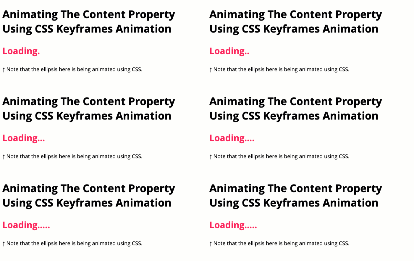
That said, when we run this in a modern browser like Chrome, Firefox, or Microsoft Edge, we get the following output:

As you can see, the ellipses within our Loading.... text is dynamically changing according to the CSS @keyframes animation. Pretty cool! And, an easy way to add a little animation without doing anything too complex or distracting.
Want to use code from this post? Check out the license.

Reader Comments