Applying Multiple Animation @keyframes To Support Prefers-Reduced-Motion In CSS
Yesterday, I demonstrated that four-sided positioning plays nicely with scale() transformations in CSS. That demo used both the opacity and transform properties in order to "enter" a modal window into view. After I posted that, I started to think about the prefers-reduced-motion CSS media query. And, I wanted to revisit yesterday's post, looking at how we might honor a user's preference for reduced motion by applying multiple @keyframes to the modal window in CSS using media queries.
Run this demo in my JavaScript Demos project on GitHub.
View this code in my JavaScript Demos project on GitHub.
When I first stated to think about this problem, my initial thought was to nest the @keyframes block inside a @media block. This way, the default definition of the animation would use a "reduced motion" configuration; and then, we'd progressively enhance the definition to use the motion-oriented properties as well:
.modal {
	/* Four-sided positioning, plays nicely with scale() transformations. */
	bottom: 0px ;
	left: 0px ;
	position: fixed ;
	right: 0px ;
	top: 0px ;

	/* Animating the modal element into view. */
	animation-duration: 1s ; /* NOTE: Absurdly SLOW for demo purposes. */
	animation-fill-mode: both ;
	animation-iteration-count: 1 ;
	animation-name: modal-enter ;
	animation-timing-function: ease-out ;
}

/* By default, we'll use the REDUCED MOTION version of the animation. */
@keyframes modal-enter {
	from {
		opacity: 0 ;
	}
	to {
		opacity: 1 ;
	}
}

/*
	Then, if the user has NO PREFERENCE for motion, we can OVERRIDE the
	animation definition to include both the motion and non-motion properties.
*/
@media ( prefers-reduced-motion: no-preference ) {
	@keyframes modal-enter {
		from {
			opacity: 0 ;
			transform: scale( 0.7 ) ;
		}
		to {
			opacity: 1 ;
			transform: scale( 1.0 ) ;
		}
	}
}
As you can see, the initial definition of @keyframes modal-enter uses the opacity property on its own. The animation is then enhanced to use both opacity and transform if the user has no motion preference.
This approach works fine. But, I didn't love the fact that I had to define opacity in both animations. I was also seeing some conflicting evidence on the web about whether or not nested @at rules were well supported. So, another thought that I had was to define the scale() value using CSS custom properties; and then override the property using a media query:
/* By default, we'll use the REDUCED MOTION version of the animation. */
:root {
	--transform-start: 1.0 ;
	--transform-end: 1.0 ;
}

/*
	Then, if the user has NO PREFERENCE for motion, we can OVERRIDE the
	animation definition to include both the motion and non-motion properties.
*/
@media ( prefers-reduced-motion: no-preference ) {
	:root {
		--transform-start: 0.7 ;
		--transform-end: 1.0 ;
	}
}

@keyframes modal-enter {
	from {
		opacity: 0 ;
		transform: scale( var( --transform-start ) ) ;
	}
	to {
		opacity: 1 ;
		transform: scale( var( --transform-end ) ) ;
	}
}
This also works; and, I don't have to repeat myself in terms of the property list; however, it just feels quite verbose. And, I know that IE11 doesn't support custom properties (and InVision's V6 platform still supports IE11). I'm also not very familiar with CSS custom properties (mostly because I can't use them at work).
So, my final thought was to apply two different @keyframes to the modal window element based on the reduce motion media query - one set would define the reduce-motion animation properties; and, the other set would define the full-motion animation properties:
<!doctype html>
<html lang="en">
<head>
	<meta charset="utf-8" />
	<title>
		Applying Multiple Animation @keyframes To Support Prefers-Reduced-Motion In CSS
	</title>
	<link rel="stylesheet" type="text/css" href="./demo.css">
	<style type="text/css">

		.modal {
			/* Four-sided positioning, plays nicely with scale() transformations. */
			bottom: 0px ;
			left: 0px ;
			position: fixed ;
			right: 0px ;
			top: 0px ;

			/*
				Animating the modal element into view: our modal-enter animation is going
				to use the REDUCED MOTION animation by default. Then, it will become
				"progressively enhanced" to use the FULL MOTION animation properties
				depending on the user's preference.
			*/
			animation-duration: 1s ; /* NOTE: Absurdly SLOW for demo purposes. */
			animation-fill-mode: both ;
			animation-iteration-count: 1 ;
			animation-name: modal-enter-reduced-motion ; /* Start with reduced motion. */
			animation-timing-function: ease-out ;
		}

		/*
			If the user has no preference (the default settings in the OS), enhance the
			modal window to use BOTH the REDUCED MOTION and the FULL MOTION properties.
		*/
		@media ( prefers-reduced-motion: no-preference ) {
			.modal {
				animation-name:
					modal-enter-reduced-motion,
					modal-enter-full-motion
				;
			}
		}

		/* Reduce motion only uses opacity, but DOESN'T MOVE the elements around. */
		@keyframes modal-enter-reduced-motion {
			from {
				opacity: 0 ;
			}
			to {
				opacity: 1 ;
			}
		}

		@keyframes modal-enter-full-motion {
			from {
				transform: scale( 0.7 ) ;
			}
			to {
				transform: scale( 1.0 ) ;
			}
		}

	</style>
</head>
<body>

	<h1>
		Applying Multiple Animation @keyframes To Support Prefers-Reduced-Motion In CSS
	</h1>

	<p>
		<a class="toggle">Open modal</a>
	</p>

	<!--
		This modal window will use FIXED positioning and have a four-sided (top, right,
		bottom, left) arrangement. It will also fade into view using CSS transitions.
	-->
	<template>
		<div class="modal">
			<a class="toggle">Close modal</a>
		</div>
	</template>


	<!-- Load scripts. -->
	<script type="text/javascript" src="../../vendor/jquery/3.6.0/jquery-3.6.0.min.js"></script>
	<script type="text/javascript">

		var modal = null;
		var template = $( "template" );

		// We'll use event-delegation so that we can capture the click event in the
		// modal, which isn't even rendered yet.
		$( document ).on( "click", ".toggle", toggleModal );

		// I show / hide the modal window by adding it to or removing it from the DOM
		// (Document Object Model) tree, respectively.
		function toggleModal() {

			if ( modal ) {

				modal.remove();
				modal = null;

			} else {

				modal = $( template.prop( "content" ).firstElementChild.cloneNode( true ) )
					.appendTo( document.body )
				;

			}

		}

	</script>

</body>
</html>
To be fair, this approach is also quite verbose. But, it also works. And, if we run this demo in the browser using different OS (Operating System) settings for reduced motion, we get the following output:
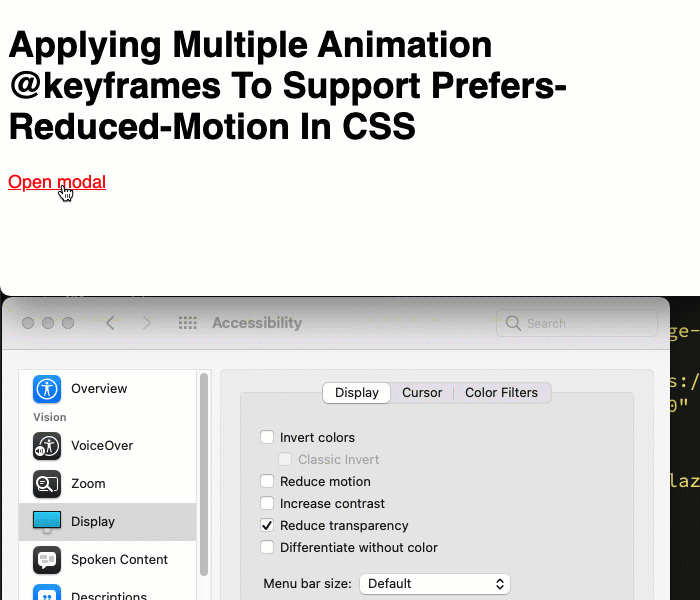
As you can see, when the reduced-motion setting is enabled, we only apply the opacity-based animation. And, the reduce-motion setting is disabled, we apply both the opacity-based and the transform-based animations.
Ultimately, all three of these approaches work (depending on browser support). And, all three of these approaches have benefits and drawbacks. But, for whatever reason, I kind of prefer the last approach - applying multiple @keyframes animations to aggregate the full set of animated properties. There's a certain "simplicity" to it that I can't articulate.
Want to use code from this post? Check out the license.

Reader Comments