
Hiding Overflow Scrollbars Until Hover (ala Gmail Labels) In Angular 9.1.7
The other day, when using my Gmail account, I noticed an interesting little user experience (UX): my list of "labels", which is longer than my browser's viewport, is only scrollable when I mouse-over it. I assume this is done to hide the scrollbar which would otherwise create a strong "visual hurdle" in the middle of the page. Many years ago, I looked at something similar - keeping overflow content unresponsive until Clicked (with jQuery); as such, I thought it might be fun to try and mimic this Gmail behavior in Angular 9.1.7.
Run this demo in my JavaScript Demos project on GitHub.
View this code in my JavaScript Demos project on GitHub.
CAUTION: I think there are non-trivial user experience (UX) issues when you hide a scrollbar. For one, in some browsers (such as Chrome), there's no way to
CMD+Fand locate the content within anoverflow:hiddenportion of the UI (User Interface). Also, depending on the design of the page, a scrollbar may be the only clear indication that a portion of the view is scrollable. As such, removing the scrollbar may confuse the user.This is one of those cases where there is clear tension between accessibility and aesthetics. It is obvious that always showing the scrollbar leads to a more accessible, more intuitive experience. However, from a strictly-aesthetic standpoint, leaving a scrollbar in the "middle" of your viewport is less attractive. There are no winners here - both approaches are a trade-off.
Upon inspecting the DOM (Document Object Model) of my Gmail app, I could see that their implementation of the scrollable area included an inner-container with a fixed-width. This inner-container's fixed-width allowed for the scrollbar (on the parent element) to show-up without affecting the width of the content:
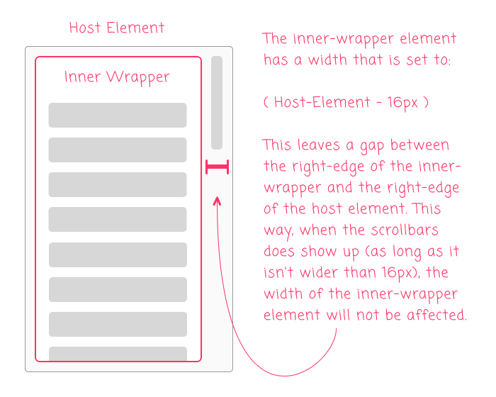
By including the 16px gap between the inner-container and the host element, adding a scrollbar (as long as it's not wider than 16px) will leave the width of the inner-container unaffected. This is important because it creates a smoother experience, removing the need for content to shift around in response to the user's interactions.
It would be easy enough to hard-code the width of the inner-container in a real-world application. But, since this is an exploration, I thought it would be more interesting to try and create an Angular Component that would manage the nested-DOM structure and the width for us.
Plus, this feels like the perfect use-case for content projection.
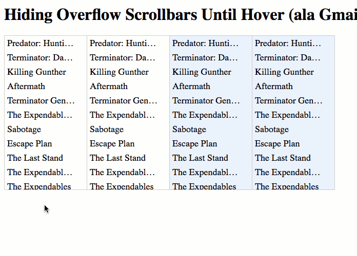
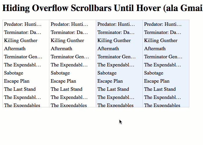
To explore this idea in Angular 9.1.7, I created an App component that lists a bunch of Arnold Schwarzenegger movies. The same list of movies is repeated 4-times. The first two lists are wrapped in one version of my solution (app-scroll-on-mouseenter); the second two lists are wrapped in a second version of my solution (app-scroll-on-mouseenter2):
<div class="lists">
	<app-scroll-on-mouseenter class="list-viewport">

		<ul class="list">
			<li *ngFor="let movie of movies" class="item">
				{{ movie }}
			</li>
		</ul>

	</app-scroll-on-mouseenter>
	<app-scroll-on-mouseenter class="list-viewport">

		<ul class="list">
			<li *ngFor="let movie of movies" class="item">
				{{ movie }}
			</li>
		</ul>

	</app-scroll-on-mouseenter>

	<!-- *********** VERSION 2 of Directive Below This. *********** -->

	<app-scroll-on-mouseenter2 class="list-viewport">

		<ul class="list">
			<li *ngFor="let movie of movies" class="item">
				{{ movie }}
			</li>
		</ul>

	</app-scroll-on-mouseenter2>
	<app-scroll-on-mouseenter2 class="list-viewport">

		<ul class="list">
			<li *ngFor="let movie of movies" class="item">
				{{ movie }}
			</li>
		</ul>

	</app-scroll-on-mouseenter2>
</div>
With my first attempt - <app-scroll-on-mouseenter> - I tried to keep it super simple! I thought that I could just use the :hover pseudo-selector to adjust the width of the inner-container:
// Import the core angular services.
import { Component } from "@angular/core";

// ----------------------------------------------------------------------------------- //
// ----------------------------------------------------------------------------------- //

@Component({
	selector: "app-scroll-on-mouseenter",
	styles: [
		`
			:host {
				display: block ;
				overflow: hidden ;
			}
			.wrapper {
				width: calc( 100% - 16px ) ;
			}

			:host:hover {
				overflow: auto ;
				overscroll-behavior: contain ;
			}
			:host:hover .wrapper {
				width: 100% ;
			}
		`
	],
	template:
	`
		<div class="wrapper">
			<ng-content></ng-content>
		</div>
	`
})
export class ScrollOnMouseenterComponent {
	// ....
}
As you can see, this Angular component has almost no logic. It's just performing some content projection (transcluding the list of movies into the .wrapper element); and then, adjusting the overflow and width CSS properties when the user mouses-over the host element.
At first, this approach actually appeared to work quite nicely! However, as I was noodling on it, I had two realizations:
The width of the scrollbar on my Mac doesn't actually take up
16pxof space. It takes of15pxof space. As such, when I change the width of the inner-container fromcalc(100%-16px)to100%, the manifested width actually changes by1px. This causes a jarring effect with the text-overflow as the location of several ellipses shift, creating a visual distraction.Even more problematic is that some people have completely insane scrollbar settings (no judgment!) where they want the MacOS to hide their scrollbar always. This means that when I activate scrolling, and change the width of the inner-container to
100%, the manifested width increases by16px, which is even more jarring than the text-overflow issue.
This latter experience can be seen in the following GIF:
As you can see, by using the [terrible] setting in your MacOS to always hide the scrollbar leads to an unintuitive, non-discoverable UI that - at least in this case - is also jarring as the content shifts around.
To deal with these different user-preferences, I created a second version of the directive that includes a bit more logic. With this second Angular component, rather than working exclusively with :hover, I am switching over to (mouseenter) and (mouseleave) event-handlers that set an explicit, pixel-based width on the inner-container.
The initial, non-scrollable width is still calc(100%-16px). However, when the user mouses into the component, I'm setting an inline style on the inner-container that is set to the result of the calculated width:
// Import the core angular services.
import { Component } from "@angular/core";
import { ElementRef } from "@angular/core";

// ----------------------------------------------------------------------------------- //
// ----------------------------------------------------------------------------------- //

@Component({
	selector: "app-scroll-on-mouseenter2",
	host: {
		"[class.is-scrollable]": "isScrollable",
		"(mouseenter)": "enable()",
		"(mouseleave)": "disable()"
	},
	styles: [
		`
			:host {
				display: block ;
				overflow: hidden ;
			}
			.wrapper {
				width: calc( 100% - 16px ) ;
			}

			:host( .is-scrollable ) {
				overflow: auto ;
				overscroll-behavior: contain ;
			}
		`
	],
	template:
	`
		<div class="wrapper" [style.width.px]="wrapperWidth">
			<ng-content></ng-content>
		</div>
	`
})
export class ScrollOnMouseenter2Component {

	public isScrollable: boolean;
	public wrapperWidth: number | null;

	private elementRef: ElementRef;

	// I initialize the scroll-on-mouseenter component.
	constructor( elementRef: ElementRef ) {

		this.elementRef = elementRef;

		this.isScrollable = false;
		this.wrapperWidth = null;

	}

	// ---
	// PUBLIC METHODS.
	// ---

	// I disable scrolling on the host component.
	public disable() : void {

		this.isScrollable = false;
		// NOTE: By setting the CSS property to NULL, the browser will REMOVE the inline
		// style from the wrapper, allowing the stylesheet properties to take precedence.
		this.wrapperWidth = null;

	}


	// I enable scrolling on the host component.
	public enable() : void {

		this.isScrollable = true;
		// At this point (while the host element is still deactivated - our view-model
		// has not yet been reconciled with the component template), the width of the
		// wrapper is "calc( 100% - 16px )". When we activate the host element, the
		// scrollbars MAY OR MAY NOT APPEAR (depending on the user's MacOS settings). As
		// such, we have to switch from a calculated width to an EXACT WIDTH in order to
		// prevent the content from jumping. To do this, we're going to set an INLINE
		// style width that is equal to the current calc()-based width.
		this.wrapperWidth = this.elementRef.nativeElement
			.childNodes[ 0 ]
			.clientWidth
		;

	}

}
As you can see, when the user mouses-into the host element, we're setting a transient inline style that defines the width of the inner-container to be the .clientWidth of the inner-container. This allows us to translate the calc()width into an explicit px width.
With this second approach, the inner-container width doesn't bounce around even with the different MacOS settings:
As you can see, with this second approach that applies an explicit, pixel-based width to the inner-container on mouse-enter, the content remains in-place regardless of the user's scrollbar settings.
As I said before, hiding scrollbars has non-trivial user experience (UX) issues. But, littering the user interface (UI) with scrollbars can lead to less attractive designs. As such, there is always going to be tension between accessibility and design. That said, wrapping this behavior in an Angular component was a fun exploration.
Epilogue On Gmail's Implementation
I noticed in the Gmail implementation that they are using min-width and max-width CSS properties on their inner-container, rather than setting an explicit width:
max-width: 240px ;
min-width: 240px ;
People at Google are pretty smart. So, I assume there is a critical difference between this approach and just setting a width:240px property. But, my CSS insights can't explain it. If anyone understands this pattern, I would love to hear it!
Want to use code from this post? Check out the license.

Reader Comments
Thanks for the amazing article! Well written and beautifully explained!
See
https://stackoverflow.com/questions/47133888/min-width-and-max-width-with-the-same-value
for some edge cases where min and max will be different than setting width
@Emm,
Thank you for the link about
min-width/max-width. Unfortunately, the answers go a little over my head :D I see they have an example withdisplay: flexwhere it does have a difference. But, I think that's only when they leave-in the defaultflexproperty, which defaults to something likeflex: 1 1 0. However, if you add in a value likeflex: 0 0 auto, then the effect changes completely..... I'm mostly just talking out-loud here because clearly I don't have the strongest understanding of why Flexbox is behaving this way. I'll have to try and build a better mental model for how flex-basis works.
@Emm,
Also, you might be interested in a follow-up post on how Slack's scrollbar works, which is quite brilliant:
www.bennadel.com/blog/3864-copying-slacks-brilliant-virtual-scrollbar-and-overflow-container-in-angular-9-1-12.htm
Like GMail, they are using the "native" scrolling behavior; but, they hide the native scrollbar in a really clever way.
Hi, can this be easily modified to take into account if there is no scrollbar in the first place?
If I remove all items but "The Expendables 2", width is still truncated by 16px and it becomes "The Expendabl..." (whereas in case of "width: initial;" it becomes "The Expendables 2").