
Customizing A Select Component Using TemplateRef And NgTemplateOutlet In Angular 9.0.0-rc.3
A few weeks ago, Stephen Cooper was on the Adventures in Angular podcast discussing the use of the NgTemplateOutlet Directive as a means to customize components in Angular. This is a topic that I've touched-on briefly in the past; but, it's been quite a while. And, since I just finished an exploration wherein I created a custom Select component with an Options list that renders in the root stacking context, I thought this would be a perfect opportunity to revamp my latest demo using TemplateRef and the NgTemplateOutlet directive in Angular 9.0.0-rc.3.
Run this demo in my JavaScript Demos project on GitHub.
View this code in my JavaScript Demos project on GitHub.
The basic idea behind providing a TemplateRef as part of your Angular Component consumption is that you can keep your component more generic (ie, reusable) by deferring some of the specifics to the calling context. So, for example, instead of a Select Component having to know how to render its own Options, it can defer the rendering to a TemplateRef such that the Select Component only has to know how to manage the "dropdown mechanics" and the uni-directional data-flow.
With a custom Select component, we could use the following types of template:
Null-Selection - A template that knows how to render the menu-root when no value is selected.
Root - A template that knows how to render the selected-value in the menu-root.
Option - A template that knows how to render each Option within the dropdown menu.
If we can offload all of this rendering logic to the calling context, then the custom Select component only has to invoke the appropriate TemplateRef and pass-in the necessary "Context" object: the dictionary of values that can be bound inside a specific instance of a given TemplateRef.
To see this in action, I'm going to render a few custom Select components that can be used to choose a Color Palette. This is a fun example because rendering a color palette uses some non-trivial HTML and CSS.
Fist, let's look at the App component to get a sense of the data in play:
// Import the core angular services.
import { Component } from "@angular/core";

// ----------------------------------------------------------------------------------- //
// ----------------------------------------------------------------------------------- //

interface ColorPalette {
	name: string;
	url: string;
	swatches: string[];
}

@Component({
	selector: "app-root",
	styleUrls: [ "./app.component.less" ],
	templateUrl: "./app.component.html"
})
export class AppComponent {

	public colorPalettes: ColorPalette[];
	public selectedColorPalette: ColorPalette | null;

	// I initialize the app component.
	constructor() {

		this.colorPalettes = [
			{
				name: "Spring Lemon",
				url: "https://coolors.co/129490-4ecdc4-6bffb8-fff275-f55536",
				swatches: [ "#129490", "#4ecdc4", "#6bffb8", "#fff275", "#f55536" ]
			},
			{
				name: "IainUKP1",
				url: "https://coolors.co/195daf-022b3a-bfdbf7-e1e5f2-ffffff",
				swatches: [ "#195daf", "#022b3a", "#bfdbf7", "#e1e5f2", "#ffffff" ]
			},
			{
				name: "Cups",
				url: "https://coolors.co/ffc0cb-fff8e8-fcd581-d52941-990d35",
				swatches: [ "#ffc0cb", "#fff8e8", "#fcd581", "#d52941", "#990d35" ]
			},
			{
				name: "FLL2",
				url: "https://coolors.co/7e8d85-454851-dbd56e-6c0e23-a1a1a1",
				swatches: [ "#7e8d85", "#454851", "#dbd56e", "#6c0e23", "#a1a1a1" ]
			},
			{
				name: "Palette1",
				url: "https://coolors.co/546a76-88a0a8-b4ceb3-dbd3c9-a0878a",
				swatches: [ "#546a76", "#88a0a8", "#b4ceb3", "#dbd3c9", "#a0878a" ]
			},
			{
				name: "Sampada Logo New Age Muted",
				url: "https://coolors.co/fcf9ea-444054-58595f-8aadb1-d3c0cd",
				swatches: [ "#fcf9ea", "#444054", "#58595f", "#8aadb1", "#d3c0cd" ]
			},
			{
				name: "Nummer 4",
				url: "https://coolors.co/9eb1b5-b1d1d3-eff6ff-c10001-700001",
				swatches: [ "#9eb1b5", "#b1d1d3", "#eff6ff", "#c10001", "#700001" ]
			},
			{
				name: "Pop 3",
				url: "https://coolors.co/ffffff-bc4f74-a22489-a553ae-c9f1e9",
				swatches: [ "#ffffff", "#bc4f74", "#a22489", "#a553ae", "#c9f1e9" ]
			}
		];
		this.selectedColorPalette = null;

	}

}
As you can see, our App component logic is pretty simple - we just define a set of color palettes with the ability to mark one as selected. The real complexity of this demo lives in the App component's template.
In the following HTML, we're going to define a few TemplateRef elements at the top of the page. Note that each of these template fragments uses the # syntax to create a template-local variable. These template-local variables are then passed into the custom Select component as input-bindings:
<!--
Our HtmlSelect component allows the developer to customize the rendering of the
component using TemplateRef inputs. Some templates, like the [optionTemplate], are
REQUIRED. But, other templates, like the [rootTemplate] and the [nullTemplate], are
OPTIONAL. Since we're going to be instantiating multiple dropdown components, let's
define our templates up top and then re-use them for each dropdown instance below.
-->
<!-- This is the template for the MENU ROOT when NO OPTION is selected. -->
<ng-template #nullTemplateRef>
<div class="pick">
— Pick a Palette —
</div>
</ng-template>
<!-- This is the template for the MENU ROOT when an option is selected. -->
<ng-template #rootTemplateRef let-option>
<ul [title]="option.name" class="color-palette-preview">
<li
*ngFor="let swatch of option.swatches"
class="color-palette-preview__swatch"
[style.background-color]="swatch">
<span class="color-palette-preview__hex">
{{ option.swatches[ 0 ] }}
</span>
</li>
</ul>
</ng-template>
<!--
This is the template for the MENU OPTION - the options that show up in the actual
dropdown menu.
-->
<ng-template
#optionTemplateRef
let-option
let-selected="selected"
let-active="active">
<div
class="color-palette"
[class.active]="active"
[class.selected]="selected">
<ul class="color-palette__swatches">
<li
*ngFor="let swatch of option.swatches"
class="color-palette__swatch"
[style.background-color]="swatch">
<span class="color-palette__hex">
{{ option.swatches[ 0 ] }}
</span>
</li>
</ul>
<div class="color-palette__name">
{{ option.name }}
</div>
</div>
</ng-template>
<!-- -------------------------------------------------------------------------------- -->
<!-- -------------------------------------------------------------------------------- -->
<!-- Now that we've defined our templates, we can re-use them in each dropdown. -->
<app-html-select
[(value)]="selectedColorPalette"
[options]="colorPalettes"
[nullTemplate]="nullTemplateRef"
[rootTemplate]="rootTemplateRef"
[optionTemplate]="optionTemplateRef"
class="top-left">
</app-html-select>
<app-html-select
[(value)]="selectedColorPalette"
[options]="colorPalettes"
[nullTemplate]="nullTemplateRef"
[rootTemplate]="rootTemplateRef"
[optionTemplate]="optionTemplateRef"
class="top-right">
</app-html-select>
<app-html-select
[(value)]="selectedColorPalette"
[options]="colorPalettes"
[nullTemplate]="nullTemplateRef"
[rootTemplate]="rootTemplateRef"
[optionTemplate]="optionTemplateRef"
class="bottom-right">
</app-html-select>
<app-html-select
[(value)]="selectedColorPalette"
[options]="colorPalettes"
[nullTemplate]="nullTemplateRef"
[rootTemplate]="rootTemplateRef"
[optionTemplate]="optionTemplateRef"
class="bottom-left">
</app-html-select>
<app-html-select
[(value)]="selectedColorPalette"
[options]="colorPalettes"
[nullTemplate]="nullTemplateRef"
[rootTemplate]="rootTemplateRef"
[optionTemplate]="optionTemplateRef"
class="center">
</app-html-select>
As you can see, we are defining three template-local variables that reference our TemplateRef instances:
#nullTemplateRef#rootTemplateRef#optionTemplateRef
We then instantiate five different custom Select components passing the same set of reusable templates into each.
Now, if we run this Angular 9 code in the browser, we get the following browser output:
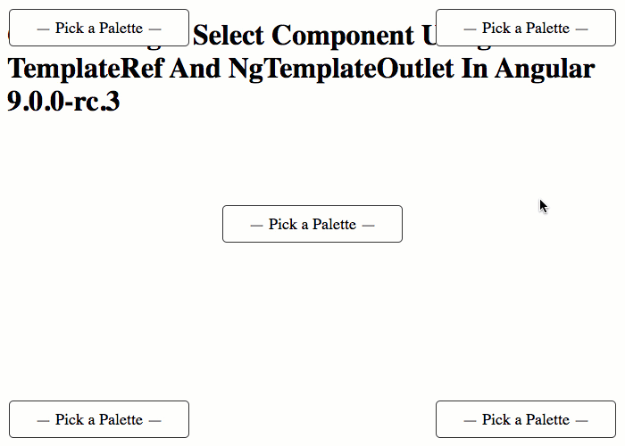
As you can see, before I've selected anything, the #nullTemplateRef is being used to render the menu root. And, once I've selected a value, the #rootTemplateRef is being used to render the root. And, when I open-up the dropdown menu, the #optionTemplateRef is being used to render the items in the options-list.
Of course, a TemplateRef doesn't render itself - it just defines the rendering template. In order to render the TemplateRef we have to pass it to a Directive that can bind it to a Context object in order to create some sort of output. So, for example, we could pass it to the ngFor Directive's ngForTemplate input binding. Or, as I do in this exploration, we can pass it to the ngTemplateOutlet Directive.
The ngTemplateOutlet Directives takes a TemplateRef and a Context object and merges the two together in order to render HTML. To see this in action, let's now look at the HTML template for our custom Select component. Notice that the Select HTML defines a default TemplateRef at the top to use in case no null-template has been provided:
<!-- If the developer does not provide a NullTemplate, we'll fall-back to this one. -->
<ng-template #defaultNullTemplate>
— Select Option —
</ng-template>
<button
#rootRef
(click)="showMenu()"
class="root"
[ngSwitch]="( value === null )">
<ng-template [ngSwitchCase]="true">
<ng-template-outlet
[ngTemplateOutlet]="( nullTemplate || defaultNullTemplate )">
</ng-template-outlet>
</ng-template>
<ng-template [ngSwitchCase]="false">
<ng-template-outlet
[ngTemplateOutlet]="( rootTemplate || optionTemplate )"
[ngTemplateOutletContext]="{
$implicit: value,
value: value,
index: -1,
selected: false,
active: false
}">
</ng-template-outlet>
</ng-template>
</button>
<div
#menuRef
class="menu"
[style.display]="( isShowingMenu ? 'block' : 'none' )">
<ul
*ngIf="isShowingMenu"
(mouseleave)="setActiveIndex( -1 )"
class="options">
<li
*ngFor="let option of options ; let index = index ;"
(click)="handleSelect( option )"
(mouseenter)="setActiveIndex( index )"
class="option">
<ng-template-outlet
[ngTemplateOutlet]="optionTemplate"
[ngTemplateOutletContext]="{
$implicit: option,
value: option,
index: index,
selected: ( option === value ),
active: ( index === activeIndex )
}">
</ng-template-outlet>
</li>
</ul>
</div>
As you can see, when I use the ngTemplateOutlet directive, I can define a context object - ngTemplateOutletContext - that provides a set of values to the TemplateRef. So, for example, when I provide a value property to the optionTemplateRef, the optionTemplateRef can then access that property by declaring let-value in the TemplateRef signature.
For completeness, I'll share the code-behind for the custom Select; but, really, the code here is not terribly relevant - I really only wanted to look at the way we can provide and then consume TemplateRef instances in a custom Angular component. This code has a lot of "noise" in it since I was revamping my previous blog post:
// Import the core angular services.
import { ChangeDetectionStrategy } from "@angular/core";
import { ChangeDetectorRef } from "@angular/core";
import { Component } from "@angular/core";
import { ElementRef } from "@angular/core";
import { EventEmitter } from "@angular/core";
import { TemplateRef } from "@angular/core";
import { ViewChild } from "@angular/core";

// ----------------------------------------------------------------------------------- //
// ----------------------------------------------------------------------------------- //

interface OptionTemplateContext {
	$implicit: any;
	value: any;
	index: number;
	selected: number;
	active: boolean;
}

@Component({
	selector: "app-html-select",
	inputs: [
		"value",
		"options",
		"optionTemplate",
		"rootTemplate",
		"nullTemplate"
	],
	outputs: [
		"valueChangeEvents: valueChange"
	],
	host: {
		"(document:mousedown)": "handleMousedown( $event )",
		"(window:resize)": "hideMenu()",
		"(window:keydown.Esc)": "hideMenu()"
	},
	queries: {
		menuRef: new ViewChild( "menuRef" ),
		rootRef: new ViewChild( "rootRef" )
	},
	changeDetection: ChangeDetectionStrategy.OnPush,
	styleUrls: [ "./html-select.component.less" ],
	templateUrl: "./html-select.component.html"
})
export class HtmlSelectComponent {

	public activeIndex: number;
	public isShowingMenu: boolean;
	public menuRef!: ElementRef;
	public nullTemplate!: TemplateRef<OptionTemplateContext>;
	public options!: any[];
	public optionTemplate!: TemplateRef<OptionTemplateContext>;
	public rootRef!: ElementRef;
	public rootTemplate!: TemplateRef<OptionTemplateContext>;
	public value!: any;
	public valueChangeEvents: EventEmitter<any>;

	private changeDetectorRef: ChangeDetectorRef;

	// I initialize the html select component.
	constructor( changeDetectorRef: ChangeDetectorRef ) {

		this.changeDetectorRef = changeDetectorRef;

		this.activeIndex = -1;
		this.isShowingMenu = false;
		this.valueChangeEvents = new EventEmitter();

	}

	// ---
	// PUBLIC METHODS.
	// ---

	// I handle the mousedown event on the document.
	public handleMousedown( event: MouseEvent ) : void {

		// If the user has moused-down OUTSIDE of the select-menu, we're going to
		// interpret that as moving focus away from the menu. As such, we're going to
		// close it.
		if (
			this.isShowingMenu &&
			! this.rootRef.nativeElement.contains( event.target ) &&
			! this.menuRef.nativeElement.contains( event.target )
			) {

			this.hideMenu();

		}

	}


	// I propagate the given value as a desired valueChange event.
	public handleSelect( nextValue: any ) : void {

		if ( this.value !== nextValue ) {

			this.valueChangeEvents.emit( nextValue );

		}

		this.hideMenu();

	}


	// I hide the pop-up menu.
	public hideMenu() : void {

		this.isShowingMenu = false;

	}


	// I get called once after the view template has been compiled.
	public ngAfterViewInit() : void {

		// CAUTION: Now that the view has been initialized, it means that Angular has
		// hooked up all of the directive and interpolation bindings. As such, it is safe
		// to move a portion of the view into the DOCUMENT ROOT without breaking those
		// bindings. How cool is that sauce!!
		document.body.appendChild( this.menuRef.nativeElement );

	}


	// I set the new active index (ie, which option the user is preparing to select).
	public setActiveIndex( newActiveIndex: number ) : void {

		this.activeIndex = newActiveIndex;

	}


	// I show the pop-up menu, and try to position it so it doesn't overlap with the
	// edges of the viewport of the browser.
	public showMenu() : void {

		var rootRect = this.rootRef.nativeElement.getBoundingClientRect();

		// By default, we're going to position the menu at the top-left corner of the
		// root button.
		this.isShowingMenu = true;
		this.menuRef.nativeElement.style.left = `${ rootRect.left }px`;
		this.menuRef.nativeElement.style.top = `${ rootRect.top }px`;
		this.menuRef.nativeElement.style.width = null;
		this.menuRef.nativeElement.style.minWidth = `${ rootRect.width }px`;
		this.menuRef.nativeElement.style.height = null;

		// Since we don't know what's inside the menu (the content is projected), there's
		// no way for us to know about the dimensions ahead of time. As such, we're going
		// to stop and force the browser to reconcile the view-model with the template
		// (ie, we're going to force it to render the menu). This will give the menu
		// physical dimensions in the viewport that we can then measure.
		this.changeDetectorRef.detectChanges();

		// Measure the viewport and the menu position.
		var windowWidth = document.documentElement.clientWidth;
		var windowHeight = document.documentElement.clientHeight;
		var menuRect = this.menuRef.nativeElement.getBoundingClientRect();

		// When we position the menu, we don't want it to butt-up against the viewport,
		// as that would be provide sub-par look-and-feel. Let's make sure it never gets
		// closer than 10px from any edge.
		var minLeft = 10;
		var minTop = 10;
		var maxRight = ( windowWidth - 10 );
		var maxBottom = ( windowHeight - 10 );

		// Ok, let's start out with the natural position reported by the browser.
		var adjustedRect = {
			top: menuRect.top,
			left: menuRect.left,
			right: menuRect.right,
			bottom: menuRect.bottom
		};

		// Now, let's adjust the rect so that the menu doesn't overlap with our min and
		// max offsets. First, we're going to do this by shifting the entire menu over.
		// Then, if the menu is still in a "bad" place, we're going to shrink the
		// dimensions in order to force the fit.

		// Constrain the left-edge. We're going to do this by shifting the entire menu.
		if ( adjustedRect.left < minLeft ) {

			adjustedRect.left += ( minLeft - adjustedRect.left );
			adjustedRect.right += ( minLeft - adjustedRect.left );

		// Constrain the right-edge. We're going to do this by shifting the entire menu.
		} else if ( adjustedRect.right > maxRight ) {

			adjustedRect.left -= ( adjustedRect.right - maxRight );
			adjustedRect.right -= ( adjustedRect.right - maxRight );

		}

		// Constrain the top-edge. We're going to do this by shifting the entire menu.
		if ( adjustedRect.top < minTop ) {

			adjustedRect.top += ( minTop - adjustedRect.top );
			adjustedRect.bottom += ( minTop - adjustedRect.top );

		// Constrain the bottom-edge. We're going to do this by shifting the entire menu.
		} else if ( adjustedRect.bottom > maxBottom ) {

			adjustedRect.top -= ( adjustedRect.bottom - maxBottom );
			adjustedRect.bottom -= ( adjustedRect.bottom - maxBottom );

		}

		// And, now that we've tried to shift the menu over in order to avoid edge-
		// overlap, we're going to ensure constraint by clamping the physical dimensions
		// of the menu.
		adjustedRect.left = Math.max( adjustedRect.left, minLeft );
		adjustedRect.top = Math.max( adjustedRect.top, minTop );
		adjustedRect.right = Math.min( adjustedRect.right, maxRight );
		adjustedRect.bottom = Math.min( adjustedRect.bottom, maxBottom );

		// Finally, we can update the position of the menu to reconcile it with the
		// calculated constraints of the viewport.
		this.menuRef.nativeElement.style.top = `${ adjustedRect.top }px`;
		this.menuRef.nativeElement.style.left = `${ adjustedRect.left }px`;
		this.menuRef.nativeElement.style.width = `${ adjustedRect.right - adjustedRect.left }px`;
		this.menuRef.nativeElement.style.height = `${ adjustedRect.bottom - adjustedRect.top }px`;

	}

}
If you step-back and think about this exploration more generally, what you can see is a separation of concerns. Or, perhaps, a separation of "Layout" and "Content". The custom Select component, in this case, provides the "layout logic" for the concept of a dropdown menu; but, it doesn't worry itself with how it renders the content of the dropdown. Instead, it defers the responsibility of content to the calling context.
I think this is a really powerful technique. To date, I haven't used it all that much because I don't create a lot of reusable components (mostly because I don't use Angular 9 at work); but, I think this technique can be used to create a lot of flexibility and customization in your Angular application. Definitely a great option to have in your Angular 9 tool-belt.
Want to use code from this post? Check out the license.

Reader Comments
Ben. This is really nice!
I am just trying to work out where:
Is referenced inside the template?
I was looking for something like:
It maybe because I read your tutorials on an iPhone, so it is probably hiding somewhere along a horizontal scroll.
@Charles,
Yep, it's just hiding from you :D There is a
(click)on the Option that calls.handleSelect(), which then turns around and calls:As far as the notation inside the
inputsmeta-data, I am just aliasing the input-binding. Meaning, when I have:... I am telling Angular that I want to use the class property
valueChangeEvents; but, I want to map that to the element propertyvalueChange. So, when someone creates a component and binds to:What they are really binding to is the
valueChangeEventsEvent Emitter. This is just a personal preference of mine. I like to call all my output events "xxxEvents". I feel like it makes the code easier to understand. Your mileage may vary :D