
Use CSS Overflow "Auto" - Not Overflow "Scroll" - When Clipping Most Fixed-Size Containers
When the Apple iPhone came out in 2007, the default Safari Mobile browser didn't have scrollbars. Well, at least, not scrollbars that were visible all the time. Thin little scrollbars showed up when you started to scroll; but, for the most part, the Apple iPhone user interface (UI) was scrollbar-free. Then, later on, MacOS followed-suit, turning off scrollbar visibility by default. This change in the Apple ecosystem has made it difficult for younger web developers to build a strong instinct for the CSS overflow property. More and more, I see web developers accidentally using overflow: scroll when what they intended to use was overflow: auto. Unfortunately, on Apple products, spotting this mistake is difficult. As such, I just wanted to quickly outline the difference in CSS overflow behaviors.
Run this demo in my JavaScript Demos project on GitHub.
View this code in my JavaScript Demos project on GitHub.
In a fixed-size container, we can use the CSS overflow property to define how the browser will render content inside of said container. When we use either overflow: auto or overflow: scroll, we're telling the browser to scroll the container when the content doesn't fit entirely within the container dimensions. The difference between the two CSS values dictates when the browser renders the actual scrollbar.
With overflow: scroll, the browser renders the container scrollbars always, even if the content fits entirely within the container dimensions. With overflow: auto, the browser only renders the scrollbars if the container actually has to scroll; that is, only if the content does not fit entirely within the container dimensions.
To see this in action, I've created a simple demo in which we have two sets of containers: one with overflow: scroll and one with overflow: auto. For each set, one example has content that fits entirely within the container dimensions; and, the other example has content that requires handling of the overflow container.
<!doctype html>
<html lang="en">
	<head>
		<meta charset="utf-8" />

		<title>
			Use CSS Overflow "Auto" - Not Overflow "Scroll" - When Clipping Most Fixed-Size Containers
		</title>
	</head>
	<body>

		<h1>
			Use CSS Overflow "Auto" - Not Overflow "Scroll" - When Clipping Most Fixed-Size Containers
		</h1>

		<h2>
			Using <code>Overflow: Scroll</code>
		</h2>

		<div class="demo">
			<div class="box" style="overflow: scroll ;">
				<p class="short-content">
					<!-- Content will go here.... -->
				</p>
			</div>
			<div class="box" style="overflow: scroll ;">
				<p class="long-content">
					<!-- Content will go here.... -->
				</p>
			</div>
		</div>

		<h2>
			Using <code>Overflow: Auto</code>
		</h2>

		<div class="demo">
			<div class="box" style="overflow: auto ;">
				<p class="short-content">
					<!-- Content will go here.... -->
				</p>
			</div>
			<div class="box" style="overflow: auto ;">
				<p class="long-content">
					<!-- Content will go here.... -->
				</p>
			</div>
		</div>

		<style type="text/css">

			.demo {
				display: flex ;
			}

			.box {
				border: 2px solid #cccccc ;
				height: 125px ;
				margin-right: 15px ;
				width: 250px ;
			}

			.short-content,
			.long-content {
				margin: 0px 0px 0px 0px ;
				padding: 10px 10px 10px 10px ;
			}

			.short-content::before,
			.short-content::after,
			.long-content::before,
			.long-content::after {
				display: block ;
				font-size: 18px ;
				line-height: 25px ;
			}

			.short-content::before,
			.short-content::after {
				content: "This is short content." ;
			}

			.long-content::before,
			.long-content::after {
				content: "This is much longer content over here which will cause more scrolling than the short content, which should make the scrollbar behavior more apparent in the demo." ;
			}

		</style>

	</body>
</html>
As you can see, the two different sets of containers vary only in their use of the overflow property. Now, if we render this on a modern Apple device with default settings, both overflow container examples look exactly the same:
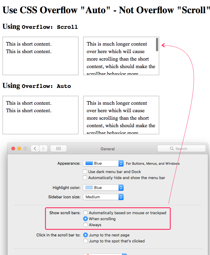
The fact that these examples look the same is really a "feature" that does young web developers a disservice. This is why I highly recommend going into the Apple General Settings and changing the scrollbar behavior to show always. This brings back the "traditional" way of rendering scrollbars and makes your web application interfaces render more consistently across platforms.
Here's what this demo looks like when I update my scrollbar settings:
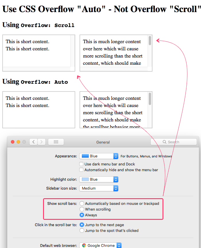
As you can see, the containers that use overflow: scroll always render a scrollbar regardless of whether or not content is large enough to require scrolling. When using overflow: auto, on the other hand, the browser only renders the scrollbar when it is needed; and, only on the axis (x or y) for which it is need.
ASIDE: You can also use the CSS properties
overflow-xandoverflow-y, instead ofoverflow, to apply more selective control over when and how the scrollbars are rendered.
Personally, I don't love that Apple's MacOS hides the scrollbars by default. On a mobile device, where there is so little screen real estate, it's a fine trade-off. But, on a desktop computer, where there is an abundance of space, I think hiding the scrollbars by default is a strange usability choice. Yes, it "looks nice" to have a UI with no scrollbars. But, to me, it makes the user interface just a little less obvious and a little less usable.
And, the fact of the matter is, overflow: scroll will show scrollbars on other platforms. For example, here's this demo in IE11 (Internet Explorer 11):
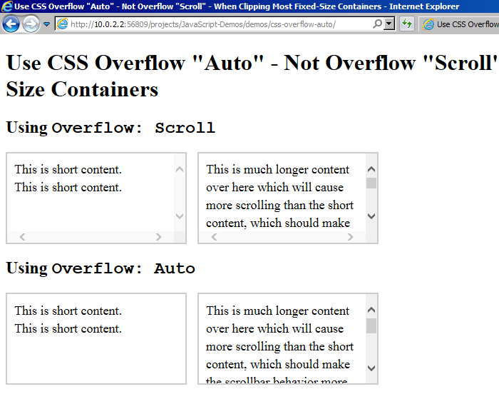
As you can see, IE11 is true-to-form on the CSS overflow property. This is why I always go into my Apple settings and set the rendering of scrollbars to be always. This fosters a better understanding of the CSS overflow property; and, makes it easier for me to build consistent interface behaviors across platforms.
ASIDE: It seems that recent versions of Windows now allow you to automatically hide scrollbars. To me, this makes it even more important that younger developers enable visible scrollbars. Otherwise it will become harder and harder for them to learn how scrollbars actually work for all of their users.
But, this post isn't about how different platforms render scrollbars - this post is about the differences between various CSS overflow properties. Ultimately, your CSS should be written with intent. And, I believe that, in most cases, developers intend to use overflow: auto, not overflow: scroll. It just so happens that this mistake it harder to see on platforms that hide scrollbars by default.
Want to use code from this post? Check out the license.

Reader Comments