
Using Inline-Block To Provide Consistent Padding And Element Width Inside An Overflow Container In CSS
This is primarily a note to self; and, is something that has been covered several times on StackOverflow; but, I can never seem to remember the answer and end-up re-learning it each time. As such, I wanted to write it down! This post looks at how to get CSS padding and widths to work consistently inside an overflow: auto (or overflow: scroll if you feel that's necessary) container by using an inner-wrapper with display: inline-block.
Run this demo in my JavaScript Demos project on GitHub.
View this code in my JavaScript Demos project on GitHub.
Most of the time, when we create an overflow container, we want to include some sort of inner-padding on that container such that the overflow contents don't butt-up against the scrollbars or the viewport border. To accomplish this, I usually just put in a "wrapper" div with a padding. And, as long as there is no horizontal scrolling, this works perfectly well.
However, the moment there is horizontal scrolling inside the overflow container, we see two unpleasant effects:
Some of the direct descendants of the "wrapper" element are "stuck" at 100% of the overflow container width and do not extend to match the width of the elements that are causing the horizontal scrolling.
The right padding of the "wrapper" element does not seem to get applied, allowing the overflow content to butt-up against the right-border of the overflow container.
To fix this, all we have to do is set the "wrapper" element to use display: inline-block (with a min-width: 100%). Something about switching from block (the default) to inline-block changes the way paddings and margins get applied (which is beyond my current understanding). To see this in action, take a look at this simple demo that contains two overflow containers, each with a child that causes horizontal scrolling:
<!doctype html>
<html lang="en">
<head>
	<meta charset="utf-8" />

	<title>
		Using Inline-Block To Provide Consistent Padding And Element Width Inside An Overflow Container In CSS
	</title>

	<style type="text/css">

		.viewport {
			border: 1px solid #000000 ;
			height: 215px ;
			overflow: auto ;
			width: 650px ;
		}

		.wrapper {
			padding: 25px 25px 25px 25px ;
		}

		/*
			By switching the "wrapper" to inline-block with min-width 100%, it will allow
			all of the content within it to automatically expand to fill the entire width
			of the wrapper, as dictated by its widest child (as opposed to "getting
			stuck" at 100% width of the viewport).
		*/
		.inline-wrapper {
			box-sizing: border-box ;
			display: inline-block ;
			min-width: 100% ;
			padding: 25px 25px 25px 25px ;
		}

		.box1,
		.box2 {
			border: 2px solid red ;
			border-radius: 5px 5px 5px 5px ;
			box-sizing: border-box ;
			margin: 5px 0px 5px 0px ;
			padding: 10px 10px 10px 10px ;
		}
		.box2 {
			border-color: blueviolet ;
			width: 900px ;
		}

	</style>
</head>
<body>

	<h1>
		Using Inline-Block To Provide Consistent Padding And Element Width Inside An Overflow Container In CSS
	</h1>

	<h2>
		Wrapper Using Display: Block
	</h2>

	<div class="viewport">
		<div class="wrapper">

			<div class="box1"> Auto </div>
			<div class="box2"> 900px </div>
			<div class="box1"> Auto </div>

		</div>
	</div>

	<h2>
		Wrapper Using Display: Inline-Block
	</h2>

	<div class="viewport">
		<div class="inline-wrapper">

			<div class="box1"> Auto </div>
			<div class="box2"> 900px </div>
			<div class="box1"> Auto </div>

		</div>
	</div>

</body>
</html>
The only difference between the two "viewport" / "overflow" containers is that one has a wrapper with display: block (the default) and one has a wrapper with display: inline-block. And, when we run this code in the browser, we get the following output:
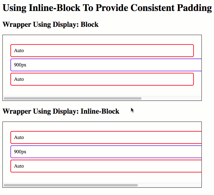
As you can see, in the first overflow container with a display: block inner wrapper, there is no right-padding getting applied; and, the two normal children don't expand to meet the element causing the horizontal scrolling.
However, in the second overflow container - the one with the display: inline-block inner wrapper, there is a right-padding; and, all of the children expand to meeting the width of the element causing the horizontal scrolling.
Now that I've written this down, hopefully the solution will stick in my head; and, I won't be confused the next time I go to apply padding to an overflow container in CSS.
Want to use code from this post? Check out the license.

Reader Comments