THIS IS US Opening Titles Animation Using CSS Animations
My brain is somewhat fried from thinking about state-management in a Single-Page Application (SPA). As such, I needed a little mental palette cleanser; and, something that I've been wanting to do for a while is try to recreate the "This Is Us" opening titles sequence using CSS animations.
Run this demo in my JavaScript Demos project on GitHub.
View this code in my JavaScript Demos project on GitHub.
While I use CSS transitions a lot, I don't often think to reach for full-on, multi-step animations. As such, it wasn't immediately clear to me how to animate all three words in the "THIS IS US" opening sequence. Once I realized an animation applies to one element at a time, I created three animations, one for each word.
Not all of the words show upon the screen at the same time. But, in order to keep the mental model simple, I am assuming that all DOM elements will be present. As such, in order to delay the rendering of one word, I simply keep it transparent in the earlier portion of the animation. I feel like this keeps the timing consistent and easy to reason about.
By default, CSS animations run once and then stop. You can define an "animation-iteration-count" property and give it a static number; or, "infinite". But, I didn't want the animation to repeat instantly; I wanted the final rendering to linger on the screen for a few seconds, then disappear for a second, and then - finally - restart.
To do this, I end up programmatically removing the animating DOM elements from the DOM (Document Object Model), waiting a second, and then re-injecting them into the DOM. By removing and then re-adding them, the animation implicitly restarts once the DOM nodes are back in place.
To time this restart sequent, my first instinct was to listen for the "animationend" event. But, this event fires once for each of the animating elements in the title sequent. As such, I ended up going with simple Timers. This just felt like the most straightforward solution.
NOTE: This Timer-based solution does lead to some strange behavior since I believe the Timers (or the animations) don't run consistently when the window is blurred. As such, if you leave the window, then come back some time later, the current animation may be truncated. But, this self-corrects the moment the next animation starts.
With that said, here's the code that I came up with:
<!doctype html>
<html lang="en">
<head>
	<meta charset="utf-8" />
	<title>
		THIS IS US Opening Titles Animation Using CSS Animations
	</title>
</head>
<body>

	<h1>
		THIS IS US Opening Titles Animation Using CSS Animations
	</h1>

	<div class="titles">
		<div class="titles__anchor">
			<span class="titles__this">
				This
			</span>
			<span class="titles__is">
				Is
			</span>
			<span class="titles__us">
				Us
			</span>
		</div>
	</div>

	<link rel="stylesheet" type="text/css" href="https://fonts.googleapis.com/css?family=Open+Sans:300">
	<style type="text/css">

		.titles {
			background-color: #000000 ;
			bottom: 0px ;
			color: #f3ca3e ;
			font-family: "Open Sans", verdana, arial, sans-serif ;
			font-size: 40px ;
			font-weight: 300 ;
			left: 0px ;
			line-height: 44px ;
			position: fixed ;
			right: 0px ;
			text-transform: uppercase ;
			top: 0px ;
		}

		/**
		* At first, I tried to position each of the titles using percentages. However,
		* since the browser has flexible values in both the Vertical and Horizontal
		* dimensions, it was easier to create a positioned anchor from which the titles
		* could be positioned with explicit pixels. This won't scale with the browser;
		* but, it makes the animation easier to put together.
		*/
		.titles__anchor {
			left: 65% ;
			margin-top: -22px ;
			position: absolute ;
			top: 50% ;
		}

		@keyframes titles-this-in {
			0% {
				left: -200px ;
				opacity: 0.0 ;
				top: -180px ;
			}
			20% {
				opacity: 1.0 ;
			}
			49% {
				left: -200px ;
				top: 0px ;
			}
			51% {
				left: -200px ;
				top: 0px ;
			}
			100% {
				left: 0px ;
				top: 0px ;
			}
		}

		@keyframes titles-is-in {
			0% {
				left: -100px ;
				opacity: 0.0 ;
				top: 50px ;
			}
			20% {
				opacity: 1.0 ;
			}
			24% {
				left: -30px ;
				top: 50px ;
			}
			26% {
				left: -30px ;
				top: 50px ;
			}
			49% {
				left: -30px ;
				top: 0px ;
			}
			51% {
				left: -30px ;
				top: 0px ;
			}
			100% {
				left: 112px ;
				top: 0px ;
			}
		}

		@keyframes titles-us-in {
			0% {
				left: 175px ;
				opacity: 0.0 ;
				top: 130px ;
			}
			55% {
				opacity: 0.0 ;
				top: 130px ;
			}
			80% {
				opacity: 1.0 ;
			}
			100% {
				left: 170px ;
				top: 0px ;
			}
		}

		.titles__this,
		.titles__is,
		.titles__us {
			animation-duration: 5s ;
			animation-fill-mode: both ;
			animation-timing-function: ease-in-out ;
			position: absolute ;
		}

		.titles__this {
			animation-name: titles-this-in ;
		}

		.titles__is {
			animation-name: titles-is-in ;
		}

		.titles__us {
			animation-name: titles-us-in ;
		}

	</style>

	<script type="text/javascript">
		(function() {

			var titles = document.querySelector( ".titles" );
			var titlesAnchor = titles.querySelector( ".titles__anchor" );

			setupAnimationHandlers();

			// ----------------------------------------------------------------------- //
			// ----------------------------------------------------------------------- //

			function setupAnimationHandlers() {

				// In order to get the animation to repeat without a "infinite" iteration
				// count, we have to remove the nodes from the DOM and then re-inject
				// them. The animation will naturally restart when the elements are
				// re-added to the DOM.
				// --
				// NOTE: I opted not to look at the "animationend" event since it would
				// have been triggered by all three animating titles. Using a timer
				// seemed like the more straightforward, cross-browser approach.
				setTimeout( removeTitles, 7000 );
				setTimeout( addTitles, 8000 );
				setTimeout( setupAnimationHandlers, 8000 );

			}

			function removeTitles() {

				titles.removeChild( titlesAnchor );

			}

			function addTitles() {

				titles.appendChild( titlesAnchor );

			}

		})();
	</script>

</body>
</html>
At first, I wanted each animating element to be positioned absolutely using percentages. But, I couldn't figure out how to scale the font-size and offsets in-step with the browser dimensions. Unlike a TV, the width and the height of the browser don't have to change in a proportional way. As such, I ended up positioning a percentage-based anchor; then, using absolute pixels to position the individual words. I am sure that I could have used media queries to do this more flexibly; but, I can almost guarantee that it would have been a world more complex.
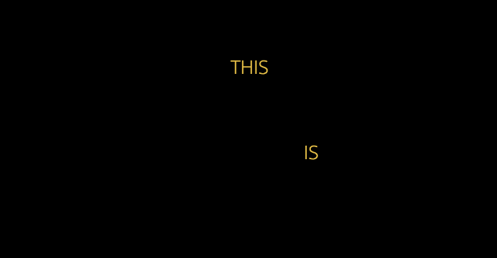
So see this in action, watch the video. But, here's a screen-shot, mid-animation:
Anyway, this was just a fun little CSS code kata. CSS animations seem extremely powerful. They are definitely a feature of web development that I have to reach for more often.
Want to use code from this post? Check out the license.

Reader Comments
@All,
At the time I posted this, GitHub was having a major outage. As such, the gist doesn't load consistently; and, I'm pretty sure the
gh-pagesbranch (which hosts the online demo) isn't building properly. I'll try to get that sorted once the GitHub incident is closed.