Using Position: Sticky With Multi-Sided Anchoring In CSS
The other day, in Dig Deep Fitness, I created a user interface (UI) in which I had two side-by-side lists of radio-buttons. In an effort to keep the UI simple but effective, I attempted to make the :checked radio-button position:sticky. And, I ended up doing so using both top and bottom anchoring. Before that, I had assumed that a sticky element could only be anchored on one side. Turns out, a sticky element can be anchored on multiple sides at once in CSS.
Run this demo in my JavaScript Demos project on GitHub.
View this code in my JavaScript Demos project on GitHub.
To demonstrate this, I'm going to create a page in which the content forces both vertical and horizontal scrolling. And, right in the middle of the content, I'm going to create a position:sticky element that uses top, bottom, and left anchoring. I originally wanted to try anchoring on all 4 sides; but, doing so would have increased the complexity of the demo.
<!doctype html>
<html lang="en">
<head>
	<meta charset="utf-8" />
	<meta name="viewport" content="width=device-width, initial-scale=1" />
	<link rel="stylesheet" type="text/css" href="./main.css" />
	<style type="text/css">

		.sticky {
			background-color: #ffeeee ;
			border: 3px solid #ff3366 ;
			padding: 20px 20px 20px 20px ;
			width: 300px ;

			/* Using MULTI-sided sticky anchoring! */
			position: sticky ;
			bottom: 5px ;
			left: 5px ;
			top: 5px ;
		}

	</style>
</head>
<body>

	<h1>
		Using Position: Sticky With Multi-Sided Anchoring In CSS
	</h1>

	<template  class="lots-o-content">
		<p> This will be duplicated with much vigor. </p>
	</template>

	<p class="sticky">
		This is a sticky situation!
	</p>

	<template  class="lots-o-content">
		<p> This will be duplicated with much vigor. </p>
	</template>

	<!-- To force horizontal scrolling. -->
	<div class="large-marge"></div>

	<!-- ---------------------------------------------------------------------------- -->
	<!-- ---------------------------------------------------------------------------- -->

	<!-- Fleshing out the vertical scrolling content. -->
	<script type="text/javascript">

		for ( var template of document.querySelectorAll( ".lots-o-content" ) ) {

			for ( var i = 1 ; i <= 40 ; i++ ) {

				template.after( template.content.cloneNode( true ) );

			}

		}

	</script>

</body>
</html>
As you can see, I'm using the <template> element to clone a bunch of content in the vertical space. Then, my "large-marge" element at the bottom will create "content" in the horizontal space. And, when we run this page, we can see the sticky element in action:
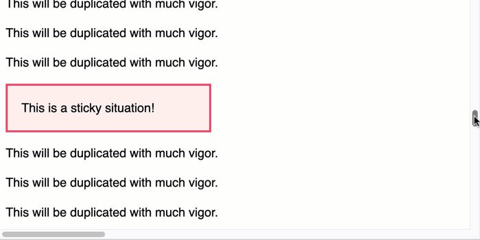
As you can see, the sticky element gets stuck to the top, bottom, and left edges of the browser viewport as the user scrolls in the various directions. position:sticky in CSS is a very powerful way to create a more intuitive user interface!
My First Ever Use of the CSS :has() Selector
As a fun aside, this exploration (in Dig Deep Fitness), was my first ever use of the :has() CSS selector. In the intro, I said that I was applying position:sticky on my radio-button. But, this wasn't quite true. In fact, I was applying the sticky positioning to the container of the radio-button. And, I was doing so with a :has(:checked) CSS selector.
If you can imagine that my HTML looked something like this:
<li>
	<label>
		<input type="radio" />
		This is an item.
	</label>
</li>
... my CSS then looked this like this:
li:has(:checked) {
	bottom: 5px ;
	position: sticky ;
	top: 5px ;
}
In this case, I was making the list item sticky if - and only if - it contained a checked radio-button.
I'm positive that the :has() selector is going to be massively abused in much the same way that the (+) sibling selector has, historically, been massively abused (to create almost unreadable CSS selectors). But, I'm excited that it can create some really powerful functionality with so little effort.
Want to use code from this post? Check out the license.

Reader Comments
Post A Comment — ❤️ I'd Love To Hear From You! ❤️
Post a Comment →