
Using ColdFusion Custom Tags To Create An HTML Email DSL In Lucee CFML 5.3.7.47, Part III
Over the last few weeks, I've been exploring the use of ColdFusion custom tags as a DSL for HTML emails, first laying the foundation of the concept, then adding themeing of HTML entities, and most recently, improving the performance by removing implicit variable access. Today, as a quick follow-up, I wanted to add some dynamic rendering in which content can be targeted for Desktop devices vs. Mobile / Responsive devices.
View this code in my ColdFusion Custom Tag Emails project on GitHub.
We actually already saw this functionality in my first post in which I dynamically changed the layout of an image-grid such that it was a 2-by-2 grid on desktop devices and then "magically reformatted" a vertical strip on mobile devices. Today's post only seeks to codify that approach in a set of ColdFusion custom tags.
The MJML framework has built-in support for completely responsive content using "ghost tables". It's really awesome. Only, I'm not quite smart enough to know how to use it. Meaning, my caveman brain doesn't model responsive layouts very well. As such, I have to go about this dynamic rendering a bit more brute-force, at least for now.
What this means is that instead of trying to use the same content for both desktop and mobile devices, I'm going to start by allowing duplicated content to be rendered, with one copy per device. To do this, I've created two new ColdFusion custom tags in my project:
<core:IfDesktopView>- shows child content on desktop devices only.<core:IfMobileView>- shows child content on mobile devices only.
Under the hood, this is driven by the theme.width property exposed by the base <core:Email> tag. And, dynamically shows and hides the wrapper elements based on media queries and max-width calculations.
To see this in action, let's look at an example in which we have one paragraph that is show on desktop; and, a completely different paragraph that is shown on mobile:
<!--- Import custom tag libraries. --->
<cfimport prefix="core" taglib="./core/" />
<cfimport prefix="html" taglib="./core/html/" />
<!--- // ------------------------------------------------------------------------- // --->
<!--- // ------------------------------------------------------------------------- // --->
<core:Email
subject="Let's swap desktop and mobile content"
teaser="Different constraints, different strategies">
<core:Body>
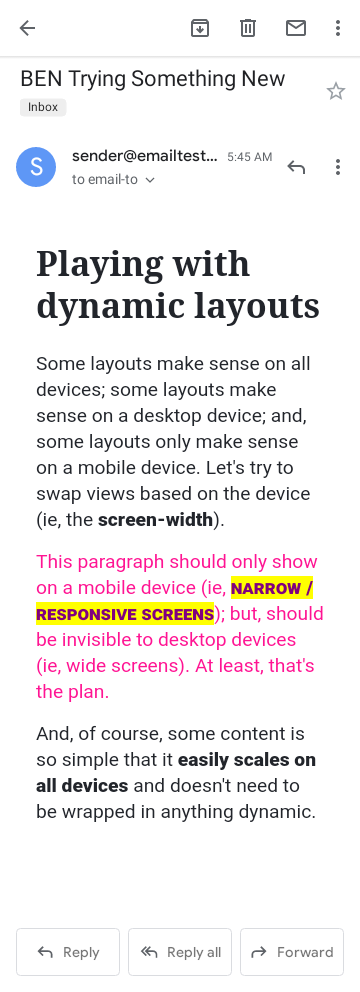
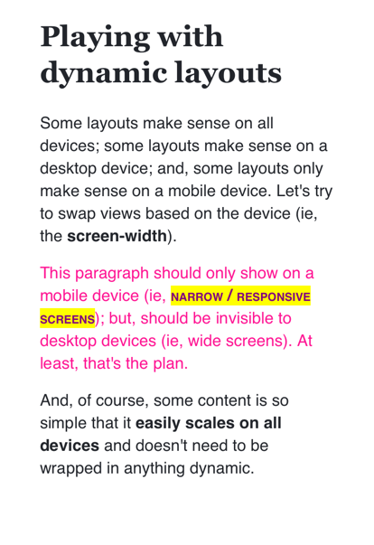
<html:h1 margins="none xlarge">
Playing with dynamic layouts
</html:h1>
<html:p>
Some layouts make sense on all devices; some layouts make sense on a
desktop device; and, some layouts only make sense on a mobile device.
Let's try to swap views based on the device
(ie, the <html:strong>screen-width</html:strong>).
</html:p>
<core:IfDesktopView>
<html:p style="color: royalblue ;">
This paragraph should only show on a desktop device (ie,
<html:strong>wide screens</html:strong>); but, should be invisible
to mobile devices (ie, narrow screens). At least, that's the plan.
</html:p>
</core:IfDesktopView>
<core:IfMobileView>
<!---
NOTE: Since themes get applied to any parent context that is a
ColdFusion custom tag, we can even leverage the IfMobileView as a
"container" that can provide local theme overrides to entities.
--->
<core:HtmlEntityTheme entity="strong">
color: purple ;
background-color: yellow ;
font-variant: small-caps ;
</core:HtmlEntityTheme>
<html:p style="color: deeppink ;">
This paragraph should only show on a mobile device (ie,
<html:strong>narrow / responsive screens</html:strong>); but, should
be invisible to desktop devices (ie, wide screens). At least, that's
the plan.
</html:p>
</core:IfMobileView>
<html:p>
And, of course, some content is so simple that it <html:strong>easily
scales on all devices</html:strong> and doesn't need to be wrapped in
anything dynamic.
</html:p>
</core:Body>
</core:Email>
As you can see, we are using the two new ColdFusion custom tags to create portions of the email that target different device resolutions. And, to make this super clear, I'm changing the color of the text in each paragraph so that when we run it through Litmus, the differences will be readily apparent.
And, when we run this through Litmus, here's a sampling of the different screenshots we get:
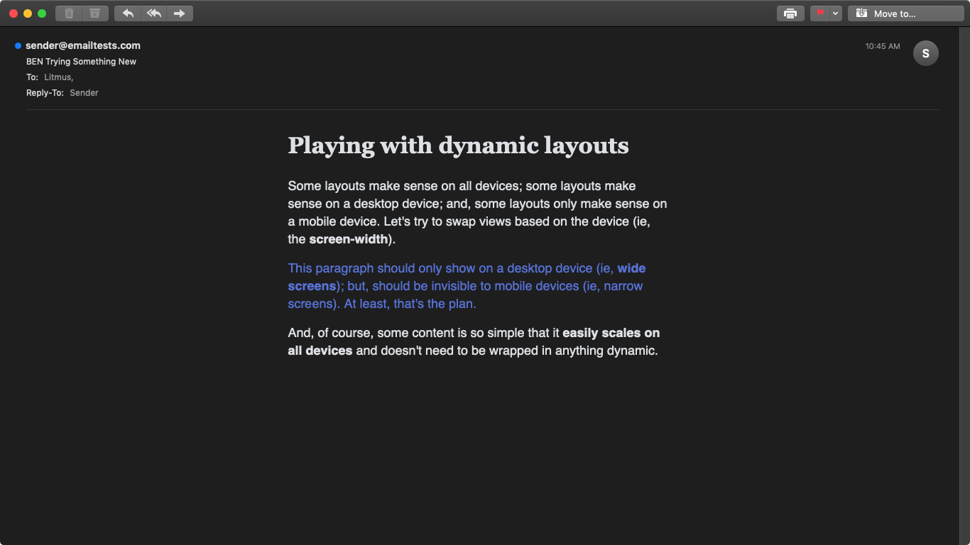
Apple Mail 12 in Dark Mode
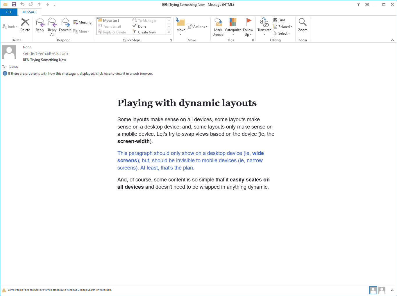
Outlook 2013 on Windows 10
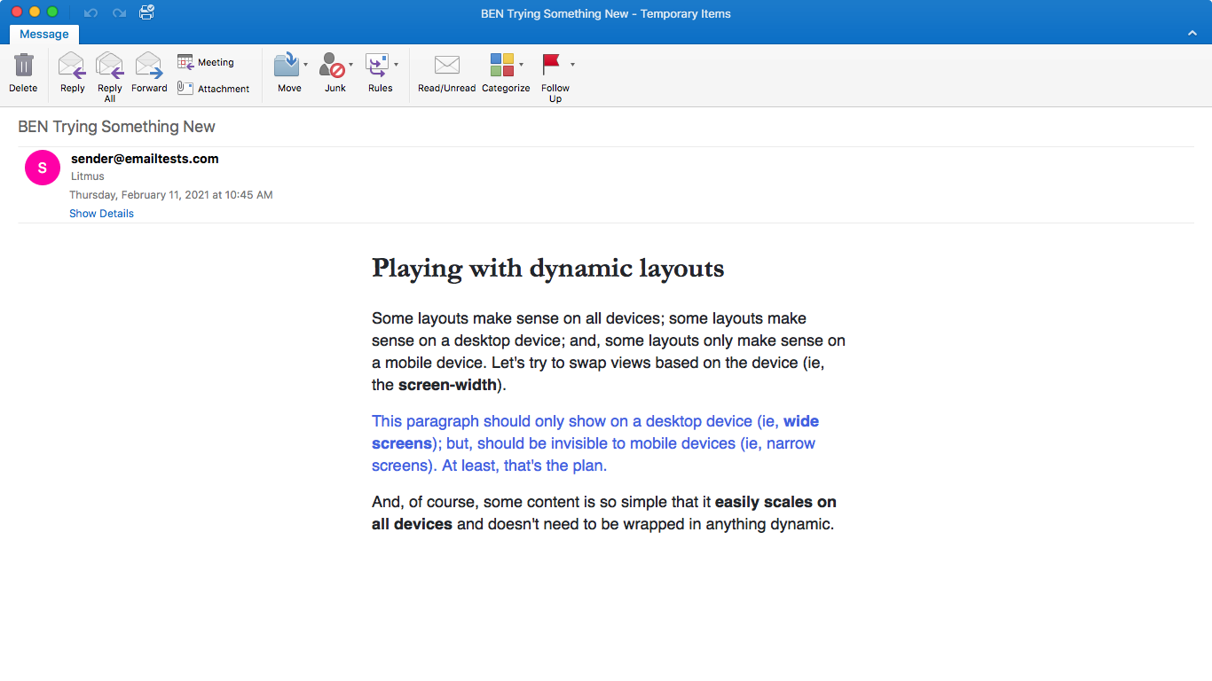
Outlook 2016 on MacOS
Gmail App on iOS 13
Gmail App on Android 7
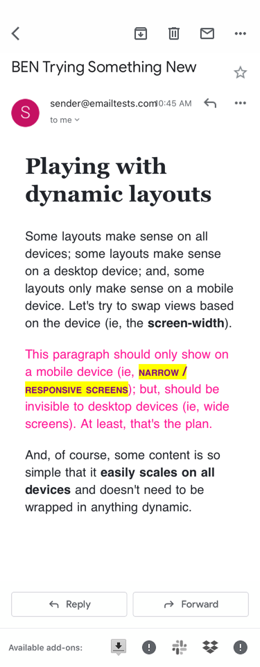
iPhone 11
As you can see, the blue-text shows up only on the Desktop devices; and, the pink-text shows up only on the Mobile devices. It even works in Outlook 2013!
This brute-force approach works for me because I tend to think about having to make completely different widgets for a fixed-width device vs. a responsive device. While this does cause some duplication of content, I find it much easier to reason about. No messing with media queries; no using right-to-left and left-to-right directional properties to swap ordering of DOM elements. Just "show this on desktop" and "show this on mobile". Nice and simple!
Want to use code from this post? Check out the license.

Reader Comments