
Animation Timing-Functions Can Be Changed Per-Keyframe In CSS
Yesterday, I demonstrated that the animation-timing-function property is applied per-keyframe in CSS. Today, as a fast-follow, I wanted to demonstrate that the animation-timing-function can also be changed per-keyframe as well. In fact, this was the hot-tip that Una Kravets mentioned on the CSS Podcast that got my mind focused on CSS animations in the first place.
Run this demo in my JavaScript Demos project on GitHub.
View this code in my JavaScript Demos project on GitHub.
In yesterday's demo, I demonstrated that a "bouncy" cubic-bezier() timing-function repeated the "bounce" within each keyframe of the CSS animation. Today, I want to take that same demo and update it so that some keyframes have the cubic-bezier() curve and one keyframe has a steps() timing-function. This will create a few smooth tweening animations and one discretely stepped / jarring animation.
In the following code, notice that I'm included an animation-timing-function property within one of the @keyframes configurations:
<!doctype html>
<html lang="en">
<head>
	<meta charset="utf-8" />

	<title>
		Animation Timing-Functions Can Be Changed Per-Keyframe In CSS
	</title>
</head>
<body>

	<h1>
		Animation Timing-Functions Can Be Changed Per-Keyframe In CSS
	</h1>

	<style type="text/css">

		.track {
			border: 1px solid red ;
			border-radius: 100px ;
			height: 100px ;
			position: relative ;
		}

		.marker {
			background-color: red ;
			bottom: 0px ;
			position: absolute ;
			top: 0px ;
			width: 1px ;
		}

		.dot {
			background-color: #212121 ;
			border-radius: 80px ;
			height: 80px ;
			left: 10px ;
			position: absolute ;
			top: 10px ;
			width: 80px ;
			z-index: 2 ;
			/*
				In order to demonstrate that the timing-function executes per-keyframe,
				I'm going to use an exaggerated cubic-bezier configuration that "bounces"
				the dot past the final "left" value of each keyframe.
			*/
			animation-direction: alternate ;
			animation-duration: 10s ;
			animation-iteration-count: infinite ;
			animation-name: dot-animation ;
			animation-timing-function: cubic-bezier( .55, -0.64, .42, 1.63 ) ;
		}

		@keyframes dot-animation {
			from, 5% {
				left: 10px ;
			}
			25% {
				left: calc( 33% - 40px ) ;
			}
			40% {
				/*
					For the "middle transition", we're going to use a completely
					different animation-timing-function that incrementally steps the dot
					across the screen, rather than "tweening" it smoothly / continuously.
				*/
				animation-timing-function: steps( 4 ) ;
				left: calc( 33% - 40px ) ;
			}
			60%, 75% {
				left: calc( 66% - 40px ) ;
			}
			95%, to {
				left: calc( 100% - 90px ) ;
			}
		}

	</style>

	<div class="track">
		<div class="dot">
			<br />
		</div>

		<!-- These markers help show the movement of the dot. -->
		<div class="marker" style="left: 33% ;"></div>
		<div class="marker" style="left: 66% ;"></div>
	</div>

</body>
</html>
As you can see, the base styles for the .dot class have the following animation configuration:
animation-timing-function: cubic-bezier( .55, -0.64, .42, 1.63 ) ;
Then, within the 40% keyframe (which applies to the 40-60% duration), we override the timing-function as such:
animation-timing-function: steps( 4 ) ;
Now, when we run this page in the browser, we get the following output:
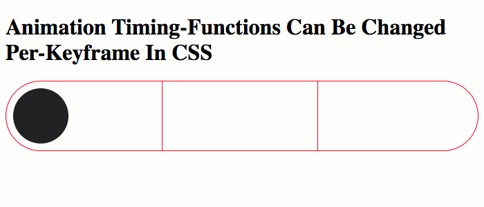
As you can see, the leading and trailing animations use the smooth and bouncy cubic-bezier() timing-function defined in the base CSS definition; but, the middle animation uses the discrete, step-based animation defined directly within the 40% mile-marker of the @keyframes. Very cool!
Between this post and my previous post, I've taken on a whole new perspective for CSS Animations. They are a lot more flexible that I had originally thought they were. I suspect I will be using them in much more creative ways going forward.
Want to use code from this post? Check out the license.

Reader Comments
Hi there, easy to understand this perfect code in CSS animation-timing. I was searching so long. Thanks a lot. Now I can go on! Greetz to "this guy" from bavaria.
@Michael,
Awesome! I'm glad you found this helpful :)