
Animation Timing-Functions Get Applied Per-Keyframe In CSS
A couple of weeks ago, I looked at creating a simple slide-show using dynamic keyframe animations in Angular 10.0.9. In the video for that demo, I mentioned that my approach was somewhat limited because the timing-function wasn't granular enough. As it turns out, my assumption of granularity was completely wrong. In fact, as I just learned from Una Kravets on the Animations episode of the CSS Podcast, the animation-timing-function property is applied on a per-keyframe basis. To help correct my poor mental model, I put together a small demo showcasing this per-keyframe granularity.
Run this demo in my JavaScript Demos project on GitHub.
View this code in my JavaScript Demos project on GitHub.
To demonstrate that the animation-timing-function within a CSS animation is applied on a per-keyframe basis, I am going to use cubic-bezier() function that moves a dot across the screen with a sort-of "bouncing" effect. This way, we can see that the dot "bounces" beyond the bounds of each keyframe configuration - not just beyonds the bounds the overall animation.
In the following CSS animation, the dot will rest at about 1/3 the horizontal distance; then again at about 2/3 the horizontal distance. At each resting point, we should see the cubic-bezier() animation-timing-function "bounce" the dot beyond the target left setting.
<!doctype html>
<html lang="en">
<head>
	<meta charset="utf-8" />

	<title>
		Animation Timing-Functions Get Applied Per-Keyframe In CSS
	</title>
</head>
<body>

	<h1>
		Animation Timing-Functions Get Applied Per-Keyframe In CSS
	</h1>

	<style type="text/css">

		.track {
			border: 1px solid red ;
			border-radius: 100px ;
			height: 100px ;
			position: relative ;
		}

		.marker {
			background-color: red ;
			bottom: 0px ;
			position: absolute ;
			top: 0px ;
			width: 1px ;
		}

		.dot {
			background-color: #212121 ;
			border-radius: 80px ;
			height: 80px ;
			left: 10px ;
			position: absolute ;
			top: 10px ;
			width: 80px ;
			z-index: 2 ;
			/*
				In order to demonstrate that the timing-function executes per-keyframe,
				I'm going to use an exaggerated cubic-bezier configuration that "bounces"
				the dot past the final "left" value of each keyframe.
			*/
			animation-direction: alternate ;
			animation-duration: 10s ;
			animation-iteration-count: infinite ;
			animation-name: box-animation ;
			animation-timing-function: cubic-bezier( .55, -0.64, .42, 1.63 ) ;
		}

		@keyframes box-animation {
			from, 5% {
				left: 10px ;
			}
			25%, 40% {
				left: 30% ;
			}
			60%, 75% {
				left: 70% ;
			}
			95%, to {
				left: calc( 100% - 90px ) ;
			}
		}

	</style>

	<div class="track">
		<div class="dot">
			<br />
		</div>

		<!-- These markers help show the movement of the dot. -->
		<div class="marker" style="left: calc( 30% + 40px ) ;"></div>
		<div class="marker" style="left: calc( 70% + 40px ) ;"></div>
	</div>

</body>
</html>
And, when we run this CSS animation in the browser, we get the following output:
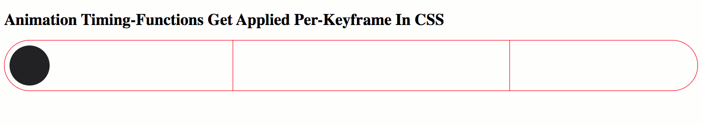
As you can see, the dot "bounces" beyond the target left alignment of each CSS keyframe. That's because the animation-timing-function is being applied on a per-keyframe basis - not to the entire animation life-span. This is a small but critical difference in how keyframe animations work. And now, hopefully, I'll remember this going forward.
Want to use code from this post? Check out the license.

Reader Comments
@All,
As a fast-follow to this post, I wanted to demonstrate that CSS Animation timing-functions can actually be changed per-keyframe:
www.bennadel.com/blog/3886-animation-timing-functions-can-be-changed-per-keyframe-in-css.htm
That's actually the piece of information that Una mentioned in the CSS Podcast - that the
animation-timing-functioncan be overridden within a key-frame; which, in turn, led me to understand that the timing-function is also applied per-keyframe as well. Overall, it seems that CSS Animations are just a lot more powerful and dynamic than I had given them credit for.