
Renderless Components In Angular 7.2.0
The other day, while trying to figure out some feature-delegation in Vue.js 2.2.0, I came across an interesting post by Adam Wathan titled Renderless Components in Vue.js. His post looked at various ways to create a Vue.js component that provides business logic but defers its own User Interface (UI) definition to the calling context. I explored a similar idea when I was trying out the Angular 2 Beta; but, back then, I was still using ES5 - not TypeScript - to author my Angular applications. As such, I thought it would be a fun cross-pollination thought exercise to take Adam's post and translate it over to an Angular context, creating renderless components in Angular 7.2.0.
Run this demo in my JavaScript Demos project on GitHub.
View this code in my JavaScript Demos project on GitHub.
To be clear, when it comes to Angular, no component is truly "renderless". Unlike React.js or Vue.js, which completely hide the very notion of an Element, an Angular component always renders its own top-level element. This upholds the "Principle of Least Surprise", and makes Angular components easier to reason about. So when I say "renderless", what I mean is that - beyond the top-level element - the component defines its own "View Template" based on content provided by the calling context.
Adam's post examined "renderless components" using a "Tags Input" custom form control. And, so shall I. The Tags Input component takes an input binding for a tags array (of Strings) and exposes an output binding for a new tags array. The Tags Input component doesn't modify the data directly; but, instead, uses a one-way data flow that supports optional two-way data-bindings via the "Box of Bananas" template syntax:
- Input: [tags]
- Output: (tagsChange)
- Two-Way Binding: [(tags)]
While the renderless component requires the calling context to define the interface, I still wanted the component to have some sort of default design for applications that didn't require a custom look-and-feel. Technically, there are ways to provide a default View (through Template References and View Queries); but, such solutions feel unnecessarily complicated. Instead, I decided to create two components, each with their own narrow focus:
- tags-input-lite - Provides only the business logic, no view.
- tags-input - Provides business logic and a view.
Having two different components makes the intent of the code easier to understand. And, frankly, it's much easier to implement under the hood. In this case, the "Lite" component does nothing but expose an API and project content. The second component then extends the Lite component and provides a "default" View Template.
To see this in action, here's my AppComponent (template only), which instantiates both version of the Tags Input: one with the default view and one with the custom view:
<!-- USING DEFAULT LAYOUT (tags-input). -->

<tags-input [(tags)]="tags"></tags-input>


<!--
	USING CUSTOM LAYOUT (tags-input-lite).
	// --
	With the custom layout, we use a different Element selector (-lite). Then, we
	get a reference to the TagsInput component (#tagsInput) and invoke methods
	directly on the reference (instead of on our own host component).
-->

<tags-input-lite #tagsInput [(tags)]="tags">

	<form (submit)="tagsInput.addTag( name.value ) ; name.value = '' ;" class="form">
		<input type="text" #name placeholder="New tag" class="form__input" />
		<button type="submit" class="form__submit">
			Add
		</button>
	</form>

	<ul class="tags">
		<li *ngFor="let tag of tagsInput.tags" class="tags__tag">
			<span class="tags__label">
				{{ tag }}
			</span>

			<a (click)="tagsInput.removeTag( tag )" class="tags__remove">
				Remove
			</a>
		</li>
	</ul>

</tags-input-lite>
As you can see, the "tags-input" element looks like any other custom component, accepting input and output bindings and nothing else. The "tags-input-lite" element, on the other hand, defines the user interface directly within the AppComponent.
Notice that the "tags-input-lite" element uses the attribute notation, "#tagsInput". This hash / pound-sign creates a "template reference" to the Component associated with the "tags-input-lite" custom element. This reference is then used to consume the API exposed by the "tags input" directly within the AppComonent template:
- tagsInput**.addTag**( tag )
- tagsInput**.removeTag**( tag )
- tagsInput**.tags**
NOTE: Remember, these methods don't mutate the tags collection directly. Instead, they emit() events that we pipe back into the component using the two-way data binding short-hand.
If we run this Angular application in the browser, we get the following output:
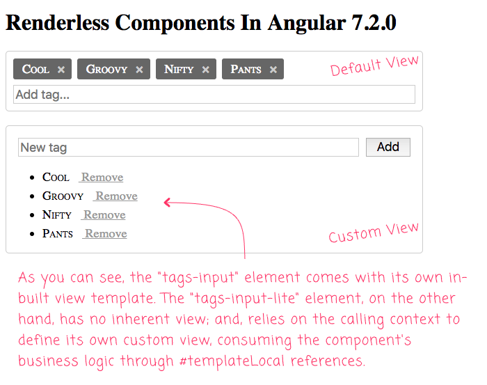
As you can see, the "tags-input" component comes with its own "default" view template. The "tags-input-lite" component, on the other hand, blindly projects its content, allowing - nay, requiring - the calling context to define the custom view for the custom form control.
And, now that we've seen how these two versions of the "Tags Input" can be consumed, let's look at how they work. First, let's look at the "lite" version which provides only the business logic around managing tags:
// Import the core angular services.
import { Component } from "@angular/core";
import { EventEmitter } from "@angular/core";

// ----------------------------------------------------------------------------------- //
// ----------------------------------------------------------------------------------- //

export type Tag = string;
export type Tags = Tag[];

@Component({
	selector: "tags-input-lite",
	inputs: [ "tags" ],
	outputs: [
		"tagsChangeEvents: tagsChange"
	],
	template:
	`
		<ng-content></ng-content>
	`
})
export class TagsInputCoreComponent {

	public tags: Tags;
	public tagsChangeEvents: EventEmitter<Tags>;

	// I initialize the tags-input core component.
	constructor() {

		this.tags = [];
		this.tagsChangeEvents = new EventEmitter();

	}

	// ---
	// PUBLIC METHODS.
	// ---

	// I emit a new collection of tags with the given tag appended to the end of the
	// collection (duplicate tags are ignored - using a CASE SENSITIVE comparison).
	public addTag( tag: Tag ) : void {

		tag = tag.trim();

		if ( ! tag || this.hasTag( tag ) ) {

			return;

		}

		this.tagsChangeEvents.emit( this.tags.concat( tag ) );

	}


	// I check to see if the given tag already exists in the current collection (using
	// a CASE SENSITIVE comparison).
	public hasTag( tag: Tag ) : boolean {

		return( this.tags.indexOf( tag ) !== -1 );

	}


	// I emit a new collection of tags with the given tag removed from the collection
	// (using a CASE SENSITIVE filter).
	public removeTag( tag: Tag ) : void {

		if ( this.hasTag( tag ) ) {

			this.tagsChangeEvents.emit( this.filterOut( this.tags, tag ) );

		}

	}

	// ---
	// PRIVATE METHODS.
	// ---

	// I filter the given tag out of the given tags collection.
	private filterOut( tags: Tags, tag: Tag ) : Tags {

		var filteredTags = tags.filter(
			( currentTag ) => {

				return( currentTag !== tag );

			}
		);

		return( filteredTags );

	}

}
As you can see, this Angular components provides methods for interacting with the Tags data-structure. But, as far as the user interface (UI) is concerned, this component does nothing but project content from the calling context:
<ng-content></ng-content>
The other version of this component, that comes with an in-built view, needs all the same business logic. So, instead of duplicating the logic, the other version of the component simply "extends" the "lite" version and then adds a view template:
// Import the core angular services.
import { Component } from "@angular/core";
// Import the application components and services.
import { TagsInputCoreComponent } from "./tags-input-core.component";
// ----------------------------------------------------------------------------------- //
// ----------------------------------------------------------------------------------- //
@Component({
selector: "tags-input",
inputs: [ "tags" ],
outputs: [
"tagsChangeEvents: tagsChange"
],
styleUrls: [ "./tags-input.component.less" ],
template:
`
<label role="none" class="wrapper">
<span *ngFor="let tag of tags" class="tag">
<span class="tag__label">
{{ tag }}
</span>
<span (click)="removeTag( tag )" class="tag__remove">
×
</span>
</span>
<input
type="text"
#name
placeholder="Add tag..."
(keydown.enter)="addTag( name.value ) ; name.value = '' ;"
class="input"
/>
</label>
`
})
export class TagsInputComponent extends TagsInputCoreComponent {
// All business logic is being provided by the TagsInputCore component. I am simply
// providing a View Template variation on the core component.
}
As you can see, this version of the component has no business logic of its own - it just extends the "lite" component:
class TagsInputComponent extends TagsInputCoreComponent { ... }
... and then defines some "template" meta-data that consumes the public API of the super class. In essence, this sub-class acts very much like the AppComponent, which leans on the business logic provided by the "lite" component, but then provides its own custom view.
Again, there are technically ways that I could have merged this all into a single Angular component that attempted to provide both a default view and allow for an override view in the calling context. But, such logic would have been complicated. Splitting the responsibility into two different components makes each component simple; and, makes the intent of the code - both from a Consumer and a Provider point-of-view - easier to reason about.
In the majority of cases, Angular components encapsulate both business logic and view logic. But, in some cases, it can be nice to define a custom view in the calling context. In such cases, we can use so-called "renderless components" that do nothing but provide business logic for consumption by Template References.
Want to use code from this post? Check out the license.

Reader Comments
Great little article. Just one thing. Where is the 'tagsChange' reference in the template? I can see that you are emitting upwards, but I don't see where the child actually passes the data to a parent method using 'tagsChange'?
@Charles,
Good question. I am using a "short-hand" notation for the two-way data-biding. So, in my template, when I have
[(tags)]="tags", that's really an abbreviation for:The brackets + parenthesis notation
[(x)]is always an abbreviation for[x]and(xChange)wherexcan be any name. So, for example, when you see examples that use[(ngModel)], that's really just a short-hand for[ngModel]and(ngModelChange).Holy smoking chickens, that's outrageous stuff! I always learn something new, from your articles. I really don't know where you find these little code shortcuts, but it is great!!!
Actually, I have just noticed that the base class is emitting to its descendent, because we are using inheritance here. Normally, it is the child component that emits to the parent. Or maybe, you can emit both ways? I always thought, as a general rule, you use Inputs to send data from parent to child and Outputs [emit] to send data from child to parent.
@Charles,
I am not sure that I would look at it as the Base class emitting to its descendant. More like the Subclass is using the inherited functionality to emit an event to the calling context (the AppComponent in this case).
OK. I am with you. Of course, the subclass receives all the methods of its base class, so it is emitting to the appComponent. I have got it! Thanks...
@Charles,
Heck yeah :thumbsup:
Great idea ! The lite component is really a service facade that is provided and provisioned in the HTML. Angular is HTML centric and this pattern brings HTML to a whole new level with declarative HTML service.
Of course, this is not for singleton services but mostly for services which scope is limited to an HTML section.
@Richard,
Well said! I think this kind of stuff is exciting because it showcases how flexible the framework is. And, about the multitude of ways that features can be expressed and consumed.