
Using CSS Host-Context To Theme Components In Angular 6.1.3
After I built BigSexyPoems with Angular 6 (www.BigSexyPoems.com), Seema Shariat augmented the application with some theming abilities. I really like the direction this app is going in; and, I want to try and take the theming functionality to the next level. Only, I've never done any theming before - not in Angular or in anything else. As such, I wanted to start playing around with some different theming strategies in Angular. The most simple approach that I could come up with was to define a CSS class on the root component; and then, use the :host-context() selector to conditionally change the CSS properties in each of the [relevant] descendant components.
Run this demo in my JavaScript Demos project on GitHub.
View this code in my JavaScript Demos project on GitHub.
In an Angular application, the "host context" selector is a way to define component styles based on some condition that exists outside of the current component. The Angular documentation describes the "host context" as looking for said condition higher-up in the DOM tree. This makes it sound like an active endeavor; but, really, all this does is compile down to a compound CSS selector path.
For example, if you have an Angular element and you define the following "host context":
:host-context( .fire ) {
	color: red ;
}
... it compiles down to the following Style declaration:
.fire[ _nghost-XXX ] , .fire [ _nghost-XXX ] {
	color: red ;
}
Not getting distracted by the "_nghost-XXX" value, which is the attribute that Angular automatically generates and applies to the rendered element for simulated style encapsulation, we can see that the :host-context() binding does nothing more than add the given selector as a prefix on the overall selector-path of the conditional styles.
Given this functionality, my plan for this exploration is to dynamically add one of the following CSS classes to the root component (app component):
- .light-theme
- .dark-them
Then, use the :host-context() selector to conditionally define CSS properties inside each of the application's components:
:host-context( .light-theme ) {
	background-color: #ffffff ;
	color: #161616 ;
}

:host-context( .dark-theme ) {
	background-color: #161616 ;
	color: #ffffff ;
}
As a first step in this exploration, I created a "variables" LESS file. Now, to be honest, this was a monkey-see, monkey-do moment. Every time I ever do any reading on the topic of theming, people are always using some sort of a variables file to hold all of their color values. As such, I created a variables file as well. In retrospect, this really didn't solve a problem that I had - at least not at this scale. Yes, it may have cut down on some degree of duplication. But, it came at the cost of increased complexity and lower readability.
If I wrote this demo over again, I would nix the variables file and just inline all of the color values. That said, here's the "variables.less" file that I am importing (at LESS compile time) at the top of each of my component's CSS files:
// The goal of this file is to keep all of the theme-variables in one place such that
// they can all be seen at once. Though, TO BE HONEST, I have no idea if this is even a
// worth-while endeavor. I only did it because I see other frameworks using a "variables"
// file. But, that is not really a great reason to do anything. After all, I'm not really
// repeating any values here. It would likely have been MUCH EASIER to just use the
// different values DIRECTLY IN THE VARIOUS ANGULAR COMPONENTS. I think the use of an
// external file, in this case, is solving a problem that I don't yet have.
// --
// NOTE: I think this kind of approach (using a variables file) would make much more
// sense if I was using a more "official" theme. Something like Material Design, where
// primary, secondary, etc. colors are more concretely followed.

// -- General -- //

@light-background-color: #ffffff ;
@light-color: #333333 ;

@dark-background-color: #121212 ;
@dark-color: #f0f0f0 ;

// -- Canvas -- //

@light-canvas-background-color: #fafafa ;
@light-canvas-color: #333333 ;
@light-canvas-border-color: #cccccc ;
@light-canvas-gutter-background-color: #e0e0e0 ;
@light-canvas-gutter-color: #999999 ;

@dark-canvas-background-color: #282923 ;
@dark-canvas-color: #f8f8f2 ;
@dark-canvas-border-color: #42433f ;
@dark-canvas-gutter-background-color: #20211C ;
@dark-canvas-gutter-color: #999999 ;

// -- Panels -- //

@light-panel-background-color: #f0f0f0 ;
@light-panel-color: #161616 ;
@light-panel-input-background-color: #ffffff ;
@light-panel-input-color: #333333 ;
@light-panel-button-background-color: #e0e0e0 ;
@light-panel-button-color: #121212 ;
@light-panel-button-border-color: #666666 ;

@dark-panel-background-color: #20211C ;
@dark-panel-color: #999999 ;
@dark-panel-input-background-color: #2e2f28 ;
@dark-panel-input-color: #dadada ;
@dark-panel-button-background-color: #121212 ;
@dark-panel-button-color: #dadada ;
@dark-panel-button-border-color: #333333 ;
As you can see, the variable names for these LESS properties are kind of ridiculous. LESS 3.5 added the ability to group variables into hashes (sort of). Which, could have made the properties a bit easier to organize. But, even so, it would just be overkill for this exploration.
That said, now that we know what kind of CSS properties are getting dynamically applied, let's look at the Angular application to see how it gets wired together. First, let's look at the root component - the app component - this is where the "theme" class is getting defined for the :host-context() bindings:
// Import the core angular services.
import { Component } from "@angular/core";

// ----------------------------------------------------------------------------------- //
// ----------------------------------------------------------------------------------- //

@Component({
	selector: "my-app",
	// Theme selection is going to be driven by a CSS Class on the App Component.
	// The App component - and all of its descendant components - will then use
	// :host-context() bindings in order to define theme-specific component styling
	// based on the existence of the "light-theme" or "dark-theme" classes.
	host: {
		"[class.light-theme]": "( theme === 'light' )",
		"[class.dark-theme]": "( theme === 'dark' )"
	},
	styleUrls: [ "./app.component.less" ],
	preserveWhitespaces: true, // Needed for white-space around links.
	template:
	`
		<div class="layout">
			<div class="layout__header">
				<app-header></app-header>
			</div>
			<div class="layout__canvas">
				<app-canvas></app-canvas>
			</div>
			<div class="layout__tools">
				<div class="layout__left-panel">
					<app-lpanel></app-lpanel>
				</div>
				<div class="layout__right-panel">
					<app-rpanel></app-rpanel>
				</div>
			</div>
			<div class="layout__footer">
				<strong>Themes:</strong>
				<a (click)="( theme = 'light' )">Light Theme</a> or
				<a (click)="( theme = 'dark' )">Dark Theme</a>
			</div>
		</div>
	`
})
export class AppComponent {

	public theme: string;

	// I initialize the app component.
	constructor() {

		this.theme = "light";

	}

}
The key feature of the App Component is the host bindings. As you can see, we're conditionally applying either the "light-theme" or "dark-theme" CSS class to the Element based on the current value of the "theme" class property. The "theme" class property can then be altered using the two links in the app's footer.
In the App component's CSS / LESS file, we're then including the "variables.less" file and defining some conditional CSS properties:
@import "./variables.less" ;

:host {
	display: block ;
	font-size: 18px ;
	min-height: 100vh ;
	padding: 1px 20px 1px 20px ;
}

:host-context( .light-theme ) {
	background-color: @light-background-color ;
	color: @light-color ;
}

:host-context( .dark-theme ) {
	background-color: @dark-background-color ;
	color: @dark-color ;
}

.layout {
	margin: 0px auto 0px auto ;
	width: 650px ;

	&__header {}

	&__canvas {
		margin: 20px 0px 20px 0px ;
	}

	&__tools {
		display: flex ;
		margin-bottom: 20px ;
	}

	&__left-panel {
		flex: 1 1 50% ;
		margin-right: 30px ;
	}

	&__right-panel {
		flex: 1 1 50% ;
	}

	&__footer {
		margin-bottom: 20px ;
	}
}

a {
	cursor: pointer ;
	text-decoration: underline ;
	user-select: none ;
		-moz-user-select: none ;
		-ms-user-select: none ;
		-webkit-user-select: none ;
}
By importing the "variables.less" file, it makes the color variables available in the current LESS file. We can then use those color variables to define the behavior of the application's color scheme under different theme configurations.
In the app component, we're applying the :host-context() binding in the root of the file. But, when we use LESS CSS, we can leverage the "&" reference to change the order of generated selectors. This allows us to embed the :host-context() binding inside of other style blocks.
For example, here's the CSS / LESS file for one of the other components (which is a descendant of the app component):
@import "./variables.less" ;

:host {
	display: block ;
}

.canvas {
	border: 3px solid transparent ;
	border-radius: 4px 4px 4px 4px ;
	display: flex ;

	&__input {
		flex: 1 1 auto ;
	}

	&__syllables {
		flex: 0 1 70px ;
	}

	:host-context( .light-theme ) & {
		border-color: @light-canvas-border-color ;
	}

	:host-context( .dark-theme ) & {
		border-color: @dark-canvas-border-color ;
	}
}

.input {
	border: none ;
	font-size: 18px ;
	line-height: 25px ;
	padding: 10px 15px 10px 15px ;

	&:focus,
	&:active {
		outline: none ;
	}

	:host-context( .light-theme ) & {
		background-color: @light-canvas-background-color ;
		color: @light-canvas-color ;
	}

	:host-context( .dark-theme ) & {
		background-color: @dark-canvas-background-color ;
		color: @dark-canvas-color ;
	}
}

.syllables {
	font-size: 18px ;
	font-weight: bold ;
	line-height: 25px ;
	list-style-type: none ;
	margin: 0px 0px 0px 0px ;
	min-height: 200px ;
	padding: 10px 0px 10px 0px ;
	text-align: center ;

	&__item {
		margin: 0px 0px 0px 0px ;
	}

	:host-context( .light-theme ) & {
		background-color: @light-canvas-gutter-background-color ;
		color: @light-canvas-gutter-color ;
	}

	:host-context( .dark-theme ) & {
		background-color: @dark-canvas-gutter-background-color ;
		color: @dark-canvas-gutter-color ;
	}
}
Notice that in this Angular component's CSS / LESS file, the :host-context() bindings are inside of a style block. And, that the :host-context() selector is followed by "&". This trailing "&" reference "bubbles" the :host-context() selector up and out of the current block, rendering the final selector segments in an inverted order.
This :host-context() pattern is then repeated in several of the other components. I won't bother showing the rest of the CSS because it's just more of the same. And, I won't bother showing any more of the component classes since they are literally doing nothing but providing markup.
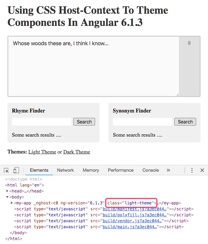
Ultimately, what we get is a small Angular application with a "light" and "dark" theme that is controlled by a CSS class on the root component and then implemented using :host-context() bindings in all descendant components. If we load the application in "light" mode, we get the following output:
And, if we switch over to use the "dark" them, we get the following output:
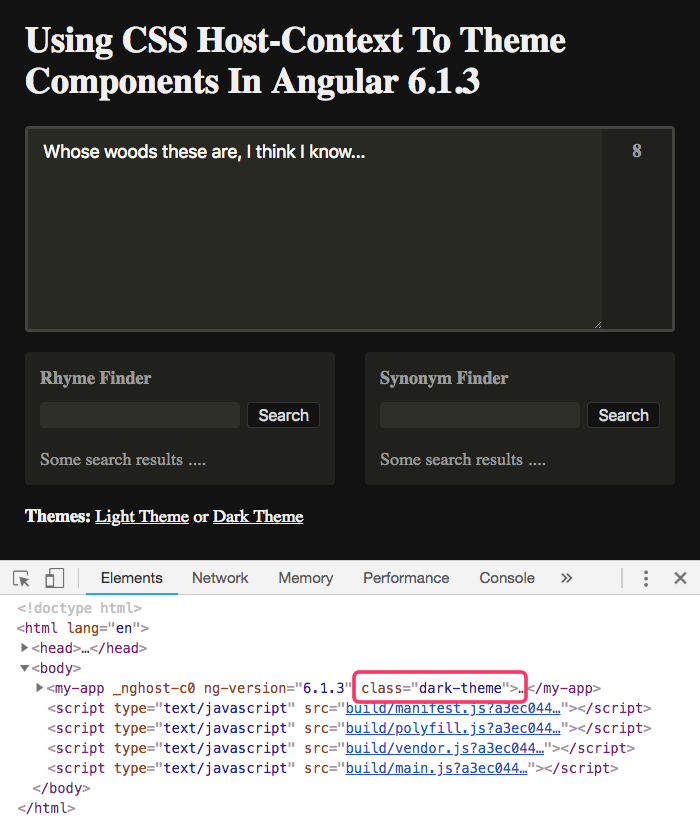
As you can see, by simply switching the CSS class on the root component, our entire Angular application is transformed through the power of :host-context() styling.
I know that there are a number of ways to implement theming in an Angular application. In fact, just the other day, I started to play around CSS custom properties (aka "CSS variables"), which seem to be the new hawtness when it comes to theming. But, using the :host-context() binding in the Angular component CSS files felt like the easiest, most straightforward first step.
Want to use code from this post? Check out the license.

Reader Comments
Awesome! Applause for giving a clear demo of how to apply host-context. I've seen some posts on how to implement the shadow dom in Angular, but this one really dives deep. Thank you!
@Seema,
Much appreciated -- and, as always, thanks for the inspiration.
@All,
For anyone interested, I re-visited this demo, using CSS Custom Properties instead of
:host-context():www.bennadel.com/blog/3485-using-css-custom-properties-to-theme-components-in-angular-6-1-3.htm
The idea is essentially the same. Except, instead of having theme blocks be differentiated in each component, there is only one set of "variables" that gets defined. Then, the theme selection updates the variables, which propagate down through the Angular application.
@All,
This morning, I partook in a fun little code kata relating to CSS Themeing -- defaulting my Angular app's CSS theme to "dark" if it's being accessed during the early morning hours (according to the user's local date/time settings):
www.bennadel.com/blog/3594-alligator-io-code-kata-defaulting-theme-based-on-time-of-day-in-angular-7-2-11.htm
Just a fun activity to get my brain going for the day :D
Make sure to check browser support before using it:
https://caniuse.com/#search=host-context
It's not supported on Firefox or Safari yet.
@Marçal Juan,
I believe you are confusing the native
:host-context()with the concept in Angular. When Angular compiles this CSS, it doesn't actually leave:host-context()in the CSS code - it changes it to be simple selectors.So, for example, in my AppComponent LESS file I have:
... which, if you look at the running Angular demo, is actually materialized as:
As you can see, the
:host-context()simply becomes an ancestor selector.