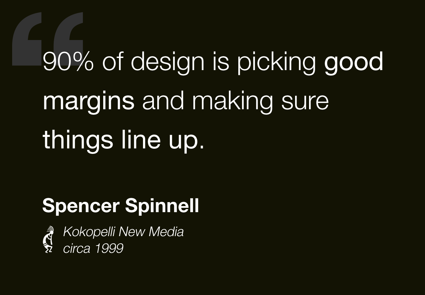
90% Of Design Is Picking Good Margins And Making Sure Things Line Up
Coming up on twenty years ago, I had an internship at a company in New York City called Kokopelli New Media. There, I had the opportunity to learn from some of the most amazing people like Glen Lipka, Ben Peters, and Ye Wang. It was there that I first learned about ColdFusion - the programming language that would later give birth to InVision App, Inc. And, although I was an aspiring engineer at the time, some of the most important lessons that I learned were from their Designer and co-founder, Spencer Spinnell.
Spencer, who is now the Director of Emerging Platforms at Google, was and remains one of the most talented designers that I've had the opportunity to work with. I was always so impressed with his range of design ideas and his ability to execute on client requirements. I appreciated his clean aesthetic and his bias towards usability in a era when flashy "entertainment sites" were all the rage.
Much of what I think about design today stems from our discussions and the time I spent taking his Photoshop files and turning them into table-based layouts. In fact, most of my strategy for product design can probably be traced back to a single statement that Spencer made to me almost two decades ago: "90% of design is picking good margins and making sure things line up."
| |
|
|
||
| |
 |
|
||
| |
|
|
To be clear, this statement is, in no way, meant to diminish design. There's an entire chasm of skill, creativity, and theory embedded in that last 10% - an impasse that will forever keep me firmly planted on the "Engineering" side of the product development spectrum. But, I've seen enough bad design in my career to know that picking good margins and lining things up is, in and of itself, an absolutely critical skill; and, one that not even all designs have at their disposal.
At first, this may seem like an overly simplistic view of design. But, think about all of the terminology and the technology that we associate with product design:
- Margins.
- Padding.
- Tables.
- Grid systems.
- CSS Flexbox.
- CSS Grid.
- CSS Columns.
- Responsive layout.
- Whitespace.
- Proximity.
- Grouping.
- Contrast.
- Line height.
- Letter spacing.
- Text alignment.
- Vertical alignment.
- Modularity.
- Accessibility.
And so on... Many of these concepts are either largely or entirely concerned with margin selection and making sure things line up. In my mind, margin selection and alignment are the atomic material of the design world - they are the building blocks that can either make or break an enjoyable user experience (UX).
The next time you're struggling to pinpoint the friction in a user experience, step back and think about the margins and the alignment. Are they pleasing? Are they constrictive? Are they disorienting? Do they convey meaning? Do they add clarity? Do they guide the user?
These types of questions will open your eyes to the powerful pattern matching mechanics of the human brain and to the far reaching effects of basic design principles.
Embracing this 90% rule won't make you a great designer. But, it will give you a tremendous leg-up in terms of product design. It provides a framework in which to think about usability and a lens through which to evaluate user interfaces. It's been an absolutely invaluable tool in my career. And, I hope that some of you reading this may get the same value out of it.

Reader Comments
I probably could debate the 90%, but rather here are photos from that time...
Spencer: https://1drv.ms/i/s!AniZsdq4WYgZhC6-mejlqRW4ByVs
Ye: https://1drv.ms/i/s!AniZsdq4WYgZhDBIVREjLhmRYIOt
Ben: https://1drv.ms/i/s!AniZsdq4WYgZhCxoHTT3EeIUloj5
Me, Ye and Ethan: https://1drv.ms/i/s!AniZsdq4WYgZhFO1cJ4u39hTpKVd
:)
Ben,
Surprised you didn't mention the golden ratio. I will never be mistaken for a designer, but once I learned this simple rule my work improved measurably. Use lots of white space and add in the right custom font and you'll look better than most developers trying to build a website. Still no substitute for a real designer though.
@Glen,
Good times :D I really enjoyed my time at Koko -- great people and much learning was had. And, of course, no shortage of "Your mother..." jokes.
@Rick,
So much this:
> Use lots of white space and add in the right custom font and you'll look better than most developers trying to build a website.
Developers seem to have an odd aversion to white-space. It's like their kryptonite :D