
Dynamic Tab-Size Demo Using CSS Custom Properties In JavaScript
The other day, I pontificated on the wildly subjective nature of programming. We all have things that we like and don't like; and, it seems almost futile to try and persuade people to move against their own realities. And yet, we - as a community - seem to want to keep doing that. Case-in-point, this post on tab-size that I am writing right now! To be clear, this is not a Tabs vs. Spaces article. In this case, I am using "tab size" to generally refer to indentation, having nothing to do with your mode of indication. This is a post about quantity of indentation. I wanted to put together a JavaScript demo that would allow people to quickly and easily adjust indentation in a live example.
Run this demo in my JavaScript Demos project on GitHub.
View this code in my JavaScript Demos project on GitHub.
When we write code, we aren't just writing code - we're building an interface. What I mean by that is that a code file is a means of delivering content. Just as a web page delivers content to our users, a code file delivers content to our engineers. As such, all of the thought and calculations that go into designing an enjoyable UI should also go into designing an enjoyable code file.
And, we can't talk about an enjoyable UI without talking about white space. The right amount of white space can make-or-break an experience. To quote Spencer Spinnell, former head of design at Koko Interactive:
90% of design is picking good margins and making sure things line up.
"Margins" is just another term for "white space". And, for Spinnell, the appropriate use of white space isn't just good, it's a major factor in great design.
A couple of years ago, I read Refactoring UI by Adam Wathan and Steve Schoger. In their book, Wathan and Schoger also talk about the importance of white space; but, what I love about their approach on the matter is that they advocate for starting with too much white space; and then, dialing it back until things look good:
White space should be removed, not added
When designing for the web, white space is almost always added to a design—if something looks little too cramped, you add a bit of margin or padding until things look better.
The problem with this approach is that elements are only given the minimum amount of breathing room necessary to not look actively bad. To make something actually look great, you usually need more white space.
A better approach is to start by giving something way too much space, then remove it until it you're happy with the result.
You might think you'd end up with too much white space this way, but in practice, what might seem like "a little too much" when focused on an individual element ends up being closer to "just enough" in the context of a complete UI. (Refactoring UI, Pages 67-69)
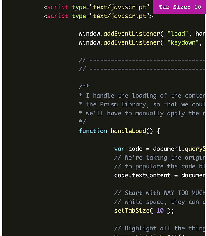
I love this mentality, of starting with too much white space; and, I wanted to run with it in a code context. What I've put together is a JavaScript demo in which you can use your Arrow Keys to dynamically adjust the tab-size CSS property of a <code> block using a CSS custom property, --tab-size. The Up/Right arrows will increase the tab-size and the Down/Left arrows will decrease the tab-size.
To align with the Refactoring UI book, I'm starting the demo with way too much indentation: 10-spaces. No matter where you fall on the indentation spectrum, I'm confident that we can all agree that 10-spaces delivers a terrible experience. But, by starting with too much and then slowly removing indentation, we can find code that looks great.
In my demo, the code block being rendered contains the code of the demo itself. Essentially, on window load, it grabs:
document.documentElement.outerHTML
... which gives us (more or less) the original source of the HTML page. I then jam that markup into the .textContent property of my <code> block and call Prism.js on it in order to apply some syntax highlighting:
<!doctype html>
<html lang="en">
<head>
<meta charset="utf-8" />
<meta name="viewport" content="width=device-width, initial-scale=1" />
<title>
Dynamic Tab-Size Demo In JavaScript
</title>
<style type="text/css">
body {
font-family: monospace ;
font-size: 20px ;
line-height: 1.4 ;
}
.label {
background-color: #ca0eb6 ;
border-radius: 0px 0px 0px 5px ;
color: #ffffff ;
padding: 10px 20px 10px 20px ;
position: fixed ;
right: 0px ;
text-shadow: 1px 1px #4e1948 ;
top: 0px ;
z-index: 2 ;
}
pre code.language-html {
tab-size: var( --tab-size ) ; /* Initial value defined in JavaScript. */
}
</style>
<link href="./prism.css" rel="stylesheet" />
</head>
<body>
<h1>
Dynamic Tab-Size Demo In JavaScript
</h1>
<p>
An appropriate amount of white space is just as critical to successful design as
anything else. Often times, we err on the side of <em>too little</em> white space,
which is a problem. To quote <strong>Adam Wathan</strong> and
<strong>Steve Schoger</strong> in their book, Refactoring UI:
</p>
<figure>
<blockquote>
<h3>
White space should be removed, not added
</h3>
<p>
When designing for the web, white space is almost always <em>added</em> to a
design—if something looks little too cramped, you add a bit of margin or
padding until things look better.
</p>
<p>
The problem with this approach is that elements are only given the minimum
amount of breathing room necessary to not look <em>actively bad</em>. To make
something actually look <em>great</em>, you usually need more white space.
</p>
<p>
A better approach is to start by giving something <em>way too much</em> space,
then remove it until it you're happy with the result.
</p>
<p>
You might think you'd end up with too much white space this way, but in
practice, what might seem like "a little too much" when focused on an
individual element ends up being closer to "just enough" in the context of a
complete UI.
</p>
</blockquote>
<figcaption>
Excerpt from <cite><a href="https://www.refactoringui.com/">Refactoring UI</a></cite>
by Adam Wathan and Steve Schoger (Layout And Spacing, Pages 67-69).
</figcaption>
</figure>
<p>
To help drive this point home in the context of <strong>code</strong>, this UI is
initialized with <em>way too much</em> white space in the form of indentation. You
can then dynamically adjust the <code>--tab-size</code> property of this page by
using your <strong>Arrow keys</strong>. This way, you can compare a 2-space indent
to a 4-space indent, and get a better sense of <em>just how wrong</em> you are
about your current choices! <code>:troll</code>
</p>
<ul>
<li>
<code>ArrowUp</code> — Increase tab width by 1-space.
</li>
<li>
<code>ArrowDown</code> — Decrease tab width by 1-space.
</li>
</ul>
<div class="label">
Tab Size:
<span class="label__value"><!-- Populated dynamically. --></span>
</div>
<!-- This PRE/CODE block will be dynamically populated on window-load. -->
<pre class="language-html"><code class="language-html"></code></pre>
<!-- This PRE/CODE block will be dynamically populated on window-load. -->
<script type="text/javascript" src="./prism.js" data-manual></script>
<script type="text/javascript">
window.addEventListener( "load", handleLoad );
window.addEventListener( "keydown", handleKeydown );
// --------------------------------------------------------------------------- //
// --------------------------------------------------------------------------- //
/**
* I handle the loading of the content. We deferred the automatic application of
* the Prism library, so that we could populate our <code> tag first. As such,
* we'll have to manually apply the runtime syntax highlighting.
*/
function handleLoad() {
var code = document.querySelector( "code.language-html" );
// We're taking the original source / DOM of this whole HTML page and using it
// to populate the code block.
code.textContent = document.documentElement.outerHTML;
// Start with WAY TOO MUCH WHITE SPACE. This way, as the user starts to remove
// white space, they can do so until the UI "actively looks good".
setTabSize( 10 );
// Highlight all the things!
Prism.highlightAll();
}
/**
* I handle keydown events on the document. If the event is ArrowUp or ArrowDown,
* the event's default behavior will be prevented and the event will be used to
* dynamically change the rendered indentation of the page.
*/
function handleKeydown( event ) {
switch ( event.key ) {
case "ArrowUp":
case "ArrowRight":
event.preventDefault();
setTabSize( getTabSize() + 1 );
break;
case "ArrowDown":
case "ArrowLeft":
event.preventDefault();
setTabSize( Math.max( ( getTabSize() - 1 ), 0 ) );
break;
}
}
/**
* I return the current --tab-size property applied to the root element.
*/
function getTabSize() {
// CAUTION: Normally, if the CSS custom property was being applied via CSS, we
// wouldn't be able to read it directly from the document element - we'd have
// to, instead, get the COMPUTED styles first. However, since we're
// programmatically setting it on document-load, we then read the SET value
// directly from the styles of the document element.
var tabSizeProperty = document.documentElement
.style
.getPropertyValue( "--tab-size" )
;
return( +tabSizeProperty );
}
/**
* I set the --tab-size property to the given value. This will cascade down into
* the <code> block and change runtime tab indentation.
*/
function setTabSize( value ) {
// Adjust the runtime styles.
document.documentElement.style.setProperty( "--tab-size", value );
// Adjust the user-facing label.
document.querySelector( ".label__value" ).textContent = value;
}
</script>
</body>
</html>
As you can see, this demo works by grabbing the current --tab-size property set on the :root element (document.documentElement in this case). And then, either incrementing it or decrementing is based on the keyboard event. And, when we open this demo and slowly start decreasing the indentation, we get the following output:
To quote Adam Watham, 2-spaces, in my opinion, is "the minimum amount of breathing room necessary to not look actively bad". But, by starting with too much indentation and then slowly decreasing it until the code looks good, I believe that we see that more indentation leads to a better user experience (UX).
Of course, it's all wildly subjective and I'm sure I won't change any minds today. But, it was a fun JavaScript demo to build.
Want to use code from this post? Check out the license.

Reader Comments
When I first read it above, I thought it made a lot of sense to start with too much white space. "Aha", I said to myself. But as I thought about my own process more deeply, I realize that whether I start from having too much or too little white space I'd tend to overshoot until I reached the outer barrier then dial back. Then I generally find something between the lower and upper range that looks well balanced. So I'm not sure it matters which end I'm starting from really. Maybe 🤔
@Chris,
Hey man, I say whatever works 😀 Whatever gets you to a place that works for you. Design is hard (at least for me). I feel like I can always look at someone else' design and tell whether it is a good or bad; but, I can't always say why it's one or the other. And, I definitely don't know how to get a good place. That's why I need these little rules / guides to help me move in the right direction.
@Ben,
💯 For sure! I appreciate that you're not only about well designed code, but also about the UX. Like me ☺️
Hey! This is really interesting to learn and a well written blog I would say. Your design is absolutely awesome and It has inspired me to look at a different perspective. Kudos to your work!
@Dejaswarooba,
Awesome, thank you for the kind words!