Using Position Absolute Inside A Scrolling Overflow Container
CAUTION: This is primarily a "note to self".
The other week, I tried to use absolute positioning inside a container that had "overflow: auto" enabled. And, somewhat to my surprise, the absolutely-positioned elements were rendered relative to the overflow "viewport," not to the "natural bounding box" of the content. This kind of threw me for a loop; and, it took me several days to come up with a solution. In retrospect, the solution is obvious. But, I had some weird mental block that was holding me back. All I had to do was wrap the content in non-overflow container and use said container as the anchor for positioning.
Run this demo in my JavaScript Demos project on GitHub.
To see what I mean, I've created a small demo in which I use the two approaches side-by-side. In the first approach, I'm using the overflow container as the position anchor. Then, in the second approach, I'm wrapping the content in an extra container in order to provide a non-overflow position anchor:
<!doctype html>
<html>
<head>
	<meta charset="utf-8" />

	<title>
		Using Position Absolute Inside A Scrolling Overflow Container
	</title>

	<style type="text/css">

		div.viewport {
			border: 5px solid #CCCCCC ;
			box-sizing: border-box ;
			height: 300px ;
			overflow: auto ;
			width: 500px ;
		}

		span.box {
			background-color: #FF3366 ;
			color: #FFFFFF ;
			padding: 7px 15px 7px 15px ;
			position: absolute ;
		}
		span.tl { left: 0px ; top: 0px ; }
		span.tr { right: 0px ; top: 0px ; }
		span.bl { bottom: 0px ; left: 0px ; }
		span.br { bottom: 0px ; right: 0px ; }

	</style>
</head>
<body>

	<h1>
		Using Position Absolute Inside A Scrolling Overflow Container
	</h1>

	<h2>
		With A Positioned Overflow Container
	</h2>

	<style type="text/css">

		div.viewport-a {
			padding: 5px 15px 5px 15px ;
			/*
				Here, the overflow container is, itself, acting as the anchor for the
				positioned elements contained within. This caused the absolutely
				positioned elements to anchor to the actual viewport of the container.
			*/
			position: relative ;
		}

	</style>

	<div class="viewport viewport-a">

		<span class="box tl">Top Left</span>
		<span class="box tr">Top Right</span>
		<span class="box bl">Bottom Left</span>
		<span class="box br">Bottom Right</span>

		<p>Yay, content!</p><p>Yay, content!</p><p>Yay, content!</p><p>Yay, content!</p>
		<p>Yay, content!</p><p>Yay, content!</p><p>Yay, content!</p><p>Yay, content!</p>
		<p>Yay, content!</p><p>Yay, content!</p><p>Yay, content!</p><p>Yay, content!</p>
		<p>Yay, content!</p><p>Yay, content!</p><p>Yay, content!</p><p>Yay, content!</p>

	</div>

	<!-- ---------------------------------------------------------------------------- -->
	<!-- ---------------------------------------------------------------------------- -->

	<h2>
		With A Positioned Content Wrapper
	</h2>

	<style type="text/css">

		div.viewport-b {
			padding: 0px 0px 0px 0px ;
		}

		/*
			Here, we're moving the position-anchoring off of the overflow container and
			onto a content wrapper (contained within the overflow area). This allows the
			absolutely positioned elements to anchor to the bounding box of the content,
			not the viewport.
		*/
		div.viewport-wrapper {
			padding: 5px 15px 5px 15px ;
			position: relative ;
		}

	</style>

	<div class="viewport viewport-b">
		<!--
			By wrapping the content in a non-overflow container, we create an anchoring
			box that is sized to the content, not to the viewport.
		-->
		<div class="viewport-wrapper">

			<span class="box tl">Top Left</span>
			<span class="box tr">Top Right</span>
			<span class="box bl">Bottom Left</span>
			<span class="box br">Bottom Right</span>

			<p>Yay, content!</p><p>Yay, content!</p><p>Yay, content!</p><p>Yay, content!</p>
			<p>Yay, content!</p><p>Yay, content!</p><p>Yay, content!</p><p>Yay, content!</p>
			<p>Yay, content!</p><p>Yay, content!</p><p>Yay, content!</p><p>Yay, content!</p>
			<p>Yay, content!</p><p>Yay, content!</p><p>Yay, content!</p><p>Yay, content!</p>

		</div>
	</div>

</body>
</html>
As you can see, the main difference between the two approach lies in where the "position: relative" style is applied. In the first approach, the relative position is applied to the "overflow" container; and, in the second approach, it's being applied to the content wrapper. Now, when we run this code, we get the following output:
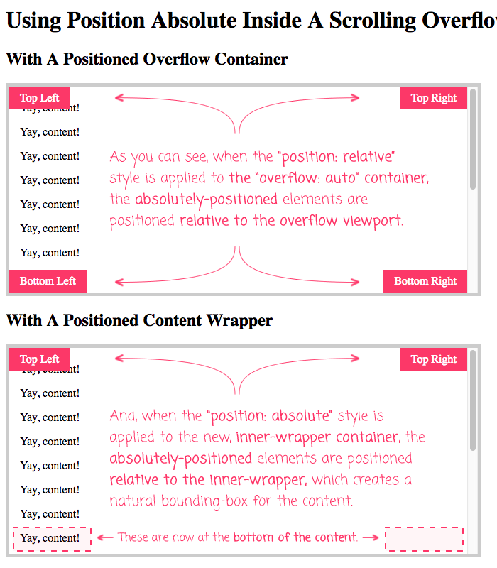
As you can see, in the first approach, the four corner boxes are positioned relative to the overflow viewport. And, in the second approach, the four corner boxes are positioned relative to the inner content wrapper, which creates a more "intuitive" bounding box for the content.
ASIDE: If you try the demo, you'll see that in the first approach the absolutely-positioned corner boxes scroll with the content. If you want the boxes to remain fixed in the corners, things get more complicated; especially in a context that may or may not present a scrollbar. When possible, you should avoid a user experience (UX) in which fixed elements overlap with scrollable content. Aside from nav-bars, it's a difficult experience to get right.
Looking back at this now, it seemed silly that this approach didn't occur to me immediately. But, at least I know now that I'll never forget it again.
Want to use code from this post? Check out the license.

Reader Comments
It's not that hard to create a more fixed position like experience but you will need to change your html.
Use the html and css from your second example except move the <span.box> elements out of the <div.viewport-wrapper> element so that they are direct children of the <div.viewport-b> element. Also, move position:relative; to the <div.viewport-b> element.
If you can't move them for whatever reason, using js to move them for you is probably the simplest solution. Otherwise you would have to do things like detect scroll and update a"top" value on the fly which is way more prone to bugs and poor performance.
@Daniel,
The problem with moving the absolutely-positioned elements to the viewport is that you run the risk of overlapping with the scrollbar itself (unless you start to involve JavaScript detection in the matter). At least, that's how I see it working. If they are inside the overflow area, then the absolute elements will naturally move horizontally when a scrollbar is introduced or removed. However, if they are outside of the scrolling area, then you run the risk of "right:0px" overlapping with the scrollbar of the viewport.
@Ben,
Hmmm... right, yeah that's a good point. That's a tricky puzzle. The only ways I can think of getting around that is either using an iframe or detecting if there is an overflow with JS and nudging the buttons over 20px if three is. The 20px nudge won't work properly on touch devices though since they don't have 20px scroll bars. `@ supports (pointer: fine)` might stop that issue.
@Daniel,
Oh, I've not hear of "pointer:fine". I'm constantly shocked how many little CSS things there are that sneak in there unnoticed :D
For things that need to be fixed "near" things that are also scrolling, I've usually gone the route of just putting them in different containers entirely. So, treating them more like "toolbars" in a greater layout, as opposed to a fixed element inside a content container:
<div class="content"></div>
<div class="fixed-toolbar"></div>
... then, the toolbar just sits outside the scrollable area. You don't get the overlap, so you eliminate that problem. Except, it only works if you can get the entire size of the "toolbar" to be meaningful (ie, it wouldn't work just a button as it would leave a lot of empty space).
If anything, this is more of a "Design" problem than it is a "CSS" problem :P
@Ben,
Sorry I meant @media (pointer: fine) { ... }, not @supports.
It detects if you are using a device with a highly accurate pointer like a mouse or a stylus pen. @media (pointer:coarse;) {...} is the opposite, detecting low accuracy pointers like touch screens and motion controls.
@media (hover: hover) {...} is also a thing that might work better detecting if the device supports hover states.
As for positioning, I get the feeling css-grid could come in handy here in some way. Grid lets you overlap components but still keep everything in flow and it makes it easy to line things up with one another.
@Daniel,
I'm kind of fascinated with this "pointer" granularity. I wonder if one could use it to make buttons "bigger" on devices that are not finely-pointer'd. Or, would you just use the screen-dimensions for such a thing. I'll let that marinate in the back of my mind for a while.
Re: CSS Grid, I just recently started playing with it for the first time. Looks pretty cool!
@Ben,
"I wonder if one could use it to make buttons "bigger" on devices that are not finely-pointer'd."
Lol, that is exactly why it was invented in the first place. So you can do stuff like that :)
"CSS Grid, I just recently started playing with it for the first time. Looks pretty cool!"
"Pretty cool" would be an understatement. I think css-grid is the most revolutionary thing to happen to css since css was invented! Layout isn't a nightmare any more. It's actually fun now :D
Hi Ben!
Thanks for posting this. This got me past my own mental block. I completely resonate with that feeling of "oh, of course - how did I miss that".
I was making a custom lightbox for my new portfolio and I had a couple positioned boxes to serve as click areas (for navigation). But of course their height was limited to the overflow parent. Bringing in an additional wrap easily fixed the issue.
I appreciate you taking the time to document what seems like a menial issue - in reality, even though it might feel a bit silly, it contributes to a larger knowledge base and will undoubtedly help many - regardless of experience.
Thanks again,
-Ryan-
@Ryan,
Well, I'm glad this was able to help in some small way. CSS is funny that way - you're cruising along, thinking you understand all the things; and then, suddenly something doesn't work the way you expect it to and you have no idea what is going on :)
Great Solution! I just ran into this and after scratching my head for 5 mins, did a quick google and solved. So obvious after reading your article! thanks
@Daniel,
Woot woot, glad to help :D
Thank a lot! You saved me a day.
@Sasha,
Woot! Glad this was helpful for you :D
Thank you man, very helpful