Creating A Marquee Effect With CSS Animations
The other day, while using the Pandora web app, I noticed that long song titles continuously scrolled by in a classic marquee fashion. Upon inspecting the DOM (Document Object Model), I saw that this effect was created using two side-by-side copies of the same content. Way back in the day, I used to do the same thing for some clients; but, my technique was powered with JavaScript. Pandora, on the other hand, was powering it with CSS transitions. I thought this would be fun to try out for myself.
Run this demo in my JavaScript Demos project on GitHub.
View this code in my JavaScript Demos project on GitHub.
The concept here is simple but clever. You place two copies of the same content side-by-side and then you transition both of them to the left at the same time using a @keyframes animation:
@keyframes marquee-content {
	/* Element one fully ON screen at left-edge of container. */
	from {
		transform: translateX( 0% );
	}
	/* Element one fully OFF screen (just beyond left-ledge of container). */
	to {
		transform: translateX( -100% );
	}
}
When the first element is at a -100% translation, it will have just moved fully off the screen. And, the second element will end up where the first element started. At that point, you snap both elements back to the starting location and it looks like one long continuous animation.
Here's the full code. Notice that the animation-iteration-count is infinite, which is what allows the animation to appear continuous. And, that the animation-timing-function is linear. This "timing" is important because it hides the fact that the elements are snapping around and gives the illusion of an infinite content tape.
<!doctype html>
<html lang="en">
<head>
	<meta charset="utf-8" />
	<style type="text/css">

		.marquee {
			border: 2px solid red ;
			display: flex ;
			overflow: hidden ;
			white-space: nowrap ;
			width: 300px ;
		}
		.marquee__item {
			animation-duration: 4s ;
			animation-iteration-count: infinite ;
			animation-name: marquee-content ;
			animation-timing-function: linear ;
			padding: 5px 15px 5px 15px ;
		}
		.marquee:hover .marquee__item {
			animation-play-state: paused ;
		}

		/**
		* BOTH of the marquee items are going to be translating left at the same time.
		* And, once each of them has translated to -100%, they will both snap back into
		* place, making it seem as if they are continuously scrolling.
		*/
		@keyframes marquee-content {
			from {
				transform: translateX( 0% );
			}
			to {
				transform: translateX( -100% );
			}
		}

	</style>
</head>
<body>

	<h1>
		Creating A Marquee Effect With CSS Animations
	</h1>

	<div class="marquee">
		<div class="marquee__item">
			There is quite a good deal of content over here.
		</div>
		<!--
			Duplication of the content in order to create a seamless wrapping simulation.
			As the element ABOVE heads off screen-left, the element BELOW will enter
			screen-right.
		-->
		<div class="marquee__item">
			There is quite a good deal of content over here.
		</div>
	</div>

</body>
</html>
And, when we run this in the browser, we get the following output:
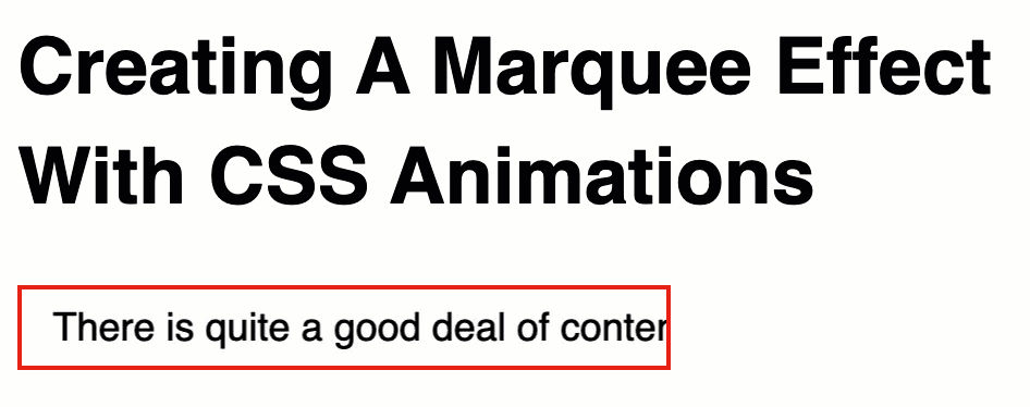
As you can see—or rather, as you can't see—the moment the first element is fully off screen, the CSS animation reaches its end and both elements snap back to their 0% offset. However, going from -100% to 0% doesn't create any visual change (that the user will notice).
Of course, this only makes sense if the piece of content is wider than the content container. Which means, if you wanted to implement something like this, you would either have to know that the length is long ahead of time; or, you would have to measure the content at runtime and dynamically duplicate the content if needed (and add CSS classes that would trigger the animation).
As I was putting this together, I came across a CSS Tricks post by Mads Stoumann that looks at pausing CSS animations. I didn't even know that this was possible! But, if you set the animation-play-state to paused, the CSS animation will stop in it current offset. In this demo, I am applying that state via the :hover pseudo-selector.
There's not a large number of places in which a marquee effect makes sense on the modern web. But, this was fun to build and I learned something new about CSS! Explorations like this are always a good - and fun - use of time.
Want to use code from this post? Check out the license.

Reader Comments
This could be nightmarish if used in abundance on a webpage that has lots of unintended truncated/overflowed content.
I think I'd switch it up and add a visual indicator on any elements that use this (due to overflow) and then scroll while hovering/mouseover and perhaps reset to original upon mouseexit. (Too much animation can be a distraction.)
To avoid being dinged by SEO for duplicate content, javascript could be used to autogenerate the duplicated DIVs.
By way of contrast, my preferred music playback app (PlexAmp) scrolls long titles back-and-forth on both desktop & mobile apps. (When it scrolls to the end of text, it pauses and then reverses direction.) This approach wouldn't require duplicating any content. I personally prefer this approach and it's possible that it could be done with more complex animation keyframes (instead of using JS).
@James,
You are preaching to the choir. I actually heavily dislike most animations. And will gladly remove most of them. In fact, in the cast of Pandora, I'd rather just let the long line wrap - that way I can still the full value at a glance. Most designers tend to not want things to wrap as it "breaks" the neat-and-tidy UI they've designed.
That said, I just liked the fact that stuff that used to be in JavaScript can now be (at least mostly) in CSS in some cases. What an exciting time to be alive 😆
I do like the idea of having it not animate until you hover over it. That also saves on the GPU cost, since animations are "running" even when when the page isn't focused, I think.
Fun trick! One thing to note is that the
animation-duration: 4s ;declaration will render a different speed depending on the length of the string.@Bruno,
Ahhh, that's a great point that I had not considered.
For anyone else reading this, the reason that string length changes the animation speed has to do with the fact that the elements on the page are translating 100% of their width over a fixed amount of time.
So, for example, if a string creates a Div that is
100pxlong and the horizontal animation is-100%over4s, that's -25px per second.But, if another string creates a Div that is
200pxlong. The same animation over 4s is now only -50px per second. Essentially, the string that is 2x as long has to move 2x the distance in the same amount of time.Spot-on, Bruno! 🙌
Hey! Thanks! 😀
My pleasure :)
Thanks, great example, helped a lot!
Post A Comment — ❤️ I'd Love To Hear From You! ❤️
Post a Comment →