
Using Picture And Source Tags To Prevent Loading Hero Image On Mobile Devices
At the top of this blog, I have a rotating hero image of me hanging out with many of the world's most awesome nerds. This hero image renders on desktop devices; but is—for performance reasons—hidden using display:none on mobile devices. Unfortunately, as I discovered this morning, my hero image is still be loaded by the browser despite it never being rendered for the user. To fix this, I am borrowing a technique that I learned from Niels Swimberghe that uses the <picture> and <source> tags to prevent image loading on smaller viewports.
This morning, I was reading up on the new NgOptimizedImage directive in Angular 15. In the Angular docs, they state that the directive applies the following Document Object Model (DOM) changes for images that are defined with a priority load:
It automatically sets the
fetchpriority="high"attribute on the<img>tag.It automatically sets the
loading="eager"attribute (the default loading behavior) on the<img>tag.It automatically injects a
<link rel="preload">for the image in the<head>tag.
I had never seen this use of the <link> tag to preload an image before. So, this is what I added to my site in an attempt to preload the hero image. Note that my <link> tag has a media query that matches minimum width at which my CSS will render the hero image - the intent being that I didn't want to pre-fetch the hero image on mobile devices since the image would never be rendered:
<!---
	Attempt to start preloading the hero image ASAP; but, only if it will be
	shown based on the media query (which must match the CSS media query as well).
--->
<link
	rel="preload"
	href="/images/header/photos/#photo.src#"
	as="image"
	media="(min-width: 1024px)"
/>
But, when I went to check this on a smaller viewport (smaller that 1024 pixels), the network activity revealed the fact that the image was still being loaded even though it was never being rendered. Apparently, display:none won't prevent images from being loaded unless those images are provided as backgrounds.
ASIDE: I think this is something that I used to know but have long forgotten. Web development is eating up the space in my brain!
As Niels Swimberghe points out in his post, one way to fix this is to use the <picture> and <source> tags alongside the <img> tag in order to define an image source based on a media query. In my case, I am using a <source> tag with a media attribute that matches the <link> pre-load tag from above:
<picture>
	<!--- Note that this src and media query match the link-preload tag. --->
	<source
		srcset="/images/header/photos/#photo.src#"
		media="(min-width: 1024px)"
	/>
	<img
		fetchpriority="high"
		loading="eager"
		alt="#encodeForHtmlAttribute( photo.alt )#"
	/>
</picture>
As you can see here, the embedded <img> tag has no src attribute at all. I believe that this is technically invalid HTML (having an img without a src); however, the browser doesn't seem to care (and neither do I). And now, on a mobile viewport (less than 1024 pixels), the <img> tag is basically useless (and is contained within a parent element that has display:none). However, if the viewport expands beyond 1024 pixels, the <source> tag kicks in and the <picture> tag updates the embedded <img> tag to use the given srcset value.
We can see this behavior if we load my blog's homepage with a small viewport and then slowly resize the window:
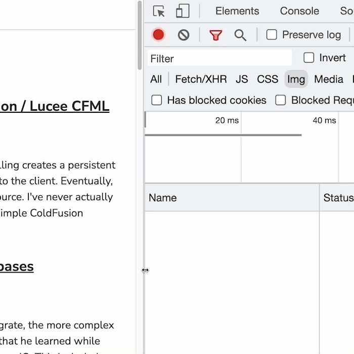
As you can see, once the browser viewport is expanded beyond 1024 pixels, the <picture> tag updates the <img> tag and the hero image request is finally initiated. At the same time, my CSS kicks in and removes the display:none from the parent element.
Not loading the hero image on a mobile viewport has had a positive impact on the mobile Lighthouse score for the homepage of my blog:
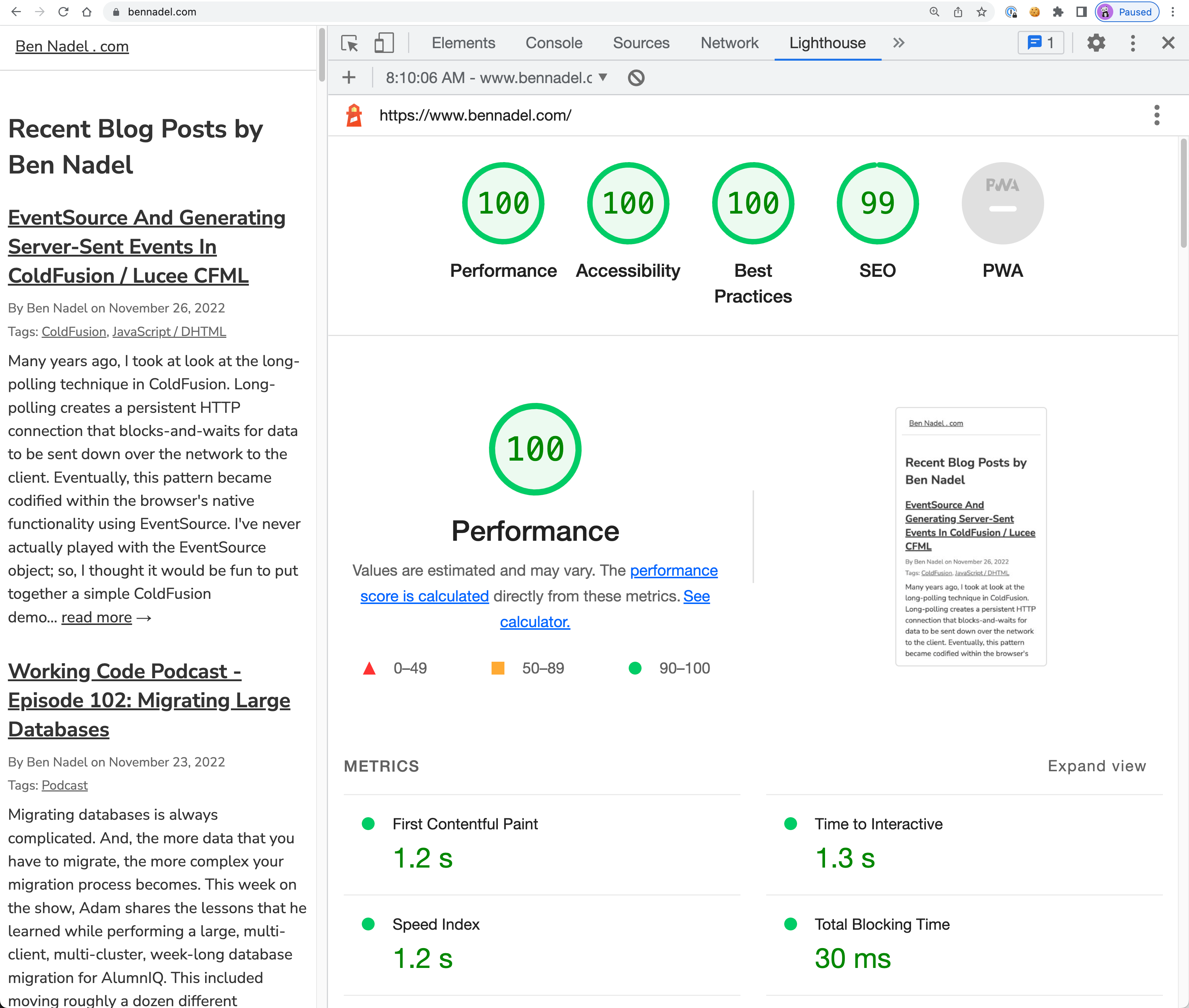
Not too shabby! And to think, this is being rendered by Adobe ColdFusion 2021 - yeah buddy!
This is the first time I've ever used the <picture> tag before, so I don't really know how it works. Nor am I going to try and describe its functionality. For the moment, I'm just glad that I can use it to defer loading of the hero image on smaller, mobile viewports.
Want to use code from this post? Check out the license.

Reader Comments
Shout out to William Rae for pointing out that my code actually broke the rotation of the hero image. My JavaScript to rotate the hero image was updating the
<img>tag'ssrcattribute. But, once I added the<source>tag, the image tag was no longer in control. I had to update the rotation logic to change thesrcsetattribute instead. Essentially:Super sloppy on my part to not test that 😱 But, thanks for catching my error!