Using InVision Principles To Experiment With Scroll Snapping In CSS
Earlier this week, I was talking about the criticality of customer empathy in our work. "Customer Empathy" is one of the core InVision Principles — principles that we take so seriously at work that we had them codified in a physical deck of cards (see the graphic in aforementioned article). As I was talking about the principles, it occurred to me that recreating the physical cards in a digital medium might be the perfect opportunity for me to experiment with CSS Scroll Snapping for the first time!
Run this demo on my InVision Principles site.
View this code in my InVision Principles project on GitHub.
Scroll Snap is a CSS module that has been around for a number of years (it even has some IE11 support according to the Mozilla Developer Network). Scroll Snap determines the valid states that an element can have within an overflow / scrollable container. I don't create a lot of user interfaces (UI) where something like this feels like a good fit. But, I had a vision in my head of a full-screen InVision Principle card; and, it felt like a perfect fit!
There are eight InVision Principles at the time of this writing:
- Humility
- Co-Ownership
- Candor with Compassion
- Relentless Self-Development
- Go-Getting and Go-Giving
- Customer Empathy ← Discussed in my previous post
- Inclusive Design (formerly "Design-Driven")
- Intelligent Urgency
I had a vision of creating a Netlify site for these principles wherein each one was represented by a full-screen experience. Ideally, as the user scrolled up or down on this site, each card would snap into view, aligning with the top of the window, providing a full view of each card in the list.
Before we look at the code, it might be best to demonstrate what I actually mean. Here's a GIF of me scrolling through this experience:
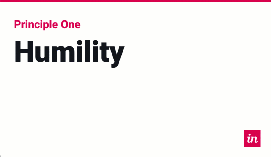
For each one of the scroll operations in the above GIF, I'm just tapping my Down Arrow key once. The CSS Scroll Snapping then takes over and snaps the next element in the overflow container into view, bringing the next card flush with the top of the screen.
At first, I tried to apply the CSS Scroll Snapping properties to the <body> element; but, this didn't seem to work. I'm not sure if I was doing it wrong; or, if it has to be applied to an explicitly-constrained container. But, in the end, I decided to create a <ul> of cards and apply the CSS Scroll Snapping properties to the list of cards.
The list of cards has the CSS properties:
overflow: auto ;scroll-snap-type: y mandatory ;
The list has to have an overflow property otherwise there would be nothing to scroll; and therefore nothing to snap into place. The y then tells the browser that we're snapping on the vertical axis. And, the mandatory tells the browser that it must attempt to snap a child element into position at the end of the user's scroll operation (assuming there's enough content to scroll).
Each <li> item within the list then has the CSS property:
scroll-snap-align: start ;
This tells the browser to snap the child element into the start of the scrollable area's viewport box. In this case, that will be the top of the screen since I have my list position: fixed with a four-side layout that consumes 100% of the screen real estate.
And that's basically all that I needed to do to get this scroll snap working. How amazing is that!? CSS is bananas these days! Rest of the CSS is just there to get the card layout and responsive styles working.
Once I got that working, I then figured I'd try to take it up a notch and use the IntersectionObserver to update the URL fragment as the user scrolled down through the cards. As each card snaps into place, I update the hash to use the current card's id property. This way, if the user refreshes the page, it will immediately bring the user back to the current card.
In the end, here's the HTML that I came up with - the HTML is a bit verbose; but, look little JavaScript is needed to create this overall experience. It's kind of banana-pants how far browser tech has come!
<!doctype html>
<html lang="en">
<head>
	<meta charset="utf-8" />
	<title>
		InVision Principle Cards
	</title>
</head>
<body>

	<svg aria-hidden="true" xmlns="http://www.w3.org/2000/svg" xmlns:xlink="http://www.w3.org/1999/xlink" class="sprite">
		<symbol id="svg-sprite-logo" viewBox="0 0 250 250">
			<rect width="250" height="250" x="0" y="0" fill="#e0005a" rx="0" ry="0" />
			<path fill="#ffffff" d="M85.07 80.45c7.90796383-.11557762 14.23609464-6.59952105 14.15932287-14.5079568-.07677176-7.90843577-6.52958492-14.26830717-14.43830219-14.23034311C76.88230342 51.74966415 70.49084456 58.17119166 70.49 66.08c.01309065 3.8436309 1.56015064 7.5229752 4.297667 10.2210623C77.52518334 78.9991494 81.22658366 80.49267032 85.07 80.45z" />
			<path fill="#ffffff" d="M54.84 157.38c-.82782834 3.53787163-1.26047633 7.15668694-1.29 10.79 0 12.65 6.86 21.05 21.44 21.05 12.09 0 21.9-7.18 28.95-18.78l-4.31 17.3h24l13.73-55c3.43-13.94 10.07-21.17 20.15-21.17 7.93 0 12.86 4.93 12.86 13.08.03912472 2.61284257-.32171622 5.21629307-1.07 7.72l-7.07 25.29c-1.01155534 3.4828975-1.51673094 7.09321915-1.5 10.72 0 12 7.07 20.8 21.86 20.8 12.65 0 22.73-8.14 28.3-27.65l-9.43-3.65c-4.72 13.08-8.79 15.44-12 15.44-3.21 0-4.94-2.14-4.94-6.43.09264834-2.2511591.45182093-4.48339997 1.07-6.65l6.87-24.65c1.5423336-5.06756394 2.33736671-10.33297395 2.36-15.63 0-18.44-11.15-28.06-24.66-28.06-12.65 0-25.51 11.41-31.94 23.42l4.71-21.56h-36.65l-5.15 19h17.16L107.73 155c-8.3 18.44-23.54 18.74-25.45 18.31-3.14-.71-5.14-1.9-5.14-6 .09156838-3.31952276.59543174-6.61478915 1.5-9.81l16.08-63.79H54l-5.14 19h16.93l-10.95 44.67z" />
		</symbol>
	</svg>

	<h1>
		<a href="https://www.bennadel.com/invision">InVision</a> Principle Cards
	</h1>

	<ul tabindex="-1" class="cards">
		<li class="cards__item">

			<div id="principle-1-humility" class="cards__card card">
				<div class="card__index">
					<a href="#principle-1-humility" class="card__anchor">
						Principle One
					</a>
				</div>
				<div class="card__title">
					Humility
				</div>
				<a
					href="https://www.bennadel.com/invision"
					aria-hidden="true"
					target="_blank"
					class="card__logo">
					<svg class="card__svg">
						<use xlink:href="#svg-sprite-logo"></use>
					</svg>
				</a>
			</div>

		</li>
		<li class="cards__item">

			<div id="principle-2-co-ownership" class="cards__card card">
				<div class="card__index">
					<a href="#principle-2-co-ownership" class="card__anchor">
						Principle Two
					</a>
				</div>
				<div class="card__title">
					Co-Ownership
				</div>
				<a
					href="https://www.bennadel.com/invision"
					aria-hidden="true"
					target="_blank"
					class="card__logo">
					<svg class="card__svg">
						<use xlink:href="#svg-sprite-logo"></use>
					</svg>
				</a>
			</div>

		</li>
		<li class="cards__item">

			<div id="principle-3-candor-with-compassion" class="cards__card card">
				<div class="card__index">
					<a href="#principle-3-candor-with-compassion" class="card__anchor">
						Principle Three
					</a>
				</div>
				<div class="card__title">
					Candor with<br />
					Compassion
				</div>
				<a
					href="https://www.bennadel.com/invision"
					aria-hidden="true"
					target="_blank"
					class="card__logo">
					<svg class="card__svg">
						<use xlink:href="#svg-sprite-logo"></use>
					</svg>
				</a>
			</div>

		</li>
		<li class="cards__item">

			<div id="principle-4-relentless-self-development" class="cards__card card">
				<div class="card__index">
					<a href="#principle-4-relentless-self-development" class="card__anchor">
						Principle Four
					</a>
				</div>
				<div class="card__title">
					Relentless<br />
					Self-Development
				</div>
				<a
					href="https://www.bennadel.com/invision"
					aria-hidden="true"
					target="_blank"
					class="card__logo">
					<svg class="card__svg">
						<use xlink:href="#svg-sprite-logo"></use>
					</svg>
				</a>
			</div>

		</li>
		<li class="cards__item">

			<div id="principle-5-go-getting-and-go-giving" class="cards__card card">
				<div class="card__index">
					<a href="#principle-5-go-getting-and-go-giving" class="card__anchor">
						Principle Five
					</a>
				</div>
				<div class="card__title">
					Go-Getting<br />
					and Go-Giving
				</div>
				<a
					href="https://www.bennadel.com/invision"
					aria-hidden="true"
					target="_blank"
					class="card__logo">
					<svg class="card__svg">
						<use xlink:href="#svg-sprite-logo"></use>
					</svg>
				</a>
			</div>

		</li>
		<li class="cards__item">

			<div id="principle-6-customer-empathy" class="cards__card card">
				<div class="card__index">
					<a href="#principle-6-customer-empathy" class="card__anchor">
						Principle Six
					</a>
				</div>
				<div class="card__title">
					Customer<br />
					Empathy
				</div>
				<a
					href="https://www.bennadel.com/invision"
					aria-hidden="true"
					target="_blank"
					class="card__logo">
					<svg class="card__svg">
						<use xlink:href="#svg-sprite-logo"></use>
					</svg>
				</a>
			</div>

		</li>
		<li class="cards__item">

			<div id="principle-7-inclusive-design" class="cards__card card">
				<div class="card__index">
					<a href="#principle-7-inclusive-design" class="card__anchor">
						Principle Seven
					</a>
				</div>
				<div class="card__title">
					Inclusive<br />
					Design
				</div>
				<a
					href="https://www.bennadel.com/invision"
					aria-hidden="true"
					target="_blank"
					class="card__logo">
					<svg class="card__svg">
						<use xlink:href="#svg-sprite-logo"></use>
					</svg>
				</a>
			</div>

		</li>
		<li class="cards__item">

			<div id="principle-8-intelligent-urgency" class="cards__card card">
				<div class="card__index">
					<a href="#principle-8-intelligent-urgency" class="card__anchor">
						Principle Eight
					</a>
				</div>
				<div class="card__title">
					Intelligent<br />
					Urgency
				</div>
				<a
					href="https://www.bennadel.com/invision"
					aria-hidden="true"
					target="_blank"
					class="card__logo">
					<svg class="card__svg">
						<use xlink:href="#svg-sprite-logo"></use>
					</svg>
				</a>
			</div>

		</li>
	</ul>

	<script type="text/javascript">
		(function() {

			focusCards();
			scrollCardIntoView();
			setupIntersectionObserver();

			// ----------------------------------------------------------------------- //
			// ----------------------------------------------------------------------- //

			// Since the scroll-snapping isn't on the BODY - it's on the cards list - we
			// want to focus the cards so that up/down keyboard navigation will apply to
			// the correct element.
			function focusCards() {

				document.querySelector( ".cards" ).focus();

			}


			// Since the body isn't actually scrolling, the browser doesn't seem to want
			// to scroll the correct ID into view. As such, we'll jump in and help the
			// browser bring the correct element into view.
			function scrollCardIntoView() {

				if ( ! window.location.hash ) {

					return;

				}

				// Since the hash is prefixed with "#", we can use it to generate a CSS
				// selector for the ID of the card. That said, since this is technically
				// "user provided content", we have to wrap in a try/catch since a user
				// may provide an invalid fragment.
				try {

					var node = document.querySelector( window.location.hash );

				} catch ( error ) {

					return;

				}

				if ( node ) {

					node.scrollIntoView();

				}

			}


			// I used the IntersectionObserver API to dynamically change the URL to
			// reflect the InVision Principle Card that is most visible on the page.
			function setupIntersectionObserver() {

				if ( ! window.IntersectionObserver || ! window.location.replace ) {

					return;

				}

				var observer = new IntersectionObserver(
					handleIntersection,
					{
						threshold: 1 // Only ENTIRE-card changes are reflected.
					}
				);

				document.querySelectorAll( ".card" ).forEach(
					function iterator( node ) {

						observer.observe( node );

					}
				);

			}


			// I handle the IntersectionObserver interaction callback.
			function handleIntersection( entries ) {

				// Since our threshold is 1 - and our cards are all 100vh - we know that
				// only one card will be visible / intersecting at a time. As such, we
				// can use the ID of the first (and only) intersection entry that we find
				// in the changing collection.
				entries.forEach(
					function iterator( entry ) {

						if ( entry.isIntersecting ) {

							window.location.replace( "#" + entry.target.id );
							// Changing the history appears to lose focus on the
							// document. As such, let's refocus the cards so that
							// keyboard navigation continues to work.
							focusCards();

						}

					}
				);

			}

		})();
	</script>

</body>
</html>
And, here's the CSS that powers this demo. The vast, vast majority of this CSS is doing layout. Only a handful of lines are actually geared towards the CSS Scroll Snapping. I'm not really very good with responsive design; so, this represents a lot of trial-and-error. This is also the first time that I ever used the aspect-ratio media-query before.
html {
	box-sizing: border-box ;
	color: #22252b ;
	font-family: "Roboto", sans-serif ;
	font-weight: 400 ;
	line-height: 1.1 ;
}

html *,
html *:before,
html *:after {
	box-sizing: inherit ;
}

html,
body {
	margin: 0px 0px 0px 0px ;
	padding: 0px 0px 0px 0px ;
}

.sprite {
	display: none ;
}

.cards {
	bottom: 0px ;
	left: 0px ;
	list-style-type: none ;
	margin: 0px 0px 0px 0px ;
	overflow: auto ;
	overscroll-behavior: contain ;
	padding: 0px 0px 0px 0px ;
	position: fixed ;
	right: 0px ;
	scroll-snap-type: y mandatory ;
	top: 0px ;
	z-index: 2 ;
}

.cards:focus {
	outline: none ;
}

.cards__item {
	margin: 0px 0px 0px 0px ;
	max-height: 100vh ;
	padding: 0px 0px 0px 0px ;
	scroll-snap-align: start ;
}

.card {
	background-color: #ffffff ;
	border-top: 6px solid #e0005a ;
	display: flex ;
	flex-direction: column ;
	height: 100vh ;
	overflow: hidden ;
}

.card__index {
	color: #e0005a ;
	flex: 0 0 auto ;
	font-weight: 700 ;
}

.card__anchor {
	color: inherit ;
	text-decoration: none ;
}

.card__anchor:hover {
	text-decoration: underline ;
}

.card__title {
	flex: 1 1 auto ;
	font-weight: 900 ;
}

.card__logo {
	flex: 0 0 auto ;
	border-radius: 4px ;
}

.card__svg {
	display: block ;
	height: 100% ;
	width: 100% ;
}

/* Sweet spot for business card layout. */
@media ( min-aspect-ratio: 3/2 /* 1.5 */ ) and ( max-aspect-ratio: 6/3 /* 2.0 */ ) {
	.card {
		padding: 6vw 4vw 4vw 5vw ;
	}

	.card__index {
		font-size: 4vw ;
		margin-bottom: 2vw ;
	}

	.card__title {
		font-size: 10.5vw ;
	}

	.card__logo {
		align-self: flex-end ;
		height: 6vw ;
		width: 6vw ;
	}
}

/* Layout is too tall. */
@media ( max-aspect-ratio: 3/2 ) {
	.card {
		align-items: center ;
		padding: 5vw 4vw 4vw 5vw ;
		text-align: center ;
	}

	.card__index {
		font-size: 6vw ;
	}

	.card__title {
		flex: 0 0 auto ;
		font-size: 10.5vw ;
		margin: auto 0px auto 0px  ;
	}

	.card__logo {
		height: 6vw ;
		width: 6vw ;
	}
}

/* Layout is too wide. */
@media ( min-aspect-ratio: 6/3 ) {
	.card {
		padding: 8vh 8vh 8vh 8vh ;
	}

	.card__index {
		font-size: 8vh ;
		margin-bottom: 2vh ;
	}

	.card__title {
		font-size: 20vh ;
	}

	.card__logo {
		align-self: flex-end ;
		height: 10vh ;
		width: 10vh ;
	}
}
I don't know how many places in my application development it will make sense to use CSS Scroll Snapping. But, dang it if this wasn't relatively easy to implement! It's just a fun user experience (UX).
Want to use code from this post? Check out the license.

Reader Comments