
Effortless Custom Form Input Styling With Webkit Appearance None
So last night, I was listening to the latest episode of JS Party, when Divya Sasidharan said something that rocked my world. Paraphrasing, she said something to the effect of, "Styling form elements is easy if you just use webkit-appearance: none". I had never hear of this webkit-appearance CSS property before; but, apparently it removes the native styling that the browser applies to a given element. And, it's supported all the way back to IE11. How am I just hearing about this now?! I had to immediately sit down and try it out for myself.
Run this demo in my JavaScript Demos project on GitHub.
View this code in my JavaScript Demos project on GitHub.
As web developers, I am sure that everyone here is very familiar with the pain of adding custom CSS styling to form input controls. Over the years, I've reached for jQuery plug-ins and added all manner of HTML Elements in order to implement the custom user interfaces (UI) that our designers gravitate towards.
To this day, I still vividly remember how thrilled I was 6-years ago to discover that you could use transparent select menus to fake the styling of a menu-root. But, even that required additional JavaScript in order to synchronize the select state with the shim-elements.
All to say, if there was a "native" way to add custom CSS form styling, I'd be all about that!
And, it turns out, it's been there all along: webkit-appearance: none.
I've known about this CSS property for less than 24-hours; so, I won't pretend to understand any of the caveats and best practices. But, from what I've been Googling, it seems pretty straight-forward and, well, hella sweet!
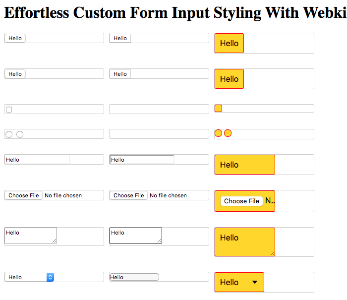
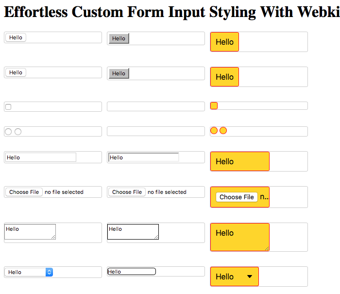
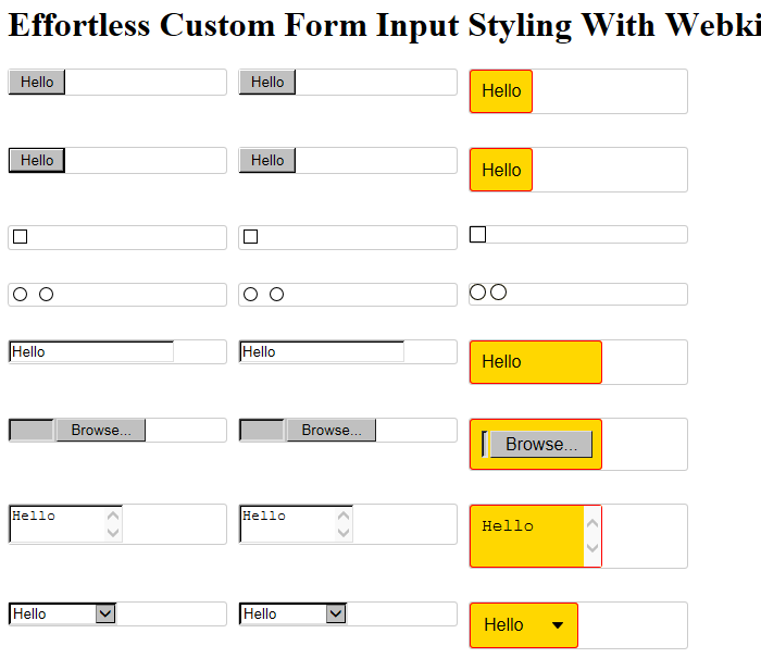
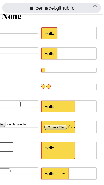
By adding webkit-appearance: none, the browser removes the styling that it normally applies with its user-agent stylesheet. This frees the given element up to be styled more thoroughly by our custom stylesheets. To this in action, I've created a simple demo that compares three things:
The native CSS styling of the various form input controls.
The appearance of those form input controls with
webkit-appearance:none.Custom CSS styling applied on top of the normalized form input controls.
<!doctype html>
<html lang="en">
<head>
	<meta charset="utf-8" />
	<meta name="viewport" content="width=device-width, initial-scale=1.0" />

	<title>
		Effortless Custom Form Input Styling With Webkit Appearance None
	</title>

	<link rel="stylesheet" type="text/css" href="./style.css" />
</head>
<body>

	<h1>
		Effortless Custom Form Input Styling With Webkit Appearance None
	</h1>

	<style type="text/css">

		/* Remove the browser's native styling. */
		.clear-styles {
			appearance: none ;
				-moz-appearance: none ;
				-webkit-appearance: none ;
		}

		/* Now, let's add our custom form input styling on top of webkit-appearance: none */

		input[ type = "button" ].clear-styles.custom {
			background-color: gold ;
			border: 1px solid red ;
			border-radius: 3px 3px 3px 3px ;
			display: block ;
			font-size: inherit ;
			margin: 0px 0px 0px 0px ;
			padding: 10px 10px 10px 10px ;
		}

		button.clear-styles.custom {
			background-color: gold ;
			border: 1px solid red ;
			border-radius: 3px 3px 3px 3px ;
			display: block ;
			font-size: inherit ;
			margin: 0px 0px 0px 0px ;
			padding: 10px 10px 10px 10px ;
		}

		input[ type = "checkbox" ].clear-styles.custom {
			background-color: gold ;
			border: 1px solid red ;
			border-radius: 3px 3px 3px 3px ;
			display: block ;
			font-size: inherit ;
			height: 15px ;
			margin: 0px 0px 0px 0px ;
			width: 15px ;
		}
		input[ type = "checkbox" ].clear-styles.custom:checked {
			background-color: #333333 ;
		}

		input[ type = "radio" ].clear-styles.custom {
			background-color: gold ;
			border: 1px solid red ;
			border-radius: 15px 15px 15px 15px ;
			display: inline-block ;
			font-size: inherit ;
			height: 15px ;
			margin: 0px 0px 0px 0px ;
			width: 15px ;
		}
		input[ type = "radio" ].clear-styles.custom:checked {
			background-color: #333333 ;
		}

		input[ type = "input" ].clear-styles.custom {
			background-color: gold ;
			border: 1px solid red ;
			border-radius: 3px 3px 3px 3px ;
			display: block ;
			font-size: inherit ;
			margin: 0px 0px 0px 0px ;
			padding: 10px 10px 10px 10px ;
			width: 100px ;
		}

		input[ type = "file" ].clear-styles.custom {
			background-color: gold ;
			border: 1px solid red ;
			border-radius: 3px 3px 3px 3px ;
			display: block ;
			font-size: inherit ;
			margin: 0px 0px 0px 0px ;
			padding: 10px 10px 10px 10px ;
			width: 100px ;
		}

		textarea {
			width: 100px ;
		}
		textarea.clear-styles.custom {
			background-color: gold ;
			border: 1px solid red ;
			border-radius: 3px 3px 3px 3px ;
			display: block ;
			font-size: inherit ;
			margin: 0px 0px 0px 0px ;
			padding: 10px 10px 10px 10px ;
			width: 100px ;
		}

		select {
			width: 100px ;
		}
		select.clear-styles.custom {
			background-color: gold ;
			background-image: url( "data:image/png;base64,iVBORw0KGgoAAAANSUhEUgAAABAAAAAQCAYAAAAf8/9hAAAAh0lEQVQ4T93TMQrCUAzG8V9x8QziiYSuXdzFC7h4AcELOPQAdXYovZCHEATlgQV5GFTe1ozJlz/kS1IpjKqw3wQBVyy++JI0y1GTe7DCBbMAckeNIQKk/BanALBB+16LtnDELoMcsM/BESDlz2heDR3WePwKSLo5eoxz3z6NNcFD+vu3ij14Aqz/DxGbKB7CAAAAAElFTkSuQmCC" ) ;
			background-position: calc( 100% - 10px ) 50% ;
			background-repeat: no-repeat ;
			border: 1px solid red ;
			border-radius: 3px 3px 3px 3px ;
			display: block ;
			font-size: inherit ;
			margin: 0px 0px 0px 0px ;
			padding: 10px 10px 10px 10px ;
		}
		/* Used to remove down-arrow in IE11. */
		select.clear-styles.custom::-ms-expand {
 			display: none ;
 		}

	</style>

	<div class="comparisons">

		<div>
			<input type="button" value="Hello" />
		</div>
		<div>
			<input type="button" value="Hello" class="clear-styles" />
		</div>
		<div>
			<input type="button" value="Hello" class="clear-styles custom" />
		</div>

		<div>
			<button>Hello</button>
		</div>
		<div>
			<button class="clear-styles">Hello</button>
		</div>
		<div>
			<button class="clear-styles custom">Hello</button>
		</div>

		<div>
			<input type="checkbox" />
		</div>
		<div>
			<input type="checkbox" class="clear-styles" />
		</div>
		<div>
			<input type="checkbox" class="clear-styles custom" />
		</div>

		<div>
			<input type="radio" name="radio-default" />
			<input type="radio" name="radio-default" />
		</div>
		<div>
			<input type="radio" name="radio-clear" class="clear-styles" />
			<input type="radio" name="radio-clear" class="clear-styles" />
		</div>
		<div>
			<input type="radio" name="radio-custom" class="clear-styles custom" />
			<input type="radio" name="radio-custom" class="clear-styles custom" />
		</div>

		<div>
			<input type="input" value="Hello" />
		</div>
		<div>
			<input type="input" value="Hello" class="clear-styles" />
		</div>
		<div>
			<input type="input" value="Hello" class="clear-styles custom" />
		</div>

		<div>
			<input type="file" size="1" />
		</div>
		<div>
			<input type="file" size="1" class="clear-styles" />
		</div>
		<div>
			<input type="file" size="1" class="clear-styles custom" />
		</div>

		<div>
			<textarea>Hello</textarea>
		</div>
		<div>
			<textarea class="clear-styles">Hello</textarea>
		</div>
		<div>
			<textarea class="clear-styles custom">Hello</textarea>
		</div>

		<div>
			<select>
				<option>Hello</option>
				<option>An option with a really long text value.</option>
			</select>
		</div>
		<div>
			<select class="clear-styles">
				<option>Hello</option>
				<option>An option with a really long text value.</option>
			</select>
		</div>
		<div>
			<select class="clear-styles custom">
				<option>Hello</option>
				<option>An option with a really long text value.</option>
			</select>
		</div>

	</div>

</body>
</html>
Special thanks to David Tang - I grabbed the Base64 data-uri for the
selectmenu arrow from his blog post on customselectstyling.
And now, the big reveal - how this actually looks in various browsers (on my Mac):
Chrome 79 - webkit-appearance: none

Firefox 72 - webkit-appearance: none
Safari 13 - webkit-appearance: none
Microsoft Edge 80 - webkit-appearance: none

Internet Explorer 11 (VirtualBox) - webkit-appearance: none
NOTE: CanIUse.com says that this isn't supported in IE11. However, clearly, something about it works. Plus, there are various blog posts on using the
-ms-expandpseudo-selector to deal with theselectmenu arrow in IE11 and IE10. So, not sure what to make of that?
Apple iOS 13 Mobile Safari - webkit-appearance: none
Ummmm, how awesome is that?! Again, I've known about this for less than 24-hours; so, I am sure the devil is in the details. But, at least at first blush, this seems extremely exciting! And, will open up a whole new avenue of custom form control styling of me. If this information is old-hat for you, I'd love to hear about your experience - and any tips-and-tricks I might need to know about.
Some worthwhile articles that I came across when looking this stuff up:
Want to use code from this post? Check out the license.

Reader Comments
Oh yes...
Is an amazing property, which I must say, I have known about for sometime.
And, if you add a label above the:
You can make a super cool file upload button...
https://codepen.io/charles1971/pen/LYVxERb
Actually, you can do this without using:
But, it kind of helps to reduce the clutter.
One of the most useful features of this property, is in the creation of universal customised select lists. At last, we can guarantee the look & feel of our select lists across all browsers and OS.
@Charles,
Oh man, I'm am so behind the times on this one :D Cool demo - I like the one-big Upload button - very slick.
And yes, the customized
selectis definitely what I am most excited about!! Only, a few years too late :PBen. No worries.
I come across tags & properties that I have never heard of, either. It seems that everyone else has been using them for years!
I only learnt about this one, when I was trying to find a cross browser solution for customising select lists. And this one, truly is a game changer!
@Charles,
Game-changer indeed :D
@All,
Ever since I've learned about this
webkit-appearance: nonebusiness, I've had my eye out for examples in the wild. And, last night, I came across something super interesting -- aninput[type="checkbox"]form element being styled using the::afterpseudo-element. I had no idea that any of the input elements even had pseudo-elements! WAT?!www.bennadel.com/blog/3778-using-css-webkit-appearance-to-style-checkbox-after-pseudo-element.htm
I had to try it out for myself.