Proof-of-Concept: InVision Screen Flow In Angular 7.2.7
A few weeks ago, I wrote a post titled, So Mediocre They Can't Ignore Me. In that post, I talked about trying to make-up for my lack of design talent with my ability to focus and grind things out. And today, that's what I'm trying to do. I have a rough idea for a feature I'd like to add to InVision. As such, I'm seeking feedback from you all on my idea. The hope being that I can use that feedback to both improve the idea; and, to demonstrate that the idea might have some traction when I pitch it to our Product Team.
Run this demo in my InVision Screen Flow project on GitHub - Desktop Version
Run this demo in my InVision Screen Flow project on GitHub - Watch Version
View this code in my InVision Screen Flow project on GitHub.
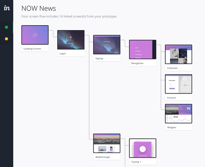
I'm calling the feature "Screen Flow", though I'm not married to that name. Screen Flow is essentially an alternative view into your Prototype that attempts to automatically arrange the screens in a hierarchical map based on the embedded hotspots. You can think of it as being akin to the old "Site Map" concept in the Web 1.0 days:
While this sounds like a simple idea, there are a number of complexities that I don't have great answers for. The most obvious being that the screens in a Prototype are highly cross-linked. Meaning, a Prototype is more akin to a spider's web than it is a clean, hierarchical flow of links. Of course, rendering the Prototype flow like a spider's web would make it completely unusable.
My current solution to this problem is to render the Screen Flow as a directed acyclic graph. Which means that I start at the first screen and then traverse the hotspot links, making sure to never revisit an existing screen:

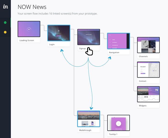
Of course, I don't want to lose the utility of the cross-linking, so when you hover over a screen, I attempt to highlight the linked screens, even if those screens have been previously visited - notice the blue-borders and shadow in the following screen-shot:

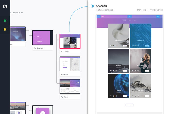
And, of course, if you click on a screen, I open a side-bar that shows a higher-fidelity version of the screen with actual hotspot rendering:

Then, there's the matter of hotspots that don't represent deterministic screen-to-screen links. For example, InVision allows you to create hotspots that "go to the next screen" or "return to the previously-visited screen" or "show as overlay". While some of these hotspots can be made deterministic at compile time, the "previously-visited" screen concept is a dynamic, runtime concern that can't be mapped to a static value.
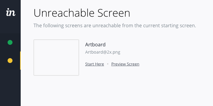
And, of course, it's unclear as to whether or not this feature would actually provide any value to the user. My gut says Yes - at least something. But, I'm also too emotionally involved at this point to be objective. That said, I appreciate that the Screen Flow provides the user with an alternative, topographical view of the Prototype. And, that is sheds on light on screens that may not be reachable based on the current hotspot configuration:

So, that's the idea that I have so far. I'd really appreciate any feedback both positive and constructive. This way, I can polish the concept and get it to a point where I feel it's ready to pitch to the Product Team at InVision.
Thank you so much for your time!

Reader Comments
You say you're not a designer, but this is a very clean interface with a good layout. I didn't know what InVision is so I had to read up on that before I understood why you created this demo. It seems like a logical and natural feature to add to InVision.
One of the first gen HTML design tools would build a flow chart so you can visualise all navigational journeys that users can take, and it flagged up pages that nothing linked to as well as links that went somewhere that didn't exist. Am I thinking of HoTMetaL or Frontpage?
@Gary,
Thank you for the kind words -- this is like my 5th attempts at designing this, with some good feedback from my local team's Project Manager. The first pass was much heavier and had more UI elements that didn't really need to be there.
I know I used to use Frontpage way back in the day, but I don't really remember much about it. I think I just used it for drag-n-drop layout. Though, maybe I am thinking of "Page Mill"?
Good to know that flagging unreachable pages is helpful, though. Thanks.
Ben,
Thank you for sharing your work-in-progress! I think the overall utility and clarity of this concept is terrific.
I have three quick thoughts to share with you.
1. This is a very useful feature.
In my work as a UX designer, I regularly, manually, create flow diagrams. "Screen Flow" would drastically reduce my efforts! Additionally, it would be a handy visual for a variety of stakeholders, from developers looking to get a sense of the app to clients seeing how different features connect together.
2. I think the "spider-web" concern could lead to a great feature.
You mentioned how one screen linking to many could lead to a "spider-web" map, and I think this could be viewed as a positive! I love the idea of using Screen Flow to create custom flow diagrams for different task flows. For example: you could select a screen, select one screen from the many it links to, and then continue onwards to create and save a particular flow through the system. This would be invaluable for mapping different flows through a large, complex app. Perhaps you could call this, "Screen Flow: Choose Your Own Adventure". ;)
3. This would make a terrific view on InVision Cloud.
I love the idea of Screen Flow as an alternative view on InVision Cloud. From the default view, I could toggle to a Screen Flow view, and then maybe have custom-defined flows within that view.
Thanks again for sharing, Ben! Look forward to hopefully seeing this feature come to life in InVision.
Ben. This reminds me of the Apple XCode StoryBoard tool. I used to develop iOS Apps and the StoryBoard tool, allows one to move, shorten, lengthen and change the angle of each interconnecting line, to make the most of the screen real estate. As the lines get closer to a hot spot, the magnetic effect increases and tries to attract the line to a docking point. Essentially, this allows connecting lines & hotspots to become interchangeable. And, ultimately allows one to find the perfect balance between empty space and a compact flow, which becomes more important in larger projects.
Sometimes, in big projects, it can be a little disconcerting, if one has scroll downwards endlessly, because it is easy to forget what the previous flow looked like. So, as one scrolls down, maybe the hotspots & lines above could auto compact, using some kind of algorithm. Let's face it, we only tend to concentrate on the central part of the screen. As one scrolls back up the lines & hotspots gradually unpack again. But, maybe this is way to ambitious, although I am not exactly sure how many resources, you would have at your disposal, in terms of manpower & technology.
But, overall, this is a solid start.
Good luck!
I love the expression "both positive AND constructive".
I make prototypes a ton, plus I review designer portfolios a lot for recruiting. Often they will have invision prototypes.
I think you are iterating on an interesting idea, but one thing I didn't hear is a clear problem statement. What are you solving with this UI? What problem did you identify that makes users unhappy?
For example, does invision have components that contain links centrally? The problem statement might be, a user changes their nav and has to link pages many many times...link each nav item for each page. If it was centralized, they could do it once instead of many times. This is a problem with Adobe XD actually, but really easy in Figma.
Make sure you are clear about the problem before you suggest a solution.
Second thing, organizing screens is a difficult problem because there is such variety in flow. Complex business apps have a lot of intricate cross navigation. It's not like a website with simple global and local. Your solution might optimize for one scenario but not another.
So ask yourself, "what is the problem? Who has this problem? How often does it come up? How annoying is it? What are the three ways I could solve the problem? How hard are those solutions to implement?"
Don't just jump to "oooh, a site map might be cool".
Was this positive or constructive? I'm going to say it was ... deconstructive! Boom.
@Glen,
Really good points / questions. Especially about how different "Web sites" and "apps" are. In fact, that very diverge in linking complexity is part of why it has taken me so long to even wrap my head around this possible UI. It wasn't until I realized that "I didn't have to show EVERY link" that I even had some approach that made sense. Essentially, I'm somewhat dumbing down_ the complexity of an "app" so that it can be rendered more like a "web site."
But, it is a bit challenging to clearly articulate the problem space in this scenario. I do like that you can see screens that might otherwise be missed / overlooked (ie, those that aren't linked-to). But, you don't need a new UI to be able to do that -- it could just be a filter option on an existing layout.
There is an emotional satisfaction to seeing the prototype from a structural standpoint. But, as I'm the one building the feature, it's too difficult for me to know if that is a byproduct of actually having been able to build it, not necessary being able to consume it.
There might be an ability to see completeness / incompleteness of the prototype. But, since I am only rendering some of the links, that might not be evident.
I'll have to noodle on this some more. It should be something that is clear in my mind so I can answer the right questions along the way.
As far as links, we do have a concept of "Hotspot Templates" that allow you to apply multiple hotspots to multiple places. In fact, in the underlying data for this feature-idea, I have those as two separate types: "hard" and "soft" links. I ended-up just rendering the same since differentiating didn't seem to add any value.
@Rohit,
I really appreciate the feedback. I have mixed-feelings about having a screen-flow that people can "manually" put together. I know that this is how some other products work. My concern with anything manual is that we rely on a human to keep two separate things in sync. And, in my personal experience, humans are not good at this. That's why I feel like an app should generally find a way to add value with as much automation as possible.
I think this goes back to what Glen was getting at -- what is the actual business problem that is being addressed. To me, I think you hit on it as people wanting to get a sense for the structure of the site and how features connect. I think there is a way to get this to happen automatically. As I said, I shied away from the "spider web" view; but, it sounds like you are thinking that might actually be a value-add. I can noodle on how to render something like that, in order to see feature-connectivity.
Hmmmm, much to consider.
@Charles,
When I originally started to noodle on this idea, I was actually going to use the D3.js charting library to try and render the site-map as a "graph" with nodes and edges. Unfortunately, I've never used D3.js before; and, I quickly discovered that I didn't have the patience to try and get it to do what I wanted :P
To a good degree, my technical ability is a limiting factor here. Right now, the tree is rendered recursively as a set of Flexbox layouts. To get something more dynamic, the layout would have to become much more calculating. In fact, someone at work sent me a link to a white-paper on how to optimize tree layouts .... it was quite a bit over my head :D
Hey, fair enough. I just wanted to find a way to reduce the amount of empty space, which seems to be prevalent in these kind of applications. It would be great to see the flow gradually ravel/unravel as one scrolls.
This would definitely create a system that would stand out, in terms of SP. But, I realise that this kind of idea would require some pretty punishing algorithms & a very high degree of complexity.
Actually, I have used d3.js for creating tag clouds. I was also going to mention using 'nodes & edges' as an alternative approach. It would certainly resolve some of the issues with empty space.
Hi Ben
I was just looking for something to show me an overview of all the screens in InVision. The other app doing this from design app (no InVision support) is called Overflow, have you see that?
This is very impressive so far, really keen to see where you go with it. Have you pitched it to the product team yet?
@Josh,
I appreciate the feedback. I am still trying to get this feature to have a little traction internally. I've gotten some positive feedback from other team members -- but so far, no one with the authority to sign-off on the feature has provided any feedback. It's still very much on my radar -- just trying to find a path forward.