
Creating SVG Icon Components And SVG Icon Sprites In Angular 7.2.0
CAUTION: This post is mostly a note-to-self as I am building up a better mental model for SVG. Do not assume that anything in this post represents a "best practice."
SVG (Scalable Vector Graphics) is one of those web technologies that is super exciting; but, remains mostly a blind-spot in my day-to-day mental model. A few years ago, I read Practical SVG by Chris Coyier. His book was was eye-opening for me. But even still, since then, I've only dabbled slightly with SVG-based interfaces (ex, creating a Twitter-inspired SVG progress indicator). The other day, however, I stumbled across MicroIcon - an SVG icon placeholder service - and it lit a fire under my ass. I decided it was time to start wrapping my head around SVG - in particular SVG icons - and how they can be used in an Angular 7 application.
Run this demo in my JavaScript Demos project on GitHub.
View this code in my JavaScript Demos project on GitHub.
To be honest, I didn't even know where to start with SVG icons in Angular. So, like most web developers, I started with Google. And, one of the first posts that I came across was, Component based SVG Icon System by Varun Vachhar. Varun's article explored the topic of SVG icons in the context of React; but, his explanation was easy enough to translate into an Angular application.
That said, Varun uses an "SVG Sprite" in his post; and, I wanted to try using individual SVG components. I assumed that individual SVG components would be easier to "tree shake" (which is probably true). But, after a few days of trial-and-error, nothing felt as good or looked as clean as the sprite-based approach. Individual SVG icon components provide more flexibility; but, at the cost of much more boiler-plate and code repetition.
So, once I had convinced myself that the sprite-based approach was the "right" approach for a basic SVG icon component system, I set about translating Varun's teaching into something that I could consume in an Angular 7.2.0 application with a Webpack build.
Of course, I didn't want to "just" copy Varun - I wanted to make an experiment of it. So, I took Varun's basic idea, translated it to Angular, and then tried to add some accessibility features to the code via ARIA (Accessible Rich Internet Applications) attributes.
ASIDE: To be super clear, I have [sadly] zero experience with ARIA. So, please take all of my ARIA usage with a grain-of-salt. My code attempts to use, at best, a poor interpretation of the article, Accessible SVG Icons with Inline Sprites by Marco Hengstenberg.
Caveats aside, let's take a look at some code. I think it makes sense to start at a high level and then work our way down into the implementation details. So, to begin, let's look at the AppComponent. In my AppComponent, I have a simple counter that can be incremented and decremented using buttons. And, for the styling of these buttons, I am using an SVG icon component ("app-icon"):
// Import the core angular services.
import { Component } from "@angular/core";

// ----------------------------------------------------------------------------------- //
// ----------------------------------------------------------------------------------- //

@Component({
	selector: "my-app",
	styleUrls: [ "./app.component.less" ],
	template:
	`
		<div class="counter">
			<button (click)="( counter = counter - 1 )" class="counter__left">

				<app-icon
					type="chevron-circle-left"
					title="Decrement Counter"
					class="counter__icon">
				</app-icon>

			</button>
			<div class="counter__value">

				{{ counter }}

			</div>
			<button (click)="( counter = counter + 1 )" class="counter__right">

				<app-icon
					type="chevron-circle-right"
					title="Increment Counter"
					class="counter__icon">
				</app-icon>

			</button>
		</div>


		<!-- To demonstrate what the rendered HTML looks like without [title]. -->
		<div class="small-icons">
			<app-icon type="chevron-left"></app-icon>
			<app-icon type="chevron-up"></app-icon>
			<app-icon type="chevron-right"></app-icon>
			<app-icon type="chevron-down"></app-icon>
		</div>
	`
})
export class AppComponent {

	public counter: number = 0;

}
As you can see, inside each button is an "app-icon" component. This Angular component has two input bindings:
- [type] : Determines which SVG icon to use under the hood.
- [title] : Provides a text-alternative for semantically-meaningful graphics.
The [type] input binding is required as it is this input-value that drives the SVG selection. But, the [title] input binding is optional. If the [title] input is omitted, the app-icon component will be hidden from assistive technologies like screen readers.
In my implementation, the [type] input binding value corresponds to the base filename of the downloaded SVG images. For this exploration, I've been using IconFinder to locate some beautiful Chevron vectors (thanks to Charles Robertson for the suggestion). These SVG files are then imported directly into my "app-icon" component:
// Import the core angular services.
import { ChangeDetectionStrategy } from "@angular/core";
import { Component } from "@angular/core";
import { OnChanges } from "@angular/core";

// Import the application components and services.
import { UniqueIDService } from "./unique-id.service";

// ----------------------------------------------------------------------------------- //
// ----------------------------------------------------------------------------------- //

// I define the collection of SVG icons that are pulled into this sprite (via Webpack
// svg-sprite-loader). I like having them listed here individually so that icons can be
// explicitly included or excluded from the build without having to remove the SVG files
// from the actual file-system. This feels more maintainable.
import "./svg/chevron-circle-left.svg";
import "./svg/chevron-circle-right.svg";
import "./svg/chevron-down.svg";
import "./svg/chevron-left.svg";
import "./svg/chevron-right.svg";
import "./svg/chevron-up.svg";

// ----------------------------------------------------------------------------------- //
// ----------------------------------------------------------------------------------- //

// CAUTION: I have no experience with ARIA configurations. I have tried my best to apply
// what I read in the following post; however, please do not view the ARIA implementation
// in this Icon component as "correct". I am not sure how the "app-icon" wrapper affects
// the implementation details. My approach was to treat the "app-icon" like the IMG and
// then "hide" the SVG itself from the device.
// --
// Read More: https://www.24a11y.com/2018/accessible-svg-icons-with-inline-sprites/

@Component({
	selector: "app-icon",
	inputs: [ "type", "title" ],
	host: {
		"[attr.title]": "ariaTitle",
		"[attr.aria-hidden]": "ariaHidden",
		"[attr.aria-labelledby]": "ariaLabelledBy",
		"role": "img"
	},
	changeDetection: ChangeDetectionStrategy.OnPush,
	styleUrls: [ "./app-icon.component.less" ],
	template:
	`
		<svg aria-hidden="true" focusable="false">
			<title *ngIf="ariaTitle" [attr.id]="ariaLabelledBy">
				{{ ariaTitle }}
			</title>

			<use [attr.xlink:href]="( '#app-icon-' + type )" />
		</svg>
	`
})
export class AppIconComponent implements OnChanges {

	public ariaHidden: true | null;
	public ariaLabelledBy: string | null;
	public ariaTitle: string | null;
	public title!: string;
	public type!: string;

	private uniqueIDService: UniqueIDService;

	// I initialize the app-icon component.
	constructor( uniqueIDService: UniqueIDService ) {

		this.uniqueIDService = uniqueIDService;

		this.ariaHidden = true;
		this.ariaLabelledBy = null;
		this.ariaTitle = null;

	}

	// ---
	// PUBLIC METHODS.
	// ---

	// I get called when the input binding are updated.
	public ngOnChanges() : void {

		if ( this.title ) {

			// If a title was provided, it means that this icon is more than just a
			// decorative element. As such, let's try to make it more accessible to
			// screen-readers.
			this.ariaHidden = null;
			this.ariaLabelledBy = ( this.ariaLabelledBy || this.uniqueIDService.next() );
			this.ariaTitle = this.title;

		} else {

			// If there is no title, we want to hide this icon from screen-readers.
			this.ariaHidden = true;
			this.ariaLabelledBy = null;
			this.ariaTitle = null;

		}

	}

}
As you can see, at the top of this module, I'm importing SVG files from the local file-system. Natively, this makes no sense in JavaScript. However, I am including the "svg-sprite-loader" in my Webpack configuration. This Webpack loader will intercept these "import" statements and extract the targeted SVG files into an inlined SVG sprite (more on that later).
The actual implementation of the AppIconComponent is fairly simple. Internally, the AppIconComponent template renders an SVG element that references an SVG symbol using the "use" element. The "href" of the "use" element is driven by our [type] input binding and will correspond to a unique ID in our automatically-extracted SVG sprite.
You may notice that my "type" value is being prefixed with "app-icon-". This corresponds to my Webpack setup, which has been configured to prefix symbol IDs for SVG in the given folder:
// .... truncated for snippet ....
module: {
	rules: [
		// I build the SVG sprite for the Angular application. By using the
		// "include" property and the "symbolId" property, I can associate the
		// SVG files in one directory with a specific set of unique IDs.
		// --
		// NOTE: If you provide multiple instances of the "svg-sprite-loader",
		// each instance can use a different "include" property and set of
		// options. These SVGs will all end-up in a single "sprite"; but, they
		// will each be named according to their own options.
		{
			test: /\.(svg)$/,
			loader: "svg-sprite-loader",
			include: path.join( __dirname, "app/icons/svg/" ),
			options: {
				symbolId: "app-icon-[name]"
			}
		}
	]
}
As you can see, the symbolId setting in our Webpack config, "app-icon-[name]", matches our "#app-icon-${ type }" syntax internally to the AppIconComponent.
The rest of the AppIconComponent deals with ARIA settings. I am hesitant to say too much about the ARIA stuff because, frankly, I'm not too confident in my own understanding. But, basically, if the [title] input binding is provided, I render that as an embedded "title" element inside the SVG. I then tie the app-icon element to the embedded title element using the "aria-labelledby" attribute and a globally-unique "id" (which is generated by my UniqueIDService class).
The AppIconComponent also has some CSS that is worth examining:
:host {
	color: inherit ;
	display: inline-block ;

	// Let the app-icon naturally scale with the font-size. Since this is bound to the
	// host element, it can easily be overridden by contextual styling.
	height: 1em ;
	width: 1em ;
}

svg {
	// Let the app-icon fill color take on the same color as the contextual text.
	color: inherit ;
	fill: currentColor ;

	display: block ;

	// Scale the SVG to cover the whole app-icon container.
	height: 100% ;
	width: 100% ;
}
The two critical properties here are:
- color: inherit ;
- fill: currentColor ;
The first property makes sure that the SVG graphic inherits color from the parent context. And, the second property makes sure that the actual SVG vectors are filled-in (ie, colored) using the "currentColor", which corresponds to the CSS "color" property. In other words, this tells the browser to match the color of the SVG to the color of the text.
Now that we have a sense of how all this SVG icon stuff fits together, let's open it up in the browser and interact with the increment and decrement buttons:
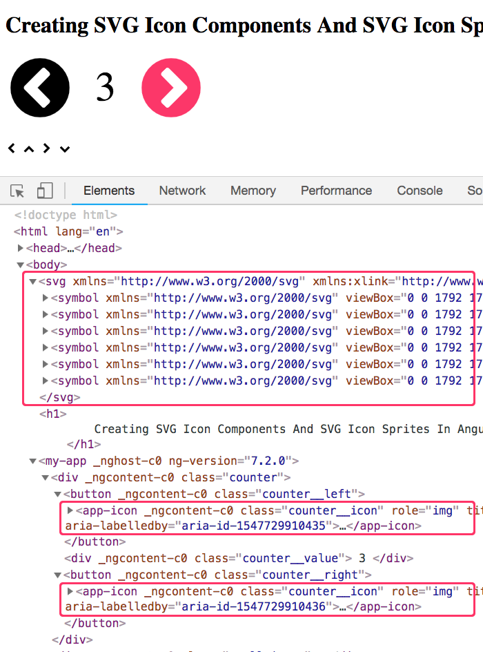
As you can see, the "app-icon" components render perfectly well inside of the "button" elements. And, since we provided a [title] for each button-based icon, the rendered HTML includes ARIA-oriented labeling (this is hard to see in the screenshot).
You can also see that the first element inside of our "body" element is an "svg" element that contains a series of "symbol" elements. This "svg" element is automatically injected by the "svg-sprite-loader" for Webpack. And, its contents are driven by the "import" statements in our AppIconComponent file.
For completeness, here's the UniqueIDService class that I am using to generate unique IDs for the ARIA labels:
// Import the core angular services.
import { Injectable } from "@angular/core";

// ----------------------------------------------------------------------------------- //
// ----------------------------------------------------------------------------------- //

@Injectable({
	providedIn: "root"
})
export class UniqueIDService {

	private id: number = Date.now();

	// ---
	// PUBLIC METHODS.
	// ---

	// I get the next available unique ID.
	public next() : string {

		return( `aria-id-${ ++this.id }` );

	}

}
This is pretty exciting! When I started this exploration, I had no idea how to go about building an SVG Icon component in Angular. And now, I feel like much of the mystery is gone. In fact, I'm pretty excited to start using SVG icons in my Angular applications. Granted, I don't feel confident in my use of ARIA attributes for accessibility. But, I am sure that this is something I will find clarity on eventually.
Want to use code from this post? Check out the license.

Reader Comments
Ohoy Ben
Been visiting your site from time to time over the last year. Loving the experimental nature of your posts!
I like the idea around having one component loading in your SVG icons, that makes perfect sense. I wouldn´t go as far as including them all via webpack in the html though.
Depending on your use case of course, one could just lazy load the icons needed on demand? Like if you´re only using
arrow-leftandarrow-right, only those are loaded. You can cache them afterwards if needed.Then, combined with intersectionObserver, you could make sure the icons are lazy loaded only right before being shown on the screen.
Once again,
awesome posts!
Regards
PH
@Poul,
Thank you for the kind words :D This stuff is a lot of fun to play around with.
The idea of lazy-loading icons is quite interesting. I had originally wanted to try making a "Component per Icon", which would then make way for some lazy-loading and tree-shaking, well, depending on how stuff is consumed in the app. But, to be honest, I don't have a great sense of how it lazy-loading would work.
I like the idea of the
IntersectionObserver, which is great for lazy-loading of images; so, I suppose you could use the same approach for SVG. But, would you be loading them as if the.svgfile was theimg[src]attribute? Or, would you be trying to use the sameapp-icon, but then augment the "svg sprite" at runtime? That would be interesting approach.@Ben,
Having fun is good!
We actually have a component that lazy loads
.svgfiles on a client project. What we do is we inline the contents of the svg file usinginnerHTML.When requesting the svg from the backend, we
force-cacheand save the request in a Map in a central service (depends on framework, but services in Angular).This works for us, and adding new svg files means just uploading new ones to the correct folder.
I hadn´t actually looked into svg symbols! Which looks awesome. I honestly haven´t worked enough with svg at all.
@Poul,
Yeah, I'm fairly new to SVG as well. I read a book, but as far as hands-on, I don't have much more experience than this post. Your approach sounds pretty cool, especially since it sounds easy to configure (as in "convention over configuration" for the file-location).
@Ben,
Ohoy! Sorry i never got back to you and thanks for the kind words.
Having read a book, you´re far ahead of me.
We´ve grown to love the fact that new icons is just putting new svg icons in a folder and commiting them.
@Poul,
I can dig it :)
Perfect, it makes things so meaningful now! But I can't figure out how you managed to have a webpack configuration in Angular 7 as
ng ejectis deprecated.@Alireza,
Sooo, I've never actually used the Angular CLI before. At this point, I've only used a plain-old Webpack configuration with the
@ngtools/webpackutility. So, I am not sure howejectactually works (and it sounds like it doesn't anymore).That said, with Angular 8 and all the interesting things that it offers, I think I may have to finally dive into the CLI.