
CSS Grid: A Free Video Course On The CSS Grid Layout By Wes Bos
Over the weekend, I watched "CSS Grid" - the newly released video course by Wes Bos. If you've been following my blog, you know that I'm a huge fan of Wes Bos and the consistently high-quality content he creates. "CSS Grid" is no different. In this course, Wes covers many of the CSS Grid features using easy-to-understand, iterative lessons that make the more confusing aspects of the grid specification concrete and consumable. If you're looking to learn more about CSS grid, I highly recommend this course as a stop on your educational journey. And, as an added bonus, the course is totally free, with thanks to Mozilla Firefox for sponsoring Wes Bos' time.
Part of what makes Wes' video courses so good is that he has a great ability to break a topic down into its fundamentals. And then, to build the curriculum up on top of those fundamentals, adding just the right amount of new information in each lesson. The resultant syllabus creates a gentle climb from total naivety to competence.
Along the way, Wes identifies aspects of CSS grid that are particularly confusing - such as the names of track or the difference between auto-fill vs. auto-fit - and does mini deep-dives that focus in on just that feature. This zoom-in / zoom-out cadence slows the pace the course down where needed; but, keeps the overall momentum of the course moving in the right direction.
And, as always, Wes includes a number of real-world exercises that take the theory of CSS Grid and applies it in ways that make the concepts much more concreate. One lesson that I found particularly interesting was his comparison of CSS Flexbox to CSS Grid. In that lesson, he went through a number of different layouts and demonstrated how each layout could be implemented with either of the technologies; or, why only one or the other technology could be used to achieve the desired outcome.
If I had one point of critical feedback, it would be that the CSS Grid course makes no mention of browser support or techniques for coping with cross-browser inconsistencies. For this topic, I've been using Rachel Andrew's article on CSS Grid Fallbacks. It seems like using Flexbox as the default and then promoting CSS Grid in a @support() query makes for the least amount of work. But, I'll have to get more practical experience under my belt before I can really attest to that.
To start honing my CSS Grid skills, I thought it would be fun try and pick up where one of Wes' lessons stopped. In his "grid-auto-flow" example, his use of "dense" left a few cells in the rendered grid empty. I wanted to see if I could find a way to fill-in those gaps to create a perfectly squared-off layout.
His grid was populated with items that had randomly-selected row and column spans (spanning anywhere from 1 to 4 tracks). So, in order to fill in the rest of the grid, I am also inserting a number of multi-row and multi-column items. The challenge is figuring out which item sizes can be used without increasing the overall bounding-box of the grid element.
Run this demo in my JavaScript Demos project on GitHub.
At first, I was going to try and figure out how many cells in the grid were consumed; and then, try to fill in the remaining cells with randonly sized items. But, it doesn't seem like the HTMLElement interface exposes much grid-specific insight. At least, none that I could find. So, I decided to brute-force it. Rather than caring about how many cells were empty, I just started inserting randomly-sized elements to the end of the grid until the grid changed size. At that point, I knew that I added one-too-many; so, I removed the last-inserted element.
<!doctype html>
<html>
<head>
	<meta charset="utf-8" />

	<title>
		Filling In The Empty Cells When Using Grid-Auto-Flow: Dense In CSS Grid
	</title>

	<style type="text/css">

		body {
			margin: 20px 20px 20px 20px ;
		}

		div.grid {
			display: grid ;
			grid-auto-flow: dense ;
			grid-auto-rows: 100px ;
			grid-gap: 14px ;
			grid-template-columns: repeat( auto-fit, minmax( 100px, 1fr ) ) ;
		}

		div.grid__item {
			align-content: center ;
			background-color: #F0F0F0 ;
			border: 1px solid #333333 ;
			border-radius: 4px 4px 4px 4px ;
			display: grid ;
			justify-content: center ;
		}

		div.grid__item--new {
			background-color: gold ;
			font-weight: 600 ;
		}

		div.grid__item--row-span-2 { grid-row: span 2 ; }
		div.grid__item--row-span-3 { grid-row: span 3 ; }
		div.grid__item--row-span-4 { grid-row: span 4 ; }
		div.grid__item--column-span-2 { grid-column: span 2 ; }
		div.grid__item--column-span-3 { grid-column: span 3 ; }
		div.grid__item--column-span-4 { grid-column: span 4 ; }

	</style>
</head>
<body>

	<h1>
		Filling In The Empty Cells When Using Grid-Auto-Flow: Dense In CSS Grid
	</h1>

	<div class="grid">
		<!-- Filled dynamically. -->
	</div>

	<script type="text/javascript" src="../../vendor/lodash/lodash-4.17.2.min.js"></script>
	<script type="text/javascript">

		var grid = document.querySelector( "div.grid" );
		var currentHeight = -1;
		var resizeTimer = null;
		var randomSizes = generateRandomSizes();

		// Move 100 randomly-sized items into the grid.
		populateGrid( 100 );

		// Fill-in an empty cells that are left over after the "dense" auto-flow has
		// moved elements around.
		fillEmptyGridCells();

		// Wire window-resize events into subsequent calls to fill-in empty cells as a
		// newly-sized window will result in a different grid topology.
		setupResizeBinding();

		// --------------------------------------------------------------------------- //
		// --------------------------------------------------------------------------- //

		// I fill in the empty cells in the gird. I use a brute-force method that starts
		// adding new grid items until the HEIGHT of the grid changes. At that point, I
		// know the grid has been saturated.
		function fillEmptyGridCells() {

			var clientHeight = grid.clientHeight;

			// Since this gets called as part of the window-resize event, it's possible
			// that the resize didn't cause a HEIGHT-change, only a WIDTH-change. In that
			// case, we can just bail-out as there should be no new empty cells (since
			// the existing cells are based on fr - fractional - units and should extend
			// horizontally to fill space).
			if ( clientHeight === currentHeight ) {

				return;

			}

			// Before we fill in the empty cells, let's first remove any existing items
			// that were inserted during a previous attempt to fill-in empty cells. This
			// way, each resize event doesn't compound the collection of fixes.
			Array
				.from( grid.querySelectorAll( "div.grid__item--new" ) )
				.forEach(
					function( node ) {

						grid.removeChild( node );

					}
				)
			;

			// Keep track of the current un-altered grid height (so we can skip
			// insignificant window resize events in the future).
			currentHeight = grid.clientHeight;

			// Now, we're going to start iterating over our random-sizes collection and
			// start inserting grid items with the given, random size. We'll continue to
			// so until no new items can be inserted into the grid without affecting the
			// original height of the grid. At that point, we'll remove the last-inserted
			// grid item and know that the grid cells has been saturated.
			// --
			// NOTE: We know this will work because the random-sizes collection contains
			// a 1x1 grid area, which will ultimately be able to fill in any remaining
			// empty cells.
			var newItemIndex = 0;
			var fillerSizes = randomSizes.slice();
			var indicesToDelete = [];

			do {

				fillerSizes.forEach(
					function ( size, index ) {

						var node = document.createElement( "div" );
						node.classList.add(
							"grid__item",
							"grid__item--new",
							`grid__item--column-span-${ size.columns }`,
							`grid__item--row-span-${ size.rows }`
						);

						grid.appendChild( node );

						// If the height of the grid has not changed, then we know that
						// the inserted grid item fit into an empty cell.
						if ( grid.clientHeight === currentHeight ) {

							node.innerText = `New ${ ++newItemIndex }`;

						// If the HEIGHT OF THE GRID HAS CHANGED, then we know that the
						// inserted grid item did not fit cleanly into an empty cell.
						} else {

							// Remove the breaking item.
							grid.removeChild( node );

							// Let's also track this size as one to delete before the
							// next iteration. If it didn't fit this time, there's no
							// reason to think it will fit in the next iteration.
							indicesToDelete.push( index );

						}

					}
				);

				// Remove any random-size combinations that we know didn't get used in
				// previous iteration (which means there's no point in trying them in the
				// next iteration).
				for ( var i = ( indicesToDelete.length - 1 ) ; i >= 0 ; i-- ) {

					fillerSizes.splice( indicesToDelete[ i ], 1 );
					indicesToDelete.splice( i, 1 );

				}

			} while ( fillerSizes.length );

		}


		// I generate a randomly-sorted collection of grid-area sizes (column and row
		// span combinations). These will be used to fill-in the empty grid cells.
		function generateRandomSizes() {

			var sizes = [];

			for ( var columns = 4 ; columns >= 1 ; columns-- ) {
				for ( var rows = 4 ; rows >= 1 ; rows-- ) {

					sizes.push({
						columns: columns,
						rows: rows
					});

				}
			}

			return( _.shuffle( sizes ) );

		}


		// I populate the grid with the given number of randomly-sized items.
		function populateGrid( itemCount ) {

			for ( var i = 1 ; i <= itemCount ; i++ ) {

				var node = document.createElement( "div" );
				node.innerText = `Item ${ i }`;
				node.classList.add(
					"grid__item",
					`grid__item--column-span-${ _.random( 1, 4 ) }`,
					`grid__item--row-span-${ _.random( 1, 4 ) }`
				);

				grid.appendChild( node );

			}

		}


		// I wire the window-resize event into a call to fill in the empty grid cells.
		function setupResizeBinding() {

			window.addEventListener(
				"resize",
				_.debounce( fillEmptyGridCells, 200 ),
				false
			);

		}

	</script>

</body>
</html>
The resultant grid is fully packed, with gold elements being the ones that I added dynamically:
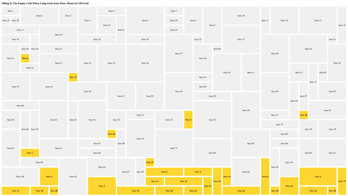
NOTE: Image is zoomed-out because it is rather large. Also, this algorithm seems to break when you are zoomed-out too far, which I assume is because the clientHeight value becomes funky?
As you can see, the grid has been completely filled. That was a fun experiment!
From reading The New CSS Layout by Rachel Andrew, it became clear to me that Flexbox and Grid are a critical part of the CSS specification to learn. Thankfully, we have video courses like "What The Flexbox" and "CSS Grid" to make learning these CSS features that much easier.
Want to use code from this post? Check out the license.

Reader Comments
I'm also impressed! Another thing I love about Wes's courses is they ignite the imagination such that you want to expand on his examples. And he always leaves you plenty of room to expand on them. Yours is a great, very pragmatic extension. Thx!
@Chris,
I totally agree. I think that's the beauty of his use of "real world" examples. He's not just going over the syntax - he's showing you how you can start to apply it in ways that make life easier. I think this is what sparks the imagination - that you can really see how these new technologies can be applied.
This morning, I tried to sit down and play with a Flexbox implementation that was progressively-enhanced to use Grid if @supports() allowed it. It was trickier than I had anticipated (due to my lack of hands-on experience). But, at least I don't feel totally lost :D