
Creating A Twitter-Inspired SVG Progress Indicator In Angular 5.0.1
I experimented a little bit with SVG (Scalable Vector Graphics) after reading Practical SVG by Chris Coyier; but, I haven't really used it since - most of my work has been back-end focused. As such, when I saw Twitter add a little progress indicator in its TweetDeck input form, I thought that it would make a fun widget to try and recreate in Angular 5.0.1.
Run this demo in my JavaScript Demos project on GitHub.
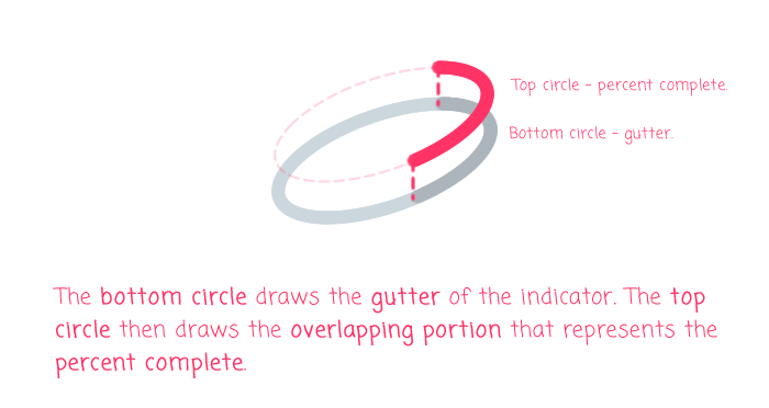
The TweetDeck textarea progress indicator appears to be composed of two overlapping circles. The bottom circle draws the gutter of the indicator and the top circle draws the partial-path that indicates the percentage of available characters used in the tweet:
In SVG, we can easily create two overlapping circles with the <circle> element. But, we can't really draw a "partial circle" for the progress without creating a more complex "path" object (at least I can't). Instead, we'll use the dashed-stroke technique popularized by Jake Archibald in Animated line drawing in SVG.
When using the aforementioned technique, the progress path of the TweetDeck indicator becomes the first dash in a dashed-stroke and the first space in the dashed-stroke is then made sufficiently large to hide any second dash from being rendered. As the progress increases, we simply increase the size of the first dash to take up the appropriate portion of the circle diameter.
The Angular component that I came up with allows you to set three properties:
- percent
- color (will also work with style:color)
- backgroundColor
The [percent] property (0-100) sets the size of the first dash in the dashed-stroke as we discussed above. The [color] property sets the stroke-color of the top circle. And, the [backgroundColor] sets the stroke-color of the bottom / gutter circle:
// Import the core angular services.
import { ChangeDetectionStrategy } from "@angular/core";
import { Component } from "@angular/core";
import { OnChanges } from "@angular/core";
import { SimpleChanges } from "@angular/core";

// ----------------------------------------------------------------------------------- //
// ----------------------------------------------------------------------------------- //

@Component({
	selector: "progress-indicator",
	inputs: [
		"percent",
		"color",
		"backgroundColor"
	],
	changeDetection: ChangeDetectionStrategy.OnPush,
	styleUrls: [ "./progress-indicator.component.less" ],
	template:
	`
		<svg viewBox="0 0 20 20" preserveAspectRatio="xMidYMid meet">
			<circle
				*ngIf="backgroundColor"
				cx="10"
				cy="10"
				r="9"
				fill="none"
				[attr.stroke]="backgroundColor"
				stroke-width="2">
			</circle>

			<circle
				cx="10"
				cy="10"
				r="9"
				fill="none"
				[attr.stroke]="color"
				stroke-width="2"
				stroke-linecap="round"
				[attr.stroke-dasharray]="dashArray"
				transform="rotate( -90, 10, 10 )"
				[class.empty]="! percent">
			</circle>
		</svg>
	`
})
export class ProgressIndicatorComponent implements OnChanges {

	public backgroundColor: string;
	public color: string;
	public dashArray: string;
	public percent: number;

	// I initialize the progress-indicator component.
	constructor() {

		this.backgroundColor = "#CCD6DD";
		this.color = "currentColor"; // Will inherit the current color context.
		this.dashArray = "0,100";
		this.percent = 0;

	}

	// ---
	// PUBLIC METHODS.
	// ---

	// I get called every time the input bindings are updated.
	public ngOnChanges( changes: SimpleChanges ) : void {

		// Validate and constrain the percentage.
		if ( isNaN( this.percent ) || ( this.percent < 0 ) ) {

			this.percent = 0;

		} else if ( this.percent > 100 ) {

			this.percent = 100;

		}

		// Normalize the background color.
		if ( this.backgroundColor === "none" ) {

			this.backgroundColor = "";

		}

		// The progress indicator is implemented as the first dash in a dashed-path stroke
		// of the circle SVG. In order to translate the percent-input into a dash length,
		// we have to determine the circumference of the circle. Then, the length of the
		// completed portion is simply the percentage translation of the circumference.
		var radius = 9;
		var totalLength = ( Math.PI * 2 * radius );
		var pathLength = ( totalLength * this.percent / 100 );

		this.dashArray = `${ pathLength },100`;

	}

}
I don't really know that much about SVG, so I'm not going to offer much additional explanation as I'm much more likely to misinform than to clarify. But, one thing that I did have trouble with was getting rid of the top circle stroke if the percent-input was zero. I could have removed the top circle with an [ngIf] directive; but, that would have ruined the stroke-dasharray CSS transitions. As such, I am using an opacity of 0 (via the "empty" CSS class) so that I can hide the zero-path while maintaining the transitions.
The transitions are defined in the CSS for the component:
:host {
	color: #1DA1F2 ;
	display: inline-block ;
	height: 20px ;
	width: 20px ;
}

svg {
	display: block ;
	height: 100% ;
	width: 100% ;
}

circle {
	opacity: 1.0 ;
	transition: stroke-dasharray ease 150ms, opacity ease-out 200ms ;
}

circle.empty {
	/*
		When the SVG circle has a first-dash of zero, it's still visible in the stroke.
		As such, we want to hide the circle when there is no percentage. But, we don't
		want to strip it out of the page, otherwise the transition won't work for the
		"stroke-dasharray" property. As such, we'll use the opacity so that we can hide
		it without janking the transition.
	*/
	opacity: 0.0 ;
}
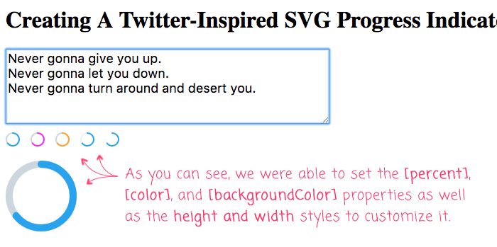
We can now use this progress-indicator directive in our app component to map out the percentage of maxlength characters used in a textarea input:
// Import the core angular services.
import { Component } from "@angular/core";

// ----------------------------------------------------------------------------------- //
// ----------------------------------------------------------------------------------- //

@Component({
	selector: "my-app",
	styleUrls: [ "./app.component.less" ],
	template:
	`
		<textarea
			maxlength="140"
			(input)="percent = ( $event.target.value.length / 140 * 100 )"
		></textarea>

		<div class="indicators">
			<progress-indicator [percent]="percent"></progress-indicator>
			<progress-indicator [percent]="percent" color="magenta"></progress-indicator>
			<progress-indicator [percent]="percent" [style.color]="'orange'"></progress-indicator>
			<progress-indicator [percent]="percent" backgroundColor="#F0F0F0"></progress-indicator>
			<progress-indicator [percent]="percent" backgroundColor="none"></progress-indicator>
		</div>

		<progress-indicator
			[percent]="percent"
			[style.width.px]="100"
			[style.height.px]="100">
		</progress-indicator>
	`
})
export class AppComponent {

	public percent: number = 0;

}
I'm using a couple of different instances of the ProgressIndicatorComponent in order to demonstrate the variety of inputs; and, using some custom height and width styles to showcase how easily SVG components can be scaled. When we run this code in the browser, we get the following output:
Since I know so little about SVG, getting this to work in Angular 5 feels like a huge accomplishment. The final SVG is rather simple; but, it took me several hours to get to this point. A huge shout-out to Sara Soueidan's series on SVG and Chris Coyier's article on SVG line animations. Without their articles, I wouldn't be using SVG at all.
Want to use code from this post? Check out the license.

Reader Comments
@All,
A quick follow-up, I wanted to start digging into creating SVG Icons in my Angular app:
www.bennadel.com/blog/3562-creating-svg-icon-components-and-svg-icon-sprites-in-angular-7-2-0.htm
This post uses the "svg-sprite-loader" for Webpack to automatically extract and embed an SVG sprite which I can then reference in my SVG Icon component.