
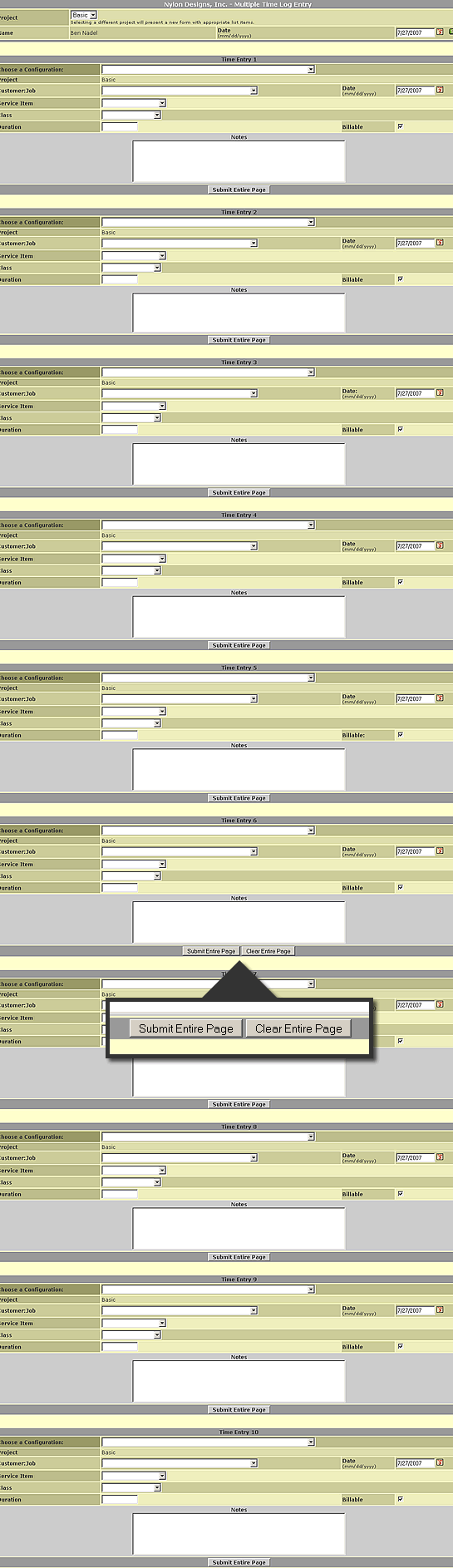
Poor Interface Design Example
Here at Nylon Technology, we use GetMyTime.com to enter our daily timesheets. Overall, I think it's a fantastic service and provides a very efficient, easy-to-use application that makes entering time a non-issue. There is one thing, though, that irks me to no end and it has to be one of the word design decisions I have ever seen. One of the features that GetMyTime.com provides is a way to enter multiple line items on one page. The screen shot down below allows up to 10 entries. That's all good and useful, but, right before item 7, the interface suddenly adds a button labelled "Clear Entire Page":
| |
|
|
||
| |
 |
|
||
| |
|
|
None of the other items have this, just Item 7. And, yesterday, I accidentally clicked it; on this page, I use tabbing and space bar to navigate (faster than using the mouse) and my tabbing hand sort of twitched and tabbed right over the "Submit Entire Page" and then instinctively hit space bar when "Clear Entire Page" was focused. And let me tell you, it does exactly what it says it will - it cleared every field in the page. No prompt. No confirmation. Just straight-up data removal.
WTF??? Why does that button even exist?!?! Who the hell enters 6 time sheet items and then thinks to themselves, "Man, I wish I could easily erase all that data I just put in!" This is just a horrible, horrible interface decision. Come on people - if you are gonna let a user erase all their data easily, at least give them a chance to cancel out of it.

Reader Comments
I agree Ben. They say that Cancel or Reset buttons are not needed on the web and should not be used. I have had to make that fight here as we build web applications and some feel they have their place. If they do the buttons need to be given a much lower visual weight. It's common best practice to never use a Reset button but there are times when you might want a Cancel one. Instead of using a button I use a link since for me it works as navigation and I give it very little visual weight so not to confuse users.
They probably initially designed this form for a calendar week's worth of timesheets, i.e. 7 days, with the reset button at the end of the form. Then decided they really needed to allow 10 days, but left the old code in that if I EQ 7 display reset button. Jakob Nielsen did a good article on this, 7 years ago:
http://www.useit.com/alertbox/20000416.html
I feel your pain. We use eFAACT at work, and it's not exactly the prettiest of applications. We often face similar data loss when entering time data. What is it with all these time tracking apps looking so horrendous?
OH MY GOD!
That is quite possible the worst form I have ever seen. What ever were they thinking? Or better yet where they?
@Javier,
I like that idea - removing them or making them much less prominent. My grief with this interface was that it made no sense in terms of placement and functionality... but now that you mention it, most forms probably don't need cancel button, or if they do, a low-priority one.
@Duncan,
That's a good article. Thanks for passing that along. I am gonna go through the related articles and see what else he has to suggest.
@Gary,
In all fairness, the form does have some really useful functionality - caching recently used combinations and stuff... its just that Reset button... I mean, COME ON!
@Ben,
I am sure it does do some really useful stuff but even with caching recently used combinations it seems a bit overkill to make such a huge form!
10 Time entries one one page? Come on! The reset entire page button was just the Icing on the cake that whole form is horrible.
If you are lucky enough to be working on only one task on a given day you still have to load that huge ... form. If you are busy and are working on 10 different tasks in a day I still think that form is just way too much.
Reminded me of this recent article: http://www.alistapart.com/articles/neveruseawarning
I agree with you Ben. Cancel button needs to die! Unnecessary in web forms.
@Sam,
Great article! I will have to keep the whole "undo" idea in mind when I build my next system.
I was doing research on time tracking solutions and found this service, I discarded it based on the GUI. Harvest was the best service I found, it is simple and it just tracks hours based on project take a look at it and move away from that monstrosity.
@John,
I will take a look at Harvast. I assume this is what you were talking about:
http://www.getharvest.com
Thanks.
Ben,
My name is Anthony Codispoti, founder of GetMyTime.com. I want to thank you for pointing out this design flaw. I am unsure why "Clear Entire Page" button was put there, and I agree that it likely serves no useful purpose to most customers. We have since removed this button. I know how frustrating it can be to lose data from a single errant key stroke, so please accept my apologies for this misplaced button. We are always looking for ways to improve our service and welcome feedback from our customers. If you have any other suggestions, we'd love to hear about them; here is our Suggestions Form http://getmytime.com/suggestions.asp
A few people in this thread commented about the use of a form with 10 time entries on it. Originally this feature did not exist but was born out of requests from several customers. The idea is that some people track their time the old fashioned way (pencil and paper) and then enter all their time at once into the system. It is more time effective for them to make multiple time entries on the same page and submit it once, rather than have to make single time entries with individual submissions.
We have been looking for a way to incorporate the functionality of this page into a more aesthetically pleasing format. We're currently working to turn our "Weekly TimeSheet View" (a screenshot can be seen here http://getmytime.com/demo/gmt/demo2.asp) into an editable grid. We don't have a release date for this yet, but it is in the works.
Our customers' suggestions have led to many new reports and feature enhancements in the past. We continue to welcome your new ideas. Thanks again for bringing this to our attention.
Sincerely,
Anthony Codispoti
GetMyTime.com
@Anthony,
Thank you for posting your comments here. I am sorry that I was not aware of the Suggestions page, otherwise I certainly would have brought this to your attention.
Also, as far as the 10-item entry page, I know some people above gave it the thumbs down, but I happen to think this is a great interface. Actually, I work on a ton of projects and I put my times in at the end of the day and I sometimes wish there was more than 10 items on that page :)
I also love the caching of often-used combinations (the configuration drop down) as it saves me a ton of time. Really, my only complaint here was that Clear Entire Page button as it makes no sense :)
Hey guys, I totally forgot to post this here, but like the day after this post was made, that "Clear Entire Page" button was removed from the multi time entry page.
Now THAT's what I call top-quality customer service!