
CSS Enter Animations Follow The 80/20 Rule
Most animations on the web are unnecessary. But, I do believe that some small set of animations are helpful. And, I believe that CSS "enter animations" using @keyframes follow the 80/20 rule. That is, 80% of the value of the animations can be realized with only 20% of the effort (if even that much).
Run this demo in my JavaScript Demos project on GitHub.
View this code in my JavaScript Demos project on GitHub.
There are two reasons to animate an element on the web: one is to create a more luxurious user experience; the other is to create a more intuitive user experience.
Luxury has a time and a place. If you have a marketing page, for example, and you want to scroll-jack the browser and do some immersive parallax animation, have at it. The gaudiness of such an animation is the goal of the page. It has nothing to do with usability—it has everything to do with shock and awe.
Outside of marketing pages, animations are used to create a more intuitive user experience. However, we have to keep in mind that the web is a medium of efficiency! The goal of most of what we build on the web is to make life easier for our users; and, to allow them to accomplish more while doing less.
Animations can get in the way—they can block the user practically; and, they can block the user mentally. As such, we must only use animations when they serve the purpose of creating an intuitive experience. If a user can easily intuit what is happening without an animation, the animation should be removed—it has become luxurious, it has become superfluous.
From a developer experience standpoint, this is great because it means less effort. And, it means less complexity. Which leads to faster production times for easier-to-maintain applications.
To this end, I love using CSS "enter" animations. They don't require any special animation libraries and they don't require any additional DOM elements. And, it creates an experience that can be very easily managed through a user's preferences (such as one for "reduced motion").
That said, I don't animate every "enter" sequence. I only animate transitions when I believe it will help the user understand the interaction or interface model. And, I try to give the user a lot of credit. Meaning, I trust that the user is going to naturally intuit most of what is taking place on the web page.
To explore this nuance, let's look at two examples: toggling an aside / fly-out panel; and, toggling a modal window. Both of these examples are in the same demo; but, I'll isolate the relevant code.
First, showing an aside. In this demo, I have a button that only renders when the aside is hidden. When the aside is toggled into existence, the button disappears. And, when the aside is toggled out of existence, the button reappears:
<!doctype html>
<html lang="en">
<head>
	<script type="text/javascript" src="../../vendor/alpine/3.13.5/alpine.3.13.5.js" defer></script>
	<link rel="stylesheet" type="text/css" href="./main.css" />
</head>
<body x-data="{
		isShowingAside: false,
		isShowingModal: false
	}">

	<h1>
		CSS Enter Animations Follow The 80/20 Rule
	</h1>

	<template x-if="( ! isShowingAside )">

		<button @click="( isShowingAside = true )" class="show">
			Show Aside
		</button>

	</template>
	<template x-if="isShowingAside">

		<aside>
			<h2>
				This is the aside!
			</h2>
			<button @click="( isShowingAside = false )">
				Hide
			</button>
		</aside>

	</template>

</body>
</html>
I have two different dynamic elements here: the button and the aside. I have chosen to only animate the button:
.show {
	/* Button slides-up from bottom of screen. */
	animation-duration: 300ms ;
	animation-fill-mode: both ;
	animation-iteration-count: 1 ;
	animation-name: enter-show-button ;
	animation-timing-function: ease-out ;

	position: fixed ;
	right: 20px ;
	bottom: 20px ;
}

@keyframes enter-show-button {
	from {
		transform: translate3d( 0px, 100px, 0px ) ;
	}
	to {
		transform: translate3d( 0px, 0px, 0px ) ;
	}
}

aside {
	background-color: #fafafa ;
	box-shadow: -1px 0px 0px #cccccc ;
	bottom: 0px ;
	padding: 15px 30px ;
	position: fixed ;
	right: 0px ;
	top: 0px ;
	width: 300px ;
	z-index: 2 ;
}
Notice that the button (.show) has a CSS animation attached to it that will translate the element into place, bringing it up from the bottom of the screen. The aside, on the other hand, has no animation because it needs no animation:
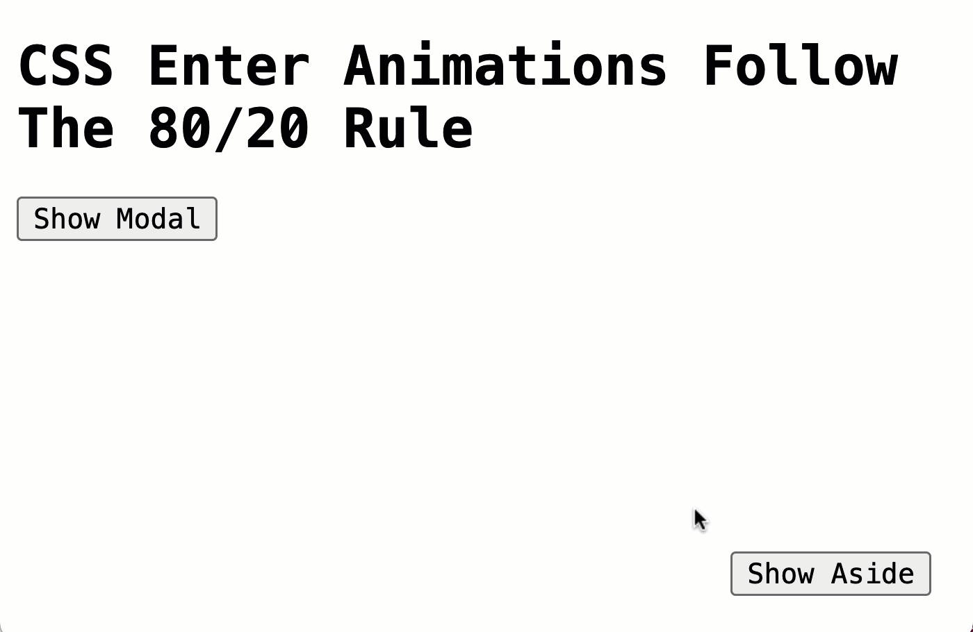
In such a small screenshot, I'll grant that the aside takes up a disproportionate amount of the browser viewport; which makes it more disruptive than it normally would be. But, the user experience is still completely intuitive. It's very tempting to want to animate the slide-in (or even the slide-out) of the aside. And, doing so would make the experience more luxurious. But, it wouldn't make the experience any more intuitive. As such, such an animation would only serve to slow down the whole interaction model.
The only animation that has something to offer the user in terms of education is the animation of the button. It pulls the user's eye to the button as part of the aside removal as a way to indicate that the button can reverse the operation that just took place.
Note: Frankly, the button doesn't really need to be animated in this case either as the user initiated the action by clicking on the button. It would make more sense if the aside was shown by default; and the animation was used to reveal the button once the aside was closed for the first time. I should have coded the demo in that way.
In the second demo, we're going to use a button to show a modal window:
<!doctype html>
<html lang="en">
<head>
	<script type="text/javascript" src="../../vendor/alpine/3.13.5/alpine.3.13.5.js" defer></script>
	<link rel="stylesheet" type="text/css" href="./main.css" />
</head>
<body x-data="{
		isShowingAside: false,
		isShowingModal: false
	}">

	<h1>
		CSS Enter Animations Follow The 80/20 Rule
	</h1>

	<p>
		<button @click="( isShowingModal = true )">
			Show Modal
		</button>
	</p>

	<template x-if="isShowingModal">

		<div class="modal">
			<h2>
				This is the modal!
			</h2>
			<button @click="( isShowingModal = false )">
				Hide
			</button>
		</div>

	</template>

</body>
</html>
In this case, I've decided to animate the opening of the modal because it fully-covers the browser viewport:
.modal {
	/* Modal window fades and scales into view. */
	animation-duration: 300ms ;
	animation-fill-mode: both ;
	animation-iteration-count: 1 ;
	animation-name: enter-modal-window ;
	animation-timing-function: ease-out ;

	background-color: #fafafa ;
	bottom: 0px ;
	left: 0px ;
	padding: 15px 30px ;
	position: fixed ;
	right: 0px ;
	top: 0px ;
	z-index: 2 ;
}

@keyframes enter-modal-window {
	from {
		opacity: 0.5 ;
		transform: scale( 0.9 ) ;
	}
	to {
		opacity: 1.0 ;
		transform: scale( 1 ) ;
	}
}
Unlike the aside, which isn't disruptive, the modal window completely consumes the browser viewport. As such, animating the modal window into existence does serve to create a more intuitive experience because it helps the user understand that this new UI is being stacked on top of the other, still existing UI.
As you can see, animating the modal into existence helps maintain a sense of object permanence for the base UI. However, there's no need to animate the closing of the modal window: once the stacking architecture of the UI has been established in the user's mind, unstacking the UI is intuitive and can happen immediately. Any animation of the modal window closing only serves to slow down the interaction model.
In both of these cases, the animation was transparently additive. Meaning, I didn't have to change the DOM structure to facilitate the animation; and, I didn't have to add special JavaScript callbacks to manage the animation. It was pure CSS. And, since we only used "enter" animations, we never had to worry about keeping an "old" DOM element in the DOM tree while applying a transition.
CSS enter animations are super easy to use and give us the overwhelming amount of value. Plus, they keep the complexity of the application low and make development easier. This is the quintessential 80/20 rule.
Want to use code from this post? Check out the license.

Reader Comments
Post A Comment — ❤️ I'd Love To Hear From You! ❤️
Post a Comment →