
Rotating Table Headers With CSS Transform
At work, I have a feature grid (ie, a data table), that is running out of horizontal room. While the icons that denote the features are narrow, the column headers that describe those features are relatively wide. As such, I wanted to start playing around with rotating table headers using CSS transform as means to reduce the horizontal space requirement of each column.
Run this demo in my JavaScript Demos project on GitHub.
View this code in my JavaScript Demos project on GitHub.
This technique isn't new - Chris Coyier wrote about it a decade ago; but, I rarely use CSS transform, so I thought I should create a small point of reference for myself as a demo before I try to use it in a production application.
The concept here is relatively simple: take the text of the <th> cell, wrap it in another element, and then use CSS to rotate() that intermediary element. That said, there's some complexity with rotating DOM (Document Object Model) elements:
By default, the DOM retains the flow of the original position of the transformed element. Meaning, even if we rotate an element to make it visually narrower, the space taken up by the element continues to match the non-transformed state.
If we take the transformed element out of the DOM flow (such as by positioning it), we need to artificially take up space both horizontally and vertically.
What this means is that it's hard to come up with a generic solution to the problem of rotating table headers. Instead, each approach will have to be hand-crafted to match the amount of header content, the degree to which the content is rotated, and what other elements are around the table.
In the following demo, each <th> cell contains two nested elements that act in concert to rotate the text:
<th>

	<div class="rotated-th">
		<span class="rotated-th__label">
			Feature One
		</span>
	</div>

</th>
In this approach, the .rotated-th class acts to both create a positioned parent and to consume the necessary vertical and horizontal space. The .rotated-th__label class then acts to rotate the table header text using both absolute positioning - relative to the .rotated-th parent - and a CSS transform:
.rotated-th {
	/**
	* Since the rotated text is taken out of the DOM flow (position: absolute), we
	* need to artificially consume vertical space so that the rotated headers
	* don't overlap with the content above the table.
	*/
	height: 110px ;
	position: relative ;
}
/**
* When an element is transform rotated, it still takes up the amount of space that
* it would have if not rotated. As such, I'm making the label "position: absolute"
* so that it doesn't take up any space ("absolute" takes it out of the DOM flow).
* Instead, I'm deferring the space allocation to the parent DIV.
*/
.rotated-th__label {
	bottom: 5px ;
	left: 50% ;
	position: absolute ;
	transform: rotate( -45deg ) ;
	transform-origin: center left ;
	white-space: nowrap ;
}
As you can see, we're setting the header text wrapper to have a height of 110px. This is so the rotated text doesn't overlap with the content that precedes the data grid. As far as horizontal space, we don't need to define anything explicitly, we just position the wrapped text at left:50% of its container. Therefore, as the width of the columns grows or shrinks, the header text will adjust accordingly. This also means that the columns to have to be of equal size.
All together, here's the demo code:
<!doctype html>
<html lang="en">
<head>
<meta charset="utf-8" />
<meta name="viewport" content="width=device-width, initial-scale=1" />
<title>
Rotating Table Headers With CSS Transform
</title>
<style type="text/css">
body {
font-family: verdana, arial, sans-serif ;
}
table {
border-collapse: collapse ;
}
tbody th {
padding: 4px 15px 4px 0px ;
text-align: right ;
}
tbody td {
border: 1px solid #cccccc ;
padding: 8px 15px 8px 15px ;
text-align: center ;
}
.rotated-th {
/**
* Since the rotated text is taken out of the DOM flow (position: absolute), we
* need to artificially consume vertical space so that the rotated headers
* don't overlap with the content above the table.
*/
height: 110px ;
position: relative ;
}
/**
* When an element is transform rotated, it still takes up the amount of space that
* it would have if not rotated. As such, I'm making the label "position: absolute"
* so that it doesn't take up any space ("absolute" takes it out of the DOM flow).
* Instead, I'm deferring the space allocation to the parent DIV.
*/
.rotated-th__label {
bottom: 5px ;
left: 50% ;
position: absolute ;
transform: rotate( -45deg ) ;
transform-origin: center left ;
white-space: nowrap ;
}
</style>
</head>
<body>
<h1>
Rotating Table Headers With CSS Transform
</h1>
<table>
<thead>
<tr>
<th>
<!-- Plan type. -->
</th>
<th>
<div class="rotated-th">
<span class="rotated-th__label">
Feature One
</span>
</div>
</th>
<th>
<div class="rotated-th">
<span class="rotated-th__label">
Feature Two
</span>
</div>
</th>
<th>
<div class="rotated-th">
<span class="rotated-th__label">
Feature Three
</span>
</div>
</th>
<th>
<div class="rotated-th">
<span class="rotated-th__label">
Feature Four
</span>
</div>
</th>
<th>
<div class="rotated-th">
<span class="rotated-th__label">
Feature Five
</span>
</div>
</th>
<th>
<div class="rotated-th">
<span class="rotated-th__label">
Feature Six
</span>
</div>
</th>
<th>
<div class="rotated-th">
<span class="rotated-th__label">
Feature Seven
</span>
</div>
</th>
</tr>
</thead>
<tbody>
<tr>
<th scope="row"> Free Plan </th>
<td> ✅ </td>
<td> </td>
<td> </td>
<td> </td>
<td> </td>
<td> </td>
<td> </td>
</tr>
<tr>
<th scope="row"> Starter Plan </th>
<td> ✅ </td>
<td> ✅ </td>
<td> </td>
<td> </td>
<td> </td>
<td> </td>
<td> </td>
</tr>
<tr>
<th scope="row"> Professional Plan </th>
<td> ✅ </td>
<td> ✅ </td>
<td> ✅ </td>
<td> </td>
<td> </td>
<td> </td>
<td> </td>
</tr>
<tr>
<th scope="row"> Comprehensive Plan </th>
<td> ✅ </td>
<td> ✅ </td>
<td> ✅ </td>
<td> ✅ </td>
<td> </td>
<td> </td>
<td> </td>
</tr>
<tr>
<th scope="row"> Ultra Comprehensive Plan </th>
<td> ✅ </td>
<td> ✅ </td>
<td> ✅ </td>
<td> ✅ </td>
<td> ✅ </td>
<td> ✅ </td>
<td> ✅ </td>
</tr>
</tbody>
</table>
</body>
</html>
And when we run this in modern browsers (Chrome, Firefox, Safari, iOS), we get the following output:
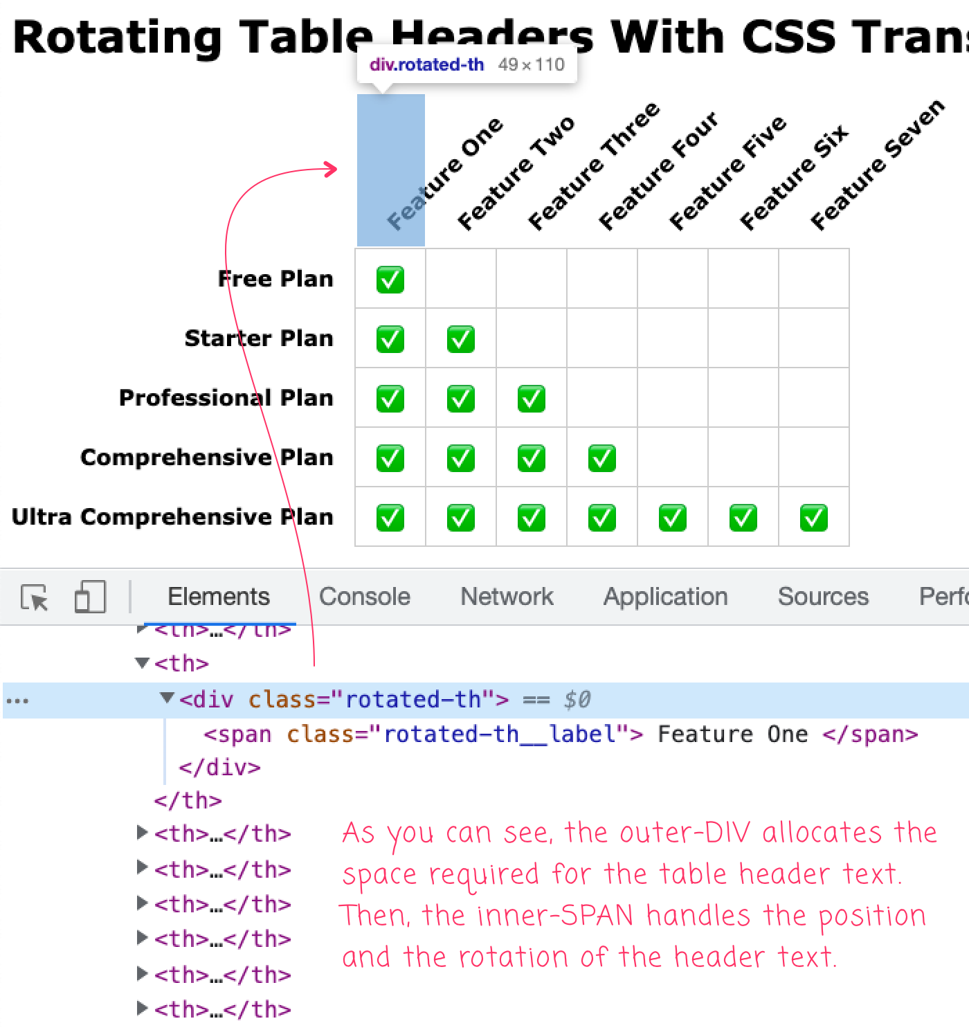
As you can see, the outer <div> allocates space for the header text; and then, the inner <span> handles the location and the rotation of the text outside of the normal DOM flow.
In my demo, the headers are just "floating", disconnected from the border-structure of the overall data grid. But, if you Google for this approach, you'll find other demos that use skew() and additional transforms in order to add proper borders to the rotated headers. For now, however, that goes beyond my table header rotation requirements.
Live Hacking the InVision Data-grid
One of the great things about having Dev Tools in the browser is that you can live-edit any website. As such, as an addendum to this post, I thought it would be fun to try and apply the aforementioned header text rotation technique right to a production table without having to deploy any code. The following is a sample of the "Share Links" data grid in a demo project without any special treatment:
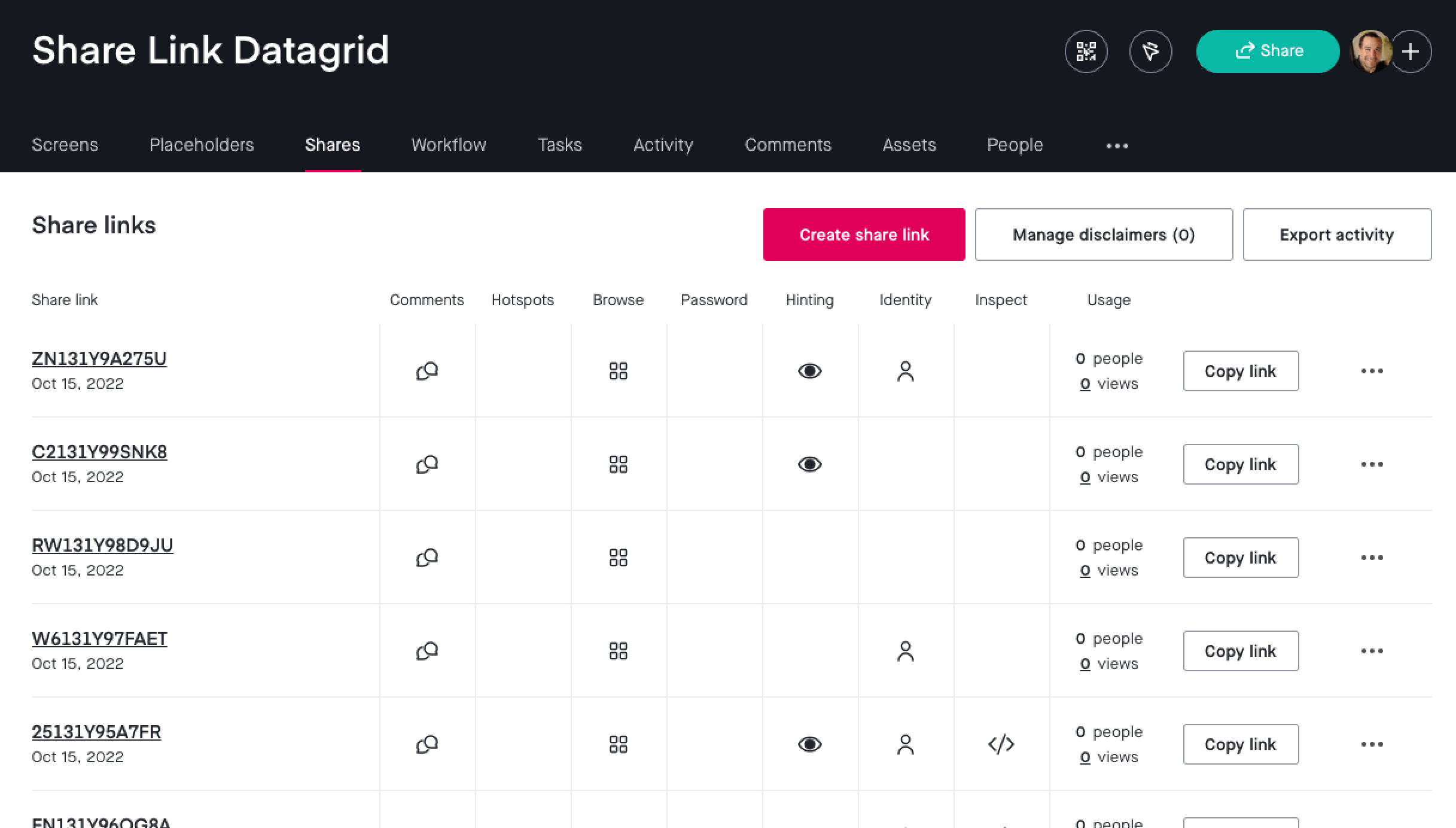
As you can see, this feature grid is basically maxed-out in terms of space utilization. But, there's a lot of white-space around the feature icons. As such, I want to try and rotate the icon-column headers in order to reduce the horizontal space utilization:
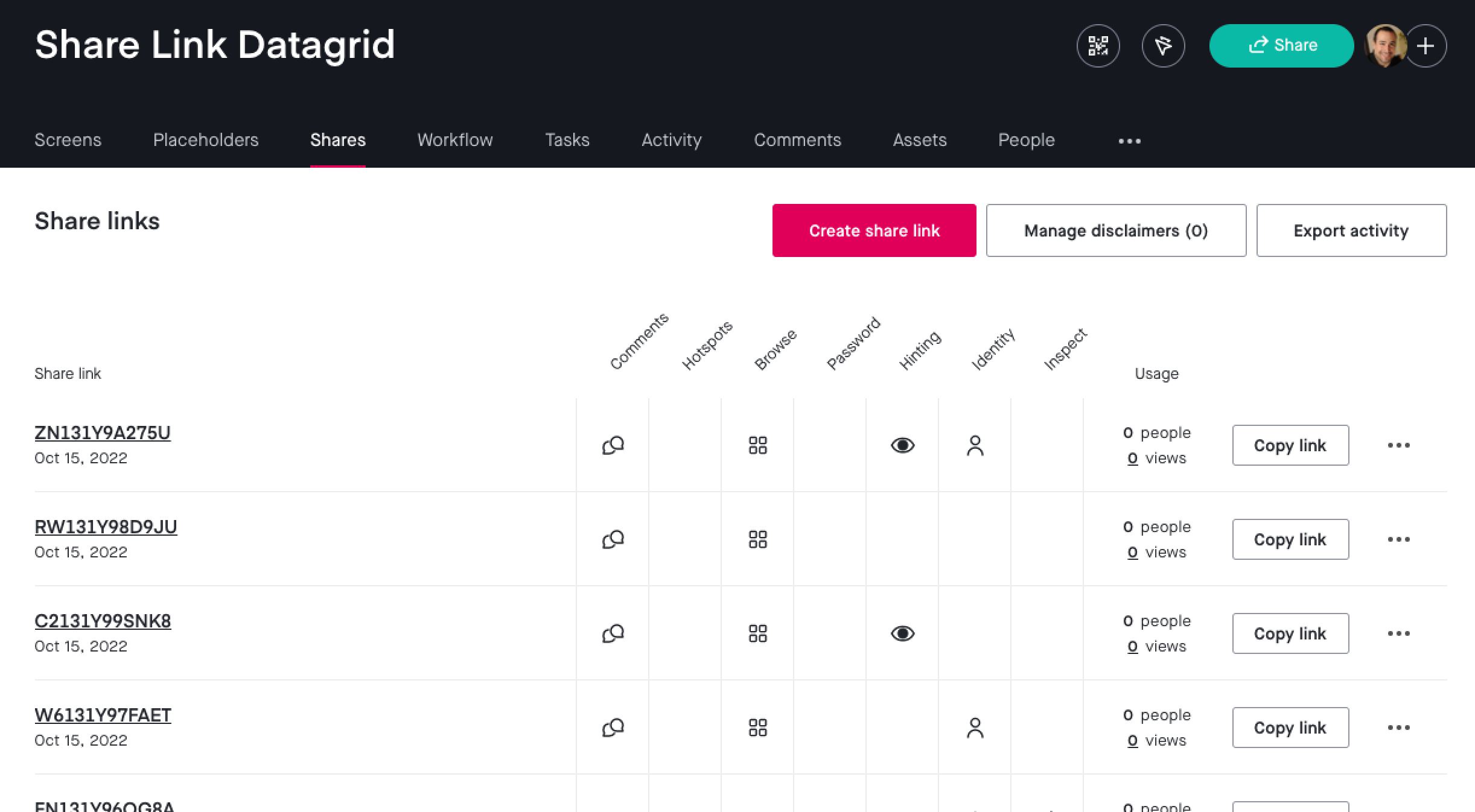
As you can see, by rotating the header text above the icons, we've tightened up the space, gaining-back about 150px in width. This means, I could fit an additional column if a new feature were to be added. More visual tweaking would need to be done; but, for a live-edit exploration, it feels like a proven solution.
Want to use code from this post? Check out the license.

Reader Comments