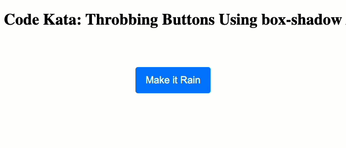
Code Kata: Throbbing Buttons Using box-shadow Animation In CSS
I'm not a huge fan of animations on the web. I do think that they serve a purpose when used well. However, in many cases, animations are overused and make interfaces feel more sluggish than they actually are. That said, they are fun. And the other day, I was on a website (I can't remember which one) that had a fun little throbbing button animation. I didn't look at how it was implemented; but, I assumed it was using a compound box-shadow CSS animation. As code kata, I thought it would help build up my CSS muscles by trying to reproduce this throbbing button animation using CSS @keyframes.
Run this demo in my JavaScript Demos project on GitHub.
View this code in my JavaScript Demos project on GitHub.
The button that I saw was a form-submission button. And, from what I remember, it throbbed because the form was valid and ready to be submitted. The throbbing effect was created by three "rings" that emanated outwards from the button with staggered timing. I'm guessing that each ring was a separate box-shadow definition.
Now, only one box-shadow property can be present on a given element at one time. However, each box-shadow property can have an infinite number of shadows defined within it. This is how people create complex pixel-art using a single box-shadow property:
element {
	box-shadow:
		0px 0px 0px #ff0000,
		0px 0px 0px #00ff00,
		0px 0px 0px #0000ff,
		0px 0px 0px #000000,

		/* ... and so on, one property, many shadows ... */
	;
}
If we want an element to have 3 rings, we simply have to give it 3 shadows. Of course, in order to have the 3 rings animate in a staggered fashion, things get quite a bit more complicated. Essentially, I' going to use a @keyframes animation that independently animates the three shadows using both the spread-radius and the alpha-channel of the shadow color. The staggered effect is created by keeping the spread-radius the same for a given shadow across multiple keyframes.
<!doctype html>
<html lang="en">
<head>
	<meta charset="utf-8" />
	<title>
		Code Kata: Throbbing Buttons Using box-shadow Animation In CSS
	</title>
</head>
<body>

	<h1>
		Code Kata: Throbbing Buttons Using box-shadow Animation In CSS
	</h1>

	<p>
		<button> Make it Rain </button>
	</p>

	<link rel="stylesheet" type="text/css" href="./styles.css" />
	<style type="text/css">

		/**
		* We're going to use multiple box-shadows to make the button throb. we can only
		* have one "box-shadow" property on a class; but, each "box-shadow" property can
		* contain multiple shadows, each of which can be animated independently(ish).
		*/
		button {
			animation-duration: 1750ms ;
			animation-fill-mode: both ;
			animation-iteration-count: infinite ;
			animation-name: button-shadow-throb ;
			animation-timing-function: linear ;
		}

		/**
		* The box-shadow property takes a comma-delimited list of shadows. To make the
		* button "throb", each shadow is going to define a "ring" around the button that
		* grows outward using the "spread-radius" (4th short-hand value). Our three
		* shadows define three rings that have a staggered outward animation.
		*/
		@keyframes button-shadow-throb {
			0% {
				box-shadow:
					0px 0px 0px 0px #007cff80, /* Ring three - hidden. */
					0px 0px 0px 0px #007cff80, /* Ring two - hidden. */
					0px 0px 0px 0px #007cff80  /* Ring one - hidden. */
				;
			}
			15% {
				box-shadow:
					0px 0px 0px 0px #007cff80,
					0px 0px 0px 0px #007cff80,
					0px 0px 0px 5px #007cff80  /* Ring one - enter. */
				;
			}
			30% {
				box-shadow:
					0px 0px 0px 0px #007cff80,
					0px 0px 0px 5px #007cff80, /* Ring two - enter. */
					0px 0px 0px 10px #007cff40
				;
			}
			45% {
				box-shadow:
					0px 0px 0px 5px #007cff80, /* Ring three - enter. */
					0px 0px 0px 10px #007cff40,
					0px 0px 0px 15px #007cff20
				;
			}
			/**
			* Once each ring reaches its outer spread-radius, it's going to fade out using
			* the alpha-channel on the RGB(A) hex color definition. Notice that the alpha-
			* channels go from "80" to "00" over the next couple of keyframes.
			*/
			60% {
				box-shadow:
					0px 0px 0px 10px #007cff40,
					0px 0px 0px 15px #007cff20,
					0px 0px 15px 15px #007cff00
				;
			}
			75% {
				box-shadow:
					0px 0px 0px 15px #007cff20,
					0px 0px 15px 15px #007cff00,
					0px 0px 15px 15px #007cff00
				;
			}
			90% {
				box-shadow:
					0px 0px 15px 15px #007cff00,
					0px 0px 15px 15px #007cff00,
					0px 0px 15px 15px #007cff00
				;
			}
			100% {
				box-shadow:
					0px 0px 15px 15px #007cff00,
					0px 0px 15px 15px #007cff00,
					0px 0px 15px 15px #007cff00
				;
			}
		}

	</style>

</body>
</html>
Getting this to look decent took a bunch of trial-and-error and page-refreshes. Notice that the 90% and 100% keyframes are exactly the same. This duplication acts as the "delay" between throbbing animation cycles. Essentially, it eats up time while all rings are currently hidden (faded-out) from view.
It's really amazing how much power if built into the JavaScript and CSS platform these days. I mean, sure the @keyframes definition was complex. But, all it took was a simple animation property to apply it to a given element. What an exciting time to be alive!
Want to use code from this post? Check out the license.

Reader Comments
I am loving the power of CSS animation. 🙂
But sometimes I like to use GSAP's TweenMax library:
https://codepen.io/charles1971/pen/YzXzQLw
SVG paths etc can be individually animated using TweenMax 🙏
@Charles,
Oooh, those buttons pulling apart with attached segments 😮 so cool! I've heard of GSAP - I think we may even have it installed on our work platform; but, I've not played with it myself. One of these days, I'll have to give it a try.
But yeah, CSS is really great these days!
I know what it is like. There are so many libraries I want to try out and not enough time in the day! 🤷♀️
Anyway, the blobby affect is created by an SVG filter called feGaussianBlur. I spent quite a long time fiddling with the attributes to get the stretchy effect. 🙏
The other great thing about GSAP is that it works on every kind of element within an SVG, so you create logos out of several shapes and animate each part. This is something I did, using a logo, cut up into 3 or 4 different shapes. I only allow it to animate when the page refreshes, which isn't often, as the website is an SPA:
https://circlemaker.establishmindfulness.com/
To be honest, I am firmly in your camp, when it comes to animation. I very rarely use it. Sometimes, I use little things like a pulsating Likes button, using the heart icon. ❤️
But I tend to steer clear of in your face animations. There is nothing worse than a website underperforming, due to resource hungry animations.
We have to remember, many people are still using low powered devices! 👏🏻