
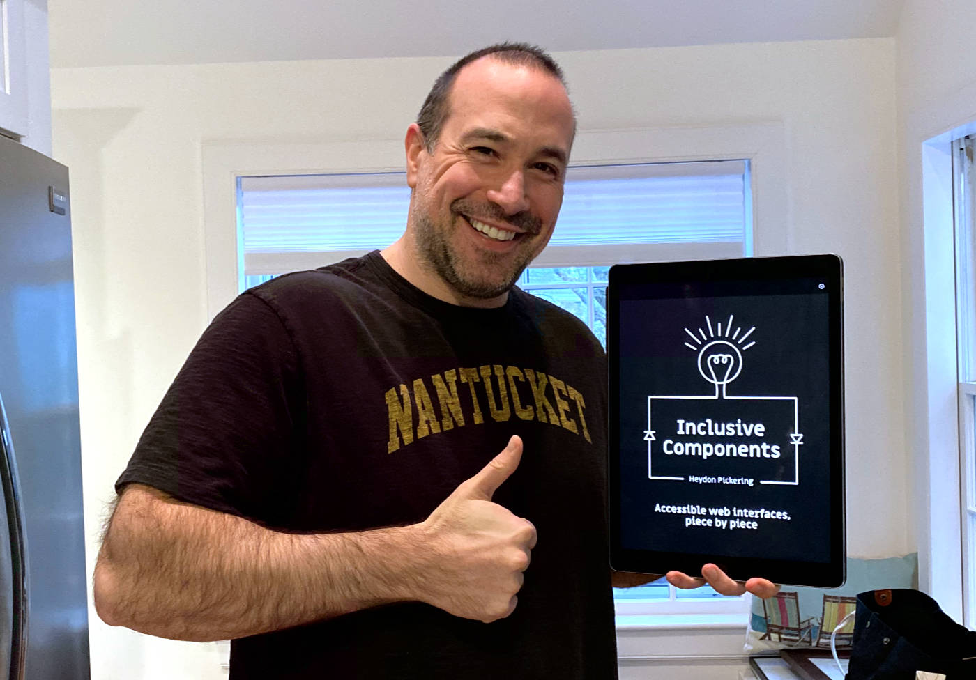
Inclusive Components: Accessible Web Interfaces, Piece By Piece By Heydon Pickering
Historically, my mental model for "accessible" websites could be summed up as follows: "use semantic HTML and don't remove form control outlines." I always knew this mental model was lacking detail; but, I didn't realized just how sub-par it actually was until I read Inclusive Components: Accessible Web Interfaces, Piece by Piece by Heydon Pickering. This book was truly eye-opening (in an tragically shameful way). It really showed me just how little I understand about other people's experiences; and, about how to construct applications with accessibility and equity in mind. I highly recommend this book for anyone who needs a wake-up call!
To be honest, I actually purchased and first started to read Inclusive Components back in May of 2020 (7 months ago). But, I immediately became overwhelmed by the content and had to put it down. If you haven't thought about accessibility before, this book is a lot to absorb. All of the visual cues that I'm used to working with have to be completely re-imagined for accessibility; and, done so in a way that doesn't negate the existing experience.
Inclusion is all about different users getting an equivalent experience, not necessarily the same experience. Sometimes what works for one user is meaningless, redundant, or obstructive to another. (Page 61)
In my first attempt at reading the book, this shift in perspective pushed me a little too far outside of my comfort zone. All of my insecurities kicked-in and the negative voice in my head told me to stop reading. It was only once I decided that I wanted to make "HTML" and "Design Systems" a personal learning priority in 2021 that I picked this book back up. And finally, with this new motivation, I was in the right mindset to accept content of the book.
One of the features of this book that I found extremely helpful was that Heydon describes how screen reader software / assistive technology will announce content as the user navigates through the DOM (Document Object Model). Screen readers have always been an abstract concept for me; and, I've been too lazy to make them more concrete; so, it was great to see (no pun intended) what that experience is actually like:
Screen reader software is fairly uniform in its interpretation of this control. On focusing the control (moving to it using the
Tabkey) something similar to, "Notify by email, checkbox, unchecked" will be announced. That's the label, role, and state information all present.On checking the checkbox, most screen reader software will announce the changed state, "checked" (sometimes repeating the label and role information too), immediately. (Page 15)
Another example:
This effectively provides a group label to the section, meaning the label will be announced in some screen reader software upon entering the section by focus. Running the NVDA screen reader, when I enter the section and focus the first checkbox, I hear "My Todo List region, list with three items, pick up kids from school checkbox, checked." It's helpful to provide this contextual information to users navigating by focus rather than by region or heading. (Page 49)
Having a better understanding of how assistive technology announces the DOM was very helpful for me in understanding why semantic HTML choices are so important. I've often wondered, for example, if I have to use a list of links inside a <nav> element. Or, could I instead just have several links next to each other in the DOM? But, to understand that the "list" gives the content meaningful structure (ex, "list with three items") that facilitates special navigational semantics makes all the difference in terms of my perspective.
The same is true for when I wrestle with whether or not I actually need to use a native <input[type="checkbox"]>; or, could I just create a custom <toggle> component that captures the on/off state with easier styling? To understand that screen reader software announces checkboxes along with their state really drives home why I can't cut corners with native form elements.
This book also effectively changed my mind about how I feel when using native JavaScript controls like confirm() and prompt(). After working at InVision for close to a decade, using a native confirm() makes me wince - like I'm using some raw, under-baked UI (User Interface) with no branding. But, the fact that the native controls make the experience more intuitive, efficient, reliable, and familiar to more people - well, it really changes the way I feel about it.
Many an inclusive design conundrum stems from the tension between logical document structure, compelling visual layout, and intuitive interaction. Where we dispense with any one of these, someone somewhere will have a diminished experience. Compromise is inevitable, but it should be an equitable sort of compromise. (Page 333)
Another sore-point that Heydon addressed for me was the use of Modal windows. I build a lot of modal windows at work. And, I'm totes over it. At first, it felt like a great way to present information "at a glance" without leaving the current context. But, I think we've begun to abuse the modal concept. Not only does the modal window have a lot of design limitations associated with it, it also has loads of accessibility issues as well.
One of the nice things in the last confirm() example is how I can write imperatively. By using just a simple if clause, I invoke a complete - and quite accessible! - intermediary UI.
But what if I wanted to customize my modal and make it do more? I wouldn't be the first. I've seen whole forms placed inside modal dialogs - even 10,000-word terms and conditions statements, complete with the necessary
overflow-y: scrollstyling.Just don't. If the content is long or complex, it needs its own page or screen. Placing a whole page's worth of content in a positioned box above another page is, frankly, dysfunctional behavior. It's ugly, awkward to cram into small screens, and completely unnecessary. (Page 315)
I will definitely be erring on the side of "routes" over modals going forward. I've been feeling this way for a long time; and, seeing that this will bring both design and accessibility wins with it is really all the encouragement that I need.
After reading Inclusive Components, do I feel confident that I can sit down and start creating accessible content? Absolutely not! I feel like I'm standing at the foot of a mountain with a hard climb ahead of me. But, thankfully, this book showed me that there is a mountain ahead of me that needs to be climbed. And, I can move forward, with eyes-open, about what I need to learn this year. I have no doubt that I will be re-reading parts of the Inclusive Components companion site on a regular basis as I am trying to build more inclusive and equitable User Interfaces (UI).

Reader Comments