Using Negative Box-Shadow Spread To Communicate Depth In CSS
Earlier this week, in Episode 17 of the CSS Podcast: Shadows, Adam Argyle made the observation that in the "real world", when you pick an object up off a surface the shadow that forms beneath the object actually shrinks. He then noted that we can better emulate this behavior by using a negative spread within our box-shadow CSS properties. Frankly, I didn't even know that the spread option could be negative. As such, I thought this would be a fun effect to try out for myself in some vanilla CSS.
Run this demo in my JavaScript Demos project on GitHub.
View this code in my JavaScript Demos project on GitHub.
To get a sense of whether or not a negative box-shadow spread communicates a more natural, organic sense of depth, I'm putting two boxes side-by-side. When you hover over each box, they "rise up" off the page: one with no box-shadow spread; and, one with a -5px box-shadow spread:
<!doctype html>
<html lang="en">
<head>
	<meta charset="utf-8" />
	<title>
		Using Negative Box-Shadow Spread To Communicate Depth In CSS
	</title>
</head>
<body>

	<h1>
		Using Negative Box-Shadow Spread To Communicate Depth In CSS
	</h1>

	<div class="container">
		<div class="tile tile--a">
			No Spread
		</div>
		<div class="tile tile--b">
			-5px Spread
		</div>
	</div>

	<style type="text/css">

		.tile {
			box-shadow: 0px 1px 0px 0px rgba( 0, 0, 0, 0.3 ) ;
			transition-duration: 500ms ;
			transition-property: box-shadow, transform ;
			transition-timing-function: ease-in-out ;
		}

		.tile:hover {
			transform: translateY( -30px ) ;
		}

		.tile--a:hover {
			/* No spread. */
			box-shadow: 0px 40px 20px 0px rgba( 0, 0, 0, 0.15 ) ;
		}
		.tile--b:hover {
			/* -5px spread pulls edges of shadow in on all sides. */
			box-shadow: 0px 42px 20px -5px rgba( 0, 0, 0, 0.15 ) ;
		}

		/* -- Non-demo-related styles. -- */

		.container {
			display: flex ;
			justify-content: space-around ;
			margin-top: 100px ;
		}

		.tile {
			align-items: center ;
			background-color: #fafafa ;
			border: 1px solid #ccc ;
			border-radius: 8px 8px 8px 8px ;
			color: #777777 ;
			display: flex ;
			font-family: monospace ;
			font-size: 18px ;
			height: 150px ;
			justify-content: center ;
			width: 250px ;
		}

	</style>

</body>
</html>
In both cases, the :hover effect increases the blur and the offset of the shadow; but, only the latter pulls the edges of the box-shadow in by including a negative spread. And, when we run this code in the browser, we get the following output:
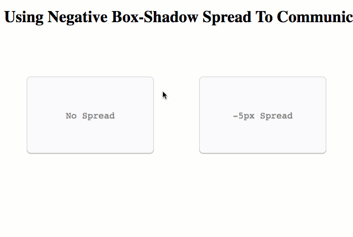
The difference is really subtle. But, I think Adam is right: using a negative box-shadow spread does feel ever-so-slightly more natural, more organic. Of course, in most application, I rarely have objects pop out from the page quite this much, so it will be interesting to see how this feels on a smaller scale. But, definitely a cool little CSS technique to have squirreled away in my brain.
Want to use code from this post? Check out the license.

Reader Comments
Ben, interesting idea.
For this demo, you might want to exaggerate the effect a little by setting it to -10px to make it a little more obvious; I couldn't see the difference at first.
Ted
@Ted,
Yeah, it's super subtle. I didn't want to make it too large or I thought it started to look a little odd (but would have been more obvious).
I think it's a cool thing; however, I am not sure how often I will have elements "come off the page" to the point where this will make a noticeable different. But, still, good food for thought.
but i think i need negative shadow like
-moz-box-shadow: inset 0 0 10px #000000;
-webkit-box-shadow: inset 0 0 10px #000000;
box-shadow: inset 0 0 10px #000000;
can you please tell me...