Attempting To Create A Flexible Dual-Select Control Component In Angular 9.1.9
Over the weekend, I took a look at an old, but wonderful, form control: the dual-select (or double-list) input, that allows a user to move options back-and-forth between two different sets of options. I love the user experience (UX) of this control because it very clearly identifies the selected options. In my previous post, this functionality was "hard coded" into the calling context; so, as a follow-up post, I wanted to see if I could factor-out the logic into a flexible dual-select component in Angular 9.1.9 that could then be reused in a variety of scenarios.
Run this demo in my JavaScript Demos project on GitHub.
View this code in my JavaScript Demos project on GitHub.
To be unguarded, this is one of the more complex components that I've created in Angular. And, I'm not 100% sold on my current implementation. Let's call this a "first attempt". I think it works quite well; but, I don't have a lot of experience with multi-component communication; and, I'm positive that things can be improved.
That said, when I sat down to noodle on how I wanted to take the hard-coded logic in my previous post and turn it into something re-usable, the first thing I did was try to "sketch out" (so to speak) what I wanted the consuming HTML to look-like. This is known as API-Driven Development (ADD), and allows me to focus on the developer ergonomics of an API first, deferring the implementation details to a future step.
The first sketch of the HTML that would invoke the dual-select component looked like this (the ds tag-prefix stands for "dual-select"):
<ds-select>

	<ds-options>
		<ds-option *ngFor="...">
			{{ value }}
		</ds-option>
	</ds-options>

	<ds-options>
		<ds-option *ngFor="...">
			{{ value }}
		</ds-option>
	</ds-options>

</ds-select>
This HTML hierarchy borrows heavily from the browser's native select, optgroup, and option Elements. At first, I wasn't sure if I wanted to explicitly define the ds-options element; or, if I wanted to pass in the options collection as an input on the ds-select component. But, one thing that I kept coming back to in my mind was that I wanted to have more control over what the "selected" options-list looks like.
Ultimately, I ended up keeping this HTML structure, where the developer has to clearly identify the markup for both sets of option-lists. It makes the HTML a little more verbose; but, gives us a tremendous amount of flexibility as you will see shortly.
Once I had the HTML looking and feeling good, I had to figure out how the dual-select component was going to announce changes to the calling context. Keeping with a uni-directional data-flow mentality, the dual-select component needs to announce two different "gestures" that the user can take:
- Move options to the "selected" options group.
- Move options to the "unselected" options group.
For this, I decided to given the ds-select component two different event-emitters which I'm binding as (select) and (unselect). Each of these event-emitters will emit an array of values, which I'll be binding to the ds-option component as a [value] input:
<ds-select
	(select)="handleSelect( $event )
	(unselect)="handleUnselect( $event )>

	<ds-options>
		<ds-option *ngFor="..." [value]="...">
			{{ value }}
		</ds-option>
	</ds-options>

	<ds-options>
		<ds-option *ngFor="..." [value]="...">
			{{ value }}
		</ds-option>
	</ds-options>

</ds-select>
To make this demo a little more spicy than the last one, I've taken my list of Contacts and I've added the concept of "favorites". Now, some of the Contacts are marked as isFavorite; and, when those contacts are "selected" (ie, moved to the "selected" set of options), I am going to separate them out as a clearly-identified group at the top. I'm also going to add a "call to action" when there are no selected options.
My demo ended up having the following collections:
unselectedContactsselectedContactsselectedFavoriteContactsselectedNormalContacts
Notice that my "selected" contacts have been broken-down into "favorites" and "normal". I'm using these two selected collections to break the "selected" list of ds-option components into two different HTML groupings.
Here's the HTML template for my App components which uses the ds-select component, along with the aforementioned data-model, to generate the dual-select user experience:
<ds-select
(select)="addToSelectedContacts( $event )"
(unselect)="removeFromSelectedContacts( $event )">
<ds-options type="unselected">
<ds-option
*ngFor="let contact of unselectedContacts"
[value]="contact">
<app-contact [contact]="contact"></app-contact>
</ds-option>
</ds-options>
<ds-options type="selected">
<!--
If NO CONTANCTS have been selected, let's render a call-to-action. The
beautiful thing about multi-component content-projection is that we can be
super flexible with what we project into "containers". In our case, the
DS-OPTIONS only cares about nested DS-OPTION components - the rest of the
markup that we want to jam in here is "gracefully ignored" by the DS-SELECT
system of components.
-->
<div *ngIf="( ! selectedContacts.length )" class="empty">
<span class="empty__message">
Please select at least<br />
one Contact.
</span>
</div>
<!--
If we have any FAVORITE contacts, we can wrap those DS-OPTION components
in additional HTML to add styling and a call-out. Again, this type of
flexibility is a trade-off that we make for the added view-complexity.
-->
<div *ngIf="selectedFavoriteContacts.length" class="favorites">
<div class="favorites__header">
⭑ Favorite Contacts
</div>
<ds-option
*ngFor="let contact of selectedFavoriteContacts"
[value]="contact"
class="new">
<app-contact [contact]="contact"></app-contact>
</ds-option>
</div>
<!-- Add the rest of the non-favorite, selected contacts. -->
<ds-option
*ngFor="let contact of selectedNormalContacts"
[value]="contact"
class="new">
<app-contact [contact]="contact"></app-contact>
</ds-option>
</ds-options>
</ds-select>
<p class="note">
You have <strong>{{ selectedContacts.length }} of {{ contacts.length }}</strong>
contacts selected.
</p>
So, there's two things to notice in this markup:
I added a
[type]bindings to theds-optionscomponent. This is needed to drive some of the wiring within theds-selectcomponent. But, I think it also adds additional clarity to the consuming markup.The
ds-optionsandds-optioncomponents are very flexible containers. Meaning, theds-optioncomponent can contain anything - in this case, a "contact" component. And, theds-optionscomponent can contain more than justds-optioninstances. In this case, you can see it has a "call to action" when no contacts are selected. And, if any selected contacts are favorites, I'm pulling them out into a separatediv.favoriteswrapper within theds-optionscomponent.
The latter point really demonstrates the power of content projection in an Angular application. When components become "generic containers", we offer a lot of flexibility to the consumer on what they want to put in that container.
Under the hood, you will see that the ds-select component is just projecting the two different ds-options containers into its own view template:
<div class="options-container">
<!-- Project the UNSELECTED OPTIONS content. -->
<ng-content select="ds-options[type='unselected']"></ng-content>
</div>
<div class="controls-container">
<button
(click)="addToSelected()"
title="Add To Selected"
class="control">
⤇
</button>
<button
(click)="removeFromSelected()"
title="Remove From Selected"
class="control">
⤆
</button>
</div>
<div class="options-container">
<!-- Project the SELECTED OPTIONS content. -->
<ng-content select="ds-options[type='selected']"></ng-content>
</div>
As you can see, the two "options-containers" elements are using ng-content to project the entirety of the two ds-options components into the view-template. This is why we can mix-in other HTML elements alongside our ds-option components - the content-projecting isn't trying to filter-out any specific type of mark-up.
Like I said, content-projection in Angular is hella flexible and totes' powerful!
Now that we know what the HTML looks like and how the components fit together from a developer ergonomics stand-point, let's run this Angular application in the browser to see what kind of functionality we are enabling:
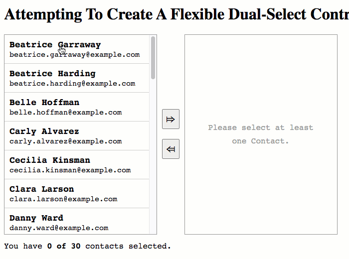
As you can see, we're able to move Contact options back-and-forth between the two options-lists. This uses the (select) and (unselect) event-emitters which we use in a uni-directional data-flow to update the HTML markup that gets projected back into the ds-select component.
And now that we see what kind of user experience we're creating, let's look at how the ds-select component works under-the-hood. Though, of course, it's not one component, it's three: ds-select, ds-options, and ds-option.
Getting these three components to work together took a bit of trial-and-error. Generally speaking, the lower-level components defer to the higher-level components for functionality. Meaning, the ds-option components defers to the parent ds-options component; and then, the ds-options component defers to the parent ds-select component.
In order to connect the hierarchy of components, I am using two different mechanisms:
Dependency-injection of higher-level components into lower-level components.
ContentChildren()query-list that pulls lower-level components into higher-level components.
I had originally started out with just dependency-injection. However, I found that I needed insight into the ordering of the DOM (Document Object Model) in order to implement the Shift+Click multi-option selection within a given list. As such, I moved from dependency-injection to a ContentChildren() query in order to pull the ds-option components into the ds-options container.
To keep things simple, I've put all three components in a single TypeScript file:
ASIDE: In a more "official" context, I'd probably break these three components into three separate files; and then, wrap them all up into a single
NgModulethat I could then import into an application. For the sake of simplicity, I'm just using a single file (below) and then importing each of the components into my App'sNgModuledeclarations (not shown).
// Import the core angular services.
import { Component } from "@angular/core";
import { ContentChildren } from "@angular/core";
import { EventEmitter } from "@angular/core";
import { forwardRef } from "@angular/core";
import { QueryList } from "@angular/core";

// ----------------------------------------------------------------------------------- //
// ----------------------------------------------------------------------------------- //

type OptionsGroupType = "selected" | "unselected";

@Component({
	selector: "ds-select",
	outputs: [
		"selectEvents: select",
		"unselectEvents: unselect"
	],
	styleUrls: [ "./ds-select.component.less" ],
	templateUrl: "./ds-select.component.html"
})
export class DSSelectComponent {

	public selectEvents: EventEmitter<any[]>;
	public unselectEvents: EventEmitter<any[]>;

	// CAUTION: I'm using the DEFINITE ASSIGNMENT ASSERTION here because the
	// ngAfterViewInit() will throw an error if the following properties have not yet
	// been registered by lower-level components (ds-options).
	private unselectedOptionsGroup!: DSOptionsGroupComponent;
	private selectedOptionsGroup!: DSOptionsGroupComponent;

	// I initialize the dual-select select component.
	constructor() {

		this.selectEvents = new EventEmitter();
		this.unselectEvents = new EventEmitter();

	}

	// ---
	// PUBLIC METHODS.
	// ---

	// I get called once after the view has been initialized.
	public ngAfterViewInit() : void {

		if ( ! this.unselectedOptionsGroup || ! this.selectedOptionsGroup ) {

			throw( new Error( "You must provide both an 'unselected' and a 'selected' options group." ) );

		}

	}


	// I emit an event to move the pending values from Unselected options-group to the
	// Selected options-group.
	public addToSelected() : void {

		var values = this.unselectedOptionsGroup.getPendingValues();

		if ( values.length ) {

			this.unselectedOptionsGroup.clearPending();
			this.selectEvents.emit( values );

		}

	}


	// I emit an event to move the given option from the given options-group to the other
	// options-group.
	public moveOption( optionsGroup: DSOptionsGroupComponent, option: DSOptionComponent ) : void {

		var eventEmitter = ( optionsGroup.type === "selected" )
			? this.unselectEvents
			: this.selectEvents
		;
		var eventValue = [ option.value ];

		optionsGroup.clearPending();
		eventEmitter.emit( eventValue );

	}


	// I emit an event to move the pending values from Selected options-group to the
	// Unselected options-group.
	public removeFromSelected() : void {

		var values = this.selectedOptionsGroup.getPendingValues();

		if ( values.length ) {

			this.selectedOptionsGroup.clearPending();
			this.unselectEvents.emit( values );

		}

	}


	// I register the given options-group with the current select.
	public registerOptionsGroup( optionsGroup: DSOptionsGroupComponent ) : void {

		if ( optionsGroup.type === "unselected" ) {

			this.unselectedOptionsGroup = optionsGroup;

		} else {

			this.selectedOptionsGroup = optionsGroup;

		}

	}

}

// ----------------------------------------------------------------------------------- //
// ----------------------------------------------------------------------------------- //

@Component({
	selector: "ds-options",
	inputs: [ "type" ],
	host: {
		"role": "list"
	},
	queries: {
		// CAUTION: Since the DS-OPTIONS component is a flexible container for content,
		// we have to use the "descendants" option. This way, we can locate DS-OPTION
		// instances that may be wrapped inside additional, decorative HTML.
		options: new ContentChildren(
			forwardRef( () => DSOptionComponent ),
			{
				descendants: true
			}
		)
	},
	styleUrls: [ "./ds-options.component.less" ],
	template:
	`
		<ng-content></ng-content>
	`
})
export class DSOptionsGroupComponent {

	public options!: QueryList<DSOptionComponent>;
	public type!: OptionsGroupType;

	private lastPendingIndex: number | null;
	private select: DSSelectComponent;

	// I initialize the dual-select options-group component.
	constructor( select : DSSelectComponent ) {

		this.select = select;
		this.lastPendingIndex = null;

	}

	// ---
	// PUBLIC METHODS.
	// ---

	// I clear any pending-item settings.
	public clearPending() : void {

		for ( var option of this.options ) {

			option.isPending = false;

		}

		this.lastPendingIndex = null;

	}


	// I get the collection of values associated with pending options in this group.
	public getPendingValues() : any[] {

		var values = this.options
			.filter( option => option.isPending )
			.map( option => option.value )
		;

		return( values );

	}


	// I move the given option to the other options-group list.
	public moveOption( option: DSOptionComponent ) : void {

		this.select.moveOption( this, option );

	}


	// I get called once after the inputs have been bound for the first time.
	public ngOnInit() : void {

		if (
			( this.type !== "unselected" ) &&
			( this.type !== "selected" )
			) {

			throw( new Error( `ds-options group must be 'unselected' or 'selected'. The value of [${ this.type }] is not supported.` ) );

		}

		this.select.registerOptionsGroup( this );

	}


	// I toggle the pending state of the given option (and possibly all of the options
	// between the given one and the last one that was toggled).
	public toggleOption( option: DSOptionComponent, isMultiToggle: boolean ) : void {

		// Options is a QueryList iterator, which is "array like"; but, doesn't have all
		// of the Array methods we would like to use in the toggle operation. As such,
		// let's convert the QueryList to an Array for the scope of this function.
		var optionsArray = this.options.toArray();
		var index = optionsArray.indexOf( option );

		if ( index === -1 ) {

			return;

		}

		var isPending = option.isPending = ! option.isPending;

		// If this is a multi-toggle action, set all the sibling options to the same
		// pending setting.
		if ( isMultiToggle && ( this.lastPendingIndex !== null ) ) {

			// Get the loop-boundaries for the multi-toggle (and make sure we don't go
			// beyond the scope of the current options).
			var minIndex = Math.min( Math.min( index, this.lastPendingIndex ), ( optionsArray.length - 1 ) );
			var maxIndex = Math.min( Math.max( index, this.lastPendingIndex ), ( optionsArray.length - 1 ) );

			for ( var i = minIndex ; i <= maxIndex ; i++ ) {

				optionsArray[ i ].isPending = isPending;

			}

		}

		this.lastPendingIndex = index;

	}

}

// ----------------------------------------------------------------------------------- //
// ----------------------------------------------------------------------------------- //

@Component({
	selector: "ds-option",
	inputs: [ "value" ],
	host: {
		"role": "listitem",
		"(click)": "toggle( $event )",
		"(dblclick)": "move()",
		"[class.pending]": "isPending"
	},
	styleUrls: [ "./ds-option.component.less" ],
	template:
	`
		<ng-content></ng-content>
	`
})
export class DSOptionComponent {

	public isPending: boolean;
	public value: any;

	private optionsGroup: DSOptionsGroupComponent;

	// I initialize the dual-select option component.
	constructor( optionsGroup: DSOptionsGroupComponent ) {

		this.optionsGroup = optionsGroup;
		this.isPending = false;
		this.value = null;

	}

	// ---
	// PUBLIC METHODS.
	// ---

	// I move the option to the "other" option group.
	public move() : void {

		this.optionsGroup.moveOption( this );

	}


	// I toggle the pending state.
	public toggle( event: MouseEvent ) : void {

		this.optionsGroup.toggleOption( this, event.shiftKey );

	}

}
Like I said before, I'm using two mechanisms to wire the various components together. With dependency-injection, the ds-options components are "registering" themselves with the parent ds-select component. And, with a ContentChildren() query, I'm pulling the ds-option components up into the ds-options component.
Ultimately, I could probably have accomplished both objectives with ContentChildren(). Since I typically build very simple components, I don't have a great instinct for when to use which inversion-of-control (IoC) technique.
There's a non-trivial amount of code in these three components; so, I will leave it up to you, dear reader, to pick through if you want to.
For completeness, here's the code for the App components. It's a bit noisy because we're splitting the selected contacts into two separate lists:
// Import the core angular services.
import { Component } from "@angular/core";

// Import the application components and services.
import { Contact } from "./data";
import { contacts as sampleContacts } from "./data";

// ----------------------------------------------------------------------------------- //
// ----------------------------------------------------------------------------------- //

@Component({
	selector: "app-root",
	styleUrls: [ "./app.component.less" ],
	templateUrl: "./app.component.html"
})
export class AppComponent {

	public contacts: Contact[];
	public selectedContacts: Contact[];
	public selectedFavoriteContacts: Contact[];
	public selectedNormalContacts: Contact[];
	public unselectedContacts: Contact[];

	// I initialize the app component.
	constructor() {

		this.contacts = sampleContacts;
		// To start with, all of the contacts will be unselected. Then, the user will be
		// able to move any of the contacts over to the selected collection.
		this.unselectedContacts = this.contacts.slice().sort( this.sortContactOperator );
		this.selectedContacts = [];

		// On the "selected side", we're going to break the selections down into Favorite
		// contacts and Normal contacts. This is just to demonstrate the flexibility of
		// the markup in the Dual-Select component.
		this.selectedFavoriteContacts = [];
		this.selectedNormalContacts = [];

	}

	// ---
	// PUBLIC METHODS.
	// ---

	// I move the given contacts from the unselected list to the selected list.
	public addToSelectedContacts( changeContacts: Contact[] ) : void {

		// Remove the contacts from the Unselected.
		this.unselectedContacts = this.unselectedContacts.filter(
			( contact ) => {

				return( ! changeContacts.includes( contact ) );

			}
		);

		// ... and move them over to the Selected list(s).
		this.selectedContacts = changeContacts.concat( this.selectedContacts );
		this.selectedFavoriteContacts = this.selectedContacts.filter( this.filterInFavoriteOperator );
		this.selectedNormalContacts = this.selectedContacts.filter( this.filterOutFavoriteOperator );

	}


	// I move the given contacts from the selected list to the unselected list.
	public removeFromSelectedContacts( changeContacts: Contact[] ) : void {

		// Remove the contacts from the Selected list.
		this.selectedContacts = this.selectedContacts.filter(
			( contact ) => {

				return( ! changeContacts.includes( contact ) );

			}
		);
		this.selectedFavoriteContacts = this.selectedContacts.filter( this.filterInFavoriteOperator );
		this.selectedNormalContacts = this.selectedContacts.filter( this.filterOutFavoriteOperator );

		// ... and move them over to the Unselected list.
		this.unselectedContacts = this.unselectedContacts
			.concat( changeContacts )
			.sort( this.sortContactOperator )
		;

	}

	// ---
	// PRIVATE METHODS.
	// ---

	// I provide the filter operator for favorite contacts.
	private filterInFavoriteOperator( contact: Contact ) : boolean {

		return( contact.isFavorite );

	}


	// I provide the filter operator for normal contacts.
	private filterOutFavoriteOperator( contact: Contact ) : boolean {

		return( ! contact.isFavorite );

	}


	// I provide the sort operator for the contacts collection.
	private sortContactOperator( a: Contact, b: Contact ) : number {

		return( a.name.localeCompare( b.name ) );

	}

}
Building multi-component abstractions in Angular is not a muscle that I have exercised enough. This demo took me about 8-hours to put together, with a good deal of trial-and-error. Ultimately, I'm fairly happy with what I came up with; and, it's really helped me think more deeply about content-projection in Angular 9.1.9. I can see how powerful it is - treating components as "containers".
Want to use code from this post? Check out the license.

Reader Comments
Your blog is a life saver as usual. Thanks again!
@Lazalu68,
Ha ha, thank you for the kind words! I'm glad this was helpful.