Looking At How Browser Zoom Affects CSS Media Queries And Pixel-Density
The older I get, the more zoomed-in my browser tends to become. I just don't have the patience for small-text - I want my font-sizes to feel luxurious and decadent. The other day, however, I needed to take a screen-shot of some graphs in Datadog; so I ended up zooming in even more than I normally do. And, as I did so, I noticed that the grid-layout of my graphs changed in column-count. This got me thinking about what the zoom feature of the browser is actually doing; and, how it affects values like screen size and pixel density. I have no current mental model for this. So, I wanted to set up some "resize" and Media Query "change" event listeners to see how the browser reacts when I start zooming in.
Run this demo in my JavaScript Demos project on GitHub.
View this code in my JavaScript Demos project on GitHub.
I honestly never thought about what is actually happening when I use the browser's zoom feature. I just know that things get larger and easier to read. To get a better sense of what's actually going on under the hood, I wanted to look at the following:
CSS Media queries - how does the zoom affect things like
(max-width:800px)?Resize Events - does the browser consider the zoom event to be a window
resizeevent?Pixel density - when I zoom in, does the browser try to mimic a higher-density screen resolution?
Going into this experiment, I knew that I could create CSS media queries to change the visual state of the document based on the screen size; but, as I was researching this, I came across the fact that you can programmatically check the state of a media query using the window.matchMedia() method. The window.matchMedia() method allows you to pass in CSS media query text and get back an object - MediaQueryList - that can tell us the current state of the media query as well as let us subscribe to changes in said media query state.
Bringing all of this together, I created a small demo in which the background-color of the browser starts out dark. And then, using CSS media queries, as the screen size gets larger, the background-color gets lighter. In addition to the CSS media queries, I'm also registering a resize event handler. And, individual .mediaMatch() change event handlers for each media query that I have defined in the stylesheet:
<!doctype html>
<html lang="en">
<head>
	<meta charset="utf-8" />

	<title>
		Looking At How Browser Zoom Affects CSS Media Queries And Pixel-Density
	</title>

	<style type="text/css">

		/*
			In order to see how the BROWSER ZOOM affects the screen width, we're going to
			change the background color / text color as the screen width changes.
		*/
		body {
			background-color: #000000 ;
			color: #ffffff ;
		}
		/*
			As the screen dimensions get larger, the background of the screen will get
			lighter. Then, as we ZOOM IN, and the dimensions get smaller, the background
			of the screen should get darker.
		*/
		@media screen and ( min-width: 200px ) {
			body {
				background-color: #111111 ;
			}
		}
		@media screen and ( min-width: 300px ) {
			body {
				background-color: #222222 ;
			}
		}
		@media screen and ( min-width: 400px ) {
			body {
				background-color: #444444 ;
			}
		}
		@media screen and ( min-width: 500px ) {
			body {
				background-color: #666666 ;
			}
		}
		@media screen and ( min-width: 600px ) {
			body {
				background-color: #888888 ;
			}
		}
		@media screen and ( min-width: 700px ) {
			body {
				background-color: #aaaaaa ;
				color: #000000 ;
			}
		}
		@media screen and ( min-width: 800px ) {
			body {
				background-color: #cccccc ;
			}
		}
		@media screen and ( min-width: 900px ) {
			body {
				background-color: #dddddd ;
			}
		}
		@media screen and ( min-width: 1000px ) {
			body {
				background-color: #ffffff ;
			}
		}

	</style>
</head>
<body>

	<h1>
		Looking At How Browser Zoom Affects CSS Media Queries And Pixel-Density
	</h1>

	<script type="text/javascript">

		// Listen for "resize" events.
		window.addEventListener( "resize", handleResizeEvent );
		// Listen for Media Query "change" events.
		setupMediaQueryListeners();

		// --------------------------------------------------------------------------- //
		// --------------------------------------------------------------------------- //

		// I handle window resize events.
		function handleResizeEvent( event ) {

			console.group( "%cResize Event", "color: red" );
			console.log( "Window width:", window.innerWidth );
			console.log( "Pixel density:", window.devicePixelRatio );
			// NOTE: Safari seems to report the devicePixelRatio as "1" (on my laptop)
			// regardless of what the Zoom is doing. Chrome and Firefox, on the other
			// hand, seem to show an increased pixel density as the Zoom increases.
			console.groupEnd();

		}

		// I handle media-query change events.
		function handleMediaQueryChangeEvent( event ) {

			console.group( "%cMediaQueryList Event", "color: purple" );
			console.log( "Condition:", event.media );
			console.log( "Matches:", event.matches );
			console.groupEnd();

		}

		// --------------------------------------------------------------------------- //
		// --------------------------------------------------------------------------- //

		// I look through the document StyleSheet and setup watchers for any Media Rule
		// in the CSS rule list.
		function setupMediaQueryListeners() {

			var rules = document.styleSheets[ 0 ].cssRules;
			var length = rules.length;

			for ( var i = 0 ; i < length ; i++ ) {

				var rule = rules[ i ];
				var conditionText = ( rule.media && rule.media[ 0 ] );

				// If this isn't a CSS Media Rule, skip it.
				if ( ! conditionText ) {

					continue;

				}

				// Create a watcher for the given CSS Media Rule condition. The condition
				// text will be something like, "screen and (min-width: 900px)". The
				// resultant object allows us to listen for "change" events on that
				// condition relative to the state of the document.
				var mediaQueryList = window.matchMedia( conditionText );

				// CAUTION: You can also use .addEventListener(change); however, that
				// method does not appear to work for Safari. Classic Safari!
				mediaQueryList.addListener( handleMediaQueryChangeEvent );

				// In addition to listening for changes on the media query, we can also
				// check to see if the initial state of the media query matches the
				// current document state.
				console.group( "Setting up media listener" );
				console.log( "Condition:", conditionText );
				console.log( "Initial match:", mediaQueryList.matches );
				console.groupEnd();

			}

		}

	</script>

</body>
</html>
In this demo, we are logging three things:
- The initial state of the
window.matchMedia()objects. - The
changeevent on thewindow.matchMedia()objects. - The
resizeevent on thewindow.
And, if we open the demo up using a screen size that is larger than the largest media query, the browsers starts out as black-text on a white-background. And, as we zoom, we get the following:
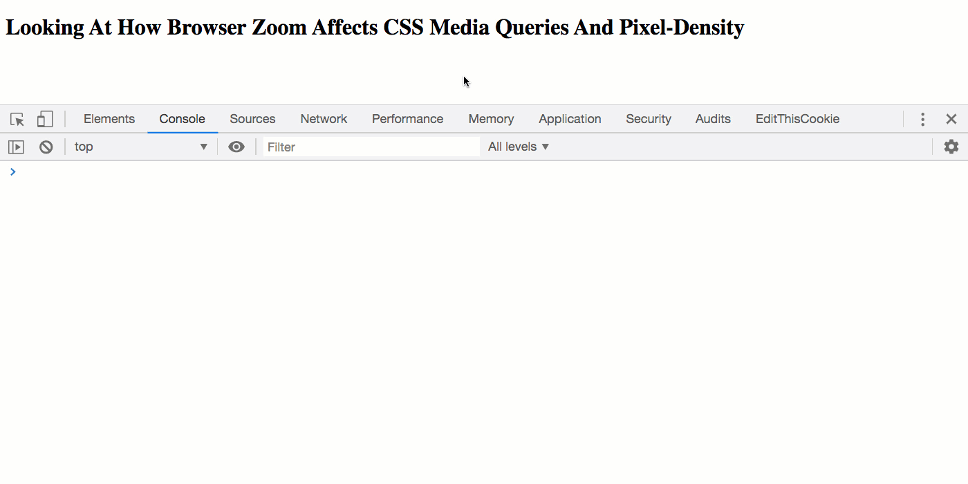
As you can see, when we zoom into the browser, the console starts logging both the resize events on the window and the change events on our various MediaQueryList objects. In Chrome and Firefox, the pixel density of the screen (as reported by window.devicePixelRatio) also starts to increase.
NOTE: On my version of desktop Safari, the
window.devicePixelRatiovalue reports a constant1regardless of the zoom factor. That said, theresizeandchangeevents fire correctly in Safari.
So, my big take-away from this - from a "mental model" perspective - is that as we zoom into the browser, the "size" of the screen decreases. Which means, we can use CSS media queries to adjust to the layout of the screen in response to the decreased amount of screen real estate. I'm also excited to see that I can programmatically check CSS media query state. I don't have a great use-case for that off the top of my head; but, I'm almost certain that such a feature will be useful in the future.
Want to use code from this post? Check out the license.

Reader Comments
The zoom level of the operating system settings can also play a role (e.g. Windows 10 at 125% with Google Chrome at 100%) in a website's CSS media queries-- something I discovered not too long ago while troubleshooting an older laptop which was seeing the mobile view of a website instead of the desktop version. Tons of fun, as you can imagine.
@Andrew,
Yo, I didn't even know you could zoom at the OS level! I'll have to look into that; though, now that you say it, it does sound like some sort of zoom-inception hell :D
Yep, zooming can be a real pain in various situations, I remember having it with fixed headers. Some safaris, when finger zooming, wouldn't really zoom in...it will just zoom the view part keeping the originals containers width, and then, at a certain point it will zoom. It can break the header and other things. Really painfull. I remember I had to do a hacky fix at that moment.
@Andreas,
Yikes. Hopefully the mobile OS's have improved or gotten more consistent. I don't actually have a lot of mobile experience. I'm still trying to get this blog to be mobile friendly. It feels really challenging retrofitting "mobile" into things.
Hello from France
Well done for your program, it works perfectly of course.
I have been looking for a long time how to zoom with an ESP32-cam streaming camera.
It's great on my PC.
But what I would like is to do it on my smartphone, and I have no idea how to embed your program in the browser (Chrome) of my smartphone ...
Do you have an idea please?
@Gérard,
I am not sure I understand your question. There's really nothing to "embed" here - I'm just exploring the interaction between Zoom level in the browser and how the CSS media-queries see the screen dimensions.
@Ben Nadel
Ha yes, I'm sorry, I thought it was a possibility of zooming in streaming videos.
thank you all the same
@Andrew,
"Operating system zoom" in Windows 10 & 11 is technically known as "Display Scaling." I'm adding this comment so that readers will be able to search for the correct term should they want more information about how Windows 10 and 11 display scaling works.
@Bill,
Thanks for the language tip. This is good to have recorded.
Thanks Ben for your experiment.
It would be also interesting to find if the page is already zoomed (e.g. browser zoom 150% and opening a webpage). I couldn't find an answer to this 😞
You have a highlighted typo, it is window.matchMedia() and not window.mediaMatch() 😉
@Patrick,
Thanks for calling out the typo -- consider it fixed. As far as the page being "already zoomed", if you just run the demo, zoom in, and then refresh the page, wouldn't that count? If so, it behaves the same way. Unless I don't understand what you mean by already zoomed.
Have you ever tried to mimic the browser zoom ? Lets say you have a website built using scaleable css value "rem" and "em" and create a button to change the base html font size from 16 to say 18. I can't find a way to make the media query trigger like they do when you use the browser zoom feature. Since you have spent considerable time playing with the zoom feature was curious if you found a way to replicate it using javascript.
@Michael,
Very interesting question. I wonder if one could create a media-query that is triggered by the base-font-size of the document? Also, I know some browsers are starting to land "container queries" where you can adjust styling and layout based on the size of a given DOM element container - perhaps that's something you could play around with.
Sorry I don't have anything more concrete. I'm still trying to get better at responsive design in general.