
Accessibility And Styled Anchor Links vs. Styled Buttons In Angular 7.2.15
After reading Accessibility For Everyone by Laura Kalbag, I've become more aware of the accessibility short-comings in my application interfaces. Of particular note is the fact that Anchor Links aren't keyboard accessible; at least, not by default. Yesterday, I demonstrated how to make anchor links keyboard accessible in Angular; but, the exercise in augmentation begs the question: is the anchor link even the right choice of Element? According to Marcy Sutton, probably not. Anchor links are for "resource links" whereas Buttons are for triggering discrete actions. And, as it turns out, Buttons happen to be much more accessible by default. As such, I wanted to take a quick look at styling Buttons in an Angular 7.2.15 application.
Run this demo in my JavaScript Demos project on GitHub.
View this code in my JavaScript Demos project on GitHub.
Marcy Sutton has a good explanation of the Button in her blog post; but, to sum up some of the key points, the Button element provides a number of benefits over the Anchor link element (in certain situations):
Buttons are naturally keyboard accessible without any additional effort, HTML markup, or Angular directives.
Buttons can be triggered with both the
Enterkey and theSpacebarkey.Buttons are more semantically correct when they are used to trigger a discrete action, like deleting an item, opening a pop-up content area, or changing the state of a toggle (which makes a difference in how Screen Readers announce them).
All of this makes me think that a good portion of the Anchor links in my current Angular applications should actually but Button elements. As such, I wanted to put together a quick demo to showcase the fact that a tags and button tags are both highly modifiable from a CSS stand-point.
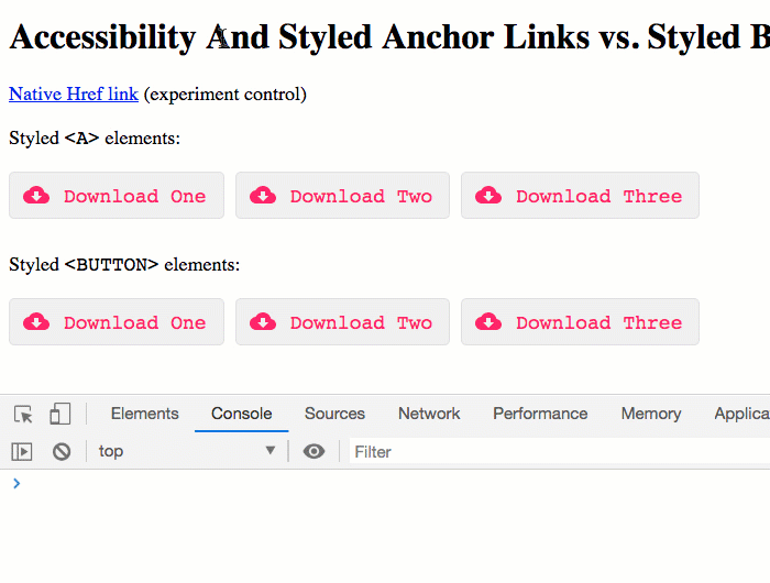
To demonstrate, I have a simple App component that lists two sets of interactive elements: one set uses the a tag; the other set uses the button tag:
<p>
<a href="#">Native Href link</a> (experiment control)
</p>
<p>
Styled <code><A></code> elements:
</p>
<div class="actions">
<a (click)="logClick( 'Download item one' )">
<svg aria-hidden="true">
<use xlink:href="#sprite-button-icon" />
</svg>
Download One
</a>
<a (click)="logClick( 'Download item two' )">
<svg aria-hidden="true">
<use xlink:href="#sprite-button-icon" />
</svg>
Download Two
</a>
<a (click)="logClick( 'Download item three' )">
<svg aria-hidden="true">
<use xlink:href="#sprite-button-icon" />
</svg>
Download Three
</a>
</div>
<p>
Styled <code><BUTTON></code> elements:
</p>
<div class="actions">
<button (click)="logClick( 'Download item one' )">
<svg aria-hidden="true">
<use xlink:href="#sprite-button-icon" />
</svg>
Download One
</button>
<button (click)="logClick( 'Download item two' )">
<svg aria-hidden="true">
<use xlink:href="#sprite-button-icon" />
</svg>
Download Two
</button>
<button (click)="logClick( 'Download item three' )">
<svg aria-hidden="true">
<use xlink:href="#sprite-button-icon" />
</svg>
Download Three
</button>
</div>
<!--
NOTE: Usually, the SVG spite is placed high in the document. However, for this demo,
I am placing it low down just to get it out of the way. It still seems to function
as you would hope.
-->
<svg style="display: none ;">
<symbol id="sprite-button-icon" viewBox="0 0 24 16" aria-labelledby="sprite-button-icon-label">
<title id="sprite-button-icon-label">
Download Icon
</title>
<path d="M19.4,6 C18.7,2.6 15.7,0 12,0 C9.1,0 6.6,1.6 5.4,4 C2.3,4.4 0,6.9 0,10 C0,13.3 2.7,16 6,16 L19,16 C21.8,16 24,13.8 24,11 C24,8.4 21.9,6.2 19.4,6 L19.4,6 Z M17,9 L12,14 L7,9 L10,9 L10,5 L14,5 L14,9 L17,9 L17,9 Z" />
</symbol>
</svg>
As you can see, the a and button elements are essentially identical. They all have a (click) event-handler (function not show in this demo). And, they all include an SVG icon. And, when we render them, they look exactly the same. The main difference is that the button elements are much more accessible:
The button element does require a tiny bit more CSS, particularly around Font style; but, as you can see in the following LESS CSS, both the a tag and the button tag are equally flexible:
:host {
	display: block ;
	font-size: 18px ;
}

.actions {
	display: flex ;
	font-family: monospace ;
	margin: 20px 0px 30px 0px ;

	a,
	button {
		align-items: center ;
		background-color: #f0f0f0 ;
		border: 1px solid #e0e0e0 ;
		border-radius: 5px 5px 5px 5px ;
		color: #ff3366 ;
		cursor: pointer ;
		display: flex ;
		font-family: inherit ; // Needed for Button.
		font-size: inherit ; // Needed for Button.
		margin-right: 10px ;
		padding: 10px 15px 10px 12px ;

		// Only CHROME seems to show a nice beefy outline by default; as such, in order
		// to get the focus styling more consistent, I am going to override the outline
		// and then use a box-shadow. This works the same in the major desktop browsers.
		&:focus,
		&:active {
			outline: none ;
			box-shadow: 0px 0px 2px 4px #ff3366 ;
		}
	}

	svg {
		fill: #ff3366 ;
		height: 16px ;
		margin-right: 13px ;
		width: 24px ;
	}
}
As you can see, it really takes no additional effort to style a button element. This may not have been true years ago; but, it is certainly true today in all modern browsers.
Now, to be clear, I am very much an accessibility novice. At this point, I'm just trying to become more aware of my own knowledge gaps; and, I'm starting to baby-step towards a more holistic understanding of my users. So, I won't get into any deeper explanation of semantic HTML or element selection. But, I will certainly be trying to use the button element in more places within my Angular applications, especially when the goal of the UI (user interface) interaction is to trigger a non-routable, discrete action. I believe this will naturally create a more accessible and intuitive experience.
ASIDE: Part of creating a "more intuitive" experience is not removingthe native focus and active indicators. For years, I've been told by designers (and by my own biased aesthetic) to remove the "outline" that shows up around an active element. Going forward, however, I will be trying to champion such accessible interface features, not trying to suppressing them.
Want to use code from this post? Check out the license.

Reader Comments