Trying To Center A Text-Overflow Ellipsis Using CSS Flexbox In Angular 7.2.15
The other day, after reading Accessibility For Everyone by Laura Kalbag, I started to re-think the accessibility and usability of text-overflow: ellipsis. As much as possible, I think that an application interface should be flexible enough to handle user-provided content. However, in cases where user-provided content can be somewhat unbounded, the application interface still needs to wrangle it. In a follow-up conversation that I had with Jeremiah Lee, he suggested that being able to use a center-aligned ellipsis (such as in the Mac OS Finder) would likely provide the most valuable content while still applying some form of truncation. So, as an experiment, I wanted to see if I could "fake" a center-aligned ellipsis using CSS Flexbox in Angular 7.2.15.
Run this demo in my JavaScript Demos project on GitHub.
View this code in my JavaScript Demos project on GitHub.
As I've stated before, CSS Flexbox is the bee's knees. I just love it. And, after recently working on styling a movie cast list using Flexbox, I thought I might be able to apply the same general idea to a center-aligned ellipsis.
If memory serves me correctly, this technique is called the "sliding door" technique, so-called because it has two-sides, one of which slides over the other, just like the doors in a house. In days of yore, this technique was used to create custom, image-based borders before things like the CSS border-radius property and the CSS box-shadow property existed.
In order to create a center-aligned ellipsis, I'm going to take a string of user-provided content and split it in two. One half of the content will be a fixed-size, and will "slide over" the other half (hence the "sliding door" technique):
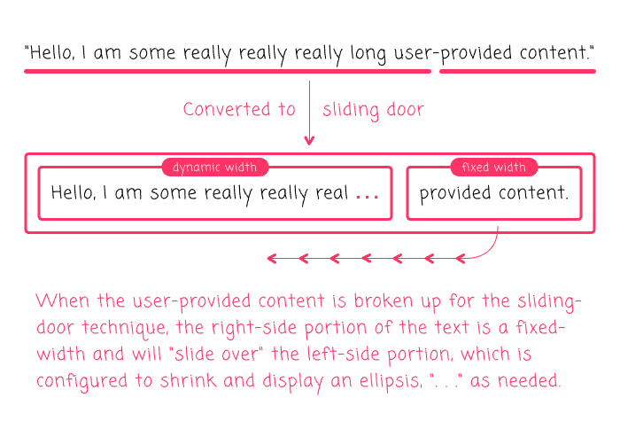
Using CSS Flexbox, this is surprisingly easy. You just have to configure the left-side of the sliding-door to "shrink", flex: 0 1 auto; and, the right-side of the sliding-door to "grow", flex: 1 0 auto. Then, apply the overflow conditions and it "just works". It even works in IE11 (bananas!).
Of course, you still need to know how to split the given string value in two. And for that, I'm going to experiment in an Angular 7.2.15 application. I've created a very simple SmartShrinkComponent component that takes a [text] input binding and renders the above sliding-door elements using two calculated properties, leftText and rightText:
// Import the core angular services.
import { ChangeDetectionStrategy } from "@angular/core";
import { Component } from "@angular/core";

// ----------------------------------------------------------------------------------- //
// ----------------------------------------------------------------------------------- //

@Component({
	selector: "app-smart-shrink",
	inputs: [ "text" ],
	host: {
		"[title]": "fullText"
	},
	changeDetection: ChangeDetectionStrategy.OnPush,
	styleUrls: [ "./smart-shrink.component.less" ],
	template:
	`
		<span class="left" [innerText]="leftText"></span>
		<span class="right" [innerText]="rightText"></span>
	`
})
export class SmartShrinkComponent {

	public fullText: string;
	public leftText: string;
	public rightText: string;

	// I initialize the smart-shrink component.
	constructor() {

		this.leftText = "";
		this.rightText = "";

	}

	// ---
	// PUBLIC METHODS.
	// ---

	// I handle the setting of the "text" input binding.
	set text( value: string ) {

		// We're going to split the string towards the end. This is just a judgment call.
		// Since we can't dynamically change the split as the container changes size (at
		// least, not with a lot more work), we have to pick a location that scales the
		// ellipsis well.
		var splitIndex = Math.round( value.length * 0.75 );

		this.fullText = value;
		this.leftText = value.slice( 0, splitIndex );
		this.rightText = value.slice( splitIndex );

	}

}
In order to remove as much of the JavaScript complexity as possible, I am just picking an offset within the given [text] binding that seems to provide a good experience: 75% of the length. You could theoretically try to observe the DOM (Document Object Model) for dimension-changes and then re-split the string; but, that starts to feel like a "Pyrrhic victory" level-of-effort.
In this component, the host element is the CSS Flexbox container. Then, the left/right SPAN elements are the sliding-doors:
:host {
	display: flex ;
}

.left {
	// The left side CANNOT GROW, it can ONLY SHRINK (and add an ellipsis at the end).
	flex: 0 1 auto ;
	overflow: hidden ;
	text-overflow: ellipsis ;
	white-space: pre ;
}

.right {
	// The right side can grow, but NOT SHRINK.
	flex: 1 0 auto ;
	overflow: hidden ;
	white-space: pre ;
}
As you can see, there's barely anything going on here at all; just some simple CSS Flexbox styling and some text-management. I am actually shocked that this "just works".
To test this, I threw together an App component that outputs several long strings using the SmartShrinkComponent:
// Import the core angular services.
import { Component } from "@angular/core";
// ----------------------------------------------------------------------------------- //
// ----------------------------------------------------------------------------------- //
@Component({
selector: "my-app",
styleUrls: [ "./app.component.less" ],
template:
`
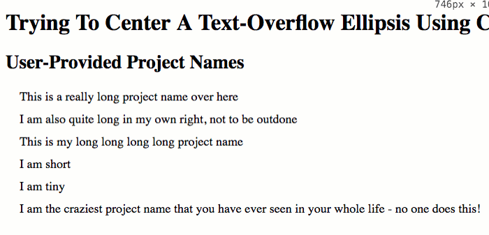
<h2>
User-Provided Project Names
</h2>
<p *ngFor="let projectName of projects" class="item">
<app-smart-shrink
[text]="projectName">
</app-smart-shrink>
</p>
`
})
export class AppComponent {
public projects: string[];
// I initialize the app component.
constructor() {
this.projects = [
"This is a really long project name over here",
"I am also quite long in my own right, not to be outdone",
"This is my long long long long project name",
"I am short",
"I am tiny",
"I am the craziest project name that you have ever seen in your whole life - no one does this!"
];
}
}
As you can see, each one of the "project names" is being rendered using the custom <app-smart-shrink> component. And when we run this in the browser and resize the page, we get the following output:
I tested this on the desktop browsers for Chrome, Firefox, Safari, and IE11. And it "just works". Kind of shocking. But, that's the magic of CSS Flexbox! As I said before, Flexbox is amazing!
Though, I will say that Safari did freak out if the <app-smart-shrink> component was inside an LI element. For some reason, if a Flexbox container is inside of an LI, Safari removes the LI styling and also adds weird padding to the first Flexbox item. I'll put together a demo for that later just in case anyone else is Googling for it, trying to understand wat?!
Safari is truly the new IE :(
The more I use CSS Flexbox, the more I fall in love with it. It just makes life better. And while it's not a perfect solution for implementing a centered text-overflow: ellipsis technique, it's definitely good enough. And, when I combine it with a dead-simple Angular 7.2.15 component wrapper, it becomes even easier.
Want to use code from this post? Check out the license.

Reader Comments
@All,
I just wanted to post a quick follow-up with regard to that Safari behavior I mentioned, in which the Flexbox container is inside of an
LI:www.bennadel.com/blog/3627-desktop-safari-seems-to-add-extra-padding-to-css-flexbox-item-inside-list-item.htm
Safari..... meh.
Hi,
Many thanks, for sharing this. I had a similar ellipsis issue, but my problem was a little different.
I am showing an overlay message(olm) on a resizable div (wrapper) within another div. Now i can resize wrapper but olm which is centered and has no other elements right or left, doesnt collapse but hides under the edges of the wrapper.
Any css tricks to force the ellipsis on the olm?
.wrapper {
display: flex;
align-items: center;
padding: 10px;
overflow: hidden;
flex: 0 1 auto ;
}
.overlay-message {
flex: 0 1 auto;
white-space: nowrap;
overflow: hidden;
text-overflow: ellipsis;
}
nice solution with flexbox! if anyone dealing with multiline ellipsis and needs more browser support, i just found and can recommend the tiny js library cuttr.js https://github.com/d-e-v-s-k/cuttr-js to truncate strings.