What If The User Experience (UX) Of My InVision Projects Page Looked More Like Basecamp
I haven't used Basecamp in about 5-years. But, I can't help but feel haunted by the "Projects" page design that was introduced in Basecamp 2. It seemed so perfect to me: it bisected the page into "the stuff I care about" (aka, favorites) and "everything else". And, what's more, it drew a hard line between the two concerns, using completely different "weights" and "information architectures". No element was superfluous. And, white-space was worshiped as a feature rather than a blank canvas needing to be filled with noise. Half-a-decade later, I still find myself nostalgic. So, in order to scratch that itch, I wanted to experiment with the design of the Projects page in InVision. Specifically, I wanted to see what it would look like if the InVision Projects page was organized more like the Basecamp Projects page.
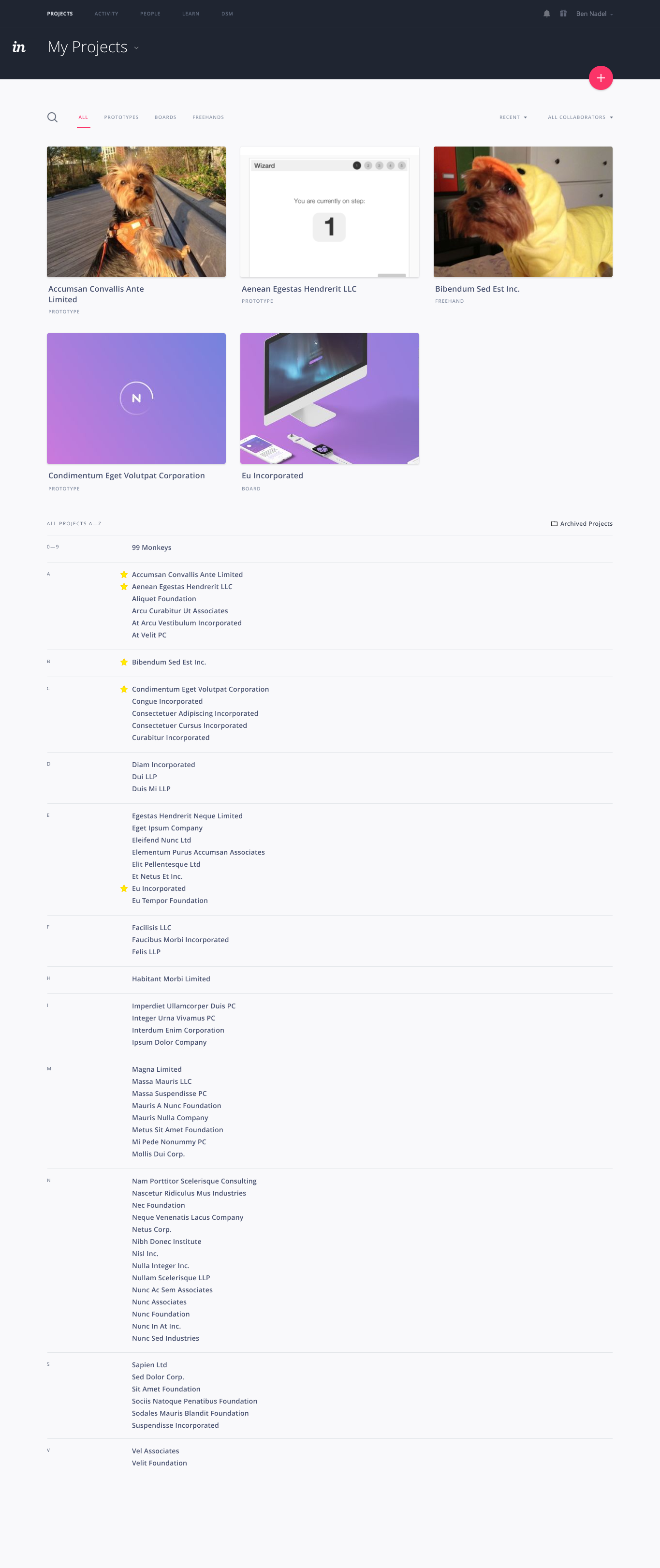
The Basecamp 2 Projects page was split into two sections: the favorites and the full projects list. The favorites section used a rich "cards" layout, where each card came with a list of members and meta-data about the project contents. The full project list, on the other hand, was a dead simple, text-only alphabetical list.
ASIDE: I freaking love alphabetically-ordered lists. I believe that they are the right approach in the large majority of contexts.
Part of why I loved this design so much was because it was so honest with itself. It didn't try to answer questions that no user was asking. And, it certainly didn't try to dress the full projects list up and make it into something more than it was. The full projects list did one thing and one thing only: it provided easy access to those projects. It didn't pretend to do anything more than that.
But, I don't want to pontificate about all the good choices that Basecamp made - I want to learn from them. So, this is my attempt to apply their design to the InVision projects page.
Click here for a full-size image.
| |
|
|
||
| |
 |
|
||
| |
|
|
It's scary to see so much white-space, isn't it? That huge list of projects screams out to be jammed-up with meta-data: thumbnails; screen count; comment count; date of last access; number of members. But, that's the beauty of this list - it doesn't succumb to such pressures; it remains true to its calling. Plain and simple.
Now, to be clear, I am an engineer - I am not a designer. So, there is definite room for improvement here. But, I've done my best to translate the highlights of the Basecamp design onto the InVision context. And, I think it's kind of exciting.
This thought has been rattling around in my head for the last 5-years. And while I don't use Basecamp at this time, I've always had a soft-spot in my heart for its design. Basecamp did a lot of things right. And, instead of just reminiscing, I'd like to spend more time trying to learn from them.

Reader Comments