
The User Experience (UX) Of Image-Oriented Lists On Apple TV
When I'm not rewriting the entire InVision App UI in Angular 5 or noodling on the proper deployment boundaries for feature flags, I'm watching movies. Specifically, I'm watching movies on my Apple TV in the bedroom. For the most part, I consume movies and shows on Netflix. But, the other day, I decided to see what movies were available on HBO GO. It had a few movies that I hadn't seen; but, nothing I was in the mood for. So, I jumped back over to the Netflix "new releases" collection; and the moment the list of movies came up, I had a jarring physical reaction to the user experience (UX). This Netflix application, which I had used a millions times before without a thought, suddenly felt janky and unusable.
To be honest, I wasn't quite sure what was happening. After all, I've been using the Netflix application on my Apple TV for years and never felt this way. I was confused, but also intrigued. As a product designer, I wanted to dig deeper and understand my reaction. So, I started flipping back and forth between the Netflix user interface (UI) and the HBO GO user interface (UI).
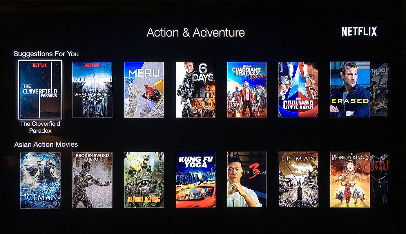
Here's a photograph (taken on my phone) of the Netflix "new releases" section:
| |
|
|
||
| |
 |
|
||
| |
|
|
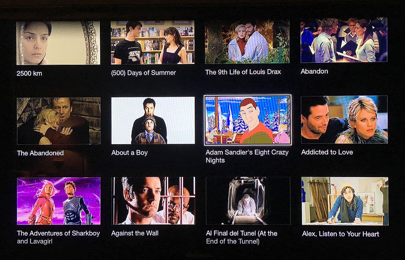
And, here's a photograph of the HBO GO movies list:
| |
|
|
||
| |
 |
|
||
| |
|
|
Jumping from the Netflix UI to the HBO Go UI was like taking a breath of fresh-air. And jumping from the HBO GO UI back to the Netflix UI felt like getting caught in quicksand. Where as the HBO GO UI felt freeing, the Netflix UI felt claustrophobic and suffocating. And, as I continued to jump back and forth between the two user experiences, I realized that there two powerful factors as play.
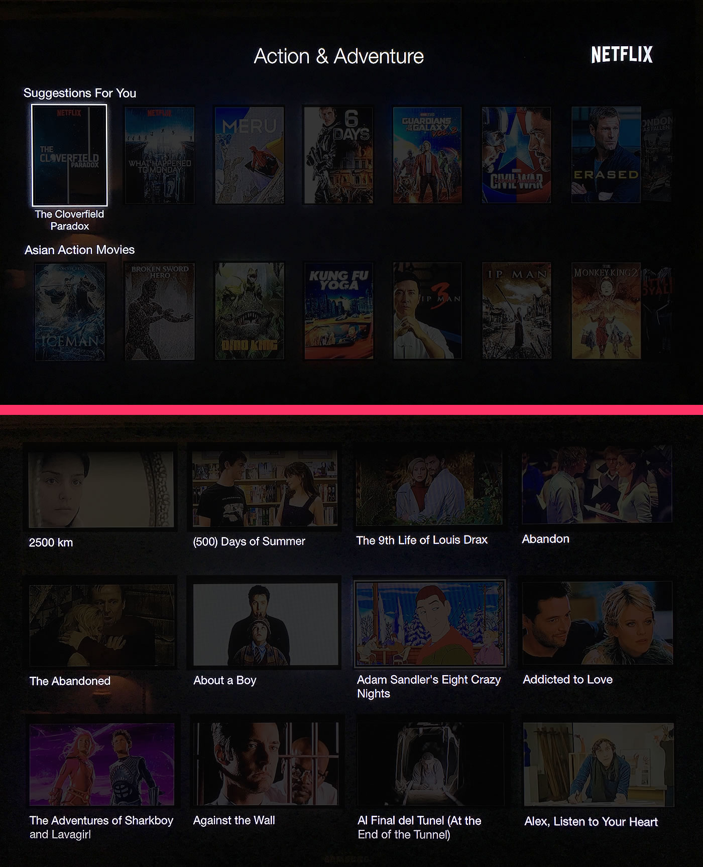
First, the Netflix UI was hiding critical data: the name of the movie. In the Netflix UI, the name of the movie is only present when you highlight a movie selection. In the HBO GO UI, the name of each movie is always present, regardless of the current selection. If we look at a lower-contrast version of the two photographs next to each other, this difference becomes obvious:
| |
|
|
||
| |
 |
|
||
| |
|
|
Look at how much more consumable the HBO GO user experience is. Even though the HBO GO UI has fewer items (12 vs. 14), it feels very much like it has more consumable data.
It's also interesting to think about what role each user interface (UI) component is playing. In the Netflix user experience, the name of the movie is there to reinforce the value of the movie poster. In the HBO GO user experience, the screen-still is there to reinforce the value of the movie name. Which begs the question, which of these two UI components is subject to difficult or incorrect interpretation? Which, of course, is a rhetorical question: the text-name of the movie is always in a consistent font, size, color, and location. The name contained within the movie poster, however, is highly inconsistent in format; and, could very easily be unreadable on such a small-scale representation of the original poster.
ASIDE: Since I've noticed this difference in the two user experiences, I've become much more aware of how little the movie posters actually help me consume the data. Sure, for big iconic movie posters, it's not so bad. But, I've seen all the big iconic movies; so, the things I'm scanning for are the movies with which I'm not as familiar. In those cases, I may not even recognize the name of the movie, let alone the tiny version of the poster.
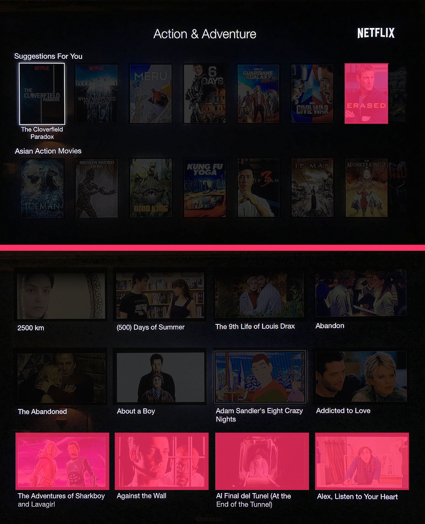
The seconding defining difference between these two user experiences is the way in which new data is shown to the consumer. Let's look at what the user sees every time she hits "next" on the given list:
| |
|
|
||
| |
 |
|
||
| |
|
|
Whenever a user proceeds to the "next" item in the Netflix user experience, she is presented with a single new item. In the HBO GO user experience, whenever the user proceeds to the "next" item, she is presented with four new items. And, each of those four new items has a visible name, regardless of the current selection.
Netflix is also using a horizontal scrolling UI. Which, let's be honest, is garbage. The weak part of my constitution is begging me to say, "most of the time," in an effort to hedge my bets. But, if I'm being truly forthcoming with myself, horizontal scrolling is garbage all of the time. I've yet to see a horizontal scrolling UI that is better than a vertical scrolling UI.
NOTE: I do like the horizontal UX of Trello. That may be the only place I've ever seen it work well - the true exception to the rule.
But, I'll defer my "horizontal scrolling" soap-box for another time. Really, my point here is that the HBO GO user experience brings in new data four-times faster and with greater clarity when compared to the Netflix user experience.
What I find so fascinating about all of this is how easy it is to get used to a bad user experience (UX). Like I said above, I've been using this Netflix app for years and never really cared. It was only after I used the HBO GO app and the Netflix app in quick succession that the juxtaposition become clear. The HBO GO app offers a roomy, comfortable, and consumable user experience. And, the Netflix app offers a small, constrictive, and tedious user experience. Understanding the differentiating reasons behind this experience is going to be super important for my work on InVision, where we have tons of image-oriented assets.

Reader Comments