
Practice: Progressively Enhancing A Flexbox Grid To Use CSS Grid
CAUTION: I'm a super-noob with CSS Grid. As such, everything I say here should be taken with a grain of salt and should be considered primarily as a note-to-self.
After watching "CSS Grid", the free video course by Wes Bos, I'm pumped up and excited to start experimenting with the CSS grid layout model. And, while CSS grid is well supported in modern browsers, it's not supported in IE 11 (at least not fully and not with the current syntax). As such, I wanted to experiment with creating a grid using Flexbox (which is mostly supported in IE 11); and then, progressively enhancing that grid to use the CSS Grid semantics if the browser supports it.
Run this demo in my JavaScript Demos project on GitHub.
When we talk about getting "grid" to work in older browsers like IE 11, it's easy to talk in terms of "falling back" to a technology like Flexbox. But, the reality is, we can't "fallback" to an earlier technology - we have to "progressively enhance" an older technology to use CSS Grid. You may see some demos that attempt to "fallback" using @supports negation:
@supports not ( display: grid ) { .... }
The problem with this is that "@supports" doesn't work in IE 11. So, with this approach, you're using unsupported query semantics to try and detect when the browser doesn't support a given CSS feature. Such an approach is dead on arrival.
Of course, while we can't depend on @supports to tell us when a technology isn't supported, we can certainly depend on it to tell us when a technology is supported (at least in the modern browsers that support CSS Grid). As such, we can start with a grid based on Flexbox and then progressively enhance that Flexbox grid to a CSS grid inside of a @supports query block.
As the context of this experiment, I wanted to try and create a "filterable" grid that can show and hide items based on a search query. This is a common user interface (UI) widget that I create; and, it's always frustrating to get the grid to layout nicely. Seems like it would be perfect for the CSS grid!
The following code provides a Flexbox grid that can be "upgraded" to a CSS grid using a radio-box input. The radio-box input toggles the inclusion of a Style tag that contains the @supports query block:
<!doctype html>
<html>
<head>
	<meta charset="utf-8" />

	<title>
		Practice: Progressively Enhancing A Flexbox Grid To Use CSS Grid
	</title>

	<link rel="stylesheet" type="text/css" href="./styles.css"></link>
	<style type="text/css">

		div.grid {
			display: flex ;
			flex-wrap: wrap ;
		}

		div.grid__item {
			display: flex ;
			margin: 0px 21px 20px 0px ;
			min-height: 150px ;
			width: 141px ;
		}

		div.grid__item--hidden {
			display: none ;
		}

		span.widget {
			background-color: #FAFAFA ;
			border: 2px solid #CCCCCC ;
			border-radius: 4px 4px 4px 4px ;
			box-sizing: border-box ;
			padding: 10px 10px 10px 10px ;
			width: 100% ;
		}

	</style>
	<style id="grid-style" type="text/css-disabled">

		@supports ( display: grid ) {

			div.grid {
				display: grid ;
				grid-row-gap: 20px ;
				justify-content: space-between ;
				grid-template-columns: repeat( 4, 141px ) ;
				margin: 0px 0px 0px 0px ;
			}

			div.grid__item {
				margin: 0px 0px 0px 0px ;
			}

			span.widget {
				border-color: gold ;
			}

		}

	</style>
</head>
<body>

	<h1>
		Practice: Progressively Enhancing A Flexbox Grid To Use CSS Grid
	</h1>

	<div class="content">

		<form class="form">
			<div class="form__filter">
				<input type="text" name="filter" placeholder="Filter..." />
				<input type="button" value="Clear" />
			</div>

			<div class="form__supports">
				<label class="form__technology">
					<input type="radio" name="technology" value="flexbox" checked />
					Flexbox
				</label>
				<label class="form__technology">
					<input type="radio" name="technology" value="grid" />
					Grid
				</label>
			</div>
		</form>

		<div class="grid">
			<div class="grid__item">
				<span class="widget">You're out of your element, Donny!</span>
			</div>
			<div class="grid__item">
				<span class="widget">It ain't cool to be no jive turkey so close to Thanksgiving!</span>
			</div>
			<div class="grid__item">
				<span class="widget">I'll be back!</span>
			</div>
			<div class="grid__item">
				<span class="widget">Wheezing the juice!</span>
			</div>
			<div class="grid__item">
				<span class="widget">Well exuuuuuse me!</span>
			</div>
			<div class="grid__item">
				<span class="widget">Yes, they are, they're perfect. Don't matter if they're skinny, fat, blond or blue. If a woman is willing to give you her love, Harvard, it's the greatest gift in the world. Makes you taller, makes you smarter, makes your teeth shine. Boy, oh, boy, women are perfect.</span>
			</div>
			<div class="grid__item">
				<span class="widget">Come with me if you want to live.</span>
			</div>
			<div class="grid__item">
				<span class="widget">So you're saying there's a chance!</span>
			</div>
			<div class="grid__item">
				<span class="widget">I wouldn't say I've been "missing" it, Bob.</span>
			</div>
			<div class="grid__item">
				<span class="widget">Molly, you in danger girl!</span>
			</div>
			<div class="grid__item">
				<span class="widget">As you wish!</span>
			</div>
			<div class="grid__item">
				<span class="widget">I wish I could quit you!</span>
			</div>
		</div>

	</div>

	<script type="text/javascript">

		var head = document.querySelector( "head" );
		var styleTag = head.querySelector( "#grid-style" );
		var form = document.querySelector( "form" );
		var filterInput = form.querySelector( "input[ type = 'text' ]" );
		var filterClear = form.querySelector( "input[ type = 'button' ]" );
		var flexboxInput = form.querySelector( "input[ value = 'flexbox' ]" );
		var gridInput = form.querySelector( "input[ value = 'grid' ]" );

		form.reset();

		form.addEventListener(
			"submit",
			function ( event ) {

				event.preventDefault();

			}
		);

		flexboxInput.addEventListener(
			"click",
			function ( event ) {

				// NOTE: In order for Safari to acknowledge the attribute change, it
				// looks like we have to remove it from the DOM and then add it back.
				head.removeChild( styleTag );
				styleTag.setAttribute( "type", "text/css-disabled" );
				head.appendChild( styleTag );

			}
		);

		gridInput.addEventListener(
			"click",
			function ( event ) {

				// NOTE: In order for Safari to acknowledge the attribute change, it
				// looks like we have to remove it from the DOM and then add it back.
				head.removeChild( styleTag );
				styleTag.setAttribute( "type", "text/css" );
				head.appendChild( styleTag );

			}
		);

		filterInput.addEventListener(
			"input",
			function ( event ) {

				applyFilter( this.value.toLowerCase() );

			}
		);

		filterClear.addEventListener(
			"click",
			function ( event ) {

				applyFilter( filterInput.value = "" );

			}
		);

		function applyFilter( filter ) {

			var items = document.querySelectorAll( "div.grid__item" );

			for ( var i = 0 ; i < items.length ; i++ ) {

				var item = items[ i ];
				var itemText = item.innerText.toLowerCase();

				// If the filter is empty or matches the element text, then show the item.
				if ( ! filter || ( itemText.indexOf( filter ) >= 0 ) ) {

					item.classList.remove( "grid__item--hidden" );

				// If the filter does NOT match the element text, then hide the item.
				} else {

					item.classList.add( "grid__item--hidden" );

				}

			}

		}

	</script>

</body>
</html>
As you can see, the base layout for the grid uses "display: flex"; but, it is enhanced to use "display: grid" in browsers that support it (when the radio-box is toggled). If we run this code using the Flexbox layout, we get the following output:
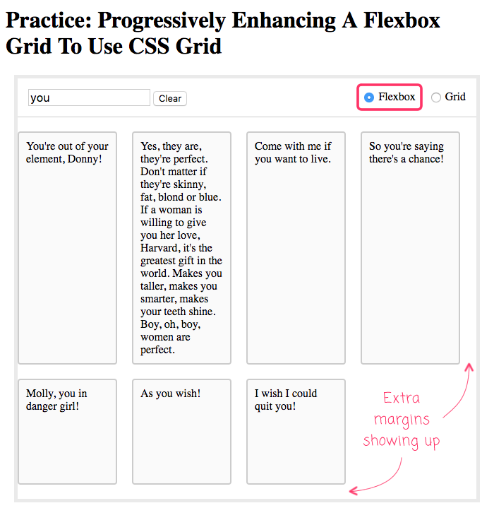
As you can see, the layout is "decent"; but, it has extra margins on the right and bottom of the grid. We could attempt to remove some of these margins by adding negative-margins to the parent container. But, when we do that, we start to run the risk of causing unwanted scrollbars.
I'm sure we could start to get more complex and add complicated work-arounds. But, the reality is, we want to free ourselves from the burden of having to have pixel-perfect layouts in all browsers. For an older browser, this layout is "fine". And, in modern browsers, we can upgrade the layout to use CSS Grid:
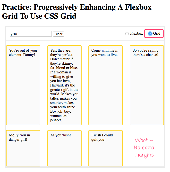
As you can see, once we enhance the layout to use CSS Grid, the layout is perfect! No extra margins and beautifully spaced table cells.
One of the nicest parts of the CSS grid is that you can define the number of columns such that "justify-content: space-between" works nicely even when you don't have enough items to fill the first row. Flexbox also supports "space-between"; but, since there is no concept of "columns" in Flexbox, it can lead to very odd spacing when there aren't enough elements in the last row.
Overall, the progressive enhancement approach adds some overhead; but, going from a Flexbox layout to CSS Grid layout really isn't all that bad - at least not in this particular experiment. I'm looking forward to sinking my teeth into this technology!
Want to use code from this post? Check out the license.

Reader Comments
Love that you're tackling fallbacks, which is where so much of the confusion happens (for me!). Doesn't look too crazy to fallback to IE11. I'd love to see what the unsupported experience looks like. Still viewable and usable?
@Chris,
Yeah, the fallback isn't so bad. It just has that unfortunate right-margin.
But, honestly, in general, I need to get more thought and experience behind my use of fallbacks and progressive enhancements. Specifically in the whole mobile-first mindset. I was working on something yesterday (not CSS Grid related) that need to degrade well on mobile. So I spend a few hours trying to "downgrade" the UI from desktop to mobile. Eventually, I got frustrated and started over with "mobile first" and then upgraded to a desktop layout. It was much easier -- just felt like I was fighting the CSS much less.
@Ben
I have the same problem, and I know you're right, but for some reason it's more difficult than it should be to switch from a desktop-first mentality. Ug!