
Sanity Check: Chrome 63 Still Causes Blurry Borders With Percentage-Based CSS Translation
The other day, I looked at creating slightly off-center elements using CSS Flexbox and "spacer" flex-children with a 40/60 flex-basis split. Afterwards, in an offline conversation that I was having with Matt Vickers - one of our lead front-end developers at InVision - he suggested using a CSS transform with a -50% translateX / translateY. In the past, I've shied away from using CSS transforms for "centering" purposes because I've seen it cause blurry content in the Chrome browser. But, it's been a while since I've experimented with it. As such, I wanted to do a quick sanity check to see if it's still happening. And, unfortunately, it appears that Chrome still renders half-pixels (causing blurry content) with percentage-based CSS translations.
Run this demo in my JavaScript Demos project on GitHub.
To see this in action, all we have to do is setup an element with an odd height and a -50% CSS translateX / translateY transformation:
<!doctype html>
<html>
<head>
	<meta charset="utf-8" />

	<title>
		Sanity Check: Chrome 63 Still Causes Blurry Borders With Percentage-Based CSS Translation
	</title>

	<style type="text/css">

		div.popup {
			background-color: #FFFFFF ;
			border: 1px solid #000000 ;
			border-radius: 4px 4px 4px 4px ;
			box-sizing: border-box ;
			font-size: 18px ;
			left: 50% ;
			padding: 20px 20px 20px 20px ;
			position: absolute ;
			top: 50% ;

			/*
				In this case, the height of the pop-up is being explicitly set to an ODD
				pixel value (201px). This is causing the -50% translation to move the
				element to a half-pixel location in Chrome, which is, in turn, causing
				borders to become blurry (both on the element and on embedded elements).

				DATE: 2018-01-06.
			*/
			height: 201px ;
			width: 400px ;
			transform: translateX( -50% ) translateY( -50% ) ;
				-ms-transform: translateX( -50% ) translateY( -50% ) ;
				-webkit-transform: translateX( -50% ) translateY( -50% ) ;
		}

		form {
			margin: 25px 0px 25px 0px ;
		}

		input {
			border: 1px solid #000000 ;
			font-size: 18px ;
			padding: 4px 6px 4px 6px ;
		}

	</style>
</head>
<body ng-controller="AppController">

	<h1>
		Sanity Check: Chrome 63 Still Causes Blurry Borders With Percentage-Based CSS Translation
	</h1>

	<div class="popup">
		This pop-up is positioned in the middle of the page,
		with ( -50% , -50% ) CSS transform.

		<form>
			<input placeholder="I am an input..." />
		</form>

		... and contains an input with a border.
	</div>

</body>
</html>
The odd height value causes the -50% translation to move the element up to a half-pixel location. Of course, changing the height of the element to be an even pixel value would fix this in Chrome; however, having explicit height control over a content container is rarely a possibility (not without some sort of JavaScript-based intervention). That said, the issue is clearly illustrated when you see a side-by-side screenshot of the demo with both an odd and an even pixel height:
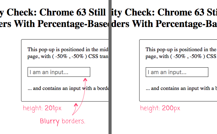
As you can see, the translateY(-50%) on the left causes the Div and Input borders to be blurry. And, the same demo on the right, with an even pixel height, causes no blurring at all.
You could argue that the difference is so slight that it's not worth worrying about. But, this blurry border situation is far too intense for my design OCD (Obsessive Compulsive Disorder) to handle. It's the very first thing that I see when I look at this page (and other pages that exhibit this behavior). So, for me personally, this potential blurring makes this particular approach to centering a non-starter; unless, I know exactly how tall the content container is going to be; or, I'm not using a percentage-based translation.
Want to use code from this post? Check out the license.

Reader Comments
I have had to resource to using tables to align stuff vertically lately because of this ;-(
@Guilherme,
It's frustrating, right? I've been trying to use Flexbox layouts more and more and have found them to be very useful, and with pretty solid support.
Still an issue in v69
@Lorin,
Meh :( Seems like they could so easily just round the px value and make this work. Must be much more complicated than it is in my head.
I had make myself a JS function to change the CSS translateY by 0.5px on my modals, because whole content of a modal was blurry.
Its quite simple, but works fine for my needs.
Your, and mine, OCD needs
backface-visibility: hidden;and atranslateZ(1)if using percentages.I ended up using:
position: absolute;
top: 50%;
-webkit-transform: translate3d(0,0,0);
transform: translateY(-50%);
I got this from here: https://github.com/mgcrea/angular-strap/issues/1234
On the parent container with the form. My whole form was blurry. This feels like it's an associated issue, but I don't know. Some good ideas in this thread at any rate just to try things out.
@Kat,
Another thing that I've become a huge fan of lately is using
flexboxto center things. If you have aflexcontainer, and the item inside it hasmargin:auto, then it will be centered vertically and horizontally. So, imagine that I had something like this:... then, the container will cover the entire viewport and the
forminside of it will be centered in the middle. I've started to use this approach more than translation; but, I just happen to be a huge fan ofcss flexbox, so I am a bit biased :D@JJ,
I've never heard of
backface-visibilitybefore. Looking it up on MDN, it's a curious property.@MiChAeLoKGB,
That's an interesting idea. If this were an Angular context, I could see putting something like that as an Attribute Directive right no the modal to perform the calculations in the background.
Seems to still be an issue in Chrome v76 for macOS.
This actually seems to affect images as well. The behavior we are seeing is compounded if the image has both an odd width and an odd height.