
CSS Flexbox: Aligning Content Slightly Off-Center
After recently learning about Flexbox and the flexible box model in CSS, I've been quickly falling in love with it. Everywhere I turn, it seems that there's some aspect of my user interface (UI) that can be simplified with Flexbox. The other day, however, I ran into a design scenario that had me a bit stumped. The designer wanted a dynamic piece of content to be positioned vertically, slightly off-center. At first, I tried playing with margin-percentages; but, that was a complete fail. Finally, I settled upon an approach that uses "spacer" items, in the flexbox children, to proportionally maintain the off-center position of the dynamic content.
Run this demo in my JavaScript Demos project on GitHub.
The content in question was a "content editable" element. Which means, the user can just click into the DOM (Document Object Model) and start typing. The more content the user enters, the taller the element becomes. And, as the editable item changes height, the product designer wanted it to remain slightly off-center:
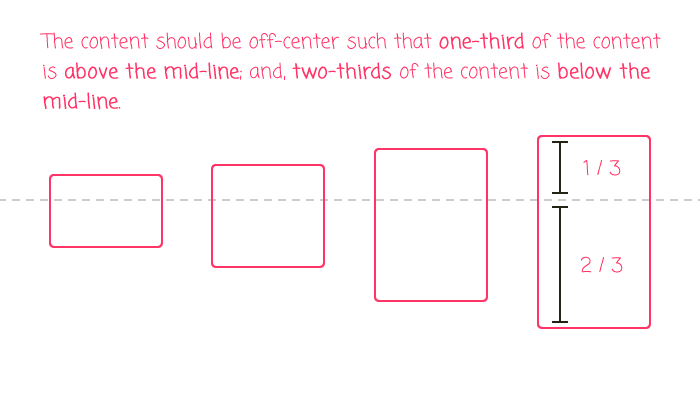
As you can see, when the height of the content grows, a proportional amount of it stays above the mid-line; and, a proportional amount of it stays below the mid-line. In order to accomplish this, I added two empty Span tags to the flex-container: a leading one and a trailing one. I then set both of these Span tags to have flex-grow and flex-shrink enabled; but, gave them a different flex-basis:
/**
* We have a Spacer element both before and after the "content". These spacers
* are what "center" the rest of the content. Notice that they have an uneven
* flex-basis (60% vs. 40%), which will cause the rest of the content to appear
* slightly off-center from the mid-line.
*/
span.spacer:first-child {
	flex: 1 1 60% ;
}

span.spacer:last-child {
	flex: 1 1 40% ;
}
Together, these two Span tags consume 100% of the left-over space in the flex-container. And, since the rest of the flex children are using a flex-basis of "auto", this 60/40 split should keep the inner-children positioned slightly off-center.
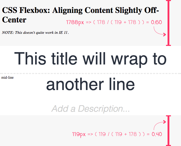
To see this in action, I put together a small demo that vertically off-centers a pair of editable elements:
<!doctype html>
<html>
<head>
	<meta charset="utf-8" />

	<title>
		CSS Flexbox: Aligning Content Slightly Off-Center
	</title>

	<style type="text/css">

		div.workspace {
			bottom: 0px ;
			display: flex ;
			flex-direction: column ;
			left: 0px ;
			position: fixed ;
			text-align: center ;
			right: 0px ;
			top: 0px ;
		}

		span.spacer {
			background-color: rgba( 0, 0, 0, 0.03 ); ;
		}

		/**
		* We have a Spacer element both before and after the "content". These spacers
		* are what "center" the rest of the content. Notice that they have an uneven
		* flex-basis (60% vs. 40%), which will cause the rest of the content to appear
		* slightly off-center from the mid-line.
		*/
		span.spacer:first-child {
			flex: 1 1 60% ;
		}

		span.spacer:last-child {
			flex: 1 1 40% ;
		}

		div.title {
			align-self: center ;
			color: #282F3D ;
			flex: 1 1 auto ;
			font-family: sans-serif ;
			font-size: 66px ;
			line-height: 150% ;
			margin-bottom: 20px ;
			max-width: 700px ;
		}

		div.description {
			align-self: center ;
			color: #CCCCCC ;
			flex: 1 1 auto ;
			font-family: sans-serif ;
			font-size: 34px ;
			font-style: italic ;
			font-weight: 100 ;
			line-height: 150% ;
			max-width: 700px ;
		}

		div.workspace::after {
			border-top: 4px dashed #EAEAEA ;
			content: "mid-line" ;
			font-size: 14px ;
			height: 0px ;
			left: 0px ;
			padding: 5px 5px 5px 5px ;
			position: absolute ;
			right: 0px ;
			text-align: left ;
			top: 50% ;
			z-index: -1 ;
		}

	</style>
</head>
<body>

	<h1>
		CSS Flexbox: Aligning Content Slightly Off-Center
	</h1>

	<p>
		<em>NOTE: This doesn't quite work in IE 11</em>.
	</p>

	<div class="workspace">

		<span class="spacer"></span>

		<div contentEditable="true" class="title">
			Add a Title...
		</div>

		<div contentEditable="true" class="description">
			Add a Description...
		</div>

		<span class="spacer"></span>

	</div>

</body>
</html>
As you can see, the two ".spacer" Span tags surround the editable content, acting as the first and last flex children. If we run this code in the browser and try to edit the content, you can see that the content remains proportionately off-center:
The nice thing about this approach is that I don't have to do any runtime calculations. As the content changes, the browser automatically adjusts the elements based on the flexible box model.
The downside to this approach is that I couldn't get it to work in IE11. It seems that IE11 has bugs around flex children and flex-direction: column. But, this could also be an issue with my relative inexperience with CSS Flexbox. If anyone has any suggestions, I am all ears.
Anyway, I just thought the use of "spacer" flex children was an interesting approach to aligning content slightly off-center. Flexbox continues to please and delight me. And, is letting me create dynamic interfaces with less and less code.
Want to use code from this post? Check out the license.

Reader Comments
Interesting technique. You could avoid the need for empty spans altogether though by applying the spacer code to `.wrapper:before` and `.wrapper:after`.
I think this would be even easier using CSS Grid though. Add a .inner-wrapper around the 2 content elements.
````
.wrapper { display: grid; grid-template-rows: 1fr auto 2fr; }
.inner-wrapper { grid-row: 2; }
````
That should get you the result that you are after. If you use autoprefixer and have it configured to work on css grid it will also display correctly in IE11.
If you have only just discovered flexbox and haven't discovered css-grid yet, prepare for your mind to be blown! :)
(PS. Can you fix your sites mobile responsive styles? Look at this page on a mobile sized screen)
@Daniel,
That's a really good point about using ":before" and ":after" pseudo elements. At the vest least, that would have kept the mark-up a little cleaner, I think.
As for CSS Grid - that is on my list of things to try and learn this year. I did read a bunch about it in Rachel Andrew's book:
www.bennadel.com/blog/3359-the-new-css-layout-by-rachel-andrew.htm
... but, I haven't actually tried playing around with it yet. It sounds like the support is pretty solid since all the browsers developed it at the same time. Will definitely be digging into that.
Re: mobile-layout ... yeah, it's kind of junky. I did a push last year to get it from completely fixed to "somewhat responsive"; but, I didn't quite know how to tackle the images, videos, and code snippets. Now that I know Flexbox, I'll re-tackle the problem this year.
@Ben,
Start off your css-grid learning by playing this game:
http://cssgridgarden.com/
There are also these games for helping you learn flexbox:
http://flexboxfroggy.com/
http://www.flexboxdefense.com/
You can start using css grid right now in production. The main issue is IE11.
Read this blog post to understand how to use grid in a way that supports IE11
https://rachelandrew.co.uk/archives/2016/11/26/should-i-try-to-use-the-ie-implementation-of-css-grid-layout/
The main things to worry about are:
- use autoprefixer with "grid" setting set to "true"
- no auto-placement of grid cells
- no grid-gap
- no grid-areas
- can only use "span" key word to span multiple columns (e.g. grid-column: 1 / span 2;)
RE: responsive
Responsive images are pretty easy.
img { max-width: 100%; height: auto; }
Done.
Responsive video is a bit harder. This blog post outines the responsive video technique:
https://css-tricks.com/NetMag/FluidWidthVideo/Article-FluidWidthVideo.php
Note that the padding bottom trick won't behave correctly when used on a flexbox or grid item in Firefox.
If you are using Sass for styling your css, you might want to try giving this media query mixin a go for handling your media queries:
https://www.npmjs.com/package/mq-scss
@Daniel,
Bro -- awesome stuff! I really appreciate you providing the resources! I'll will report back when the things are all more responsive!!
Responsive all the things!!!
Oh and one more thing.
*, *:before, *:after {
box-sizing: inherit; // makes responsive design much easier (prt 1)
}
html {
box-sizing: border-box; // makes responsive design much easier (prt 2)
word-break: break-word; //allows text to wrap if the full word doesn't fit in its container (Good for the display of links on mobile)
}
PS. I'm the author of that media query mixin ;)
@Daniel,
I'm always a little hesitant to attach selectors like "*" as I'm afraid it hurts performance. But, that might be a very outdated view -- I have to assume that the browser can apply some sort of optimization for *-based selectors so it's not working too hard.
I like border-box. Seems to the most sense most of the time (at least from a human-readable) stand-point. I like the suggestions. Especially for word-break - pretty sure I've never used that in my life :)