CSS Flexbox: Creating The InVision Avatar Row Widget
After recently reading The New CSS Layout by Rachel Andrew, I am feeling reinvigorated when it comes to learning modern CSS. And, what's more, everywhere I look, I'm seeing opportunities to replace float-based layouts with flex-based layouts. One such place is the little avatar-row widget in InVision. This widget is particularly interesting because the items in the row overlap in an order that is opposite to the natural stacking order of the Document Object Model (DOM). As such, I thought it would be a fun widget to examine.
Run this demo in my JavaScript Demos project on GitHub.
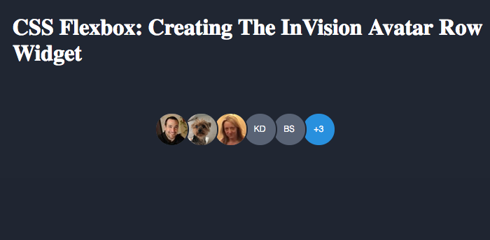
The avatar row widget in InVision displays a collection of avatars next to each other. But, each avatar is slightly offset so that it underlaps with the avatar before it. Using flexbox, we can easily lay the avatars out in a horizontal manner without floats; but, the overlapping of the avatars forces us to think about stacking-order.
By default (and this is a vast over-simplification of the stacking context rules), overlapping elements stack in the order in which they appear in the Document Object Model. As such, the second-child of a container would stack above the first-child; and the third-child would stack above the second-child; and so on. The is opposite to what the InVision avatar row widget is doing. Which means that we have to set some explicit zIndex values in order to create a reverse stacking order.
Luckily, we can create a stacking context with our avatar row container, which means that we can then stack the individual avatars in isolation to the rest of the page. We can then use :nth-child() CSS selectors to apply the explicit zIndex.
<!doctype html>
<html>
<head>
	<meta charset="utf-8" />

	<title>
		CSS Flexbox: Creating The InVision Avatar Row Widget
	</title>

	<style type="text/css">

		body {
			background-color: #1F2532 ;
			display: flex ; /* Flex container for UL. */
			height: 100vh ;
			margin: 0px 0px 0px 0px ;
		}

		h1 {
			color: #FFFFFF ;
			left: 20px ;
			position: absolute ;
			top: 0px ;
		}

		ul.avatars {
			display: flex ; /* Causes LI items to display in row. */
			list-style-type: none ;
			margin: auto ; /* Centers vertically / horizontally in flex container. */
			padding: 0px 7px 0px 0px ;
			z-index: 1 ; /* Sets up new stack-container. */
		}

		li.avatars__item {
			height: 49px ;
			margin: 0px 0px 0px 0px ;
			padding: 0px 0px 0px 0px ;
			position: relative ;
			width: 42px ; /* Forces flex items to be smaller than their contents. */
		}

		/*
			These zIndex values will only be relative to the contents of the UL element,
			which sets up its own stack container. As such, these will only be relevant
			to each other, not to the page at large.
			--
			NOTE: We could theoretically get around having to set explicit zIndex values
			by using "flex-direction: row-reverse" and using the natural stacking order
			of the DOM; however, to do that, we'd have to reverse the order of the HTML
			elements, which feels janky and unnatural.
		*/
		li.avatars__item:nth-child( 1 ) { z-index: 9 ; }
		li.avatars__item:nth-child( 2 ) { z-index: 8 ; }
		li.avatars__item:nth-child( 3 ) { z-index: 7 ; }
		li.avatars__item:nth-child( 4 ) { z-index: 6 ; }
		li.avatars__item:nth-child( 5 ) { z-index: 5 ; }
		li.avatars__item:nth-child( 6 ) { z-index: 4 ; }
		li.avatars__item:nth-child( 7 ) { z-index: 3 ; }
		li.avatars__item:nth-child( 8 ) { z-index: 2 ; }
		li.avatars__item:nth-child( 9 ) { z-index: 1 ; }

		/*
			These items are all 49px wide while the flex-item (in which they live) is
			only 42px wide. As such, there will be several pixels of overflow content,
			which will be displayed in a reverse-stacking order based on above zIndex.
		*/
		img.avatars__img,
		span.avatars__initials,
		span.avatars__others {
			background-color: #596376 ;
			border: 2px solid #1F2532 ;
			border-radius: 100px 100px 100px 100px ;
			color: #FFFFFF ;
			display: block ;
			font-family: sans-serif ;
			font-size: 12px ;
			font-weight: 100 ;
			height: 45px ;
			line-height: 45px ;
			text-align: center ;
			width: 45px ;
		}

		span.avatars__others {
			background-color: #1E8FE1 ;
		}

	</style>
</head>
<body>

	<h1>
		CSS Flexbox: Creating The InVision Avatar Row Widget
	</h1>

	<ul class="avatars">
		<li class="avatars__item">
			<img src="./ben.png" class="avatars__img" />
		</li>
		<li class="avatars__item">
			<img src="./lucy.png" class="avatars__img" />
		</li>
		<li class="avatars__item">
			<img src="./jill.png" class="avatars__img" />
		</li>
		<li class="avatars__item">
			<span class="avatars__initials">KD</span>
		</li>
		<li class="avatars__item">
			<span class="avatars__initials">BS</span>
		</li>
		<li class="avatars__item">
			<span class="avatars__others">+3</span>
		</li>
	</ul>

</body>
</html>
In this code, we're actually using nested CSS flexbox containers. First, the body element is a flex container, which is being used to vertically and horizontally center the UL element - its only flex item. Then, the UL turns around and acts as a flex container for the LI elements, which are laid out horizontally. Notice that the LI elements have an explicit width of 42px while the content elements have an implicit width of 49px (45px + 4px border). This will cause the content to bleed outside of the flex item, overlapping with the sibling element. And, because each nth-child has a decreasing z-index, we get the following stacking order:
I think this looks pretty cool. It's frustrating to have to apply the z-index values. But, it's not really much more work with the nth-child() CSS selectors.
One of the interesting features of flexbox is that the visual rendering of the elements doesn't have to match the order of the elements as they appear in the DOM. In fact, we can reverse the visual order of the avatars in this demo by using flex-direction: "row-reverse". This provides us with a "questionable" opportunity to refactor the avatar widget without having to use z-index.
NOTE: I say "questionable" because there is something that feels very janky about having the visual order and the elemental order being in conflict. It feels like we're fighting HTML semantics. I am not sure how I feel about it; other than to say it feels janky and unnatural. But, maybe that feeling will change over time.
Remember, the natural stacking order within a stacking context follows the document order of the elements. So, if we can order the avatars backwards in the DOM, we can get the same stacking order without the use of a zIndex. But, at that point, the visual order of the elements will also be backwards. Until we apply flex-direction: "row-reverse". This will take out backwards list of DOM elements and render then as if they were not backwards, giving us the desired visual order and the desired stacking order:
<!doctype html>
<html>
<head>
	<meta charset="utf-8" />

	<title>
		CSS Flexbox: Creating The InVision Avatar Row Widget (Row-Reverse)
	</title>

	<style type="text/css">

		body {
			background-color: #1F2532 ;
			display: flex ; /* Flex container for UL. */
			height: 100vh ;
			margin: 0px 0px 0px 0px ;
		}

		h1 {
			color: #FFFFFF ;
			left: 20px ;
			position: absolute ;
			top: 0px ;
		}

		ul.avatars {
			display: flex ; /* Causes LI items to display in row. */
			list-style-type: none ;
			margin: auto ; /* Centers vertically / horizontally in flex container. */
			padding: 0px 7px 0px 0px ;

			/*
				By using the row-reverse layout, the visual ordering will be opposite of
				the DOM ordering. This will allows us to stack the items in the opposite
				direction of the natural stacking order without having to mess with the
				zIndex value. The MAJOR DOWNSIDE is that the HTML itself now reads
				backwards, which super janky.
			*/
			flex-direction: row-reverse ;
		}

		li.avatars__item {
			height: 49px ;
			margin: 0px 0px 0px 0px ;
			padding: 0px 0px 0px 0px ;
			position: relative ;
			width: 42px ; /* Forces flex items to be smaller than their contents. */
		}

		/*
			These items are all 49px wide while the flex-item (in which they live) is
			only 42px wide. As such, there will be several pixels of overflow content,
			which will be stacked using the natural DOM-based stacking order.
		*/
		img.avatars__img,
		span.avatars__initials,
		span.avatars__others {
			background-color: #596376 ;
			border: 2px solid #1F2532 ;
			border-radius: 100px 100px 100px 100px ;
			color: #FFFFFF ;
			display: block ;
			font-family: sans-serif ;
			font-size: 12px ;
			font-weight: 100 ;
			height: 45px ;
			line-height: 45px ;
			text-align: center ;
			width: 45px ;
		}

		span.avatars__others {
			background-color: #1E8FE1 ;
		}

	</style>
</head>
<body>

	<h1>
		CSS Flexbox: Creating The InVision Avatar Row Widget (Row-Reverse)
	</h1>

	<ul class="avatars">
		<li class="avatars__item">
			<span class="avatars__others">+3</span>
		</li>
		<li class="avatars__item">
			<span class="avatars__initials">BS</span>
		</li>
		<li class="avatars__item">
			<span class="avatars__initials">KD</span>
		</li>
		<li class="avatars__item">
			<img src="./jill.png" class="avatars__img" />
		</li>
		<li class="avatars__item">
			<img src="./lucy.png" class="avatars__img" />
		</li>
		<li class="avatars__item">
			<img src="./ben.png" class="avatars__img" />
		</li>
	</ul>

</body>
</html>
As you can see, there is no use of z-index in this code. But, the order of the flex-items has been reversed in the HTML. However, since we're using flex-direction: "row-reverse", we get the desired output in the browser:
This works. But again, something about this feels janky and unnatural.
In the end, this avatar row widget doesn't use all that much flexbox. But, in a way, that's kind of the point - you don't need that much flexbox to start reaping a lot of the benefits of flexbox. In this demo, it didn't do much more than replace the use of CSS floats. But, it feels much cleaner.
Want to use code from this post? Check out the license.

Reader Comments
@All,
As a follow-up, I just finished "CSS Grid" - the latest video course from Wes Bos:
www.bennadel.com/blog/3403-css-grid-a-free-video-course-on-the-css-grid-layout-by-wes-bos.htm
It's a really good course - highly recommended.