
Exploring CSS Specificity With Shadow DOM Styles In Angular 2.4.1
UPDATE - December 28, 2016: I ended up solving this problem by moving my global stylesheet into the shadow DOM styling of my root component. This normalizes the attribute selectors across the entire component tree.
A couple of months ago, I was experimenting with the idea of moving [almost] all CSS into the component tree of my Angular 2 app. Meaning, instead of having something like an "app.css" file, I'd move all of the "app.css" content into the simulated shadow DOM of the root component. After all, wouldn't it make sense for the "app component" to fully own "app styles"? In the comments of that post, however, Amy challenged the general concept of shadow DOM styling in the context of a flexible UI (User Interface). And, while I think there's a bigger philosophical discussion there, it did make me want to build out a better mental model for CSS specificity in Angular 2's simulated shadow DOM implementation.
Run this demo in my JavaScript Demos project on GitHub.
If you've used CSS (Cascading Stylesheets), you are probably familiar with the concept of "specificity". Specificity is the calculation that the browser uses when trying to figure out how to apply CSS rules to a given element. Properties within CSS rules that have higher specificity override properties within CSS rules that have lower specificity.
In the past, I've experimented with calculating the relative specificity of arbitrary CSS selectors. It's a fun exercise to perform. And, it shows us that CSS specificity is broken up into a few groups (in order of increasing specificity):
- Type selectors (e.g., h1) and pseudo-elements (e.g., :before).
- Class selectors (e.g., .example), attributes selectors (e.g., [type="radio"]) and pseudo-classes (e.g., :hover).
- ID selectors (e.g., #example).
When thinking about Angular 2's simulated shadow DOM, the ordering of these groups becomes important because Angular's simulated shadow DOM uses attribute selectors for name-spacing. In fact, it uses two different attribute selectors:
- [ _nghost-* ] - Applied to the host element.
- [ _ngcontent-* ] - Applied to the content elements within the host template (ie, the shadow DOM).
The internals of the shadow DOM aren't terribly interesting. After all, they are meant to be hidden away - mere implementation details of the component. But, the host element is not an implementation detail. In fact, the host element is the public face of the component - it's the only portion of the component that can be seen by the outside world.
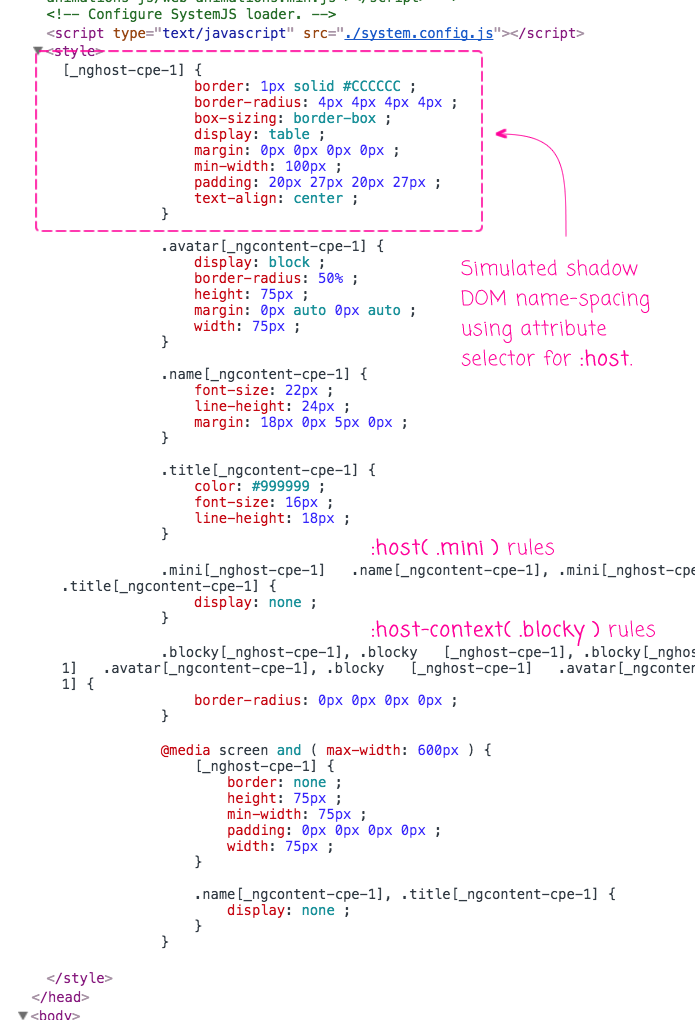
This poses an interesting CSS specificity problem. Consider an Angular 2 component called "info-box". With the simulated shadow DOM, Angular will generate CSS definitions that look like this and inject them in to the HEAD element:
[ _nghost-cpe-1 ] { .... }
.div[ _ngcontent-cpe-1 ] { .... }
.img[ _ngcontent-cpe-1 ] { .... }
Now, imagine that the info-box component has a default display of "inline":
[ _nghost-cpe-1 ] { display: inline ; }
... but, I want to make all instances of "info-box" have "block" display in my application. So, I add a global style for the custom element selector:
info-box { display: block ; }
Unfortunately, this won't work. My CSS rule is using a "type selector" which has a lower specificity than the "attribute selector" used by Angular 2's simulated shadow DOM. As such, the browser will override my custom CSS properties with the "more specific" ones provided by the component itself.
To see this in action, I've created an Angular 2 component, info-box, that renders an avatar, a name, and a title. In this case, I'll be experimenting with the "margin" property; but, the same rules would hold true for any :host-level CSS property:
// Import the core angular services.
import { ChangeDetectionStrategy } from "@angular/core";
import { Component } from "@angular/core";

@Component({
	selector: "info-box",
	inputs: [ "avatarUrl", "name", "title" ],
	changeDetection: ChangeDetectionStrategy.OnPush,
	styles: [
		`
			:host {
				border: 1px solid #CCCCCC ;
				border-radius: 4px 4px 4px 4px ;
				box-sizing: border-box ;
				display: table ;
				margin: 0px 0px 0px 0px ;
				min-width: 100px ;
				padding: 20px 27px 20px 27px ;
				text-align: center ;
			}

			.avatar {
				display: block ;
				border-radius: 50% ;
				height: 75px ;
				margin: 0px auto 0px auto ;
				width: 75px ;
			}

			.name {
				font-size: 22px ;
				line-height: 24px ;
				margin: 18px 0px 5px 0px ;
			}

			.title {
				color: #999999 ;
				font-size: 16px ;
				line-height: 18px ;
			}

			/* -- variations - host class targeting. -- */

			/*
			:host( .mini ) {
				margin: 10px 0px 10px 0px ;
			}
			*/

			:host( .mini ) .name,
			:host( .mini ) .title {
				display: none ;
			}

			/* -- variations - parent / ancestor (ex, <body>) class targeting. -- */

			:host-context( .blocky ),
			:host-context( .blocky ) .avatar {
				border-radius: 0px 0px 0px 0px ;
			}

			/* -- variations - media query targeting. -- */

			@media screen and ( max-width: 600px ) {
				:host {
					border: none ;
					height: 75px ;
					min-width: 75px ;
					padding: 0px 0px 0px 0px ;
					width: 75px ;
				}

				.name,
				.title {
					display: none ;
				}
			}
		`
	],
	template:
	`
		<img [src]="avatarUrl" class="avatar" />

		<div class="name">
			{{ name }}
		</div>

		<div class="title">
			{{ title }}
		</div>
	`
})
export class InfoBoxComponent {

	public avatarUrl: string;
	public name: string;
	public title: string;


	// I initialize the component.
	constructor() {

		this.avatarUrl = "";
		this.name = "";
		this.title = "";

	}

}
In the root component, I then instantiate two instances of this component:
// Import the core angular services.
import { Component } from "@angular/core";

@Component({
	selector: "my-app",
	template:
	`
		Before components.

		<info-box
			avatarUrl="./sarah.png"
			name="Sarah Connor"
			title="Freedom Fighter">
		</info-box>

		<info-box
			avatarUrl="./sarah.png"
			name="Sarah Connor"
			title="Freedom Fighter"
			class="mini">
		</info-box>

		After components.
	`
})
export class AppComponent {
	// ...
}
Notice that the second info-box has class "mini" applied to it. When we run this code, Angular 2 generates the simulated shadow DOM styles and injects them into the HEAD element:
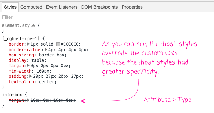
Now, let's add some global styles to try and override the margin:
/*
	CAUTION: This one does NOT WORK because the ELEMENT selector has
	less "specificity" than the ATTRIBUTE selector that is being used
	by the simulated shadow-DOM:
	--
	Element < Attribute
	--
	As such, the more-specific :host margin overrides this margin.
*/
info-box {
	margin: 16px 0px 16px 0px ;
}

/*
	CAUTION: This DOES WORK. Since the ATTRIBUTE and CLASS selectors
	are at the same level of specificity, this selector becomes more
	specific that the one being used by the simulated shadow-DOM:
	--
	Element + Class > Attribute
	--
	As such, this more-specific margin overrides the :host margin.
*/
info-box.mini {
	margin: 16px 0px 16px 0px ;
}
Notice that in the first rule, I am just using the type selector and in the second, I'm using both the type selector and the class selector (which is would target the second info-box on the page). Now, when we run this app, and look at the styles applied to the first info-box, we can see that it didn't work:
But, if we look at the styles applied to the second info-box, with the "mini" targeting, we can see that it did work:
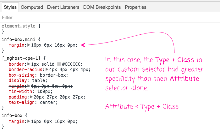
That said, don't let this fool you - this worked by coincidence only. Meaning, if the .mini styles in the info-box component also had a margin, our custom styles would not have been applied. So, the second case only worked because the internals of the info-box component didn't have overlapping CSS properties.
To see some more exploration of this, watch the video.
This is an interesting problem. And, to be honest, it's one that I'm not entirely sure how to solve. Clearly we need a way to provide default styles for the host element, which can be done with the :host rules in the simulated shadow DOM. But, we also need a way to be able to override those default styles, which can't be done with a type selector. We could start to add arbitrary CSS classes; but, this seems heavy-handed. Truly a problem worthy of deep thought.
Want to use code from this post? Check out the license.

Reader Comments
@All,
Something that Tero Parviainen just pointed out to me is that in "true shadow DOM" functionality, the :host{} styles actually have lower specificity than the parent page:
https://www.html5rocks.com/en/tutorials/webcomponents/shadowdom-201/#toc-style-host
> One gotcha is that rules in the parent page have higher specificity
> than :host rules defined in the element, but lower specificity than a
> style attribute defined on the host element. This allows users to
> override your styling from the outside. :host also only works in the
> context of a ShadowRoot so you can't use it outside of Shadow DOM.
So, it seems that this is just a byproduct of the "simulation" / "emulation" of the shadow DOM.
@All,
I figured out a fix, which in retrospect makes sense - will try to post in the morning.
@All,
The solution I came up with was to move the global styles into the shadow DOM styling of my root component:
www.bennadel.com/blog/3204-solved-css-specificity-and-shadow-dom-overrides-in-angular-2-4-1.htm
... doing this "normalizes" the Attribute selectors across the entire component tree, essentially cancelling each other out. This leaves you with the CSS rules that you are used to thinking about.
Stop thinking about styling documents and applications the same way.
When you style a document it is a simple matter to write with semantic mark up. This lets you easily control presentation for use in multiple situations.
Application interfaces are not documents. Each item in the UI has at least two competing semantics. For example a button represents both a button and the thing it does. While CSS mixins will ameliorate the issue by allowing high level style composition, they are only a partial solution.
Instead, we should build themeable components with a well defined, documented interface for presentation.
We should look to decades of prior art in desktop UI toolkits; uderstand how they handle presentation and customization of elements.
Remember that any customization hook you allow becomes part of the interface you must support. Unrestricted use of CSS is dangerous because it has a huge implicit interface footprint.
@Mark,
I think I tend to agree with your point of view. There is something that feels fundamentally different between "content" and an "Application Interface", even though they may be powered by the same technologies. Sometimes like the difference between throwing a random JavaScript SCRIPT tag on the page vs. having a module loading systems that allows for a robust architecture. Same technology, very different mindset.
That said, I wish I knew more about the history of app UI to pull from. That's what they say about the programming world - we keep trying to reinvent the world, over and over.
@All,
This morning I sanity-checked the behavior of "styleUrls" in the Angular component meta-data. Turns out, I had been making a very poor assumption - that shared styleUrls would create duplication in the compiled assets. This is, in fact, not true:
www.bennadel.com/blog/3372-sanity-check-shared-style-urls-are-only-compiled-into-angular-5-0-1-once.htm
... the shared styleUrl just gets compiled as a single module and the required into each consuming component (at least in the way I am compiling with Webpack). This is very exciting because it means that much of what would have been higher-up in the component tree can actually be moved down into various components where it becomes much more clear and locally-scoped from a view-encapsulation standpoint.