Thinking In (A Different) Context - A Prototype For User Experience (UX) Designers
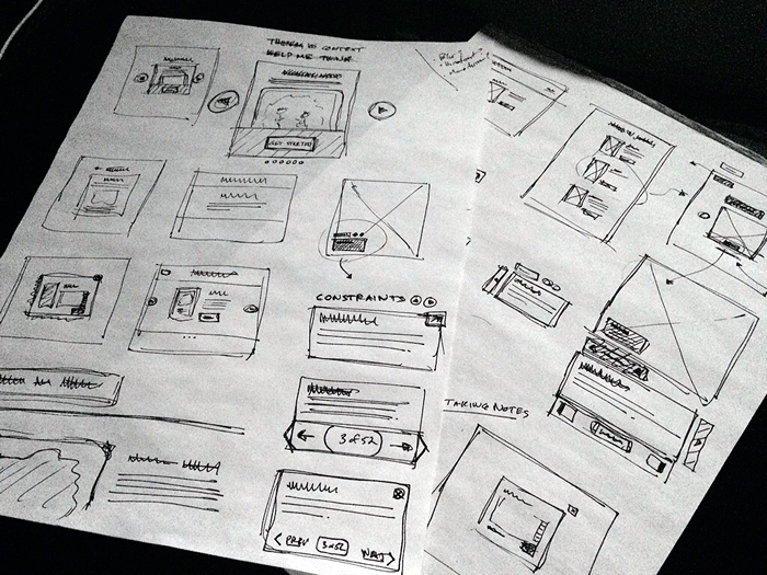
When I'm working on a prototype, my first step is always sitting down and sketching out ideas. I have the perfect pen and a stack of unlined paper pads ready to go. I keep my sketches small and rough - the right balance of detail and workflow; enough to get the machinery firing, but not so fine-grained that I'm married to any particular aspect.
Try running this prototype for yourself on InVision.
I use the sketches in order to construct a foothold into an idea. And, once I have enough of a foothold, my next step is to create a detailed digital prototype using Adobe Fireworks and InVision. Since I'm a user experience (UX) engineer, and not a graphic designer, I always work in grayscale - you don't want me picking out colors. Of course, when it comes to solving business problems, I truly believe that low-fidelity is the new high-fidelity.
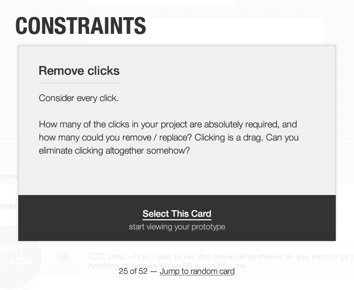
Once I have a digital prototype in play - something that I can click through and get a better sense of - I'll often start using design-inspiration tools like "Mental Notes". This, and card decks like "Constraints," are awesome for helping you view the application in a different way, coming at it with a different context and a different perspective. It's kind of like "guided meditation" for design. It's still your creative process; but, sometimes you just need someone else to point you in a new direction, throw you off-balance, and force you to use new mental muscles.
A while back, I had an idea to try and build this kind of feature into InVision. A sort-of guided-thinking application for your InVision prototype. So, I put together a crude demo and tried to shop it around the product team. Unfortunately, it never got any traction. But, I still think it's an interesting idea. So, the other morning, I sat down - again - and tried to sketch out some fresh ideas. Then, yesterday, I spent a few hours converting those sketches into an InVision prototype, which you can run here.
The idea is basically to frame the prototype in the context of these various design inspiration tools. So, as you're clicking through your various workflows, you can do so while thinking about a particular problem, constraint, or aspect of human behavior and motivation.
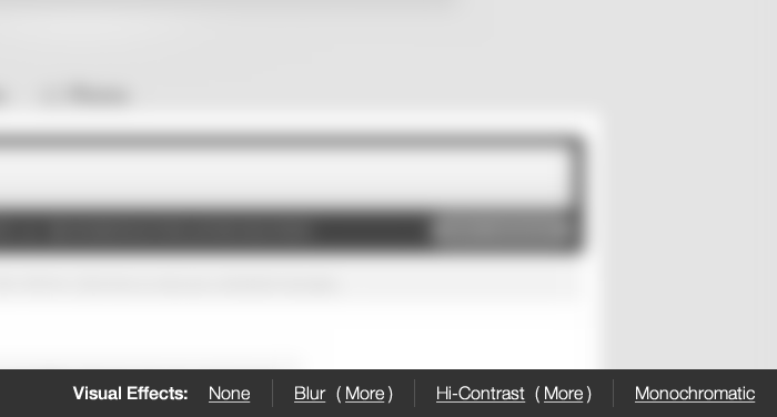
I thought it would also be interesting to provide some graphic tools so that you could tweak the visual experience in order to skew your own perspective. For example, in my prototype, I have tools for blurring, increasing the contrast, and rendering the images in monochrome. To be honest, I have no idea if these effects would have any value; but, I thought it might help to pinpoint areas of the application that were ambiguous, overly noisy, or perhaps lacking a clear call-to-action (CTA).
While I love thinking about product design and user experience, I do spend the majority of my time (these days) with the technical aspects of InVision App. So, if nothing else, this was just a fun exercise in flexing a muscle that I don't get to use as much as I'd like to. If anyone has any feedback on this idea, I'd love to hear it. And, if you think this might be an idea worth pursuing, that would also be wonderful to hear.


Reader Comments
@Ben, I think it's a great idea. I love the idea of grouping concepts together contextually and would personally love to see this come to fruition. I love GoodUI (http://goodui.org/) for this very reason. Have you seen this site?
@Chris,
Cool - glad this connects with you. I'm not familiar with that Good UI site; but, at first glance, it looks really good. I'll have to give it a more thorough look after work. Thanks!