
The User Experience (UX) Of Design Thumbnails
At InVision App, we often have heated debates about the importance of thumbnails vs. the importance of naming conventions. I am the loud minority that loves naming conventions; everyone else loves thumbnails. Until recently, I had only ever argued my point based on gut-feelings; but, in the last few days, I've had a moment of great clarity: The complexity of our applications is ever-increasing. And, as the complexity of user-interactions increases with it, the value of thumbnails will diminish greatly, perhaps to the point of insignificance.
It used to be that the designs of application interfaces each had very distinct looks. This is because page-state and micro-interactions were part of the percentage-of-design-effort that was often deferred to the Development phase (and perhaps even deferred to the developer herself). As such, each design file (and its exported JPG or PNG) had high-contrast when compared to the others. This contrast was then carried over to the scaled-down thumbnail.
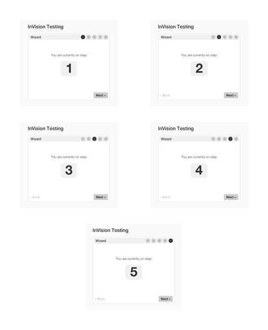
To demonstrate my point, here are the thumbnails of the designs that I often use to build and test InVision App features:
| |
|
|
||
| |
 |
|
||
| |
|
|
Even at a quick glance, one can easily spot the visual differences between these thumbnails, and therefore, should be able to quickly select the desired design file. But, that's because these are "test designs" and are intended to be obviously different.
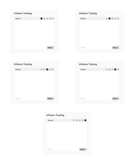
Now, take a look at the same set of thumbnails, this time with the primary differentiator removed:
| |
|
|
||
| |
 |
|
||
| |
|
|
If you move your eye back and forth, you can probably spot that the circles in the top-right change on each thumbnail; but certainly, differentiating between the thumbnails - and ultimately selecting the correct thumbnail - is at least an order of magnitude harder.
And, that's on a set of design files that only incorporate 3 visual elements (title, navigation, and buttons). Imagine working with a set of design files in which the changing portion - the states and micro-interactions - only accounted for a tiny fraction of the visual noise. Selecting the correct thumbnails would become an unnecessarily difficult task.
Ultimately, I believe that the only approach that will maintain its efficiency over time, as our applications get more complex, is to prioritize naming and downgrade thumbnails as a "nice to have" convenience. Now, naming things is not easy. In fact, it is often said of Computer Science:
There are only two hard things in Computer Science: cache invalidation and naming things. -- Phil Karlton
I am not hailing "naming" as the "easy" alternative. I'm hailing it as the "viable" alternative - as the alternative that maintains its usability as the number of design files increases.
Naming conventions also have the added benefit that they provide data that an application, like InVision App, can consume. It's very hard, technically, for an application to consume the visual differences between designs; but, files names - text data - can be easily consumed and leveraged to provide a better user experience.
For example, as a random idea, imagine that InVision App would automatically create screen dividers based on file names such that a double-dash [--] would indicate an implicit section title. Then, the application could take the following design file names:
- home--empty_state.png
- home--activity.png
- home--activity_expanded.png
- projects--empty_state.png
- projects--active_screens--default.png
- projects--active_screens--hover.png
- projects--archived_screens--default.png
... and automatically create the following sections:
- Home
- + Empty State
- + Activity
- + Activity Expanded
- Projects
- + Empty State
- ---- Active Screens
- ---- + Default
- ---- + Hover
- ---- Archived Screens
- ---- + Default
I'm not saying this is a prefect idea; I'm simply pointing out that naming conventions provide long-term value to the user in two ways: user consumption and application consumption.
As the complexity of our applications increases, and the number of micro-interactions increases, the value (and therefore the role) of design thumbnails is going to decrease. In its place, I think that naming conventions provide a powerful alternative with many potential benefits. But, not without the cost of evolution. We are in the design age; and as User Experience designers, we are charged with growing into the role that is being demanded of us. In this case, it means bringing the same level of consciousness to our file names as we do to our designs.

Reader Comments
I'm with you Ben. I prefer organizing by name. I'm in the InvisionApp almost daily. With each new project my screen-to-screen differences become less obvious and I find reordering the thumbnails to be tedious.
I love the idea of creating screen dividers based on some naming standard.
+1 for naming conventions.
@Perry,
Thank you! I'm happy to know I'm not the only crazy one :D