Using Four-Sided Positioning In CSS (Cascading Style Sheets)
Typically, when it comes to positioning elements with CSS (Cascading Style Sheets), I am used to using two-sided positioning; that is, I define two of the four offsets on a given element. This is most often "top" and "left"; but, I make frequent use of the "bottom" and "right" offsets as well. Recently, however, as I was going through some of the code that Ryan Jeffords was working on, I noticed that some of his UI (User Interface) elements had four-sided positioning; that is, he defined all four offsets - top, right, bottom, and left - on a single element. To be honest, I didn't even know this was possible. But, upon some light testing, this approach appears to be quite well supported.
To see what I'm talking about, take a look at the following code. In it, we have two nested elements. The outer element has a "fixed" position relative to the page. The inner element has an "absolute" position relative to the outer element. Neither of these elements has any defined width or height; they simply rely on the four offsets to resize the boxes in a fluid manner.
<!DOCTYPE html>
<html>
<head>
	<title>Four-Sided Positioning With CSS</title>

	<style type="text/css">

		div.fixed {
			background-color: #E8E8E8 ;
			border: 1px solid #CCCCCC ;
			bottom: 20px ;
			left: 20px ;
			position: fixed ;
			right: 20px ;
			top: 75px ;
			}

		div.absolute {
			background-color: #FFFFCC ;
			border: 1px solid #FFCC00 ;
			bottom: 50px ;
			left: 50px ;
			padding: 30px 30px 30px 30px ;
			position: absolute ;
			right: 50px ;
			top: 50px ;
			}

	</style>
</head>
<body>

	<h1>
		Four-Sided Positioning With CSS
	</h1>

	<!-- This will be FIXED on the page. -->
	<div class="fixed">

		<!-- This will be ABSOLUTE to the Fixed div. -->
		<div class="absolute">

			CSS Positioning, For The Win!

		</div>

	</div>

</body>
</html>
As you can see, no width or height is being defined on any of the elements. And yet, when we render this page, we get the following output:
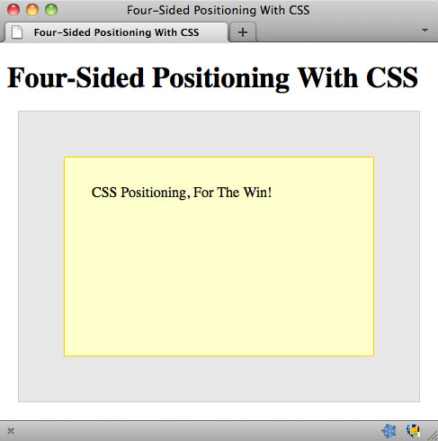
As you can see, each element is rendered exactly as we would hope it to be rendered! I tested this on Firefox, Chrome, Safari, and IE7-9. This worked across the board.
NOTE: IE7 and IE8 testing was done using IE9 on a Windows 7 machine when the IE browser was put into IE7/IE8 rendering mode. I am not sure how accurate that is; but, I assume they know what they are doing.
Furthermore, since no width was defined, neither the "border" nor the "padding" values have an additive affect on the final width of any of the elements. This is particularly exciting as it will make creating complex user interfaces much easier.
I don't know if this four-sided position approach is well known in CSS. Before looking at Ryan's code, I can't remember ever seeing it in action - I'm pretty sure it would have blown my mind at the time. If you weren't aware of it, I hope this post helps. I'm definitely gonna be making much more use of this four-offset position going forward. And, just in case it wasn't obvious, you can also make use of three-sided position as well.
Want to use code from this post? Check out the license.

Reader Comments
Just like Flex. It's very nice, but you have to be careful about using padding for the container being position. It'll throw things off. User margins on inner children to push them away from the edges.
I can't believe I never thought to try this before...
@Andy,
Yeah, I've definitely seen it done in Flex. In all the demos and keynotes, they always have that cool little widget in the bottom-right where they lock down all the sides. I was always secretly jealous :) As far as the margins, though, I think it only becomes an issue if the inner element has a defined width... which, in all fairness, it probably will *most* of the time.
@Gary,
Right?! I just assumed this wasn't possible. It would be too easy ;)
The padding sizing issue was always a pain in my rear. UNTIL I found out that you can specify a different box sizing model via CSS.
The standard box model uses padding when calculating the overall width. So, if you have a div with a css width of 100px and add 10px padding to each size, the REAL width will be 120px.
If you use the border-box box model for that same div. 100px wide + 10px padding on either side. The actual width will be 100px and the inside of the box will be padded by 10px on either side.
This was a huge breakthrough for me...
Here's a relevant link: http://www.quirksmode.org/css/box.html
Ben,
Perfect timing. I knew (assumed) 4-sided was possible, as I had used left and right + top previously.
What I plan on using this for is in combination with MOD and a WinPhone 7/Win8 "look".
Thus the page would look something like this:
Home Search Link1
Link2 Link3 Link4
Link5 Link6 Link7
But maybe it would adjust if the browser was resized down to:
Home
Search
Link1
...
Or
Home Search
Link1 Link2
...
IE6 and IE7 screenshots: http://gyazo.com/fad7909f9830dc5600cf92a87336faa2
@Ben D,
Yeah, the box model can be funky stuff to think about. One of the ways I've started to deal with it is to have an outer container that handles the dimensions; and then, to have an inner buffer to handle the paddings and what not. Sometimes, I definitely miss the old IE-style box model.
@Randall,
It sounds like a "media query" might also help your stuff. I know nothing about media queries; but, I think they can help take screen dimensions into account by applying specific styles.
@Vladikoff,
Yeah, I didn't even test in IE6. In fact, IE9 doesn't even provide an IE6 option. Basically, not even Microsoft cares about IE6 any more :D
Ah, yes, I appreciate the reminder.
http://www.w3.org/TR/css3-mediaqueries/
The short version:
<link rel="stylesheet" type="text/css" media="screen" href="sans-serif.css">
<link rel="stylesheet" type="text/css" media="print" href="serif.css">
Other media types (http://www.w3schools.com/CSS/css_mediatypes.asp):
all Used for all media type devices
** handheld Used for small or handheld devices
aural Used for speech and sound synthesizers
braille Used for braille tactile feedback devices
embossed Used for paged braille printers
print Used for printers
projection Used for projected presentations, like slides
screen Used for computer screens
tty Used for media using a fixed-pitch character grid, like teletypes and terminals
tv Used for television-type devices
about ie6 support:
ie6 doesn't support
You can emulate it with
but it's slow and bad practice overall ( like using ie6 )
Indeed, this technique is very useful. I use it a lot for what I call "inner shadow". If I use box-shadow with the `inset` keyword, I have few control on opacity.
See http://jsfiddle.net/tbassetto/gyZhg/ => If you comment the line with the "four-sided positioning" and uncomment the one above (using with and height at 100%), the result is not what I expect :)
@Ben,
I do this (top, right, bottom, left) too, but only in strict mode. You don't want to attempt it in IE quirks mode.
Unfortunately, that includes TRYING to use IE strict mode but someone putting an HTML element (even just an HTML comment) above the doctype. That's pretty easy to do in ColdFusion with shared look-and-feel cfincludes/customtag and a new employee not knowing how to use the routines properly.
But when it works, here's how it works: Suppose you've specified left and top. If you give width, right is calculated. If you give right, width is calculated. If you give height, bottom is calculated. If you give bottom, height is calculated.
I've also done it the other way around. Suppose you've specified right and bottom. If you give height, top is calculated. If you give top, height is calculated. If you give width, left is calculated. If you give left, width is calculated.
To sum up, to specify bounds on an absolutely positioned element, you need exactly two of left, right and width, and you need exactly two of top, bottom and height.
Seems like an interesting technique, but I'm having trouble coming up with a good use-case for it. In the example given, the same result can be accomplished using margin instead.
Ben,
Microsoft actually has a neat tool (I know, hard to believe) for their own browser testing that comes with their IE10 Platform Preview
http://ie.microsoft.com/testdrive/Info/Downloads/Default.html
You put the page in and choose the version you want to view it in from the 'Debug' menu.
Careful if using it with browser checking logic, as it will still make your application believe it's being viewed in IE 10.
What you find funny is you can view it in IE 5, but like you said, I think they have given up on IE 6 as it's not even an option =)
@JGarrido,
Here's an excellent use case: a "C clamp" (different kinds of navigation on top, left and bottom, roughly forming the shape of a letter C), with a non-navigational content region that's dynamically expandable both to the right and down.
Or an "O clamp". You don't see too many good examples of O clamps. MapQuest doesn't do that anymore, ever since their navigational overload was featured so prominently as something never, ever to do in Nielsen's Designing Web Usability.
Or a box that you'd like to end at a fixed pixel distance from the right edge, rather than a percentage of the available width, which varies according to window size.
Oh wow, what a great technique. This is definitely something I would've liked to know a long time ago.
@JGarrido, P.S.:
In answer to your alternative suggestion of using margin, that doesn't work with absolutely positioned elements.
Specifically, if you specify top and left, but not right, bottom, height or width, an absolutely positioned block will be sized just like an inline-block. That is, it will have the minimum height and width necessary to accommodate its contents. Margin has no effect.
In order for a div to naturally expand to the width of its container, it has to be rendered "in the document flow". Absolute positioning takes a block out of the document flow. As far as its container is concerned, it's as if it didn't even exist. Absolutely positioned elements take up 0 pixels in the document flow.
Not to denigrate your post, but I just remembered where I first saw this. http://www.alistapart.com/articles/conflictingabsolutepositions/ for what it's worth.
There's a workaround for getting IE <7 to work.
Hmm, have been using this for a lot of personal projects (e.g. http://ngtunes.hosting.apriol.com [CHROME only for optimal display, it will start working in the future in other browser as well once HTML5 becomes more common]). But as far as the box model itself goes: http://www.css3.info/preview/box-sizing/
@Stryju,
Yeah, I basically don't care about IE6 anymore... it's time to let go :) I'm think the fact that it's supported (fixed position) in IE7 is good enough for me. I am not typically building things that cater to such old systems.
@WebManWalking,
I'm not exactly sure what you're saying. When I'm using a 4-sided position, I am not setting height or width (thought I might for a parent container). It depends on the situation.
@JGarrido,
A cool use-case for it might be having a visual module. Then, someone performs an action and you show a "modal" over the module. Instead of having to calculate the dimensions of the module, you can just use 4-sided positioning to make sure the "modal" (which is really a hidden child of the module) covers it completely.
@Jim,
MS has actually been doing some good stuff for Dev lately, as far as testing goes. I'm pretty happy with it!
@Jon,
Good link, thanks! I had seen other ALA posts about positioning, but not that one in particular.
@David,
Good example of exactly the kind of stuff that this sort of position can make easier!
Quick question about this technique with relative positioning. I was playing around with this and tried position: relative for the containing element. Shouldn't the result be the same? Or is it broken because position: relative does not remove from document flow and fixed does? Forgive me, I am not as experienced as most and tend to over-think CSS positioning. Thanks in advice!
Thirteen years later, I learned something totally new about four-sided positioning—it works in conjunction with
marginas well:www.bennadel.com/blog/4662-using-margins-with-four-sided-positioning-in-css.htm
This kind of breaks my brain!