
Most CSS Floats Can Be Replaced With Relative And Absolute Positioning
First off, I'm not a CSS expert. So, let that frame what I'm about to say: The vast majority of "float" styles can be replaced with some form of relative and absolute positioning. Whenever possible, I try to avoid using "float"; and so far, it has been working out quite nicely.
Obviously, some situations require float; if you need rows and columns (and it doesn't call for a Table element), you're gonna need to float those elements; if you need pixel-perfect white-space that can't be achieved using "inline-block," you're gonna need to float. But, in most other cases, "float" seems like an incorrect "gesture."
I can't necessarily explain why I feel so strongly about this. It's just in my gut. I don't like "float." And, I really don't like "clear." And, I definitely don't like using ":after", as part of a clear-fix, inside of an element, like a UL, that syntactically shouldn't contain anything other than LI elements.
At this point, you probably think I'm crazy. That's fair - I won't be offended if you stop reading. But, if you're curious, replacing "float" with relative and absolute positioning is rather easy; you just need to understand how absolute positioning works:
... position it at a specified position relative to its closest positioned ancestor ...
The key here is "positioned ancestor." Notice that this definition doesn't make any statements about how the ancestor is positioned - simply that it has an explicit position. This means that we can have an absolutely positioned element inside a relatively positioned element. And, this fact allows us to get rid of most floats.
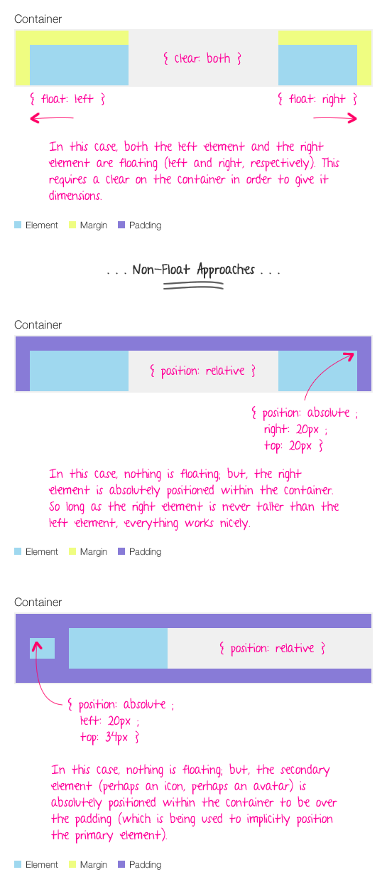
In the following graphic, I am trying to show two common use-cases where floats can be replaced with positioning. In the first case, we have two elements on different sides of a container. In the second case, we have two elements on the same side of a container.
| |
|
|
||
| |
 |
|
||
| |
|
|
In both cases, the container's layout is naturally filled by the primary element. In other cases, I may give the container an explicit height if I know what it's supposed to be.
This approach isn't a cure-all for "float" CSS; floating is still a necessary part of managing complex layouts. But, once you understanding positioning (especially four-sided positioning), I think you'll find that you use float less and less.
Reader Comments
In your first example you rightly point out that the element needs to be smaller then the left element, but this is a point of failure, in a lot of cases, you might not be able to control the the height of the content.
Your second example is how I've been approaching that type of scenario for a few years now, but anything that needs a container to grow with height, really shouldn't be using absolute positioning.
Give credit where it's due :) Once something is absolutely positioned, there is no way to force containing elements to hold it; its not useful for say putting to columns next to each other with a footer below, unless you know the exact content of the columns. For the situations you describe, yeah, its probably way easier to absolutely position them.
Interesting, but I think that you would need to consider the situation before applying this rule across the board.
For example, for SEO purposes, you might want navigation links to appear in the code closer to the top of the page so that the search engines give the content more importance, but you may want to display the actual links in the footer or somewhere else in the layout. In that case, an absolute position would be good.
One argument against using absolute positioning vs floats is that it makes the site style sheet harder to maintain and you have to worry more about pixels vs general placement of elements. Also - you could run into elements overlapping each other.
I think you need to consider each case separately and decide which is the best approach for the situation and understand why you are making that choice.
Personally, I like absolute position in the header where the content is not likely to change often, and I like to use floats in content areas where I don't have to keep track of width and height issues at the pixel level.
The whole thing is a hack, really. We are still dealing with the problem that a web browser was never intended to do layout and the DOM assumes top/down, left to right rendering and you have to break out of the flow to arrange things differently...
Float is a difficult property to get one's head wrapped around because many look at the smaller picture (how does 'float' affect my element compared to what I want to do) vs the big picture (understanding document flow).
Float is all about adjust "document flow", which is the method by which elements position themselves to one another naturally as you traverse down the document.
When you float an element, you are essentially removing them from the normal document flow and then adjusting how elements flow around them. Position and Float are different properties, but after often used with one another to achieve the desired result.
When you state 'relative' position, you are positioning yourself relative to where you would normally appear. If you had a 20x20 image inline in a paragraph and then you performed a:
img { position: relative; top: -20px; }
You would move the element up 20px, but the browser would still reserve the original "space" that the 20px image took because you have not adjusted the element's document flow (float), just its position.
Now change that to:
img { position: absolute; top: -20px; }
And all of a sudden the space the image took up is now gone (because absolute positioning removes the document from flow) and the point of positioning becomes the nearest parent element that is given a positioning property. It starts from that element's 0,0 and puts the img 20 px above that. This is why absolute positioned elements ignore float properties.
When you float an element, you're adjusting its location in the document flow, which yes, does often visually move it, but is not considered a positional property.
I think floating and document flow is one of the more challenging facets of CSS, but putting effort into getting that Eureka moment and comprehending how flow functions will definitely help the developer understand both when (and which) to use.
I usually actually feel strongly about not using relative and absolute positioning, but rather using floats. (Note: I never use clearfix.) With floats, it's natural to position elements on the page as blocks that can push eachother around, and have them reposition themselves depending on the available space in a way that makes sense. On the other hand, using relative and absolute positioning is like forcing elements to be at a specific position without taking into account the natural document flow.
Where your caveat most certainly would apply is the floating of elements further down a containing element, most commonly seen when needing to offset some sort of call-out box amongst body paragraphs.
Example in the wild: http://www.npr.org/blogs/thetwo-way/2013/10/02/228396228/shutdown-solution-theres-none-to-be-seen-just-yet
Achieving the same effect is difficult and hacky if not impossible using absolute positioning.
Though I think the main point of this post holds up well: there's many instances where floats aren't really the best approach, but are used because at some point absolute positioning was labeled 'evil' and a best practice to avoid.
If you need content to be next to each other, and there is no clear "primary" element that is responsible for the height of a container, then you will have to use floats. This is why I went with "vast majority" of cases, not "all" floats.
Perhaps I am biased by the types of layouts I generally build. In my context, things are usually fairly clear-cut. Things have specific dimensions and there is usually only *one* element (if any) in a given location that needs to be a flexible size.
As far as maintenance of the site and the CSS overtime, I don't personally find it harder to change; that said, it doesn't change that often. So, again, that might just be my personal experience.
@Chris,
Your link (to NPR) makes me think that I should point out something important that maybe I didn't consider. I mostly build web *applications*, not content-driven sites. Though the lines between such things is getting more blurry every-day, perhaps an "app" has a much more predictable layout than a content site?
@Ben
I definitely feel both position and float have their place in web design, and many times we develop personal "snippets" of associated functionality once we've used such properties over and over in our apps.
I can see many things which are UI-centric to the site design may be more prone to using positioning than floating, since a document's content is what is usually "encased" in the site UI, so the outer has to let the inner flow naturally.
Speaking of CSS, have you ever used LESS? I'm in love with it. Not only for the myriad of developer-centric functions it gives to CSS (variables in your CSS!), but I freaking LOVE how it allows me to nest my CSS rules. I could write:
body {
background: white;
p { color: red; }
}
And it would create:
body { background: white; }
body p { color: red; }
automatically. I now have a CSS code format that feels natural and more easily allows me to find my rules. My only beef is that my IDE doesn't support LESS syntax. I'm holing that CF Builder 3 does, cause I plan on getting that.
Using position 'relative' and 'absolute' is IMO the correct way when working with layouts. In your second example you're absolute positioning the icon or the avatar. Is there any reason for not using relative positioning here? In this case it is relative to the document flow. I find myself using position:absolute when I want to position the element to the right.
Also, I use float only when I have to wrap an image with text.
@Aaron,
LESS is awesome!!! I started using it at InVision App and have been using it ever since. It definitely makes creating CSS waaay easier; though, I know that some people criticize it for making selectors that are too deep. But, it's been great for cross-browser vendor-prefix stuff. And, the variables have been awesome for cache-busting:
@version: 20121002;
background-url( "/img/stuff.png?@{version}" );
... so nice!
I still haven't learned all the mixin and templating stuff; I can only do some basic stuff. But, still love it.
@Sagar,
In this case, I'm not using relative position because I don't want the "space" for the element to be kept in the flow of the document. The absolute position takes it out of the flow and positions, almost in another layer (how I mentally visualize it).
I'd like to suggest that you can remove the whitespace from inline-block elements quite easily that is 100% cross-browser compliant. Either comment it out:
Or, just butt the elements together:
Or finally, just minify your HTML.
Either way, I'd highly recommend against messing with absolute positioning as you'll end up trading a very simple issue, the unwanted white-space that is solved extremely easily (see above), for a whole lot of other issues concerned with absolute positioning.
Now, there is something you have not mentioned, and that is the use of the CSS property display: table and display: table-cell. Those two properties can give you some very powerful layout features baked right in.
Anyway, take it from someone who has been laying out websites and apps for almost a decade, you really want to leverage inline-block and table-cell as much as possible. You are right to avoid float; it was never intended for layouts, and as such, is a hack.
Absolute positioning can work, but it does not come cheap or free of troublesome side-effects.
Just my two cents,
Justin
For someone that's severely neglected their front end layout skills, does anyone have a particular book or reference they'd like EXTREMELY recommend? I'm intermediate CSS for all intents and purposes except layout, so only looking for layout knowledge. Thanks.
@Justin,
I've had to use your comment-approach when dealing with Bootstrap's center-aligned pillnav elements; they need to be butted up against each other and deal with that AND center alignment AND block(ish) display ... it seemed to be the only solution.
I've started to get into inline-block more than I have in the past. Table-cell style layout is not something that I have played with yet. Looking at caniuse.com, it looks like IE started supporting in IE8. There are definitely parts of my app that I can use that for then (though parts of my apps, the more public aspects, tend to try to support earlier).
That said, I don't find that positioning really has much cost to it. But, that might be the type of layouts I'm building.
@David,
Hmm, not off the top of my head. I've read some decent CSS books in the past; but, they were all old, before browser has such excellent support for Zoom In/Out. It used to be you had to be so careful about using "px" since browser couldn't override it, so it seemed like SO MUCH of what I read was dealing with using "%" and "em" and all kind of fancy-footwork to enable proper scaling. But, now that browsers can zoom no matter what, I think some of those techniques are unnecessary.
That said, I'm still *not* on the responsive-design bandwagon. But, it looks like is the *hot* thing these days.
Much gracias.
Thanks so much for this post and discussion. I have had extreme difficulties with CSS as I am really more of a programmer and better at working with functionality and things like database rather than asthetics or look-feel. As such, I have been a programmer/developer at least 3 times with companies that employed full-time designers to deal with the asthetics of site design. As such, I didn't have to work with CSS or design-related tasks more, but I did sometimes run across them as I was programming functionality into a site and had to fit elements or whatever into the design that had been created by our brilliant designers.
Honestly, one of the companies I worked for used table layouts, and I learned how to do that, and I know it is a total TABOO and no-no to use tables...using divs and css is much preferred, and there is a BIG push to go 100% totally table-less, but for programmers like me, tables just seem SO MUCH EASIER to control the design/layout. I guess I am just too controlling. :-D
Since I'm a programmer and not so much of a designer, CSS has at times frustrated me and even to the point of making me want to pull out my hair! I understand the idea that using tables is BAD and we should always use CSS and DIVs for page layout, and CSS is cool, and I enjoy screwing around with it from time to time, it just is frustrating to me and seems not to work in the way I think it should. I know that is due to my lack of understanding, but still...
Anyway, I recently came across a problem that I thought I'd mention, because it seems to relate. For context, we were using bootstrap framework to help with the scaling problem. The layout of the page had 3 boxes near the top under the page heading (with the logo, etc.) The boxes were determined to be a certain size. (we, by the way, took the "min" part of bootstrap out in the end, because we decided not to have this particular page scale, and these 3 boxes were part of the reason). Anyway, withing these boxes was a heading, descriptive text, and a button. The button was supposed to come to the same place within all 3 boxes, no matter how big the text ended up being...and there was a maximum length the text could be. Anyway, I was screwing with absolute and relative positioning and couldn't get that particular button to come to the exact same right place using those. Now...let me just say that it could have very well had to do with the "containers" and that the button could've somehow been in the wrong container, so that may have been why absolute and relative position was screwing me. But I also played with float as well, and that didn't do too much satisfactorily with me either...I never achieved the desired result that way. HOWEVER...what I did that worked, was I used something called min-height. That worked like a charm and did exactly what I wanted it to do! I'm not bragging here on myself or calling myself a CSS genius by any stretch of the imagination. I stole the idea for min-height from someone else...it was not my baby. I snatched some of our designer's code and looked at it, looking for clues to solve my problem and came across it that way. (many props to him).
I just wanted to mention that in case anyone else is reading this and happened to come across this particular issue when trying to work with CSS...and maybe they wouldn't be pulling their hair out working with this for hours and going bald. :-)
@Aaron...LESS sounds awesome. I especially like the idea of using variables in CSS...something I've been wanting to do for quite awhile. In the past, I always had to vary which CSS I used within the code itself to vary and control my design, but using variables within actually CSS itself is something I always thought would be very desirable. Thanks for bringing that up and bringing that to my attention.
@Cindi V...WOW...you sound extremely knowledgeable about SEO...I'd sure love to pick your brain as the company I am working for is very concerned with that in the webs we develop, but I don't wanna go completely OT on this post of Ben's (well, any more than I probably already have)
@Everyone...thanks for all of your contributions. Happy programming!!! :-)
@Anna,
2 things. 1. Yes, LESS *IS* awesome. Check it out! You're a developer at heart, so having the ability to programmatically affect your CSS files should be right up your alley! Plus, it's one of the VERY FEW sites that references technical aspects with great documentation and readability (love their site). Too many times people are put off learning because sites feel that 10pt fonts and walls of text are the best method to teach newcomers about the tech. Simply is never the case.
That aside, to your main point... You need to embrace CSS. I know that many many people get into the mindset that "Developer" and "Designer" have to be 2 separate things. In truth, yes, each is a career unto itself, but you are really doing yourself a disservice by not learning CSS inside and out.
Many developers associate CSS with design simply because many of the attributes of CSS modify how an element LOOKS, but what you're more interested in is how that element's FLOW within the document can be modified by CSS. Without comprehension of document flow, CSS can seem daunting and outside your realm of responsibility. But once you understand how elements in a document interact with one another, and how CSS-properties can affect the way they position themselves to one another, you can take confidence in utilizing the power CSS has over these objects to ensure that your site not only is programmatically smooth, but respects the document flow as well.
I'm glad to see, too, that you know that tabular layouts are bad; this too, made many developers uneasy to learn CSS; but again, it's about understanding flow and positioning, not about assigning a pretty shade of purple. So it's paramount that you get yourself to a level of comprehension where you can predict what will happen if you modify an element's document flow.
Developers love tables because tables are structured how developers think. Columns, rows. They see the page split up into a grid, and by controlling simple cell width and heights, they can position elements where they need. Break free of this crutch! I recommend TeamTreehouse.com (sorry for linking, Ben) as they explain things visually by video, and then give the user the opportunity to test out what they saw with code challenges. A great learning resource.
What you need to do, is not get into the act of labeling. Calling yourself a "Developer, not a Designer" simply is a way of excusing yourself from expanding your skill sets. Remember, A+B is always more enticing to people than A OR B.
As for your problem, without that comprehension of document flow, "screwing around" with values is basically akin to just taking stabs in the dark. I understand it's the best you can do at that point; but what may be happening here, and I know it sounds horrible, is that browsers can have issues themselves with how they render the document model. These are the reasons why CSS hacks were invented, and why the CSS "acid test" was used to help ensure that browsers not only supported CSS across the board, but that they rendered the DOM appropriately as well.
But I think we can all agree here, that NONE of us like flailing around for answers; even if we haphazzardly come across a solution that "works", not knowing why it does is, at least for myself, VERY frustrating. I don't like working in such a reactive manner; I'd rather be proactive and KNOW how the document flow works, so that I can apply the fix and see the result I expected; but we all work within our means and its understandable that we're all learning new things all the time. Heck, this field is NOTORIOUS for people having to learn stuff through trial and error rather than structurally. But I won't get into that snafu.
@David,
TeamTreeHouse.com. I whole-heartedly recommend them. I don't know about you, but I learn things SIGNIFICANTLY faster by visualization. Reading, for me, is a last ditch effort.
TTH plays a video which discusses the CSS topics at hand (among other subjects), and once that is done you're taken to 1 of 2 different places next:
1. A quiz, to help ensure that you're comprehending the video's subject matter that was just shown. This is usually a process of 1-6 questions, multiple choice.
or
2. A Code challenge. This is a great tool where an instruction is presented at the top (related to the topic you just watch) and there are 2 panes below. The one on the left allows you to write code, and the one on the right, renders what you have in the left. There is a button for SUBMITTING your answer and REFRESHING/UPDATING the right panel with the code you have in the left.
It may ask "Create a style for the paragraph tag and set it's padding-top to 10px." So you're write: "p { padding-top: 10px; }" in the left panel, and if you want, could press UPDATE to see it take effect in the right panel, before submitting it for review.
If you're correct, it provides you with a couple more test cases to show you comprehended the subject presented.
Really a great resource that ranges from basic styling to positional document flow properties as well down the line.
@Anna,
I feel bad for joining in on this hijacking (sorry Ben), but since Aaron mentioned Treehouse, I figured I'd mention CodeSchool.com. You can see there HTML/CSS classes here: https://www.codeschool.com/paths/html-css
The one thing I like about them is how they break up the tutorials with well executed, interactive coding quizzes. I pay for my team's subscription; there's about 5 of us. They all seems to really like the format they provide.
We were going back and forth between them and Treehouse, but ended up choosing CodeSchool. Either way, good luck!
@all...my thing was long, sorry.
Thanks, guys (@Aaron and @Justin) for the resources. I'll check them out!
@Aaron, you hit the nail on the head about the comfort with tables and it being similar to the way I think...I was honestly just thinking about that. My thought patterns and processes can be, believe it or not, pretty linear, and I think tables are more like the way my thoughts flow as opposed to the other methods of writing code to control the layout of a page.
I'm trying to keep this short, so I'll just say Adios and thanks everyone for your contribution!
Thanks man! Very useful little fix for the annoying float!
This site has a short but useful guide: http://learnlayout.com and this has also some good snippets and blog
http://css-tricks.com/
http://css-tricks.com/all-about-floats/
wow this article is terrible. Always use floats, only absolute positioning if you have to. Also this article also is terrible across multiple platforms, devices, and resolutions.
@Elyse,
Lol, you obviously don't know anything about UI engineering.
@Greg,
lorem
Hi Guys. I wonder if you can you help please ?
I've just finished my new website and testing it in all browsers. It works fine in Chrome, Firefox and IE but in Safari the background images and many other images on the page do not show. This happens on some pages of my site, but not all. I have a Windows OS and the version of Safari is 5.1.7 .
I have noticed in the code view that one part of the <section id =" aboutArea"> is underlined green on the pages which don't work properly. If I hover mouse over that green underlined bit, the following text appears:
"If one or more absolute - position elements are placed within a relatively positioned element with no assigned dimensions, either no scroll bar will appear at all, or it will not indent far enough to view all of the content. (Note : this bug will not affect your page if the content in the AP element does not extend beyond the height of view point. Affects: IE 6.0 likelihood: possible."
www.mongolia.co.uk home page does not show background images in Safari.
www.mongolia.co.uk/mongolian_visa.html works OK even in Safari and there is no green underlining of the code.
Many thanks.
I couldn't agree more! floats can be a nightmare when you have multiple columns stretching across the page and multiple rows. Bootstrap do a good job of floats though in their grid system.