I Just Got Badass(er) - UNCIVILIZED Brand Clothing By Mario Valero
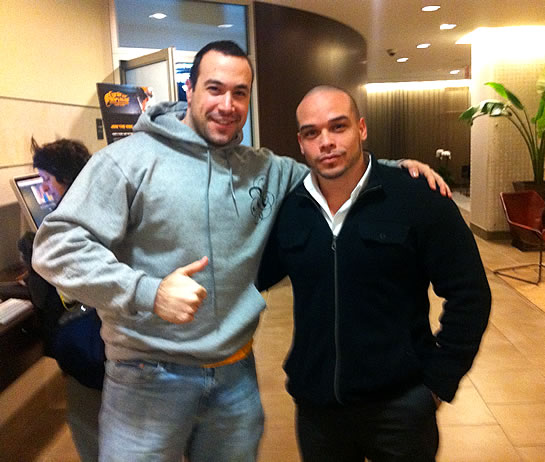
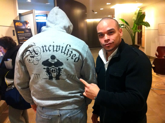
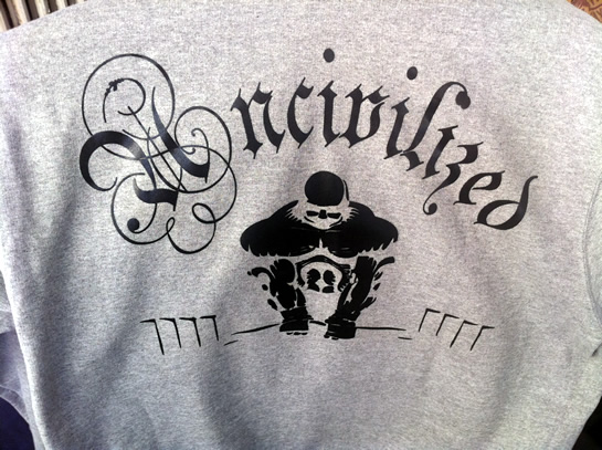
My good friend and amateur powerlifter, Mario Valero, recently showed me his latest UNCIVILIZED Brand design concept - a massive dude deadlifting some serious weight. As a long-time weight lifter and gym enthusiast, I saw this and simply had to have it! The graphic is just too badass. I immediately custom-ordered one in my colors of choice and, after some giddy anticipation, went to pick it up this morning from Mario himself.
| |
|
|
|
|
| |
 |
|
||
| |
|
|
| |
|
|
|
|
| |
 |
|
||
| |
|
|
| |
|
|
|
|
| |
 |
|
||
| |
|
|
Upon receipt, Mario told me:
"Now that you have the sweatshirt, you gotta live up to the brand."
Challenge accepted!!
Reader Comments
Well, I'm not badmouthing your buddy, but in all honesty, I'm not too impressed with the logo.
Luckily I had the chance of reading the logo before I made the connection between the slug name and the brand, and it took me about 4 seconds to determine the word was "Uncivilized" (the font used is known as a "display" font, which are flamboyant and can be very edgy, but may not be too easily readable.
As for the graphic, I actually couldn't make heads nor tails of what it was. At first I thought it was a gorilla sitting squat on the ground and I was trying to make out shapes into recognizable forms.
Once you made mention of him lifting dead weights, I figured out it was just the upper torso above where the bar is and that put everything into focus.
Branding's a rather important aspect of getting one's company and image out there, making sure the logo works well as a single color, at small sizes, etc. can all factor into a successful logo design.
I hope that doesn't come off negative, it's just my take on it; I'm sure it clicks very well with a lot of people too. Such a profession wants to exude power, strength and a nasty (badass) disposition. :)
It's a common font treatment in acid and death metal, and I think the suggestion of power with the angle of light on a very simple black / shadow treatment on the lifter is complementary to the font. Sure, it's a display font and it probably works better on paper than a sweatshirt, but I'm guessing the overall effect evokes exactly what Mario (and Ben) are looking for. Very cool, Ben.
If you replaced the barbell with a little laptop that would make a cool logo for your blog Ben ;)
@Aaron,
Aside from being a fellow weight lifter, Mario is also embedded in the motorcycling community. In fact, I believe his clothing line is / was originally targeted at that crowd. Perhaps this type of design is much more prevalent in that group?
I suggest this only because the moment I saw the graphic of the deadlifter, I knew exactly what it was. When I said I needed one immediately, this was not a hyperbole. Of course, the type of graphic on my sweatshirt is so endemic to world of lifting, that I am sure my brain is fine-tuned to see it.
The font, on the other hand, I do find a bit hard to read.
@Jason,
Thanks :) I know that Mario did recently get a slew of orders for this specific shirt; so, clearly, something is working.
@Darren,
Ha ha ha, awesome!
@Ben,
Yeah, it seems that a variance on olde time calligraphic fonts is a favorite of quite a few sub cultures; and getting a font that works perfectly with the nature of a company is a key element to successful logo design; so to that end, I think the font style is right up the alley of weight-lifting.
I've yet to figure out if anyone had said this (but will take credit of no one does), but like Murphy's Law, there seems to be a law out there that the more responsible you become with a project or familiar to an item, the less objectively you can perceive it, and the more subjective all your opinions become of it.
When I make a website, I'm so familiar with how it works in my mind, that if a client gets stumped somewhere, my first response (never vocalized) is "Are you kidding? It says right HERE to do THIS. Why are you doing THAT?)
But it's because I'm so familiar with it that I cannot see it objectively. :)
Needless to say I wish your friend much success with his business. Mayhaps you can turn him into the amazing power that is ColdFusion? :D
@Aaron,
Ha ha, I know exactly what you mean. One thing that I am trying to work on personally is my ability to empathize. When I am too familiar with a subject matter, it's almost impossible, as you say, to see it the way others do.
Your design is so nice in your pictures, I like the back view of that dress so nice design with great creativity. Thanks for such a nice blog.