Giving (click) Anchor Links Tab-Access Using A Directive In Angular 7.2.15
Ever since reading Accessibility For Everyone by Laura Kalbag, I've become much more aware of the accessibility failings in my own user interface (UI) architecture. One of the first things that jumped out at me was the fact that anchor links <a> that use the (click) directive in Angular (and lack an href attribute) can't be accessed using the Tab key. Furthermore, they can't be invoked, ie "clicked", using the Enter or Spacebar keys. As such, I wanted to see if I could use a simple Directive in Angular 7.2.15 to unilaterally expose anchor links to Keyboard controls.
Run this demo in my JavaScript Demos project on GitHub.
View this code in my JavaScript Demos project on GitHub.
Directives are such a subtle part of the Angular experience, it's easy to not even be cognizant of just how powerful they are. But, they are truly stunning! Directives are, in my opinion, one of the features that makes Angular a clear leader in the JavaScript Framework landscape. This becomes more obvious when you see how simple it is to retrofit your Angular application with Tab-accessible links without having to change any of your HTML markup.
To demonstrate, let's look at a simple App component. This App component has two sets of anchor links - one set that will be retrofitted with Tab-accessibility; and one set that will use the [x-no-tabbing] attribute to explicitly skip the retrofitting:
// Import the core angular services.
import { Component } from "@angular/core";

// ----------------------------------------------------------------------------------- //
// ----------------------------------------------------------------------------------- //

@Component({
	selector: "my-app",
	styleUrls: [ "./app.component.less" ],
	template:
	`
		<p>
			<a href="#">Native Href link</a> (experiment control)
		</p>

		<p class="actions">
			<a (click)="logClick( 'Item one' )">Item One</a>
			<a (click)="logClick( 'Item two' )">Item Two</a>
			<a (click)="logClick( 'Item three' )">Item Three</a>
			<a (click)="logClick( 'Item four' )">Item Four</a>
		</p>

		<!-- NOTE: The [x-no-tabbing] attribute will cause demo Directive to be omitted. -->
		<p class="actions">
			<a x-no-tabbing (click)="logClick( 'Item one' )">Item One</a>
			<a x-no-tabbing (click)="logClick( 'Item two' )">Item Two</a>
			<a x-no-tabbing (click)="logClick( 'Item three' )">Item Three</a>
			<a x-no-tabbing (click)="logClick( 'Item four' )">Item Four</a>
		</p>
	`
})
export class AppComponent {

	// I log the click event.
	public logClick( value: string ) : void {

		console.group( "Clicked Anchor" );
		console.log( value );
		console.groupEnd();

	}

}
As you can see, both sets of links are using the (click) Directive to trigger an action in the component - in this case, it's just logging the click event to the console. Notice, however, that there is nothing special about these links from a markup stand-point. They look just like any (click)-based links that you would create in your Angular application.
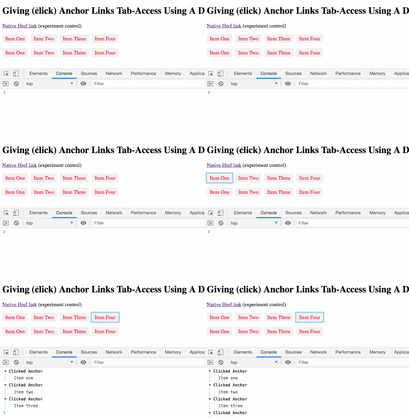
If you were to run this in the Browser and attempt to Tab-through the links, what you'd see is that the first set of links can be accessed (and invoked with the Enter and Spacebar keys); and, that the second set of links is completely skipped:

In order to expose the (click) links to the keyboard-based navigation and invocation, I added a small Directive that binds to the a element and augments the runtime functionality of the link:
// Import the core angular services.
import { Directive } from "@angular/core";

// ----------------------------------------------------------------------------------- //
// ----------------------------------------------------------------------------------- //

@Directive({
	selector: "a[click]:not([href]):not([role]):not([tabindex]):not([x-no-tabbing])",
	host: {
		// Adding [tabindex] allows tab-based access to this element. The "0" indicates
		// that the tabbing order should follow the native DOM element ordering.
		"tabindex": "0",
		// Adding [role] tells screen readers that this "link" is really a "button",
		// in that it triggers an action, but doesn't navigate to a new resource.
		"role": "button",
		// Adding (keydown) allows us to translate the Enter and Spacebar keys into a
		// "click" event. This is the native behavior of a Button; so, we are trying to
		// mimic that behavior for our "link button".
		// --
		// NOTE: This is perhaps a good "code smell" that we should be using a Button
		// instead of a link for this host element.
		"(keydown.enter)": "$event.preventDefault() ; $event.target.click() ;",
		"(keydown.space)": "$event.preventDefault() ; $event.target.click() ;"
	}
})
export class TabbingClickDirective {
	// ....
}
This Angular Directive is so simple, it doesn't even have any internal logic. It's just a collection of host bindings that augment the <a> instance. In this case, I'm adding the following:
[tabindex]- By adding thetabindexattribute, it ensures that the Element is accessible by Tab-based navigation. The0value tells the browser to use the natural ordering of the DOM (Document Object Model) when determining the order in which to make the Element available.[role]- By adding the WAI-ARIA (Web Accessibility Initiative - Accessible Rich Internet Applications)roleofbutton, we are telling screen readers that this link doesn't navigate to a new resource; but is, instead, used to trigger a discrete action within the application.(keydown)- By adding thekeydownbindings, we're translatingEnterandSpacebarkey-events into triggers of the link. This allows the user to both tab-to and invoke the link without having to use the mouse.
ASIDE: All of this behavior is implicitly provided by the Browser if we use a
buttonelement instead of anaelement. But, that's a conversation for a follow-up post.
By adding this directive to a "Shared Module" (a common Angular practice), the entire Angular application will immediately have Tab-accessible anchor links. Of course, this may not always be the desired effect. So, I tried to use a selector that only applies the Directive if none of the augmented attributes already exist. Also, you can see that it uses :not([x-no-tabbing]), which allows for an explicit escape hatch.
Can we just stop for a second and think about how cool this is? I just used an Angular Directive to seamlessly retrofit my application with accessible links. No post-render enhancement; no global key-event binding; no "hacking"; just native Angular mechanics.
One of the most compelling features of the Angular framework is just how easy it is to extend. Extending DOM events; extending DOM Elements; adding custom Elements (ie, Components). It all just happens so seamlessly. In this case, you can see how easy it is to upgrade the link elements in Angular 7.2.15 to be Tab-accessible.
Tab Accessibility in the Firefox Browser on MacOS
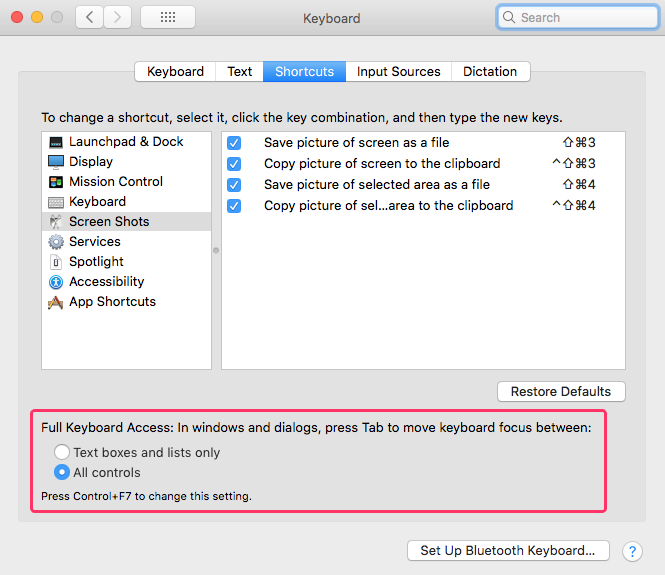
Apparently - as I learned while authoring this code - the Firefox Browser doesn't support tab-based navigation on all "normal" elements by default. Instead, you have to go into the Keyboard Preferences and explicitly enable keyboard shortcuts for "All controls":

Then, once this is enabled, you actually have to close your current Browser Tab and re-open it for the new settings to take effect.
Want to use code from this post? Check out the license.
Reader Comments
@All,
After posting this, the next question was obvious, "Should I even be using links for some of this stuff?". And, according to Marcy Sutton, the
buttonelement is more semantic and accessible for much of these discrete actions. As such, I wanted to look at stylingbuttonandalinks in an Angular app:www.bennadel.com/blog/3634-accessibility-and-styled-anchor-links-vs-styled-buttons-in-angular-7-2-15.htm
... what you'll see is that styling them is equally easy in both; and, the
buttonadds much more access right out of the box!Ben, thanks for this article, it really pointed me in the right direction!
After I used your example in my code, our linter started complaining that it will only accept
@HostBingingand will no longer accepthost:. I reworked it to achieve this and thought I would share if you're interested:The line there that says
is to chill out the linter if it complains that you can't use
'a'as a selector and it would rather you use some kind of prefix likeapp-.@Christian,
Ah, very interesting. I do see that people are starting to shy away from
hostproperties in the root decorator. I am not sure why that is. I feel like it was just something the core Angular team started doing and suddenly everyone followed-suit.Personally, I really liking having all of the meta-data at the top in one place so that I can see it all at a glance. I'd be curious to hear more about why you are favoring
@HostBindingover the original syntax?