Fixing Grayscale PNG Thumbnail Images That Come Out Too Dark In ImageMagick 6.7.7
For the last couple of days, I've been battling with ImageMagick and the generation of image thumbnails. For the most part, it's been super awesome - fast conversions and high-quality images. But, I noticed that grayscale images tend to come out extremely dark. Most of the forums and threads that I came across just said that there's nothing you can do about this without upgrading ImageMagick. But, thankfully, I came across this blog post by Adam, which explained how to fix this issue!
It turns out that, in my version of ImageMagick (the one you get with apt-get on Ubuntu), ImageMagick tries to be too clever. When it looks at the content of an image, and sees that it is all grayscale, it tries to define the output image as a PNG-8. Unfortunately, this only supports 256 colors, and many of the half-tone grays come out looking way too dark in the conversion.
To see this in action, I've put together a script that generates a thumbnail from of a grayscale PNG image, excluding any "fix" code:
<!---
	NOTE: I am currently running ImageMagick 6.7.7-10 2014-03-06 Q16. Some of these
	concerns no longer exist in later versions of ImageMagick; though, your mileage
	may vary - I've read conflicting testimonials on this matter.
--->

<!--- Setup our ImageMagick arguments. --->
<cfset args = [] />

<!--- Setup our input file. Adding quotes to ensure valid paths. --->
<cfset arrayAppend( args, ( """" & expandPath( "./calm-face.png" ) & """" ) ) />

<!--- Resize the image to a max-width of 200px. --->
<cfset arrayAppend( args, "-resize 200" ) />

<!---
	Define the color-space of the thumbnail to be sRGB. This seems to be the more
	commonly supported color model (though, caveat, I know next to nothing about
	what color spaces even mean!)
--->
<cfset arrayAppend( args, "-colorspace sRGB" ) />

<!--- Setup our output file. Adding quotes to ensure valid paths. --->
<cfset arrayAppend( args, ( """" & expandPath( "./thumb.png" ) & """" ) ) />

<!--- Run the convert command. --->
<cfexecute
	variable="result"
	name="convert"
	arguments="#arrayToList( args, ' ' )#"
	timeout="60"
	errorVariable="exeError"
/>
When we run this, we get the following result (for demonstration purposes, the thumbnail is being overlain on top of the original image):
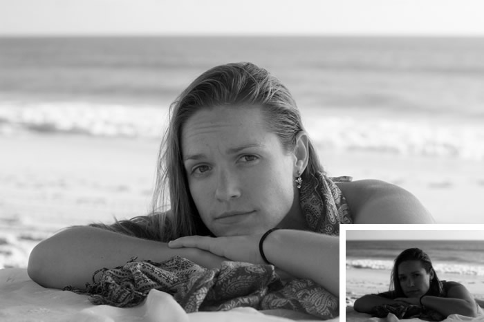
Notice how dark the thumbnail is! It looks horrible.
Now, as Adam explained in his post, this is because ImageMagick is converting the image to a PNG-8. To fix this, we can explicitly tell ImageMagick which format to use for the output file. In this case, since we're dealing with a PNG image, we'll define the format as PNG-24. Technically, I believe this may lead to some data loss if the input image is a PNG-32 or higher; but, for the purposes of thumbnailing, I am not concerned.
<!---
	NOTE: I am currently running ImageMagick 6.7.7-10 2014-03-06 Q16. Some of these
	concerns no longer exist in later versions of ImageMagick; though, your mileage
	may vary - I've read conflicting testimonials on this matter.
--->

<!--- Setup our ImageMagick arguments. --->
<cfset args = [] />

<!--- Setup our input file. Adding quotes to ensure valid paths. --->
<cfset arrayAppend( args, ( """" & expandPath( "./calm-face.png" ) & """" ) ) />

<!--- Resize the image to a max-width of 200px. --->
<cfset arrayAppend( args, "-resize 200" ) />

<!---
	Define the color-space of the thumbnail to be sRGB. This seems to be the more
	commonly supported color model (though, caveat, I know next to nothing about
	what color spaces even mean!)
--->
<cfset arrayAppend( args, "-colorspace sRGB" ) />

<!---
	For PNG images, sometimes ImageMagick tries to be too clever. It will look at the
	image data, and if it sees that it is all grayscale, it will try to collapse the
	color model down to PNG8. This causes grayscale images to come out far too dark.
	But, if we force ImageMagick to keep the image as PNG24, things will work out
	much better.

	CAUTION: I *think* PNG24 may result in some data-loss with regard to alpha-
	transparency. But, I have not worked too much with transparency and ImageMagick, so
	take that warning with a grain of salt.
	--
	Read More: http://adamish.com/blog/archives/746
--->
<cfset arrayAppend( args, "-define png:format=png24" ) />

<!--- Setup our output file. Adding quotes to ensure valid paths. --->
<cfset arrayAppend( args, ( """" & expandPath( "./thumb.png" ) & """" ) ) />

<!--- Run the convert command. --->
<cfexecute
	variable="result"
	name="convert"
	arguments="#arrayToList( args, ' ' )#"
	timeout="60"
	errorVariable="exeError"
/>
Notice that we are including "-define png:format=png24" in the list of arguments. This time, when we run the thumbnailing action, we get the following result (for demonstration purposes, the thumbnail is being overlain on top of the original image):
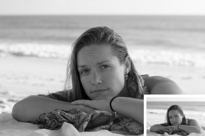
As you can see, this is way way better!
So far, this this seems to be working great for ImageMagick 6.7.7 and grayscale PNG images. When I create thumbnails using ImageMagick 6.8.9 (on my Mac), the grayscale thumbnails seem to work fine even without the fix. But, according to various forum-threads that I've read, your mileage may vary. As such, this PNG-8/PNG-24 fix may still be applicable in later versions of ImageMagick. Much thanks to Adam for saving my bacon!
Want to use code from this post? Check out the license.
Reader Comments
This may just be a matter of taste, but I kind of liked the 1st improvement better, especially at just first impression/first glance. The 2nd one seemed to be just a little "too" washed out. Although that was just my first impression/first glance. When I looked back at both of them more closely, I could barely even detect a difference between them. I worked as a photoshop technician a long time ago for a photographer, and one of the things we did to photos was use photoshop to make them ready for print. One of the things we talked about is how it is good to have some contrast and dark in the picture (without getting too contrasty) So I'm guessing that's part of the reason I preferred the 1st one right off as opposed to the 2nd one. Don't get me wrong, the 2nd one is great too, I just first preferred the 1st one (I'd also like to mention that when it comes to light and dark parts of the photo, different parts of the photo look better in different circumstances in terms of light and dark. What I mean by that is, for example, eyes almost always look better lighter. But a lot of time, you bring in "blacks" and darker colors into the background to make the background darker and bring out things like the eyes. The skin of a person in a photograph is very complex, and there are areas of the skin where darks are good to be brought out, but other areas where it is good for it to be lighter. Too light, especially overall without contrast, and you start loosing some of the dimensional effect. I guess the 1st improvement seemed to have a bit of dark in it more so than the 2nd one, and the 2nd one seemed to "lose" some of the "dark", and so it was more light overall, but there was less contrast maybe.) I am realizing that a lot of this is outside of the scope of what you were trying to do and say, and I apologize for that, but I'm too lazy to go back through and modify it and delete out certain parts, and it's one of those things where I simply can't resist hitting the submit button. Sorry. lol
@Anna,
I think there must be a misunderstanding of how the images are being presented because I think there's no way you could consider the first one a better thumbnail :D I think you must be looking at the larger image, not the smaller on (in the corner of the larger image). But, if you are referring to the thumbnail... to each their own, I suppose :)
Over the years, my ability to mess with a photo has gotten better; but, it's still pretty lackluster. I can mess with brightness and contrast, a bit with "levels" and have recently tried to figure out how all the "curves" work when messing with individual colors. Frustrating, but fun stuff.
@Ben,
Oh I think I was misunderstanding how the images were being presented! Oops! Overworked brain. lol And "curves" are always frustrating, aren't they? ;) lol
Awesome article. THANK YOU. I had been looking for the solution for ages.