The User Experience (UX) Of Color Contrast In A Call-To-Action
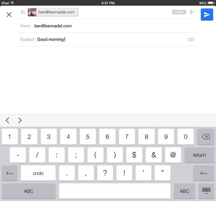
I don't use the Google Mail app on my iPad all that much. I'll glance at the inbox to see if there are any emergencies; but, beyond that, I don't do anything that requires significant interaction. As far as I'm concerned, my iPad is for consumption, not production. From time to time, I'll send myself a quick reminder email or a mental note - but nothing more than a few words. This is what I was actually doing last night when I had a strange realization - I have no idea what the "Send" icon represents in the compose window of the application.
To be clear, I'm talking about the blue icon in the top right:
| |
|
|
||
| |
 |
|
||
| |
|
|
Is it supposed to be an arrow? And, if so, why the missing wedge? Or is it supposed to be a paper airplane? And, if so, why? What does that have to with email? To be honest, there's very little about the content of the icon that indicates "send". So, how is it then that, despite almost no practice, I'm able to send emails?
This interface works because the user experience (UX) here is incredibly contextual. When you're in the compose window, there is only one reason for you to be there - to write and then send an email. And, if there is only one reason to be there, there can only be one [primary] call-to-action (CTA). In this case, "Send."
If you look at the user interface (UI), it's completely monochromatic; it looks like one of my wireframes. Except, of course, for the blue button. The blue button stands in such stark contrast to the rest of the page - and looks sufficiently button-like - that one has no choice but to consider it the primary call-to-action. And since a compose window has only one purpose, you have no choice but to consider the blue button the Send button.
That said, I don't think this is a particularly good user experience. The content of the button should be more indicative of the action, "send;" I think it works in spite of the UI, not because of it. If nothing else, however, this goes to show how powerful color contrast can be, especially in the context of a highly-focused UI.
Reader Comments
Ben,
I believe the icon is supposed to be a paper airplane. It's the same icon used in the Android GMail app. However, in Android, the icon is grey. I, too, find it odd that Google opted for a bright blue instead of the grey to match the overall UI.
Google's UI has always erred on the side of simplicity. In cases like this (I had the same problem for awhile - that button is definitely NOT intuitive) it is simply erring.
@Mike,
If the icon looked a little bit more like an actual paper airplane, it would definitely work better. The "top" view is odd, and also not terribly accurate - paper airplanes don't have transparent opening in the middle. If the rotated it slightly, it probably would have been much more recognizable.
That said, I still am not sure what a paper airplane has to do with sending email... but something about it sort of works :) Like paper airplane == motion == delivery.
@Francainath,
I bet if they tweaked it just a little bit, they could make the button much more intuitive. It seems like a small step and its odd that they didn't take it.
Not sure why the word "send" can't be used as it is in the web browser on a desktop. Other than multi-language concerns, I'm not sure using an icon has any benefit when a clear text call to action could so easily be used. Am sure they've done their research and have their reasons but i do agree the icon isn't clear.
On a related note, the first time I used Outlook, I *completely* missed the "Send" button. For those that haven't seen it, it is *HUGE* and right next to the "To" field. This page has a screenshot (from MS, titled, "I cannot find the Send button"):
http://office.microsoft.com/en-us/outlook-help/i-can-t-find-the-send-button-HA010239007.aspx
However, my eyes were looking everywhere else. I mean, I've already dealt with the "To" (and cc and bcc), so I just completely skipped over that part. I was looking in the menu, at the bottom, in the ribbon area ... finally, I think I looked away, and when I looked back, there was that huge button -- slapping me in the face.
Perhaps MS could use some "color contrast" for this call-to-action button?
I am going with a paper airplane too, all i can presume is their design team went along the lines of mail...mail used to be mainly paper...air-mail was quickest...email is quicker...lets use a paper plane!
@Mcaulay,
The irony is that they have plenty of room for the word "send" - the button isn't next to anything. It would make it much more clear.
@Jason,
Ha ha, plus, who doesn't love paper airplanes :D
@Tom,
Yeah, that button definitely fades into the background. Plus, to me, it seems odd to be _before_ all the other stuff. I feel like, when you think about the workflow, you fill out the form as you go down - seems like the Send button should be at the bottom.
2 words: blink tag. LOL
@Francainath,
Ha ha ha :D
Looks a lot like the U.S. Postal Service symbol. http://www.bakkentoday.com/media/full/jpg/2012/05/03/usps.jpg
@Irv,
Ha ha ha, it totally does :P
The reason why this does not come across as good UI (resulting in bad UX) is because your cognitive load was too high. We preach the adage, "Don't make me think" (Steve Krug), and basically there are 2 primary "loads" which we try to reduce: a motor load and a cognitive load.
A motor load is when you have to do something physical, such as move your eyes to find information, or move your hand to follow up with another motor load, a click. Cognitive loads are decisions you are making internally in order to route your action. As we can see in your introduction in this article, you asked a myriad of questions, thus proving that the cognitive load of the UI was too great.
A problem we have as web developers is that the more we are responsible for building an application, the less objectively we can see that app. This is where our user-testing comes in, allowing us to perceive how users completely unfamiliar to the app design and operations interact with it (but even these users start to build a 'tolerance' once they develop an understanding of the operations and can no longer be seen as objective).
I am wildly interested in the field of Human/Computer Interaction. It is truly an amazing field of psychology which provides us with great guidelines as to why we consume interfaces in the manner we do; and with that understanding, we can work to ensure that UI elements do not incur any more cognitive loads than they should.
Interesting. I can't *not* see it as a paper aeroplane! And also see it as a good metaphor: it's got a sense of direction visually with the "arrow" look, and a sense of transporting something from x to y. It also has the metaphor of a letter (piece of paper) being made to move (by being treated as a plane).
I'm not trying to suggest you're wrong, Ben: if anything it demonstrates how one needs to be really cautious about this sort of thing. What is completely obvious to one person can be - quite legitimately - opaque to someone else.
They can't really have an icon that says "send" as that only means something to English-speaking people. The whole idea behind these pictographical UIs is that they are language-agnostic. Sometimes - it seems - at the expense of articulating any concept at all!
--
Adam
@Ben,
Apple uses a paper airplane for the Mail application in OS X, as well. I guess at some point this became a common image for sending mail. What ever happened to just using the word "Send"?
Here's a screenshot of the same call to action in gmail but in a web browser.
http://cl.ly/Uo48
Much better.
The problem with Apple branding a 'send' button across multiple devices with that symbol is that new users to their products will have a harder time adopting that until they figure it out through context. Like one browser using: form.submit() to submit a form and another using submit(form). I'm sure the more familiar you are with Apple devices, the easier the acclimation will become (until they make a change).
@Aaron,
So. Very. True:
A problem we have as web developers is that the more we are responsible for building an application, the less objectively we can see that app.
At work, when I'm reviewing a prototype (from the Product / Design side of the house), half my brain is thinking about the features and looking for inconsistencies, or holes in the workflow ... and then half my brain is furiously calculating all the work that will have to go into building said prototype. This latter 50% makes it impossible to look at the design from a completely objective point of view.
What's more, is that if I see a feature that is not terribly compelling, I might ask myself the question, "Is the user better off if this app has the feature than if it doesn't have it?" And, sometimes, the answer is, "Yes, a little bit." But, the problem is, if that "little bit" is joined by weeks of development time, my brains imply cannot acknowledge that it's a good idea - I can only see the "wasted effort" that would go into building it.
It's a great skill to be able to quiet the engineering half of the brain. I'm getting a little better every day; but, sometimes, it feels like scaling Mt. Everest.
@Adam,
It's funny you say that, because I think I *do* see it as an airplane. But, I think the link between the airplane and the concept of "send" just couldn't click. And because that, I was like, "No... that can't be an airplane."
It's be like if you saw Bill Clinton in a superman suit, you're first reaction would probably be, "That can't be Bill Clinton," and not, "Oh look, Bill Clinton in a superman suit." :)
Re: other languages, this shows how bad I am -- I didn't even consider that.
@Mike,
To be honest, I've never opened the Apple mail client. Sure, I've accidentally triggered it a lot of times (and the configuration screen pops up); but I just close it out. I just have my Gmail app open in a browser tab all the time.
@Ben,
Your constant questioning of yourself is probably a systemic extension of your ever-present quest to optimize workflows. That's definitely not a bad thing to have (but I'm sure it takes a lot of experience that you've built over the years to be able to do it as well as you are doing now)
I've felt that, in my experience, the more I've learned to see patterns, the better I've been able to insert a solution that handles it in the most optimal way. This has been very challenging, but I'm sure that people with a stronger Engineering side of the brain are probably very apt at the process!
Email is one of the best of Internet applications. Email applications are the worst, however. There is no email client that has every completely satisfied my front-end requirements. I could list 12 things wrong with every client I've ever used within seconds. Thunderbird - horrible address book management. Outlook - obscuring addresses and non-standard rich text support (meaning it supports rich text). (Al)Pine - hard to setup filters (rules). JBMail - no support for UTF subject lines. SquirrelMail - slow. Gmail - threaded view - who uses this?!?! Pegasus - too complicated for normal users. YahooMail - interface changes every time I log in, which isn't often.
No, I don't understand the paper airplane "send" button, but I agree it has to do with a telegram (paper message) being sent someplace. Maybe implying the message is somehow airborne represents speed?
I read somewhere where there was a movement to remake icons removing their real-world equivalent references. So that would make interfaces even more quizzical, right?
@Sean,
So far, GMail is the best one I've used so far. Though, I am not sure what you are referring to when you say "threaded view." Is that the default view? or is that something else, like a Labs setting or something?
@Ben
Threaded view is where the messages are listed by recipient as "conversations" and not as a simple list sorted by arrival in descending order.
Another beef with Thunderbird is that it's near impossible to update the subject line of incoming emails to something actually resembling the message content.
Returning to the paper airplane icon and the power of color scheme, I agree that the color scheme is the only reason anyone knows to click that button to send. It is certainly not the icon design, nor the text (none shown) nor placement (button belongs on lower right underneath the message text area input, IMO)
Having something like (a href='form_act.cfm')Send(/a) would be too easy and too HTML 1.x. Can't possibly have that ...
@Sean,
Yeah, the placement of the button is a bit odd. But, I assume they did that because the keyboard covers the bottom portion of the screen. But putting it in the top-right, it's always visible, especially since people are more likely to write shorter emails on a mobile/tablet device.
So - this UX conversation about color contrast is a fail.
We're all really upset with the graphic design hack who designed that icon?
Just sayin'.